GSoC 2020: Outliner Discussion and Suggestions

Hello everyone! I’ll be working on improving the Outliner again this summer for the Google Summer of Code. Last year was amazing, and I’m excited to see what great changes we can make this year! :slight_smile: Many of the goals for this summer’s project come from last year’s great suggestions, thanks for all the great ideas!

Design Task: ⚓ T77408 Continued Outliner Improvements Design

I’ve created this topic for two reasons; the first is to get feedback and suggestions on the proposed plans. A build will be made for testing, but it is also important to get feedback on the proposed plans before coding begins. The second reason is to get ideas for other smaller issues to fix, similar to last year. Last year there were so many great ideas for suggestions, and this year it would be great to see more feedback on the current proposal as well. Feel free to suggest new ideas though.

For more detailed plans, read the full project proposal on the wiki: User:Zachman/GSoC2020/Proposal - Blender Developer Wiki. Links to development tasks are included.
Project Plans:

  • Decoupling of selection, activation, and interaction mode toggling. (D5817) Currently, selection/activation of outliner elements is tightly coupled, e.g. clicking mesh data selects the object and toggles edit mode, or selecting a collection always makes it the active collection. By separating these behaviors the way is opened for further improvements, including those listed below.
  • Properties editor “syncing”. (T63991) Continuing the previous example, if clicking mesh data no longer toggles edit mode, that action can be used to switch to the mesh data tab in the properties editor. This will work for other datablocks like modifiers or materials too.
  • Mode toggling and activation column. (T68498) 2.80 introduced multi-object editing, but there is still not an efficient way to add and remove objects from edit mode. A new column can be added to the outliner to bring objects in and out of edit mode. For other data types, this column can be used for activation (e.g. activation of scenes and collections).
  • Item sorting. (T68502) Currently collections are sorted manually, and objects are either sorted by creation order, or alphabetically. Options will be added to sort objects manually as well. There is room for other sorting modes as well such as sorting by object type, or sorting modifiers and constraints.
  • Context Menu improvements. The context menu is currently messy, and full of undocumented and unsupported operators. Additionally, it does not operate on the right click target which could make it more intuitive to use.
  • Other ideas. I would like to make other smaller changes including creating a new collection from the selection, drag and drop improvements, and others.

Thanks!
44 Likes

Immediately I’m going to suggest something that maybe sounds like it’s outside of the scope here, but it’s the one of the oldest feedbacks regarding the outliner in the paper cuts thread and still relevant in 2.82. I would love to see a design pass on highlights, because with active object, active camera, active collection, selections and filter highlights, it’s very messy and confusing:

2 Likes

Great to know that you are involved again. Those improvements helped me a lot.

Just an idea: If the hovered object is somehow hilighted in the 3D viewport too, it might be helpful to scan through a long list.

4 Likes

I’m really happy to see you continuing the improvements of the Outliner.

I have been collecting few ideas since the last year:

1- There is a proposal from Andrzej Ambroz (jendrzych), that the icon and the name color changes for the objects that are in edit mode. Aug 10 2019, 5:01 PM, which I consider an excellent proposal. This would relieve from having the Object Data icon.

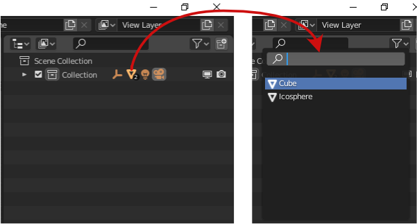
Additionally, I would like to suggest the having the icons depending on what the object has on it, materials, modifiers, constrains, etc. all visible next to the object name. Something like this:
image.
I see few advantages on this, first the user can see clearly what the object has enable or assigned, second we can use the same principle of the list menu when we select a parent or collection that has many objects as child to quickly select what the user needs (and this tied to the properties sync) could be a boost on the workflow.
The list menu I’m talking is this one:
image

Third advantage is a little more clean hierarchy when everything is unfolded, by grouping the materials, just like the Vertex Groups, or modifiers.

2- Drag and drop without holding Shift to make a child or to take it out from the parent. Just like collections behave.

3- Deleting parent have to delete all the child without warnings, just like Photoshop for example. This applies for collections as well.

4- Hide parent will automatically hide child with the possibility to override one child visibility (same for collections).

5- Scroll bar always visible. (from my last year wish)

6- From the context menu a “Delete only parent”, so if the user wants to delete only the parent of a hierarchy, just click there and that’s it.

7- Be able to select (move, scale, etc) a hidden object. Specially great when dealing with boolean objects.

8- Have axis for collections like collection instance.

9- Honestly I have to say that I dislike so much the concept of active object vs selected one, can we just get rid of it?

10- When using box select, one the objects that gets inside of it should become the selected one. Unlike now, where if I have a light selected and then I use box select to other object, the light gets deselected but still is the active object… extremely confusing and useless if I’m totally honest with you.

That´s it for now :sweat_smile:
Anyway keep the great work :+1:

6 Likes

The main thing that must be improved, from my point of view, is that deactivate a collection remove all the visibility states of the inside objects or collections. It’s a real frustation se all your scene visibiloty reset by a simple click.

4 Likes

I think there is a differential already planned for that. Don’t remember which one is.

  • Selecting hierarchies in the latest 2.9 is still not working for me the way it should.
    With the new shortcut, you still have to select it twice, which makes selecting multiple hierarchies at once not possible.
    My proposal is to make selecting hierarchies a one click solution, like object selection.
    If you select the top root node, it should automatically select all children. Why would you select it otherwise?
    And I know this is outside the Outliner specs, but it would be nice to have this behavior translated to the 3d view as well, in some way. Not just the current shortcut or menu option.

  • Deleting items from the Outliner still doesn’t works sometimes. It seems especially the case for empties (coming in from FBX imports). You have to RMB/Delete it to get rid of it.

  • Duplicating hierarchies seem to work now as expected :slight_smile:

cheers!

rob

1 Like

Sounds great! These improvements will benefit many people. Wish you luck on this project.

2 Likes

Thanks for your work on the outliner last year - it’s a massive improvement over 2.80’s original outliner. Looking forward to seeing some more good changes this year. Here are a couple of small suggestions/papercut things you could probably fix easily:

  1. The selection order of things selected in outliner is not consistent with selection in the viewport. Selection in the viewport results in the active object being the last object selected, and outliner it’s the other way around (active is first and I can’t figure out how to change it…)
  2. When filtering objects by name, collections containing search results can’t be collapsed, which can be a bit annoying.
  3. I would LOVE an option to always put newly created objects, and potentially objects pasted with ctrl+v in the scene collection instead of the selected collection. Sometimes I create an object and it goes into the wrong collection, meaning I have to find it before I move it. If it’s in the scene collection it’s very easy to find. Objects copied with shift+d, or instanced should go in the same collection the original object is already in.
2 Likes

Oh, here’s a papercut I definetly missed to link the last thread… I don’t think there’s a menu entry for “collapse all” or “collapse hierarchy” yet?

EDIT: I just tried the right-click “view” options “hide one level” and “show hierarchy” and got the following super illogical results:

  • “Hide one level” collapses everything up to the collection level… it doesn’t contextually hide one level of hierarchy at all.
  • “Show hierarchy”, if performed immediately after the above, does nothing on a collection…
  • …it does, however, expand everything on the same level, so it should be renamed “expand current level”.

I guess I shouldn’t have been surprised at these results. :upside_down_face:

1 Like

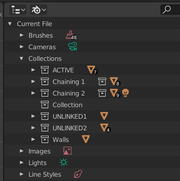
What about splitting collections to Linked Collections and Unlinked Collections in Blender File list?
It is not possible to determine which collections are linked to the scene, they all are mixed in Collections list.

изображение

4 Likes

Good News @Alberto! That has been fixed in 2.83 since April 9th.

https://developer.blender.org/rBf3433fcd3bf87c9405fb05c96fde036eb658e8aa

6 Likes

Thanks, good news @EAW

  1. The selection order of things selected in outliner is not consistent with selection in the viewport. Selection in the viewport results in the active object being the last object selected, and outliner it’s the other way around (active is first and I can’t figure out how to change it…)

Another inconsistency in selecting objects is that in the 3D viewport shift is used to select multiple objects one by one and control to select objects with everything in between; while in the outliner it is the other way around (which is more consistent with other programs/OS’s).

5 Likes

My idea to improve the outliner.
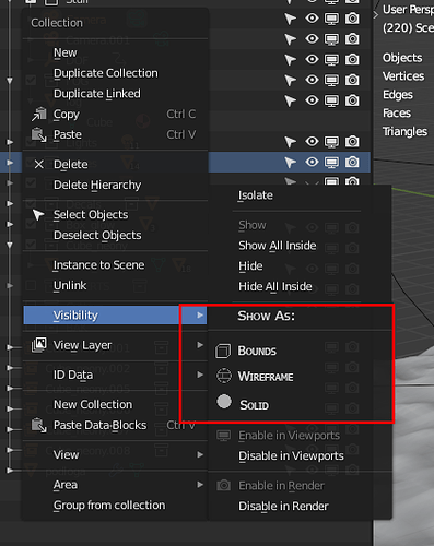
The toggles in the menu under RMB on the Collection, toggles all objects visibility in viewport in it as bounds, wireframe! In heavy scenes it will be useful i think.
Again thank Yoy very much for Your work #blender natecraddock !

12 Likes

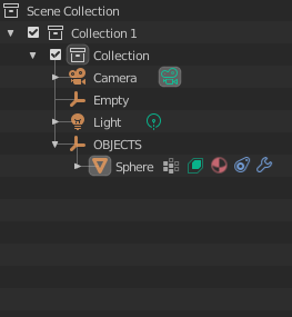
Also: those visibility toggles on your screenshot should be enabled by default. I don’t know why only the “viewport toggle” is the only one who comes enabled on the default file.

3 Likes

Hello @natecraddock , good to see that you have been accepted again this year, good wishes for success!
I would like to point out one thing …
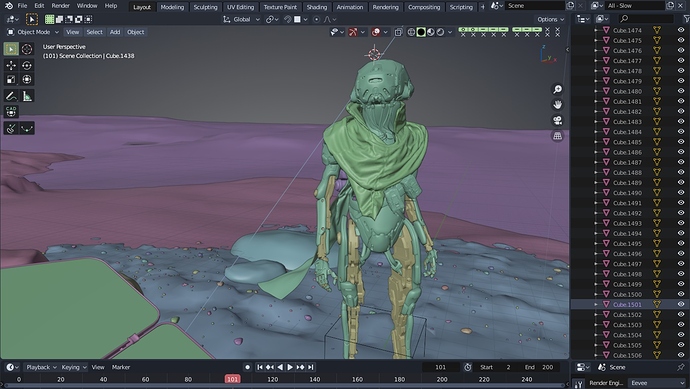
Loading the wanderer scene that has many objects, in blender 2.90 I realized that navigating between the names of the objects in the outliner with the key arrows (holding down) becomes exponentially slow until it stops or skips large portions of objects, there is nothing that can be done to solve this problem ??

1 Like

Two loose QOL ideas for Outliner:

  1. One of the most requested feature on RCS regarding Outliner is autoscroll with selected item: https://blender.community/c/rightclickselect/Zvcbbc/ That would be exceptionally handy.

  2. When selected multiple objects hitting F2 for rename could automatically trigger batch rename utility. One keybinding free, and one shortcut less to remember. Plus in some Linux distros Ctrl+F* is reserved for switching workspaces, so for a user there is a conflict to resolve.

11 Likes

Coloured collections :

11 Likes

Hello, a few requests to consider:

  1. It would be nice to be able to disable non-object data in the outliner (Mesh, Material, Pose, etc.) or even enable/disable visibility by data-block type. Sometimes I just want to see all of the objects in a hierarchy, and when I shift-click to expand a collection, it shows all the data, and it becomes too much to understand at a glance. Maya, for example, can filter object types and hide/show properties. Of course, Maya has the opposite problem: while I can easily make the outliner as simple as I want, the menus are completely indecipherable for all their entries.

  2. I wish I could right-click on an empty area of the outliner and “Link collection…”. For example, in a new scene, there are no collections linked and I have to go to the .blend file view of the outliner to link them. This would be a simple QOL improvement.

  3. I would rather the outliner’s use of CTRL and SHIFT be consistent within Blender than consistent with OS’s. I always get it wrong in Blender, because I am thinking in terms of Blender. Is this editable in the keymap somehow?

1 Like