I am creating this thread because many users requested but are not getting a answer.
So, on devtalk, we are requesting a little change to the interface but no answers so far.
I dont know why someone would make the topbar locked in place and global since it display local tool settings, but I hope you are already aware of the problems it brings up.
Problem
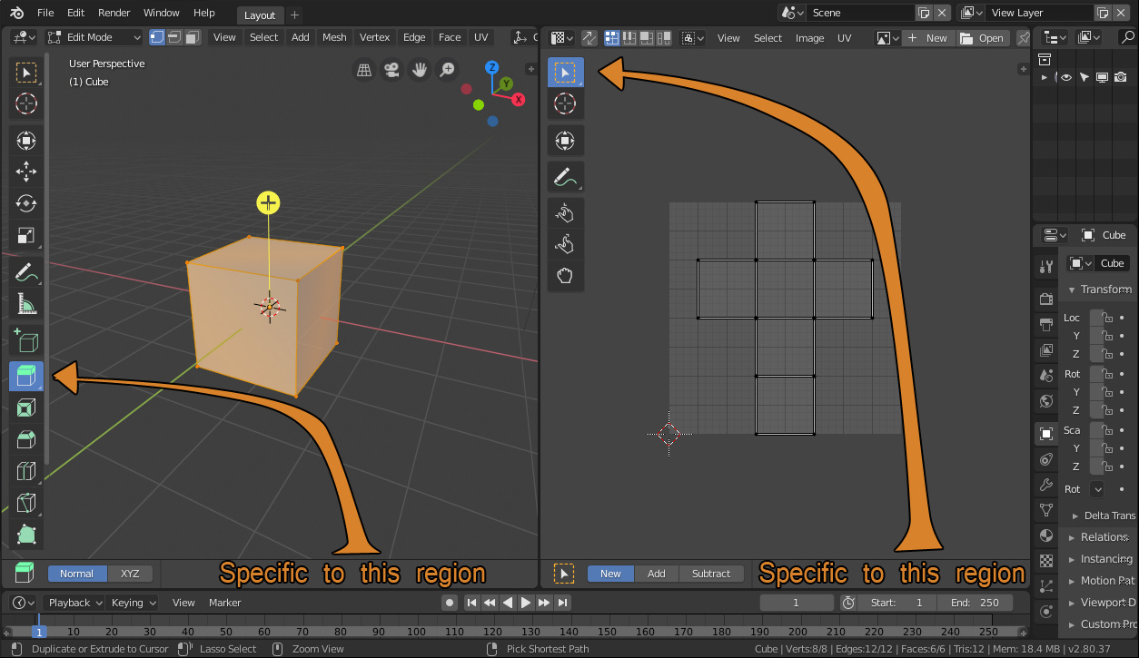
Top bar is global and unmovable, it picks the settings if the last activated tool, which brings inconsistency and requires extra clicks and unnecessary movements to reach the topbar specially when there are multiple regions of different types sharing the same topbar

We see it being reported in the devtalk multiple times.
And I didn’t mention proposals that doesn’t relate to topbar but provide better solutions than those.
Intriguing enough, I don’t find any answer from devs to why this is a bad idea or if its going to happen or not.
Edit:
OK Guys! What I feel in this thread is that no one here actually likes the topbar, but we all disagree on whats the proper solution to the problem.
SO lets recapitulate.
The Current State.
-
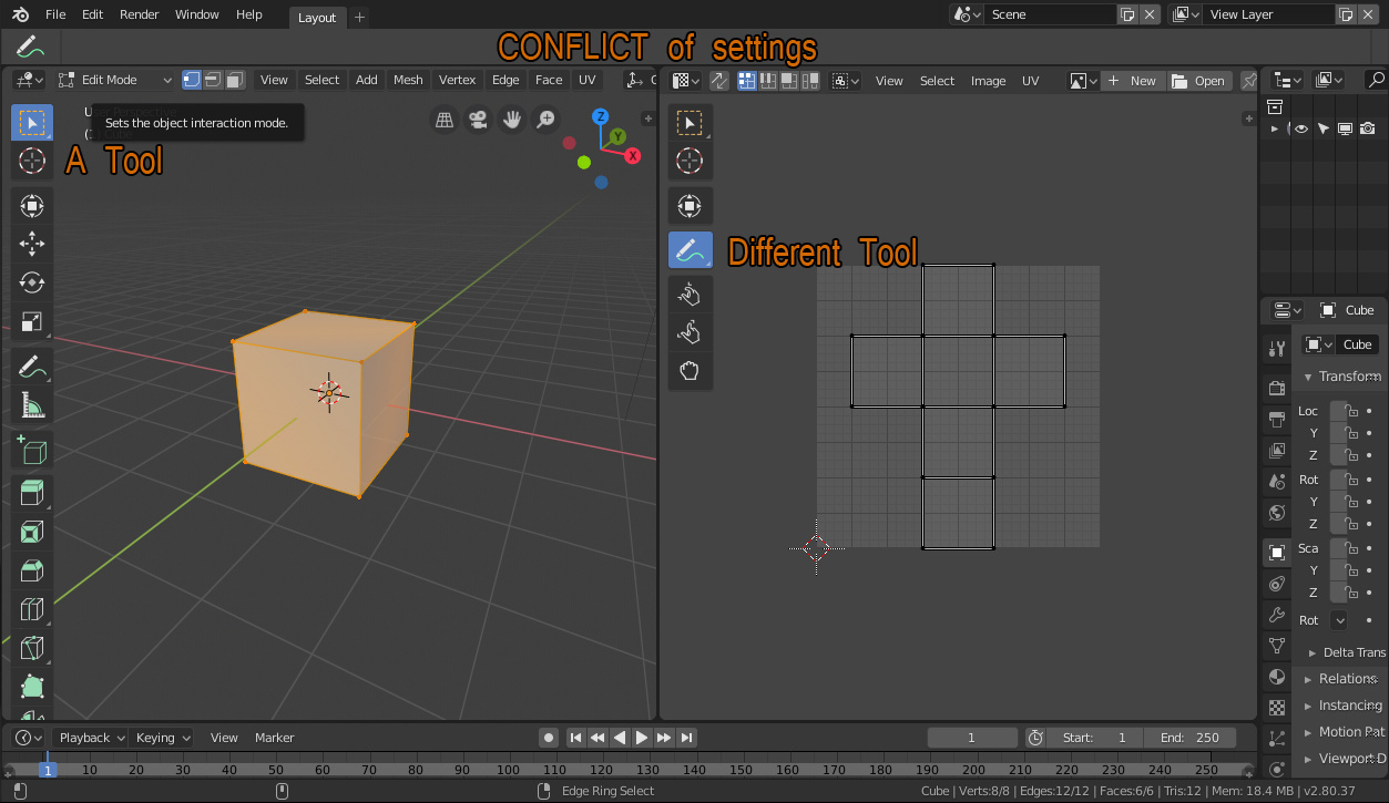
Multiple Editors and only one topbar to display settings causes conflicts in the settings
-
Multiple Editors and a single topbar (at the top) leave the tool settings too far away from lower editors
-
Topbars are supposed to display tools settings rather than settings.
-
Topbar isn’t an editor and stays glued in place, which limits the possible layouts.
The Fixes
Here we get mad because basically everyone has a different concept of interface and wants a different kind of fix so I will list the fixes in the order from the most easy to implement to the harder.
Fix A:
Tool Settings in properties (N) panel:
This is the easiest fix just because requires the devs to put the draw functions from properties editor in a panel with a single long if-elif-else statement and bam! everything is on the viewport.
now you can just press N to hide and unhide the settings like you want, no extra effort needed.
It also doesnt requires the topbar removal/refactor neither tool settings panel removal.
Fix B
Tool Settings in a popup:
This also require devs to create a popover that can be caled by a shortcut and may be as hard as the N panel thing but will require some changes to make popups support collapsable panels, maybe a fake popover?
But anyway, this puts the settings right under a shortcut which means you can work with maximized viewport for most tasks without need to worry about the topbar or the tool settings. This also doesn’t require any drastic change to the interface.
Fix C
Return of the T-shelf
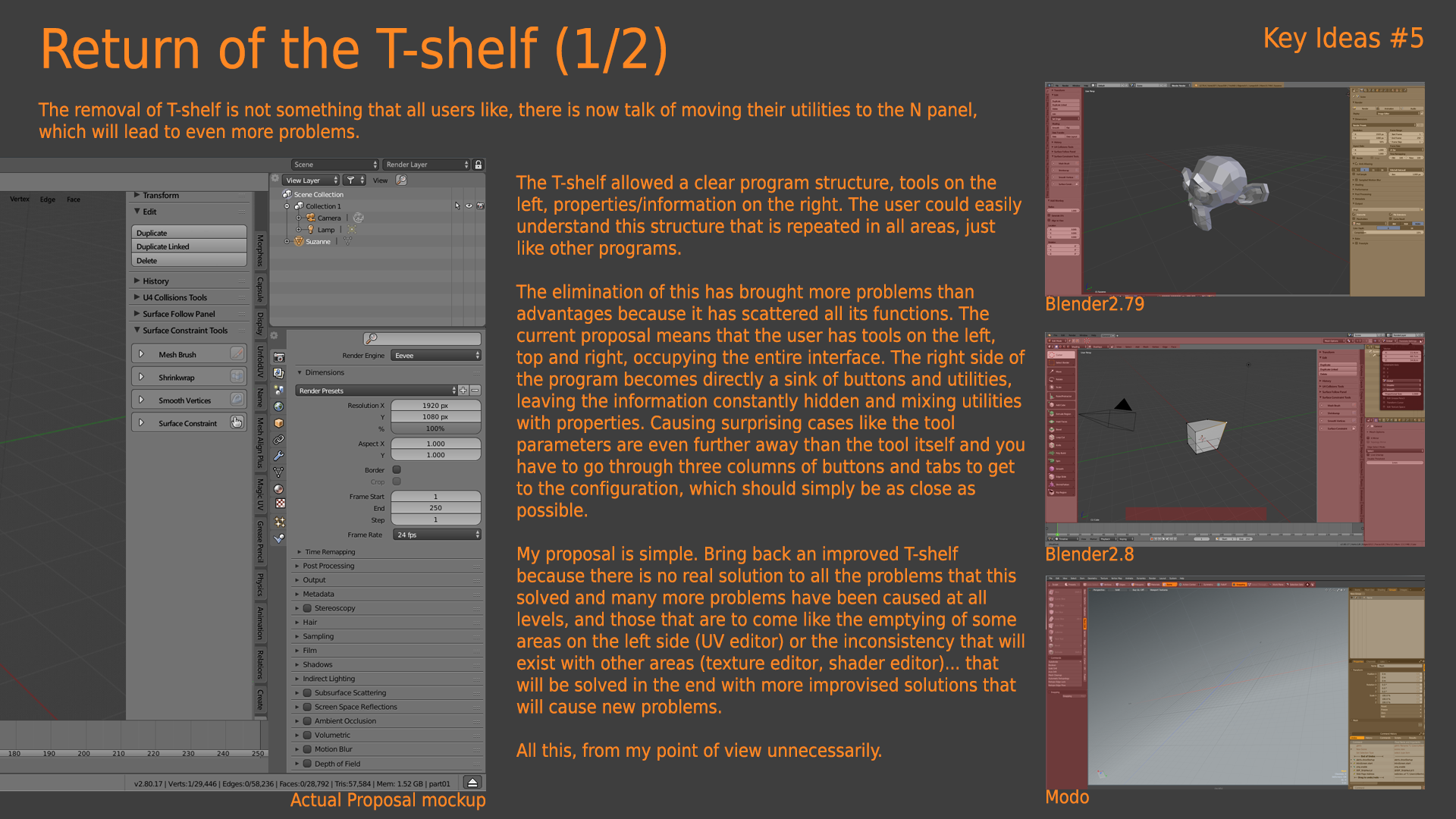
This proposal from @alberto? looks similar to fix A but adds tools to the shelf also and offers a mix of the tool system and the old operator buttons along with its settings, all in a single tab, which sounds good for learning and can be quite organized since the tools and the settings are in the same place.
Looks also quite easy to implement, just lots of UI code that even a kid can write.
Fix D:
Toolbar relocation:
The idea sounds simple, take the tools put on the bottom and take the settings and put on the left.
Looks quite visually appealing as well. This will move the tools and the settings near to each other and makes tools easy to reach from any side of the screen, which is the opposite of what happens with the tool settings in the properties panel which have settings on the far left and tools on the far right.
about the status bar, I guess it doesn’t really matter if its on top or bottom, its so thin that basically fits in any place.
This solution would require some changes to the source code since it needs editors with two headers but I guess is very possible.