+1 agreed with everything.
Brecht told that maybe they do the topbar a new area. I think that all new parts of blender interface must be areas, specially topbar and statusbar.
I made a proposal about that. But they have change a few the topbar toolbar utility since then.
https://devtalk.blender.org/uploads/default/original/1X/f44610ee07e5e62ea468c4c4f705fd7ccdc1228f.jpg
@brecht?
@ideasman42?
@billrey?
@pablovazquez?
@anyone ?
Any thoughts about making topbar and status bar as independent editors? Possibly merging both.
I agree that the theme should be clear and simple. Maybe make a survey about what the default theme should be. This might mean to have a pair of default themes - light and dark.
I personally hate playing with themes. I also think that most of the time the professionally developed themes are the best.A lot of software contain a bunch of useless themes - for example who needs a pink theme with pink letters - this is bad for the human eyes. Most of the user made themes are of this quality.
BTW. I think that the Cinama4D above looks the best and is the most clean. I am not biased as I have never used that software.
Unclickable bones should be click-through
So I’ve noticed that if a bone is set in the outliner so it can’t be selected, I also can’t click through it to grab
another bone. I think this would be useful during animating in case you don’t want to hide the bones.
Thank you
One more reason why top toolbar needs to be customizable as in a scenario where an artist wants to sculpt in a window and have something else in another window, he will be constrained to move with the mouse on top just to change the settings for his brush, so will become an unnecessary effort.
And you can’t force him to sculpt on top side because in this way the windows customization will become useless.
Just watched the recent video by Pablo which is awesome.
But - and I replied that there as well - in my opinion the redo panel is a step back from the amazing viewport work and the ui vision in general.
It takes a good part of the viewport, which I think (and to my understanding that’s the vision) is disrupting the workflow and can confuse the user with settings and toggles overlapping the main work area.
I mean it does contributes to discoverability, but I think the cost is too big.
One of the main issues, is that it is still displaying many irrelevant options. For example, with a simple move transform, you get the option to constrain to X, Y or Z. This is not needed, as the X, Y and Z controls are per definition constraining to axes already.
There are also options for Proportional Editing, even if you didn’t initiate the transform with it enabled. All this makes the panel about three times larger than it needs to be for simple operations such as Move, Rotate, Scale and Extrude.
On the todo list is to go ahead and remove those unnecessary options when not needed, but this requires extra work, so hasn’t been done yet.
Lastly, when an operation only has few settings, we want to use a more compact design, as described here: https://developer.blender.org/T55039
I like the idea of the redo panel, I suppose that we could hide completely in a future. But I don’t understand, the original idea of the topbar was to put here all controls of the tool, if you keep this in the viewport, near to old position of the T-Shelf… then the topbar have some sense?
Having panel like in 2.4 now with new interface is great idea and I think it will fit great. Its not super important if it would be possible to move it around or not. Grid/Fluid functionality is nice. When it has been proposed I thought it could break some thing but I assume trade off small. It could bring nostalgia (2.4 again) if you stretch properties panel horizontally.  I like option to turn manipulator on and off. I do think that it should be turned on by default since goal for new UI is to be more friendly initially and for those that figure out customization available.
Where will go the facedot activate option now? to see in solid mode when you edit.
It’s visible when Limit Selection to Visible is on.
I think it’s acceptable for the first time for discoverability. Issue is that when collapsed it still shows the name of the operation which can vary greatly. Maybe an icon/indicator would be enough when collapsed (just like in 2.7).
The face dot is really important at all times, though. For instance it’s not uncommon to accidentally cancel an extrusion which results in an extrusion of zero depth. This was easy to see in 2.79. It would look like an edge with a face dot in the center of it. I think it should be an option. Because I remember going to Blender after using 3ds Max for 20+ years and thinking the face dots cluttered the display too much, which they do, but are great for quickly visualizing problems with the mesh if that’s what’s needed.
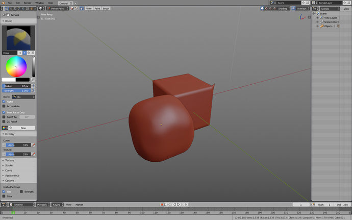
Well, I can pretty clearly state that Blender won’t be in Vertex Paint mode as its primary Workspace. That seems like one of the more odd suggestions. The default object will also certainly not be a cube with one vertex offset.
Most likely the default workspace will also have the viewport manipulator enabled, the grid visible and the toolbar on.
Yes, Face Dots will probably get added as an optional overlay for debugging your mesh. They are useful at times, but make the edge flow in dense meshes hard or impossible to make out. For this reason, they are not well suited to be on by default.
But again, making them available via an overlay is something we’ve discussed and want to do.
Right now, in youtube, Pablo says it won’t come back, here you say it can come back, I don’t know who to believe. I’m surprised that for only two people in the UI, they have such divergent opinions.


