I want to live a feedback about the tools menu.
At first when it was introduced for spacebar key, i didn’t like it all. But on shift-space shortcut it is appeared like really convenient function. I like to use it during the modeling process and probably it is good to use during the sculpting.
Although i would like to have an option to use larger icons with horizontal rows instead of one vertical, just like in zbrush.
Feedback about the “tool properties” in editor properties area.
Having here the properties of the tool entails a rather annoying problem, the fact that this panel can only show the properties of a single tool, not several. When the user can have different tools selected in different areas, for example when editing UVs. Making it difficult to predict what will be in the properties of the tool.
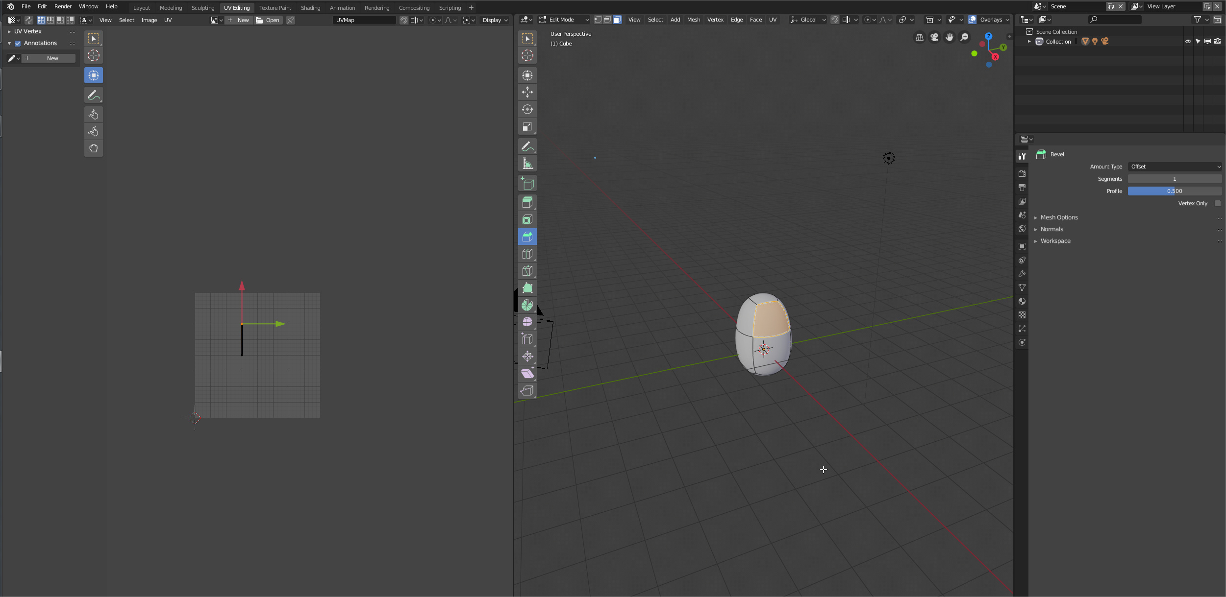
Same problem in the topbar.
3 Likes
Yeah, its a need to each editor have its own tool settings panel.
1 Like

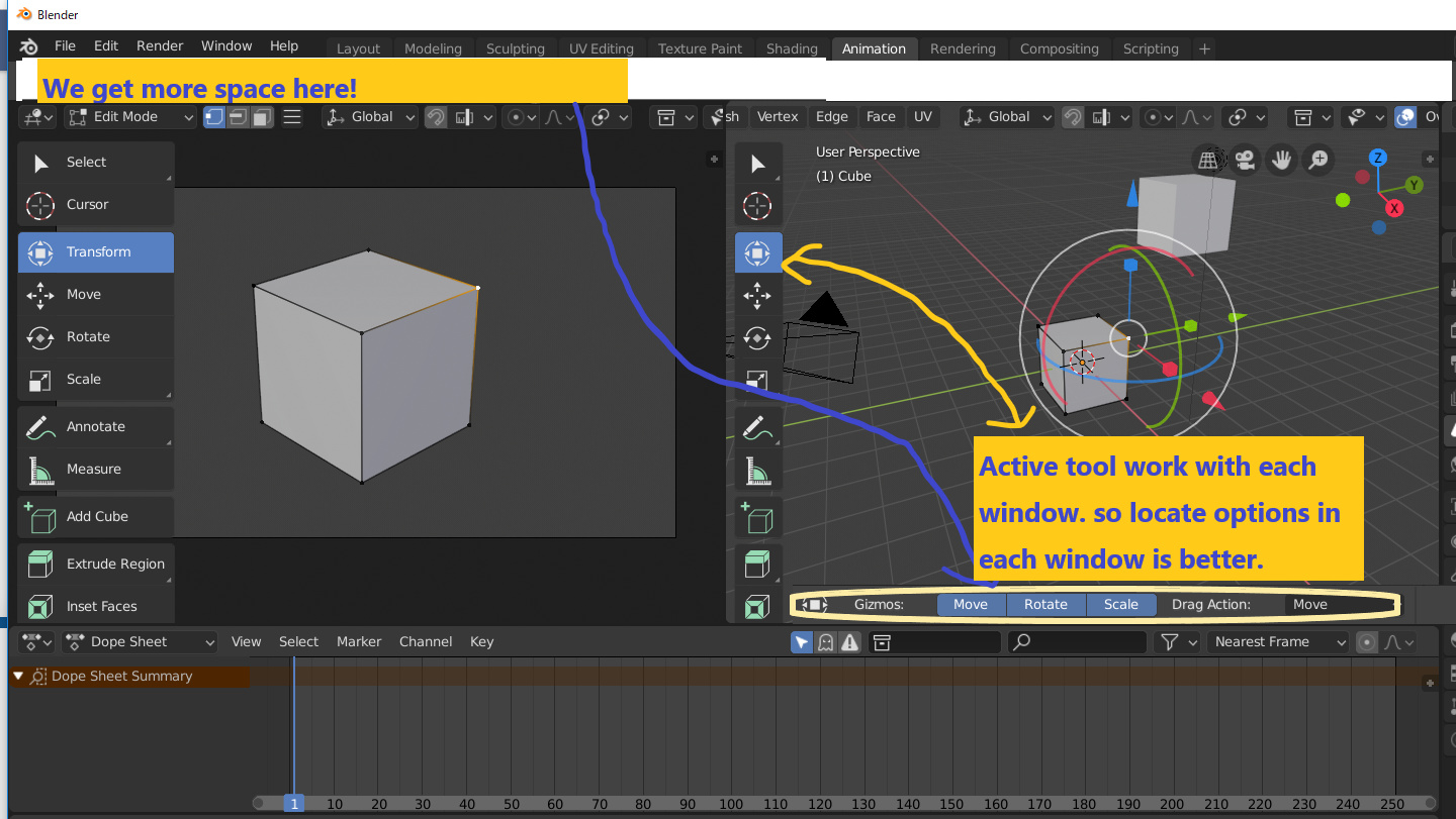
Proposal for the topbar inside the each area, like other users told. It will work like a area with two headers.
This approach allow some interesting things like this
9 Likes
I love it. This imo could solve many UI quirks and perplexities
Other example of the idea with a UVeditor layout. Other good thing of this solution is that allow to separate viewport setting header of actual edit mode settings/tools.
Anyway I still asking for the tool tab in the sidebar. For complex controls. The idea could be that tabs in sidebar don’t have name, have an Icon, and if addon developers don’t create an icon the Tab only have one or two letters to identify.
And the good thing is that you can still naming it topbar.
8 Likes
As someone suggested, having toolbar into editors (only those who need it btw) could allow to send the toolbar content horizontally up there, and all the tools properties back to their 2.7x position on the left column
IMO, as long as the topbar contains editor specific content, it should be in said editor, or change according to the active editor + have a way to lock on a set (i.e. like the pin button). Otherwise, let the user choose manually what is in the topbar.
Other softwares already does that, and it works. And it’s another way to have an easy access addon widgets area.
1 Like
yes please, as in here!
1 Like
+1, it should be inside the viweport itself, and each editor should have its own topbar, so we dont mix settings!
1 Like
When working on shading a scene, it’s pretty slow to switch between editing the world material and editing the object’s materials. @pablovazquez recently mentioned bringing back the buttons to save a click.
What if the shader editor automatically switched to the world when nothing is selected? It makes logical sense given the hierarchy of scene data, we wouldn’t need multiple modes for that editor, and would save us clicks.
2 Likes
I don’t know why devs simply won’t make dockable toolbars like everywhere else - photoshop, cinema, maya, 3ds max, substance. currently the ui lacks flexibility, i’m haytin it every time when i need to quickly rearrange my working area. Although i don’t personally like horizontal toolbars because they eat precious vertical space(in the modern days of ultra ultra wide curved monitors i’m ready to kill for every 10 pixels of vertical space taken from me) but it would be great to have an ability to deal with those editors and windows and placing or docking them where you need with a simple and straight forward drag’n’drop thing.
3 Likes
@billrey, @ideasman42, @pablovazquez
I know it may be too late, but we were asking this since before the beta, its a mistake to make a global topbar, I really wish you could get a bit more overhaul on that before the final release, If tools are per-editor, topbar(s) also have to be inside each editor, just like a header, otherwise, you know, this is really limitating to the fexibility of the interface.
2 Likes
Active tool is one of main concept of 2.8. but to work it as designed, at least I do not think, current “topbar location” is good. This problem may be more clear, when developer gather feedback about each workspace and current status.
How developer think, these options will pop up, as Top (or bottom) “sub” menu?
of course user can still choose locatiton. Top or bottom as same as main top menu.
current status , it is somehow strange, when we use active tool in right side or bottom etc, those option are only shown in Top left side. (or developer hope to use property > tool? it use huge space,and I seldom set
as tool (the property we need to change more detail about each properties, not set it as tool just change active tool options,I feel)
9 Likes
I forwarded a ticket, hopefully devs answer why they are ignoring this topbar problem:
https://developer.blender.org/T59419
1 Like
STOP STEALING MY VERTICAL SPACE! monitors already turned into a narrow planks! and you want to screw things even more with that top bar! NO! JUSST NO!
1 Like
The same space stealed in a viewport is gained by removing current topbar. Unless you have two editors one above the other, this layout uses (or wastes) the same vertical space
Man… i’m totaly agree with you!!!
Its too bad that most casual modeler asking dev-team to add such unnoing and useles thing like go up and click+go down and clik… its like a crow with no brain in head ))) and waiting from a programm like Blender the magic button “Do everything for me” ))
I’m strongly against those long horizontal lines with tool properties no matter where on top or at the bottom of the screen they will be placed. I don’t know why developers can’t just place those in a pallet inside N sidebar, it’s plenty of horizontal space and you can easily toggle it on and off when you need it.
3 Likes