Yes, that can be done like that or with a tool panel in the viewport where you can add editors.
Hi,
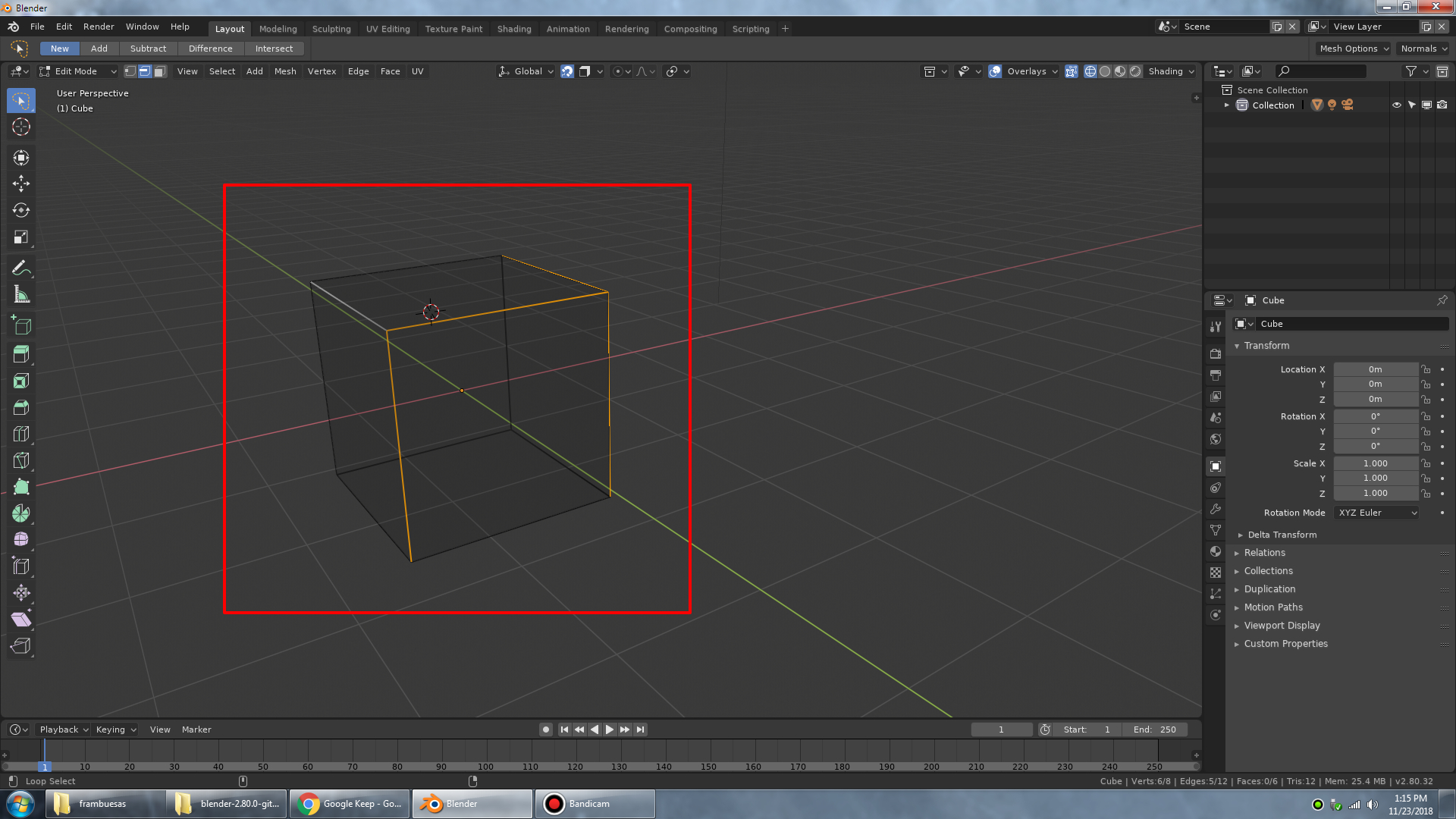
I may be completely dumb, but how do I disable “Limit selection to visible” option in 2.8? I don’t see the option anywhere. Only thing that toggles if selection is limited to visible is this “Show whole scene transparent” option, which really makes my whole scene ridiculously transparent and impossible to visually navigate.
Yet, I am unable to find the option that just toggles if the selection selects only visible faces, but does not modify the scene shading. These two are completely unrelated things 
2 Likes
Does that mean that Shift select will finally do a list selection in the outliner, like in every OS and Software I can think of ?
CTRL would be use to add, and ALT to minus ?
Thanks for the reply
3 Likes
Ehy you! Addon coders from around the world!
4 Likes
Are there any plans to further improve viewport edge rendering? Some edges look thin, others fat, some look aliased, some don’t…
This was with the best settings (everything set to the max) already chosen in the preferences.
6 Likes
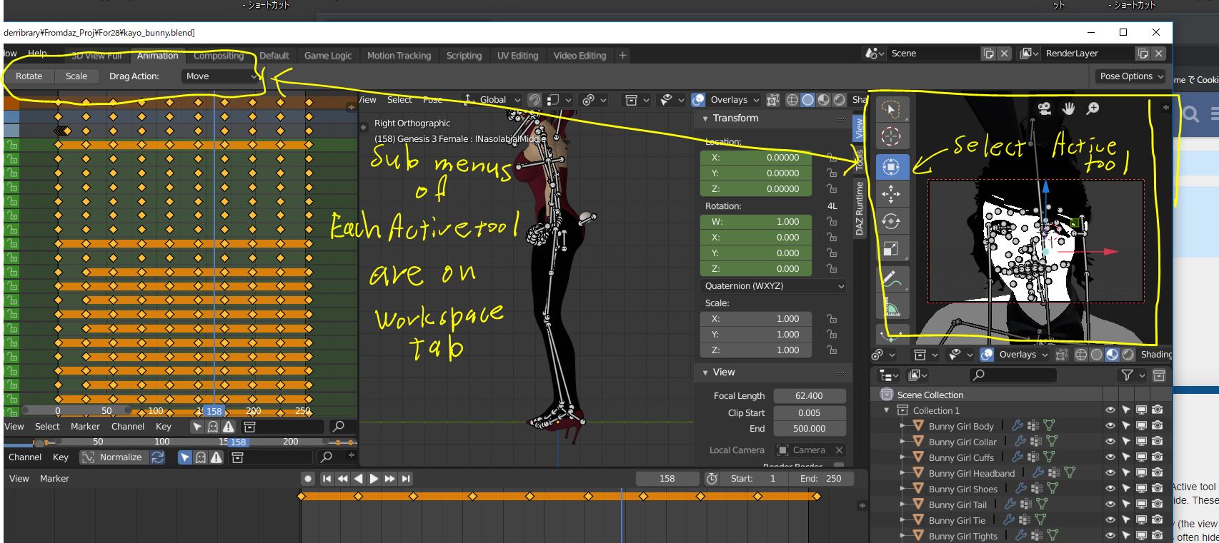
Is not it better, all active tool option menus located in the 3d view window?
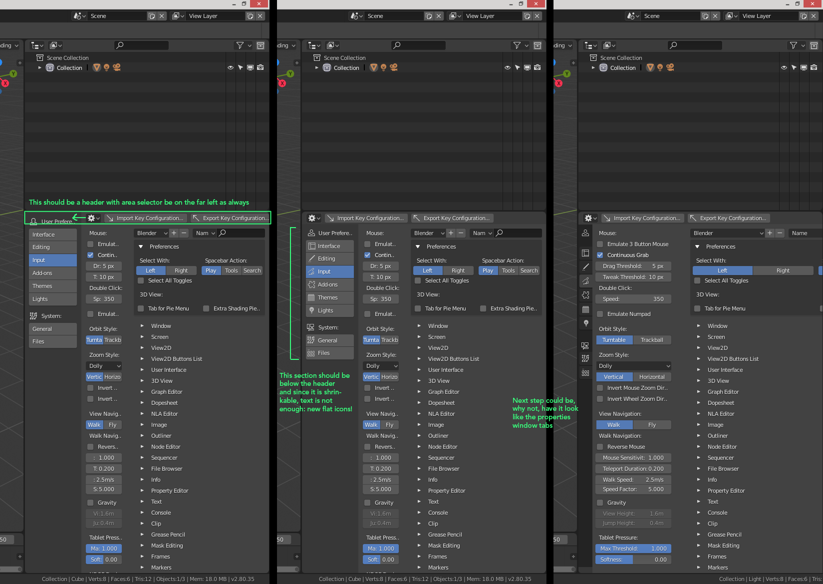
At current it should be shown on top left side of the Blender UI.
Transform sub menus (Gizmos and Drag options)
Selection tool sub menus (add, subtract, Radisu (for circle) etc)
Cursor tool sub menus (surface tool procject, and Orientation)
all these sub menus (options?) only need for each active tool. and Active tool are located on 3d view.
so it seems not good, Active tool sub menus locate Full UI top left side. These are not gloval menu.
In this pic, I hope to tweak facial pose, on right side 3d camera view (the view for facial camera)
then when I select these small bones,with Active tool, those options often hide from my monitor.
At least I expect, option menus of activer tool locate near the tool. And tool location are in 3d View.
Though I can not offer, how it achive, but I think, it may better locate Top or Bottom 3d view.
even though I need to drug menu as same as 3d view headers, when these are hidden.
1 Like
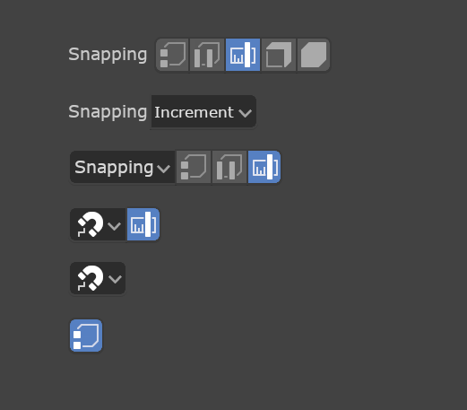
One thing I’d love to see changed is for us to adopt a more consistent widget design and ordering. What I specifically mean is to have consistent left-to-right order, have menus (and popups) be self-contained, and for tool buttons to be only optional shortcuts. Let’s start with an example:
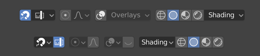
Obviously the top row is how a few items look now, and below how they could look and operate. By moving the menus to the left it means the menu (if using text) can act as explanation for the section in the correct left-to-right order.
With dropdowns and menus being “self-contained” I mean that the buttons can be removed if desired. So the snapping menu, for example, contains “off”. And Proportional editing includes “none”. By having the menus work on their own and the buttons being optional shortcuts, it means that all the following are consistent optional layouts for users of different experience and needs. And because they keep a consistent left-to-right order they can properly coexist with any other items with similar options:
This type of change opens up things we can’t really do now like having some File and Edit shortcuts closely associated with those menus:
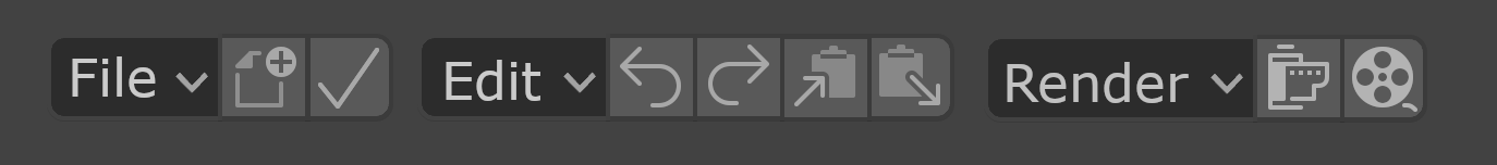
Note also that having a consistent left-to-right ordering also makes it easy to swap the order for users who are used to a right-to-left reading order.
3 Likes
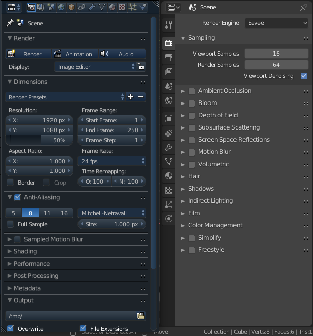
Loots of new settings here:
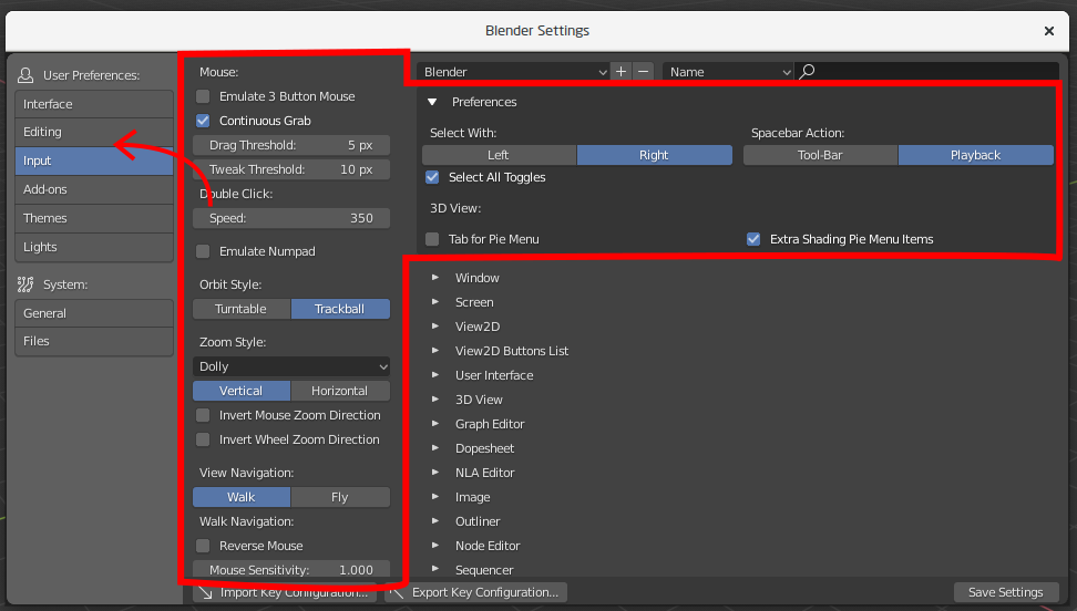
Maybe separate it to the new tab? One tab will be Input settings, second - Keyboard Shortcuts
2 Likes
Yes it seems good, to exchange view mode easy.
Then I feel when we are in camera mode, I hope there is icon which can “lock camera to view” ON OFF toggle, I really often use it with middle scroll.
I often serch this toggle button in N panell menu. But this option may better near the camera view icon, I think.
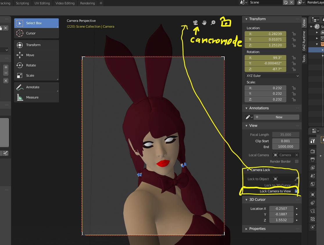
(OFF adjust camera frame size, with scroll, to fit in current 3d view window size)
(ON move camera toward focus, )
I hope to exchange turn-table, and Rotation style,(Turntable and Trackball), Navigation style (Free Orbit)
I made add on , but it located in N panell ,for 2.79, it seems better, we can access them, near the camera
toggle icon.
those options are actually for view and camera setting.
7 Likes
I wonder if there will be an option to make scrollbars thicker? I don’t know how the others but currently for me it’s impossible to hit them from the first try, i always misclick on them. in 2.7x scrollbars were tied to ui scaling, and it seems that there is no way to make them bigger.
4 Likes
Very useful and fast
I’m a games industry dev whose been using blender for years, ever since blender 2.8 decided to make the nav bar icons B&W it takes me a solid 30 seconds to locate what I’m trying to click on. This modernist minimalist trend is absolutely absurd and unprofessional. So far blender 2.8 promises to kill my workflow with its slow shortcuts and training-wheels focus. I don’t need nor want cartoon childish icons to eat away at my focus when working. What I do need is colored icons dedicated to muscle memory and not intrusion. Every icon in the old ui was completly unique and instantly identifyable in peripheral vision. If icons in blender 2.8 take longer than 10ms for professionals to recognize than the ui is a waste of time for speed modelers and asset producers. Also, forcing me to decide only between placing the nav bar icons on the left or right side of the tab, and not the top, takes away from personalizing blender to my own ergonomics.
5 Likes
10 Likes
Hi, so t’s 2018, I see a lot of good and fancy stuff in terms of UI, we have a slick GUI, pie menus, widgets… but there is something I’ve felt missing for a long time in texture paint mode… a color widget popup! we have shortcuts for the brushes, we can easily add shorcuts for symmetry and other options, and well, we can create a color popup with python, but… how about something like this built in by default?:
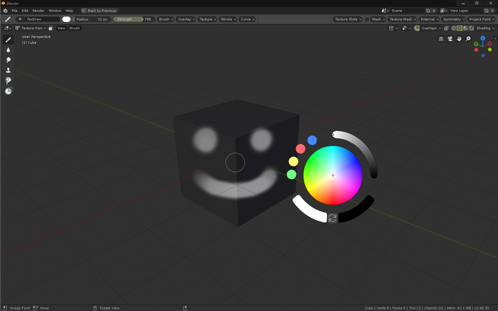
Anyone who paints textures by hand will agree it is a real slow pain in the ass having to move the cursor to one side of the window to choose a color constantly… I think it is about time to give texture paint mode a bit of love in that regard…

P.S.:
Suggestion for the color popup use:
- “C” displays popup (opens with a tap on c, but holding and releasing to close it would be nice, otherwise, RMB/ESC/click outside, same as pie menus I think?)
- Double click on the color circle adds a new color to the palette on the left
- Double click on the palette circles deletes them
- Click and drag from the palette circles to the color circle to change the sampled color.
- It would be nice to also have an optional X icon to close and a Pin icon to hold it on the viewport.
- As well as being able to manipulate position scaling and rotation with GSR keys.
28 Likes
Hi, many things have changed in the user interface. I have a small feedback about the new icons in properties editor:
The small colouring helped differentiate icons, maybe the new icons could have some colour also?
12 Likes
https://devtalk.blender.org/t/adding-an-image-to-themeui/3410
I personally thing it is a matter of building muscle memory, position is always the same, but…
How about adding an option to colorize each tab? Both in the theme settings and with a RMB option on each tab, and just as we can change shortcuts, we could quickly change the color of a particular tab…
Pretty sure that is planned already
That does seem interesting to me, if possible extend that to any UI widget?
Tabs of colors are fine but, if you study visual perception you know that the colors are relative to the context, usually in the software related to the visual arts it is important to avoid the color in the interface, since it can generate a distortion in the general color balance of the composition. Info: https://vimeo.com/26788521
But anyway it would be interesting to try it since it might not influence so much. And maybe you can leave a desaturated rendering tab.
It might be a good idea to show quick favorites on the RMB context menu too.
4 Likes
That’s typically an issue with large blotches of colour or backgrounds, small icons aren’t likely to cause an issue, especially if they’re not over the top of the compositing work. So colouring the tabs might interfere, since they’d be large blocks of colour. But if you coloured the icons it shouldn’t be an issue.
Unless the interface turns into a rainbow of highly saturated icons or blocks of colour, I don’t think there’s anything to worry about.
1 Like