The tool settings is there. What’s with the crying?
The topbar needs to change from settings to shortcuts yeah, but that’s all. All this crowded viewport ideas are a no go.
The tool settings is there. What’s with the crying?
The topbar needs to change from settings to shortcuts yeah, but that’s all. All this crowded viewport ideas are a no go.
I wanted to tell that all these ideas were showed and proposed long time ago.
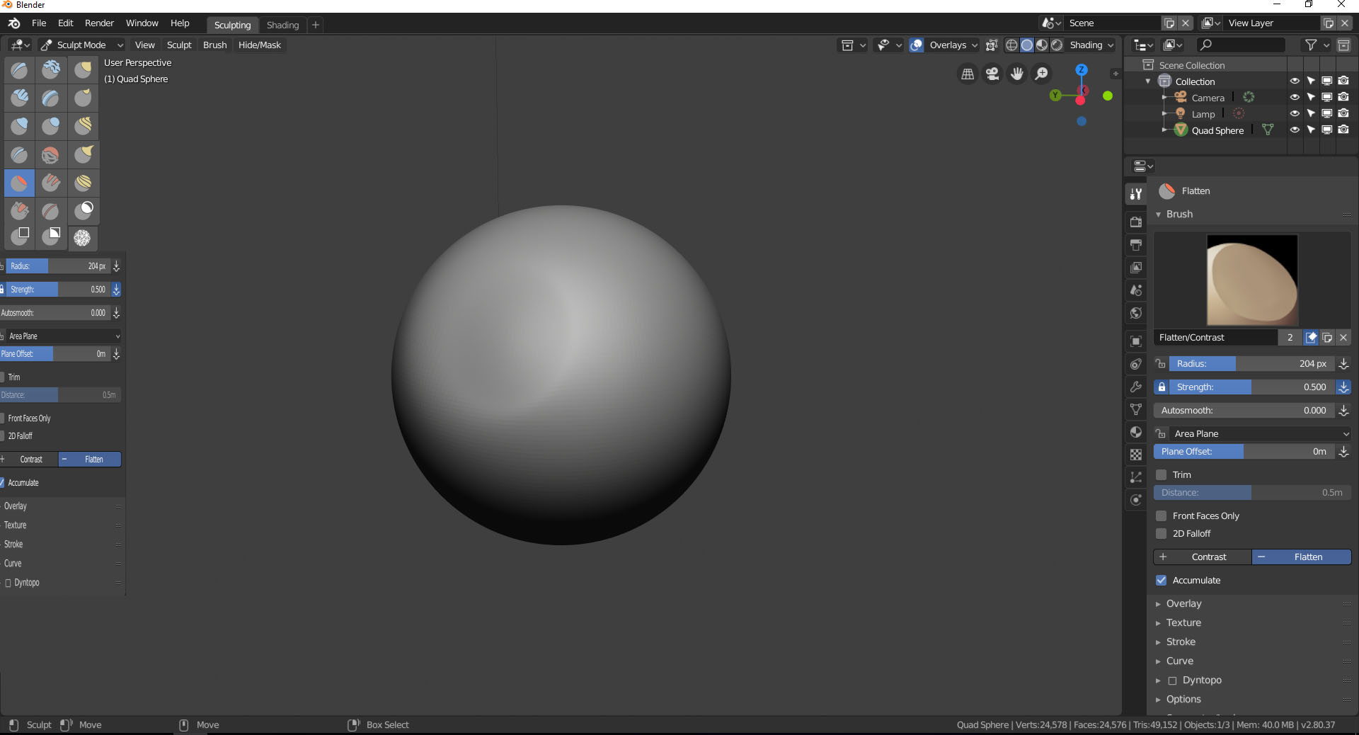
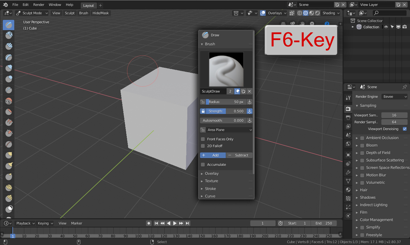
For example, tool settings of active tool inside viewport, bottom, was the official solution to Active Tools settings.
I don’t believe that developers would to change nothing if they ignored all proposals of topbar since before the topbar was implemented. And this thread only repeat discussion that actually we have in design thread.
You dont get, we would ratther have a crowded viewport or a not working viewport, and the fact that topbar fails when using multiple editors cant be ignored.
and there are so many clean suggestions around there, look back on the links.
The viewport works. Settings and tools are not meant to be in the viewport, this is a design failure that I only see in blender. Better start using the tool settings which is future proof.
It’s not that settings are not meant to be in the viewport, the fact is that the ToolSystem requires it to be per viewport unless you have the tools outside it.
Could you tell me if that is OK for you?
This is how it works everywhere. If you want to see the settings of a tool you click on it
You can’t have tool settings switching when you mouse over on a editor, that’s insane. And putting settings on each editor would be madness.
That’s false, when you work in a lot of program each tool have a dedicate windows with dedicate controls and tools, like for example UVs.
I’m talking about the settings. They always show in the tool settings.
Just remember, we are talking about our beloved blender not any software, blender should be better than any other software.
Here we go with a lot of solutions of many users to this inconvenience you face as normal.
From @Znio.G
Cluttering the editors will only make it far worse than anything else.
Those suggestions are terrible.
That’s not true, a lot of programs show settings in different sites, popovers… and the worst program with worst interface are the programs that put settings allways in the same site. For example Krita and “tool settings” that is a really bad place.
You guys always told “all programs” when is false. in reality few programs put the tool settings in the same place. and less programs uses the same windows/area for object properties and tool settings.
This is wrong, Spreading settings all over the place is never a good thing.
please define cluttering. you are using a meaningless word.
If cluttering is having a hidable settings bar near of where you are working then yes, we need more cluttering.
if cluttering is having a useless bar that only serves as decoration to a software so yes we have too much cluttering.
Spreading tools all over the place is also not a good thing.
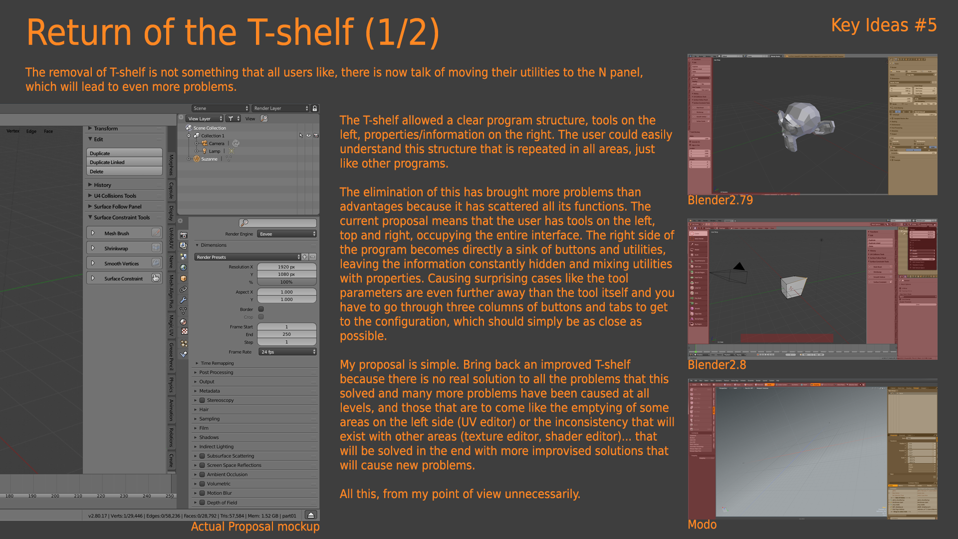
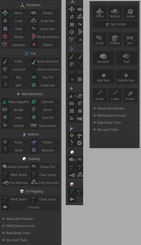
Blender 2.79, tool settings in the
Blender 2.8 toool settings in
But you defend 2.8 solution…
This was one of the arguments to don’t move the tool settings. In blender 2.79 you have a clear UI distribution, tools in the left of the UI and properties/outliner in the right of the program. In Blender2.8 you have tools and addons in all the interface.
Another solution, I hope no one disagree with because really doesnt affect the UI, only adds a easy to access settings popup.
there was a better solution by the dev themselves but don’t know why they didn’t go with it probably they wanted the tool-Panel to take less space and bigger icons for tablet users but i think they can make a much better solution…the setting can be a seprate part of the tool Panel and be easily flipped left and right from the tools…etc
I wish, there are devs following this thread but if there is, they’re probably just looking to guarantee no one is going salty and ignoring all the suggestions 
That was some of the proposal to improve the old T-shelf. I wished something like this. But developers try to quit all commands from the hand of the users.
in these times of use of blender 2.80 I have matured the fact that the t-shelf is too limiting, because of the little space available, I am of the opinion that the floating pannels-popups that open around the object are a better idea. …
maybe they could improve this perspective making them better, like “windows” that can be positioned, flaglable, resizable closable etc … manageable at will …
the new t-shelf / toolsbar is good that it is a list of tools with icons that recall the tools (and property windows) we need