I’m against everything related to the T and N panels. Those are the worst things in Blender imo.
Oh, and the redo panel in the viewport is about to join that list.
I’m against everything related to the T and N panels. Those are the worst things in Blender imo.
Oh, and the redo panel in the viewport is about to join that list.
if you dont like the T and N panel, where would you put the tools and settings? there must be a place and I dont think outside the 3dView is a good bet.
The tools should have their own customizable panel/palette so we could put it whatever we want in the interface. And the settings of course they belong in the tool settings.
there is flaw in that design what about other modes like edit mode? the list gets bigger and addons can also add tools to the list making visually annoying to work with, we all like the viepwort to be clean, personally i like to use hotkeys to call the tools, or even hide the T panel and call it with it’s shortcut…with this design u can’t and status in the top-bar doesn’t make any sene it’s one of the weird things that blender should avoid as much as possible like many things it already has.
I like the design as it is right now, sorry. Hopefully the panels wont be moved again.
Any updates on how and when this is going to be fixed?
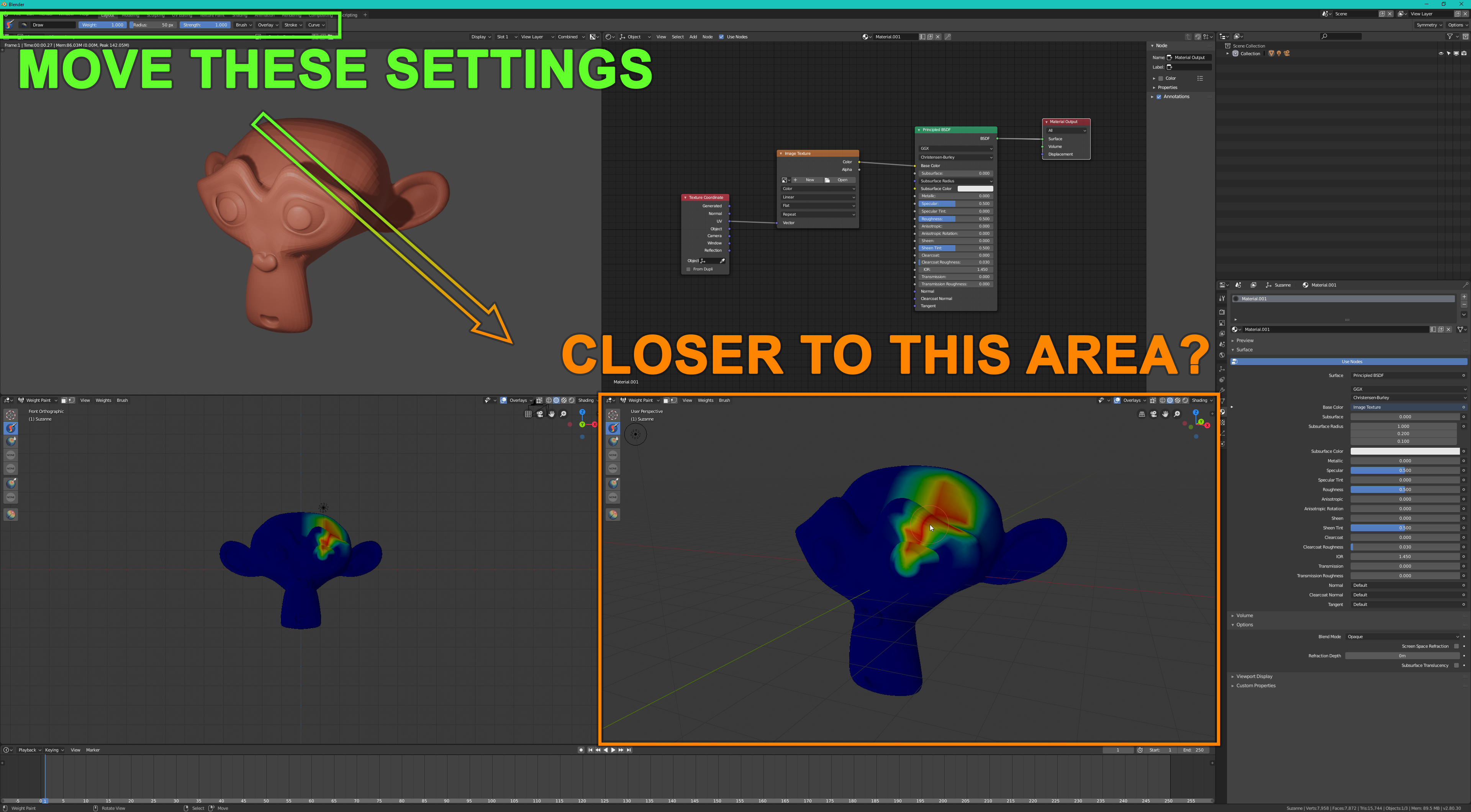
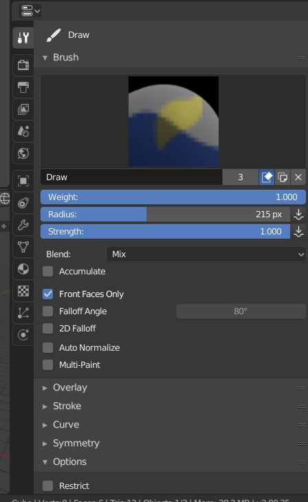
When using a brush, all the brush settings are too far away from my preferred working area.
This is a huge problem for users who like to split their viewport.
Also I think the Add Cube -tool is bugging when you have more than one viewport. (How should I report a bug or check which bugs are known?)
without news about this, although I know many of us have asked for it.
Nor has it been commented if it is possible, if not, if it is not wanted to be done…
Don’t bother with the topbar. The tool settings is right there on the right for it.
are you talking to me? because i am not calling for design changes…u tagged the wrong person i think.
By far what you like is a much worse solution.
No. That’s the best solution. The topbar as it is now is pretty much useless.
Start using the tool settings and forget about the topbar…
The topbar will be always useless, is a bad site to put a lot of things and only allow few changes. Few things, like brush controls or shorcuts like maya, can work in it.
Agree 100%…
But with a few impormente could be really usefull… For example allow user to put like any other editor. Put controls in vertical…
Yes I know that and it helps a little but not much. It’s more like a workaround than a solution.
The brush settings are still not where I need them.
Also that increases the amount of clicking required when changing the tab.
In 2.79 I was able use paint tools in any viewport I wanted without any problems.
But now I have much worse options.
I can either use a viewport that is close enough to the top bar or use a viewport that is close to the properties tool panel.
To use any other viewport, I first have to split the viewport and change the editor type to Properties (which requires much more clicking).
Why it has to be this complicated? Makes no sense.
Blender 2.8 have lost some of it’s flexibility because of this.
Sorry, my bad. Wrong button probably.
it’s not complicated it’s a new design that you have to get used to because the old one had many issues and inconsistency, it’s a sacrifice that it had to be made and i don’t think the devs will revert to old system.
That’s not true. THe old design didn’t have any problem.