I have been giving the age old usability issue of Blender a try: the management, splitting and joining of areas.
Because it is very easy to make an uninformed design, I actively try to avoid this by going down the hard route - diving deep into earlier discussions and reading about defined design paradigms and the inner workings of Blender. I’ll try to be as transparent as possible in my knowledge and research on the topic.
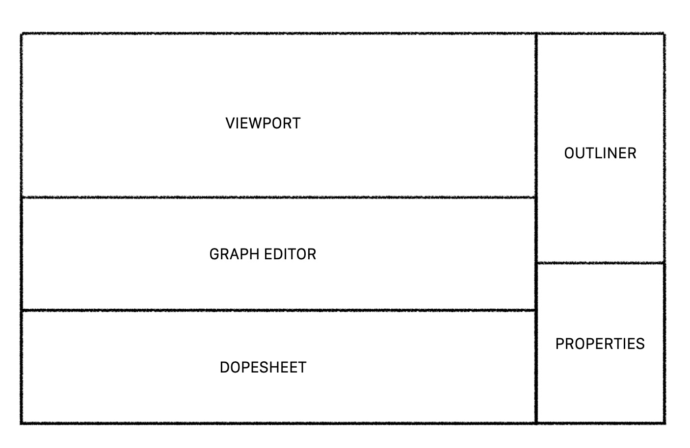
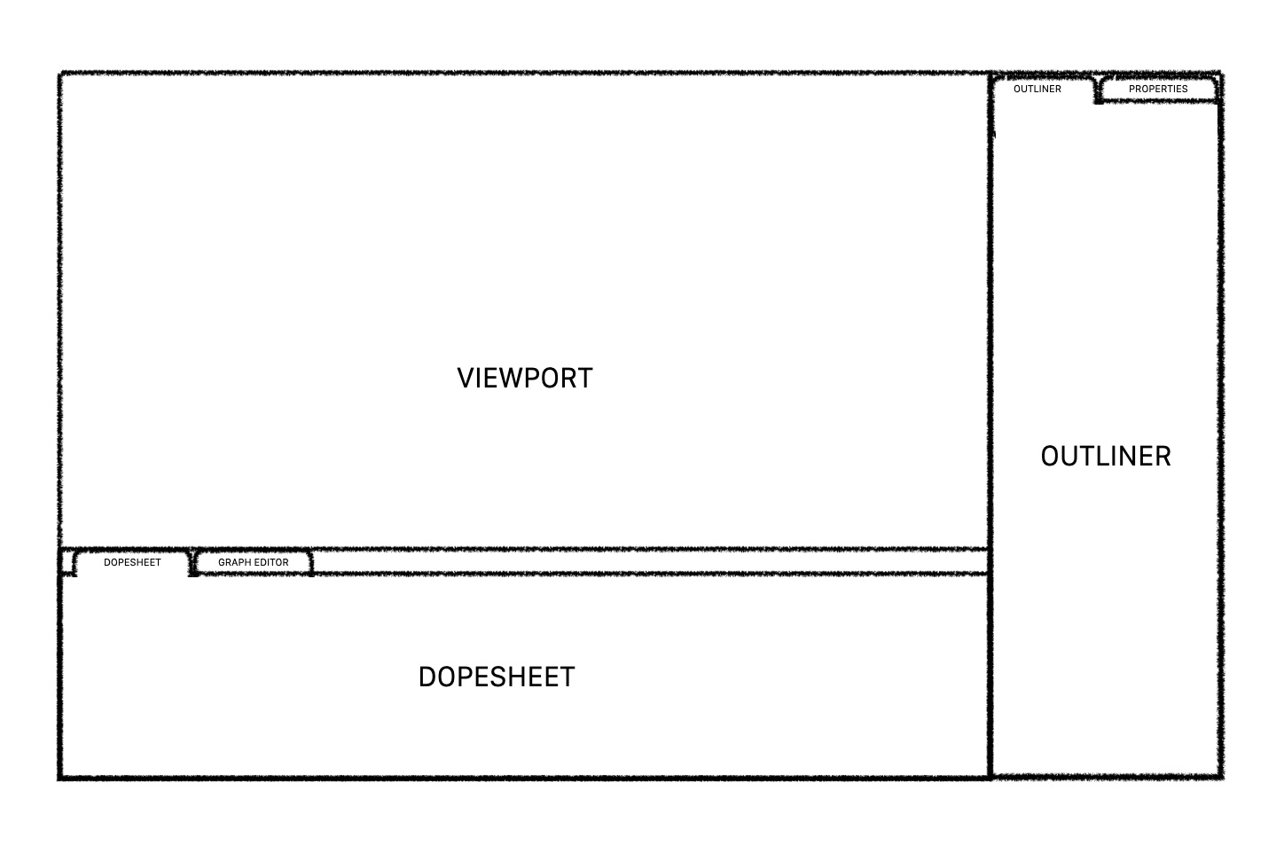
Current system
Non-overlapping user interface
The first thing I would like to point out is that having a non-overlapping user interface is ideal. The introduction of workspace tabs also - at least as far as I can tell - satisfies the need for changing editor types often. Having tabs for areas such as implemented in i3 (i3 - ArchWiki) or suggested in Tabs for interface areas and Right-Click Select — Blender Community thus doesn’t seem necessary.
Splitting and joining operations
While the current system for splitting or joining areas works from a technical standpoint, it doesn’t perform well in terms of usability:
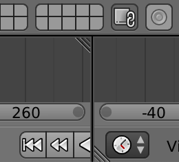
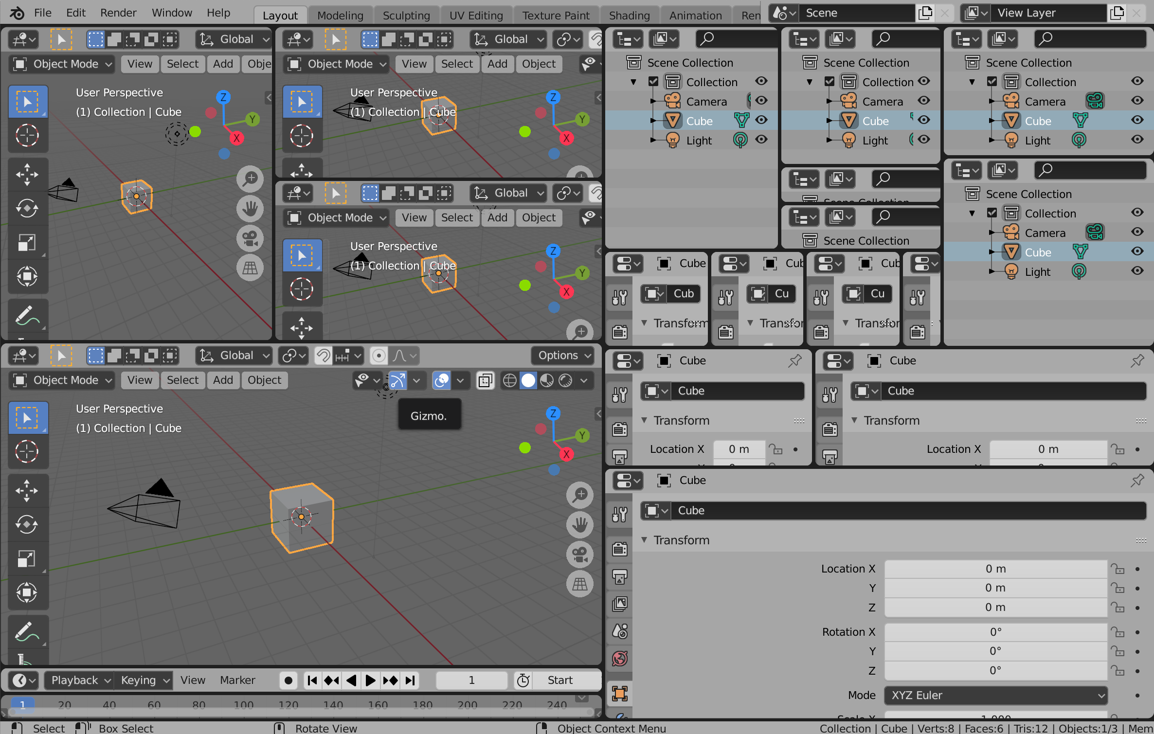
- There is no clear communication to the user on how the system works, or that there even is a system in place. This is partially because of the lack of a visual indicator. In Blender 2.79 however, the corners did have those:
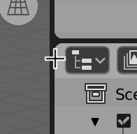
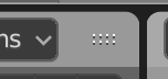
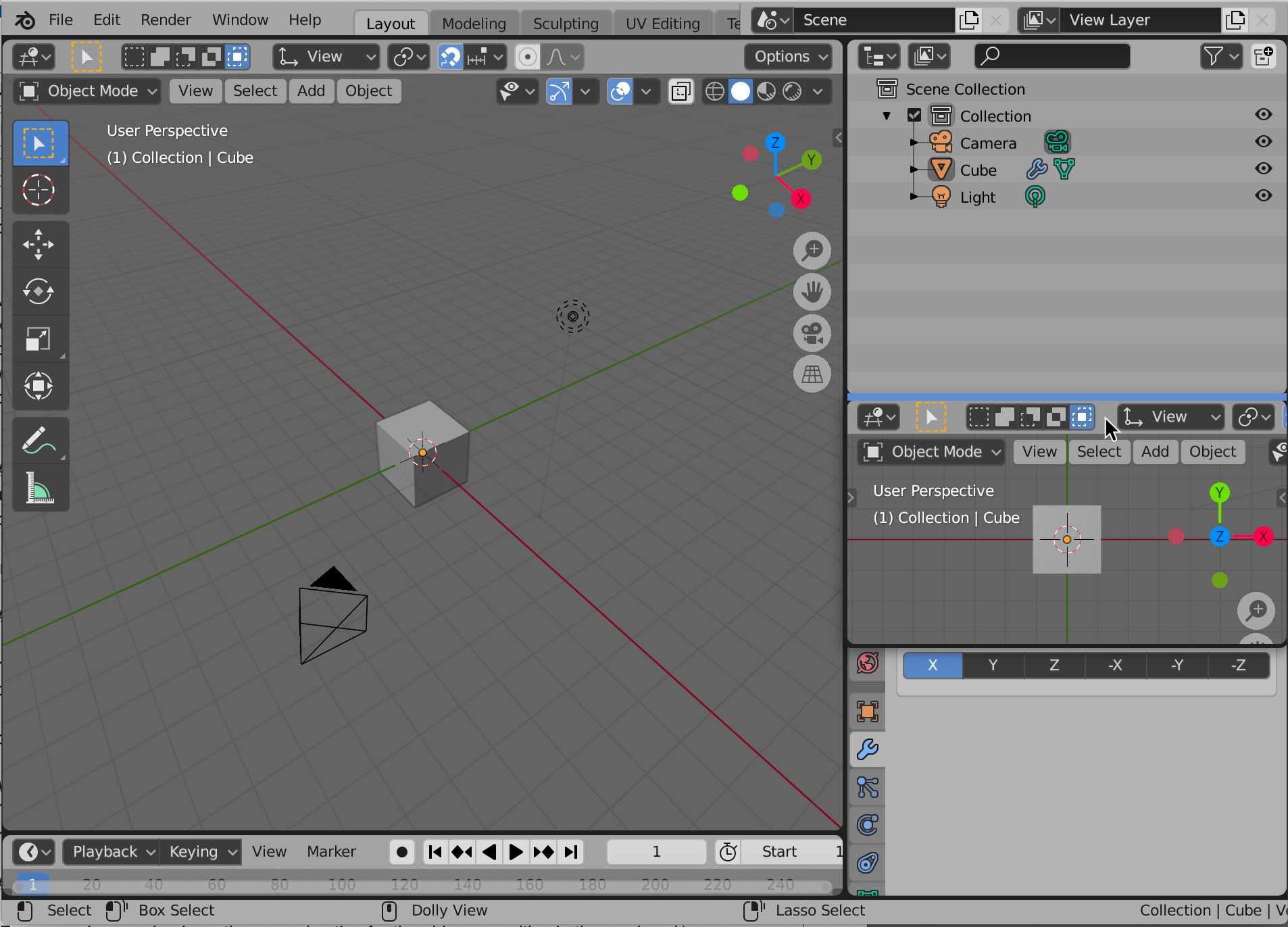
In 2.83, the only visual indicator is the cursor changing to a cross:
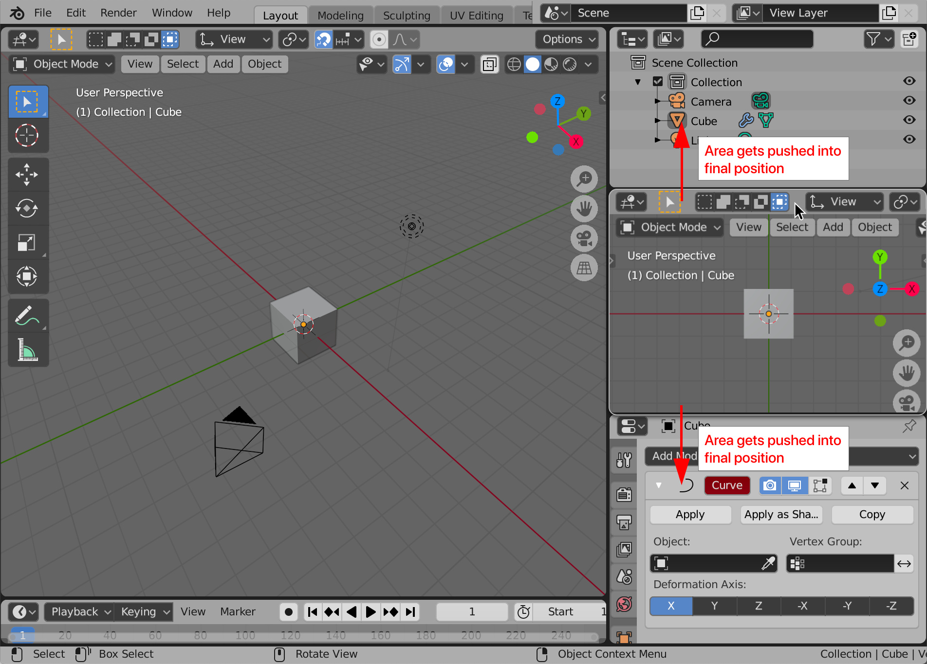
But even with visual indicators, there is no proper way to communicate the possible functionality of splitting and joining in such a small space. - Even when the user has found out that the functionality exists, the fact that dragging a corner can perform two widely different tasks can result in this scenario:
The difference between dragging corners inwards or outwards is very subtle, making it easy to accidentally perform the wrong operation.
The only way to truly understand how to use the functionality is to read the manual: Areas - Blender 4.2 Manual
Even as a relatively experienced Blender user I did the splitting and joining purely on intuition and preferably avoided it altogether.
List of users experiencing issues with splitting and joining:
The above mentioned issues are evident in user questions on different forums. Note that it’s not just absolute beginners having trouble with this.
- interface - How to close view windows? - Blender Stack Exchange
- How to remove added blender windows - Basics & Interface - Blender Artists Community
- https://www.reddit.com/r/blender/comments/37cipd/its_really_a_dumb_question_but_how_do_you_close/
- interface - How to close windows in 2.8? - Blender Stack Exchange
- Closing Split Screens - Basics & Interface - Blender Artists Community
- Closing panels in 2.8 - #5 by Piotr_Adamowicz - Blender Development Discussion - Blender Artists Community
- interface - How do I close unwanted windows? - Blender Stack Exchange
- interface - How to close/open a view panel - Blender Stack Exchange
- interface - split screens in 2.8 - Blender Stack Exchange
There are more instances but I think this serves the point. The main takeaway is that users have a certain action in mind (e.g. “I want a new area” or “I want to close this area”) and they don’t know or can’t be expected to know how to do it.
Relation to other developments
Given that this is a common problem, there is currently effort being put in making area management easier and more fluid:
The following development gets praise, but the issue of discoverability and communication isn’t taken into account.
Proposal
Rearranging areas by dragging
This takes inspiration from the recent development in rearrangement of the modifier stack: New modifier panel and list - #17 by julianeisel
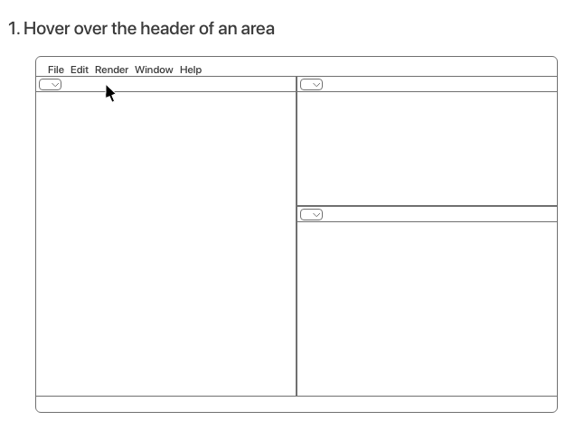
Visual indicator
Adding a visual indicator for draggability to the header part of an area communicates to the user that the area is draggable:
Full window mockups
Size of draggable area inside header
(confusing naming with areas ![]() )
)
-
The most apparent option is to have only the visual indicator as the draggable area .
-
The actual draggable area of the header could be expanded to all empty space instead of just the visual indicator, making areas with less populated headers easier to drag around, while still providing a fallback for when a header is entirely filled.
-
Another option is to make buttons in the header area, or in Blender as a whole, only have a click event when the mouse button is released. Right now it invokes a click event on mouse press. That would make the entire header draggable, making it easy to rearrange the areas from any mouse position on the header. However, this would reduce speed of selecting from a drop-down menu or switching between a row of options (e.g. selection add, intersect…)
Behaviour and appearance during drag
But now comes the real question: how do the areas behave during drag and how does their appearance change? To facilitate this discussion, I identified the following options:
(note that in these mockups I didn’t add the drag indicators)
What happens to the old area position?
- When the area gets lifted from its original position, this empty space could stay in place until the dragged area is placed.
- The empty space could also be filled out immediately when the area gets dragged.
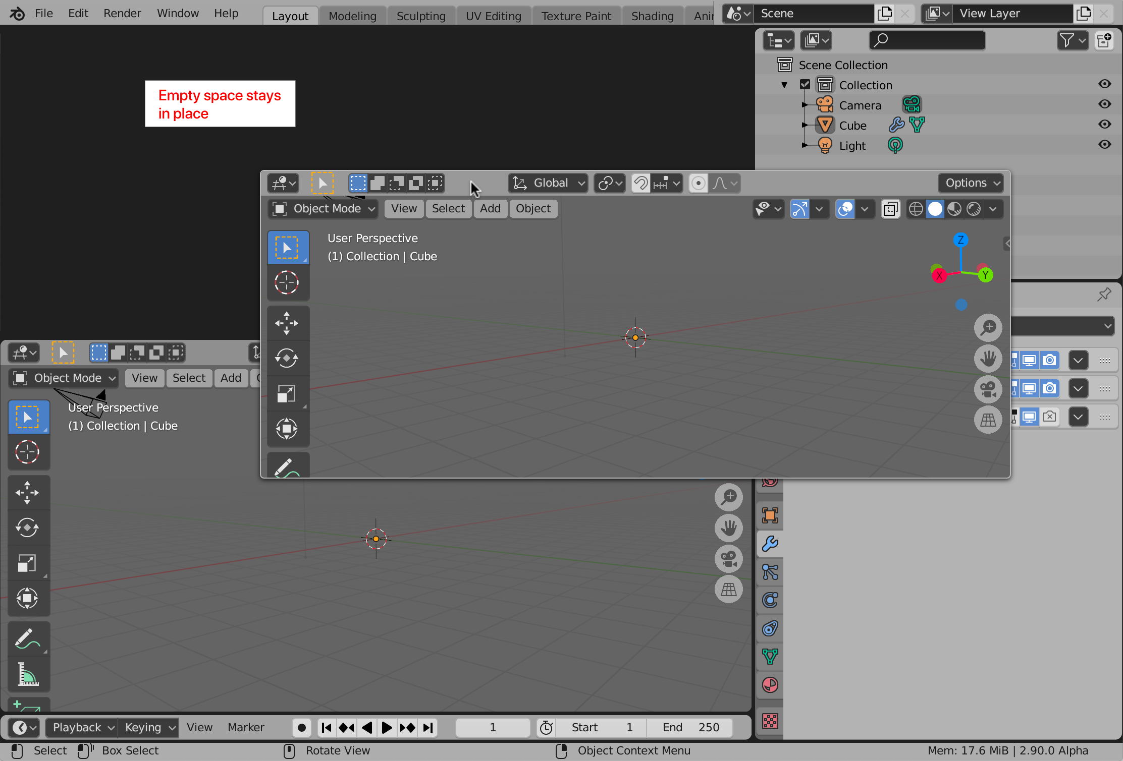
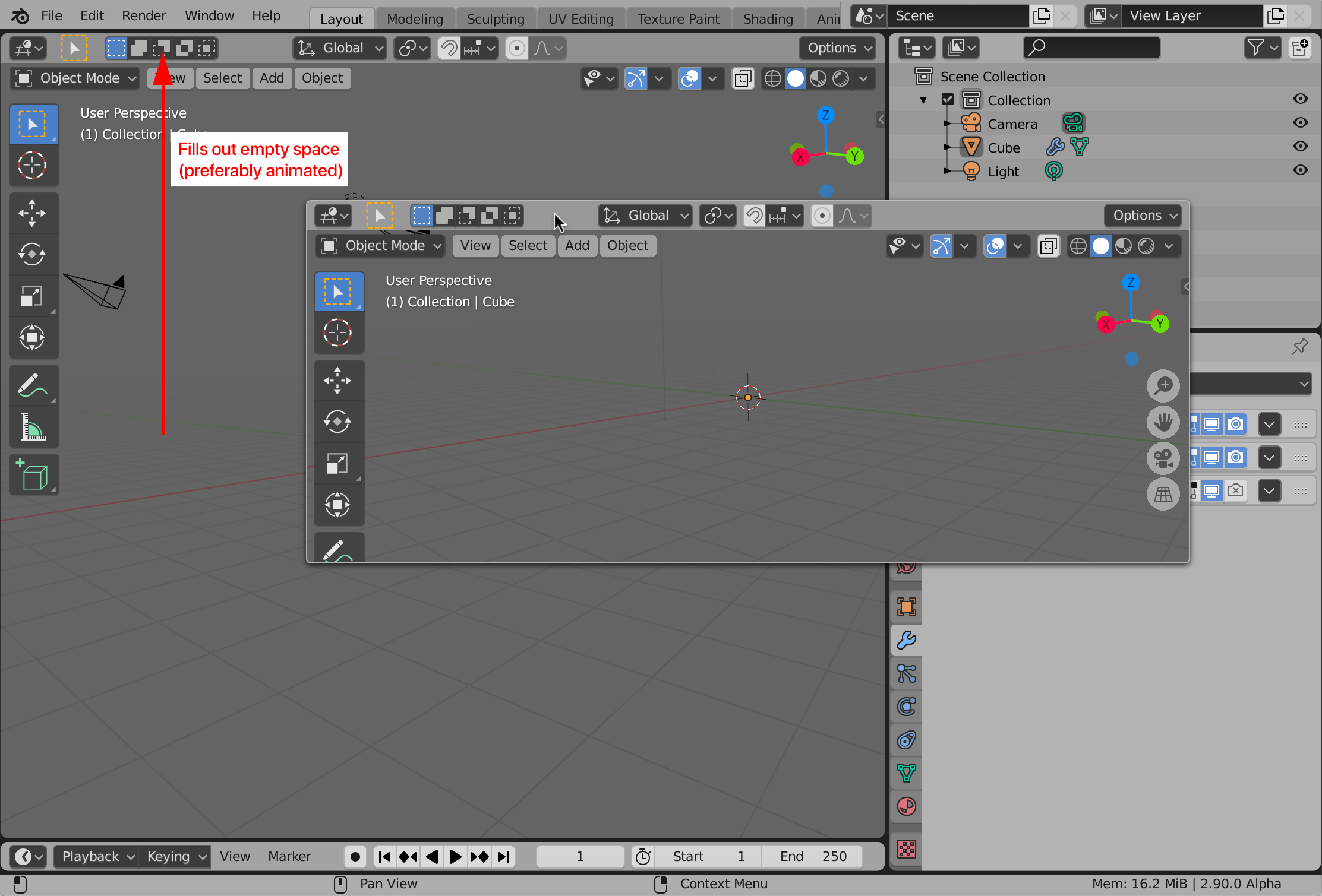
- Which area fills out the empty space is determined by the subdivision structure.
- To communicate which area fills out the empty space, animating from the initial to the final size of the area would help. This would also result in a decrease in jarringness.
How to communicate the new placement of the area while dragging
(For convenience sake, I use the second option for the old area position in the mockups)
- The first option is to show a line where the area would be placed. The dragged area would then become transparent to not obstruct this line. This is the approach Adobe programs take.
- The second option is to show the preview of the dragged area aligned to the edge of an area. The other areas stay in place - they don’t adapt yet to the new area placement. This is an approach that Unity takes. It could again show the line for increased clarity:
- The third option is to have the dragged area actively push the other areas to their final position.
This could be done instantly, but animations could again communicate the movement of areas better. However, this amount of animations for the user interface could become distracting after prolonged use. The goal is not to create eye candy, but something functional, usable and easily understandable - something that stays out of the way.
In this third option, it might be a good idea to have the header of the dragged area change appearance. Even though with continuous motion it probably won’t be confusing, having the header change to a slightly lighter colour, or having a border around the window would increase the understanding that it’s an area that is being dragged.
Duplicating an area: an alternative to splitting
With the concept of dragging areas in place, creating a new area is can be implemented as follows:
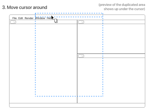
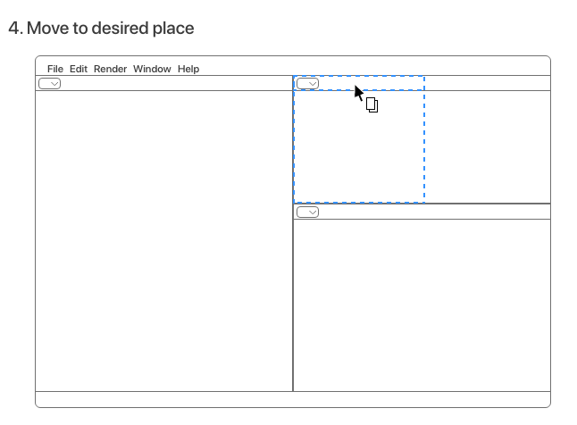
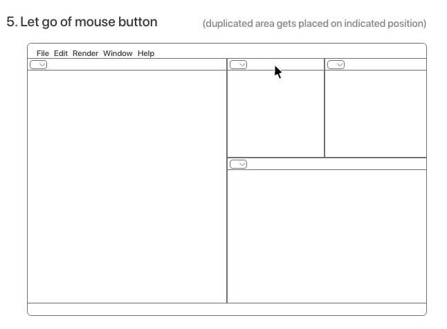
The user performs the exact same action, but now with holding down the alt / option key on the keyboard. The original area will stay in place and the user is now dragging an exact copy of the duplicated area. Placing this new area is the same as in the method mentioned before.
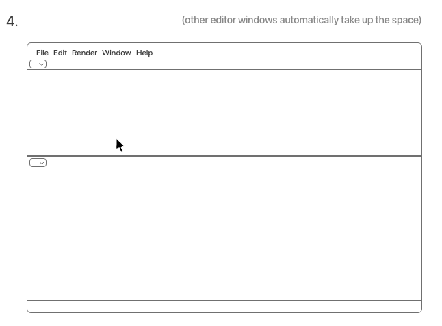
Closing an area
Closing an area is an alternative to the concept of “joining areas”. It’s the approach that is used by - as far as I can tell - many creative software programs (e.g. Adobe programs, Unity). It also is more in line with the initial thought a user might have: “How do I get rid of this area?”
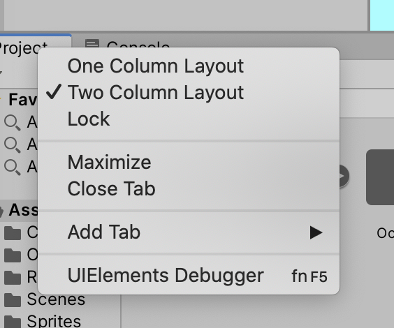
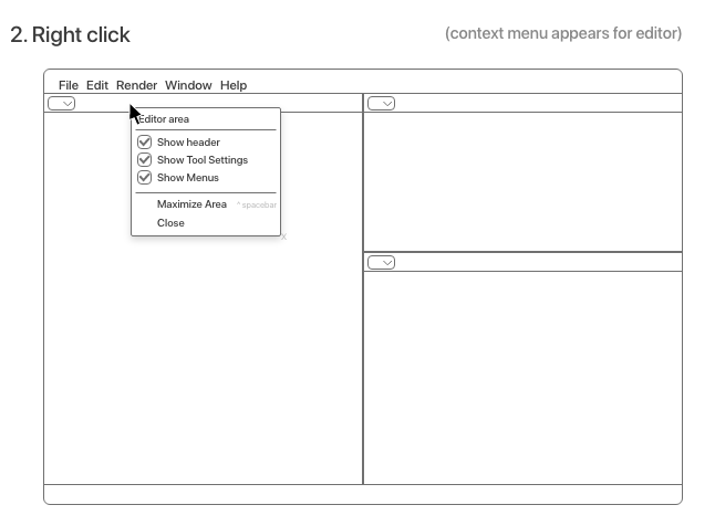
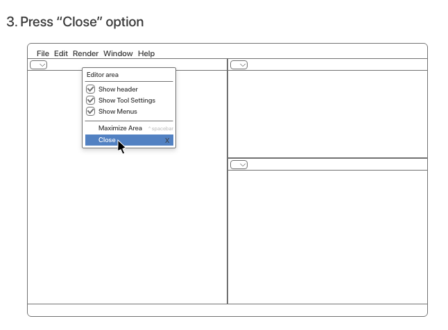
The easiest option is to add it to the header context menu:
It could also be done by differentiating between the Ctrl + Q shortcut and the Ctrl + W shortcut. Ctrl + Q could then be for quitting the program, and Ctrl + W for closing an area.
Argumentation
- The alt / option key + dragging is commonly used to create a copy of an object in programs as Photoshop, Illustrator, Adobe XD, Pages, macOS Calendar, macOS Preview
- It’s predictable. The difference between dragging a corner inwards and outwards is not evident without reading the manual, so it feels almost as if it chooses randomly whether to join or split. There is no difference in
- Draggability is in line with current developments to make Blender more user friendly, such as in the aforementioned post: New modifier panel and list - #17 by julianeisel
- This system still honours the UI paradigms of a non-overlapping user interface and subdivision structure. (User:ThatAsherGuy/UI Paradigms - Blender Developer Wiki)
- The system takes inspiration from other software, which allows for an increase in familiarity (“Close” entry in the header context menu)
- It can be implemented in increments, slowly building towards a more “intuitive” or discoverable area management system. For example: the so called low fruit would be implementing a “Close” entry in the header context menu.
Considerations
- When creating this proposal, because of its widespread-ness in other programs, I didn’t test the existence of alt / option + drag behaviour in Blender. It turns out that the alt / option key is currently not being used by Blender for this purpose, which makes adopting this idea of duplicating areas a bit more difficult. It could also indicate that this functionality of alt / option + dragging should be implemented in other parts of Blender as well - for example the 3D Viewport and Node Editor. On the other hand, alt is now used for selecting tools.
- To continue on the previous note, how can the functionality of alt / option + dragging be communicated towards users? Maybe by adding it as a tooltip? Or as a option in the header context menu, with the shortcut key “alt / option” displayed?
- Performance impact, especially when animating the area sizes to reduce abrupt changes.
- Feasibility, how much effort / rewriting does this take to implement?
Final thoughts
I hope this post can bring about an interesting discussion about the future of area management of Blender ![]()