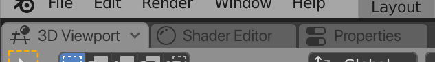
Tabbed interface design + mockups
This is also in reply to @billrey, and somewhat @Hto_ya
I get that there needs to be a big design discussion for revamping the area management and that there are other priorities right now, so I’m not sure if it’s a good idea to continue this discussion at this moment, but seeing a positive view on tabbed areas does motivate me to create additional designs.
With tabbed areas it would be interesting to look into what implications it has for the workspaces in the top bar. I personally use the workspaces for switching between modelling, UV editing, shading, compositing and scripting and I don’t experience any slowdown or need for rearranging areas. That’s why in the initial post I stated that adding tabs didn’t seem like a necessity.
However, being invested now, I identified some options to better understand how this functionality could be implemented in Blender:
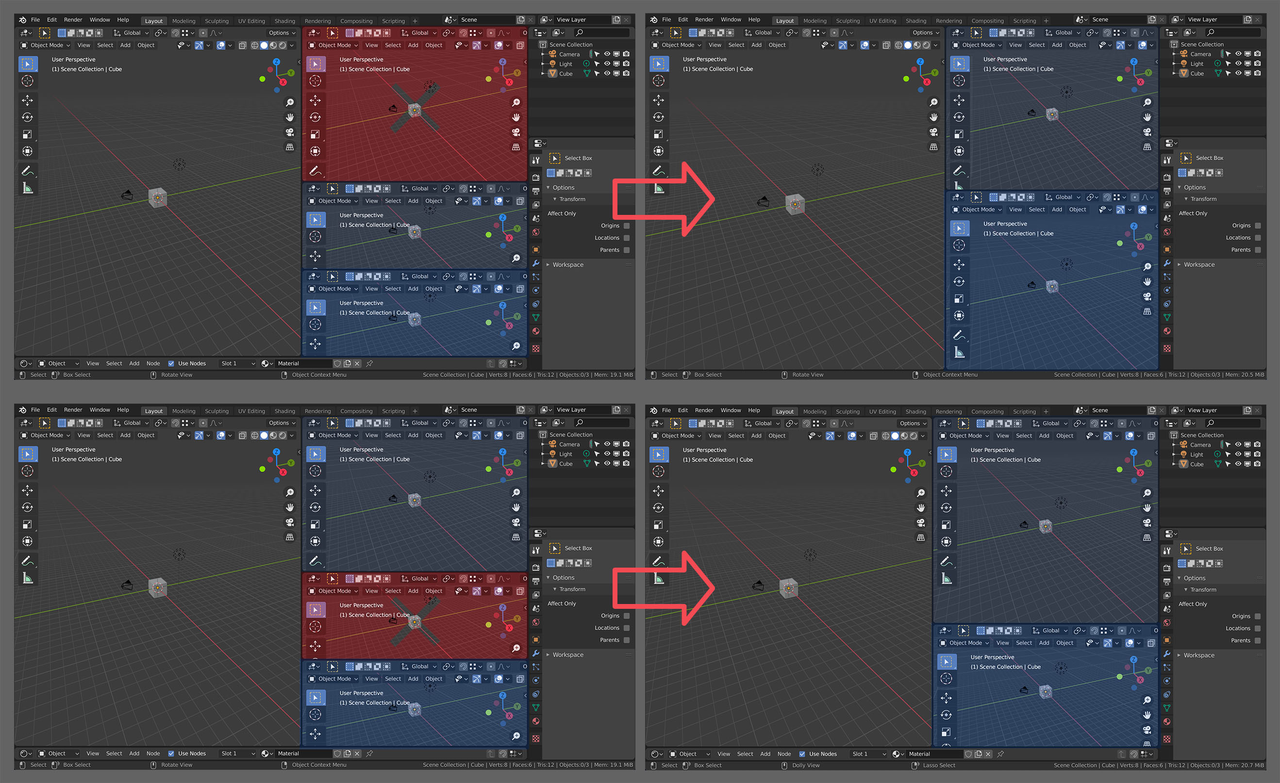
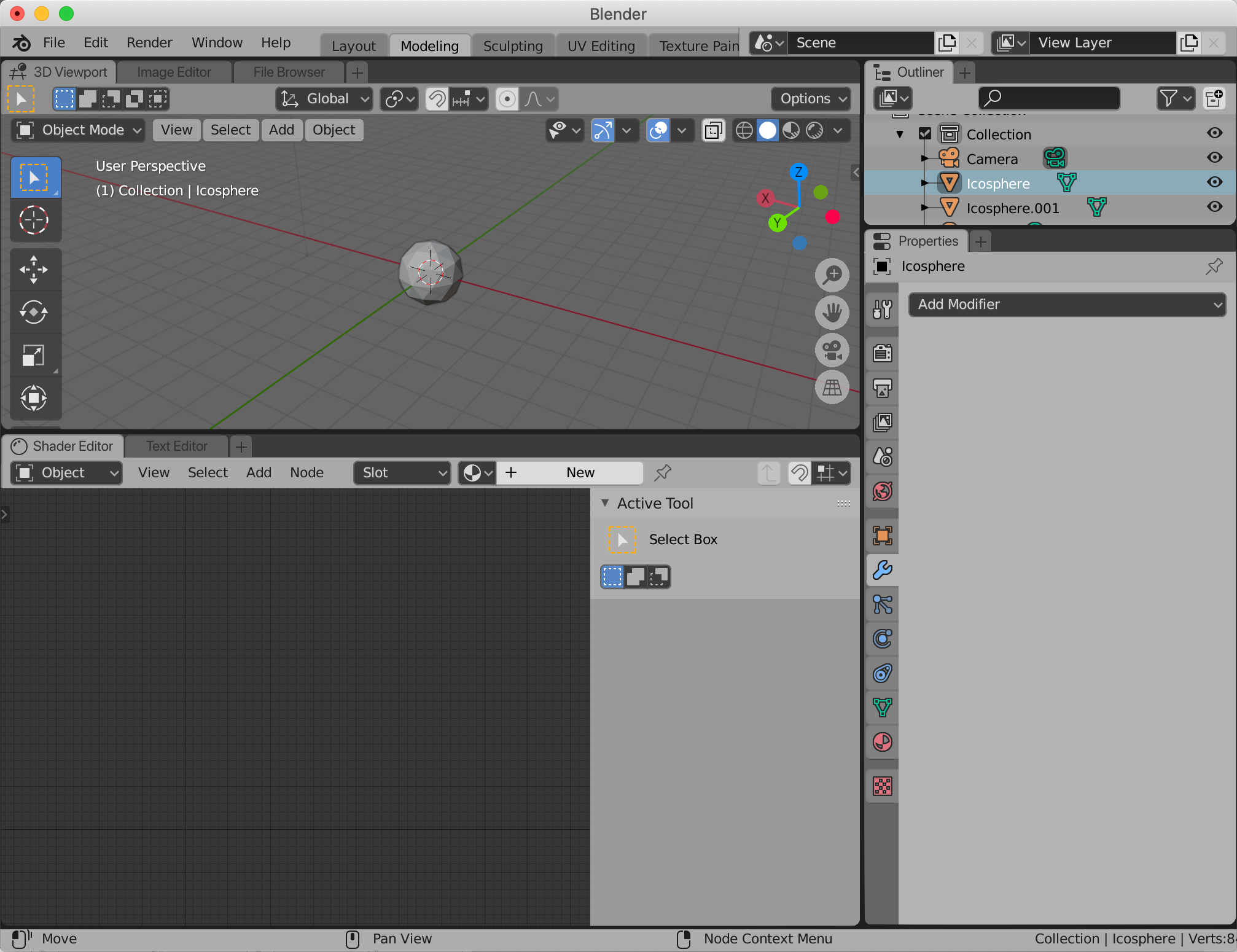
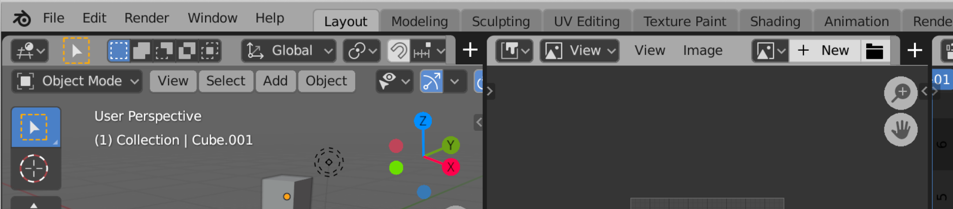
Mockup
The goal of this mockup is to give an initial idea of what this functionality could look like in its entirety. With that in place, it is easier to form an opinion about the options I describe after this.
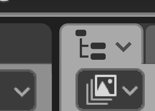
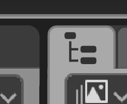
Appearance and functionality of selected tab
The first thing is the appearance and functionality of the active tab. I identified the following options:
(In these options, clicking the downwards facing arrow would open the Editor type switch panel / drop down menu)
-
Icon, name, dropdown:
-
Icon, name:
-
Icon, dropdown
-
Icon:
-
Name, dropdown
-
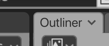
Name
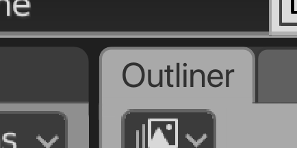
With the addition of a tab row above the header row of an editor, the full name could be beneficial, because someone can refer to a specific editor by its name instead of its icon or position, for example in the context of a tutorial or when helping someone else out.
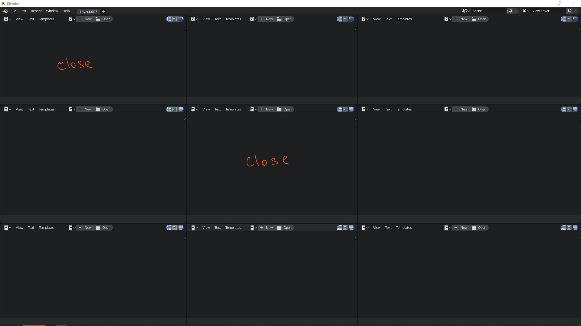
Right clicking on the tab, outside of the downwards facing arrow, would invoke the header context menu. This menu can be extended with tab specific functionality as “Close tab”
Appearance and functionality of an inactive tab
The obvious: The colour gets toned down to indicate that this is in fact an inactive tab.
To stop tabs from jumping around - which is unwanted behaviour - the width of an inactive tab should be the same as when it is active. However, reducing the amount of visual elements could be wanted. I identified the following options:
Show:
- icon, name, dropdown

- icon, name
- name or icon (depending on the aforementioned active tab options), dropdown

- only name or icon

What to do with an area that has only one tab
An issue that is being raised is that when there is only one editor in one area, there is unused space in this tab bar. It is proposed that the tab could then be collapsed back into the header, to make optimal use of space.
I do think this is a valid option. However, there are some arguments to be made against it:
- It would lower the discoverability of the functionality of tabs.
- It would reduce the consistency and clear hierarchy that having this tab bar everywhere creates.
- It would remove the name of the editor type (e.g. 3D Viewport, Shader Editor), which could be something the user is searching for.
- If a button is implemented for adding tabs (which I will discuss in a bit), this would either also have to be removed, or be integrated in the header of the editor which doesn’t look right - in my opinion:
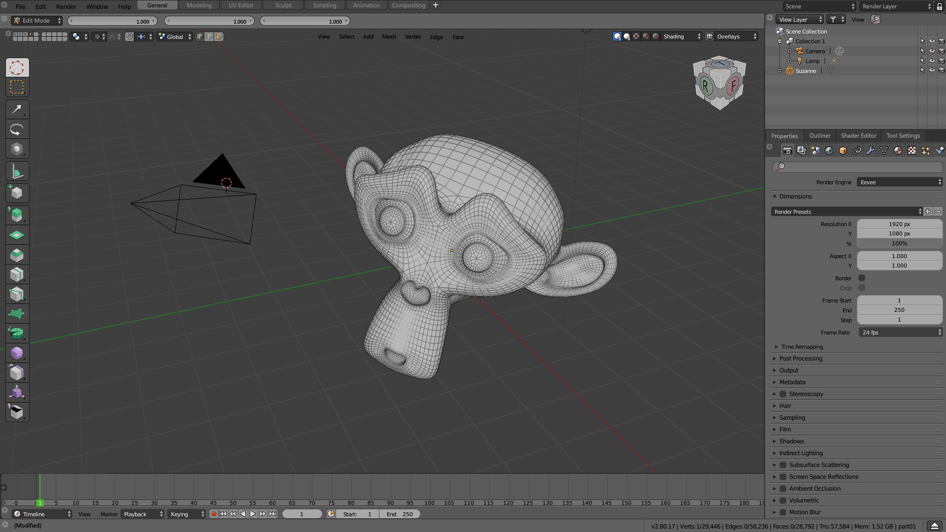
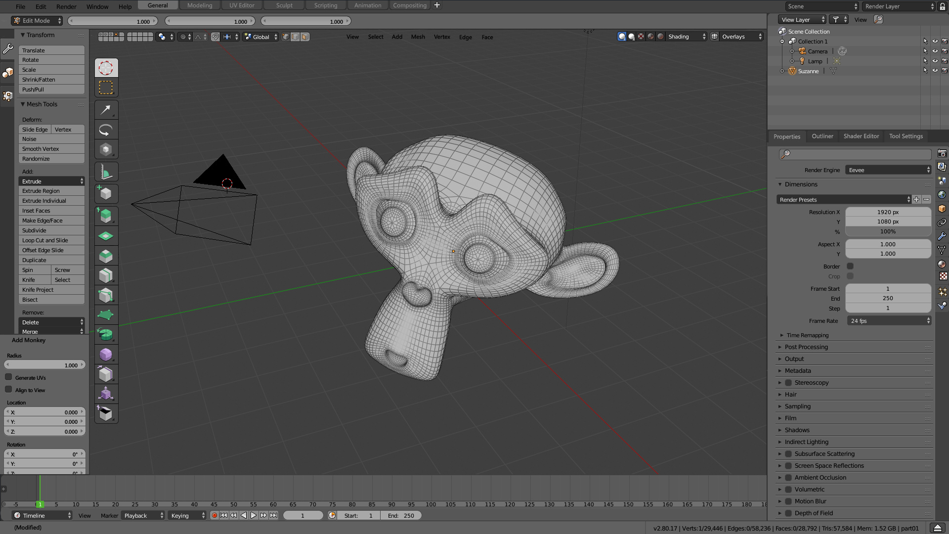
Background colour of tabbed area
One important aspect to note is how the tabbed area shows that it is a container for editors. In my earlier shown mockup, this is dealt with by having a background colour for the tab bar:
Also note the straight upper corners of the editor.
Add button
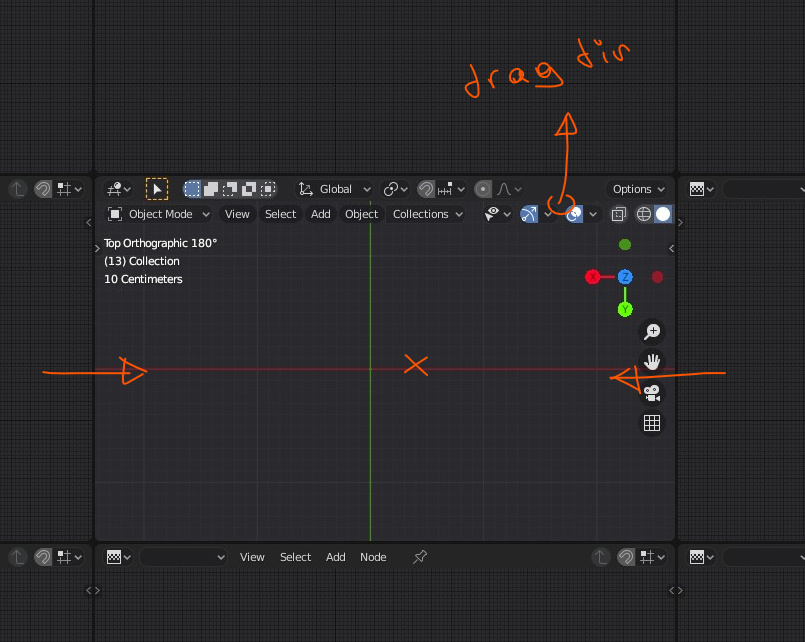
Lastly, how does the user create new tabs?
- Implement a menu entry “Add Editor” in the top-bar menu “Window”, which has the full list of available editors as submenu entries.
- Implement this same menu entry “Add Editor” (but then named “Add Tab”, maybe?) in the context menu when right clicking the tab bar.
- Have an add button (visible in the mockup) in the row of tabs.
The behaviour of when editors are dragged around or created can still be along the lines I originally proposed. This behaviour of draggable editors is, as mentioned before in line with other software packages.
Thank you for taking the time to read and comment on this post ![]() , I’m having a lot of fun thinking about this topic and creating mockups.
, I’m having a lot of fun thinking about this topic and creating mockups.
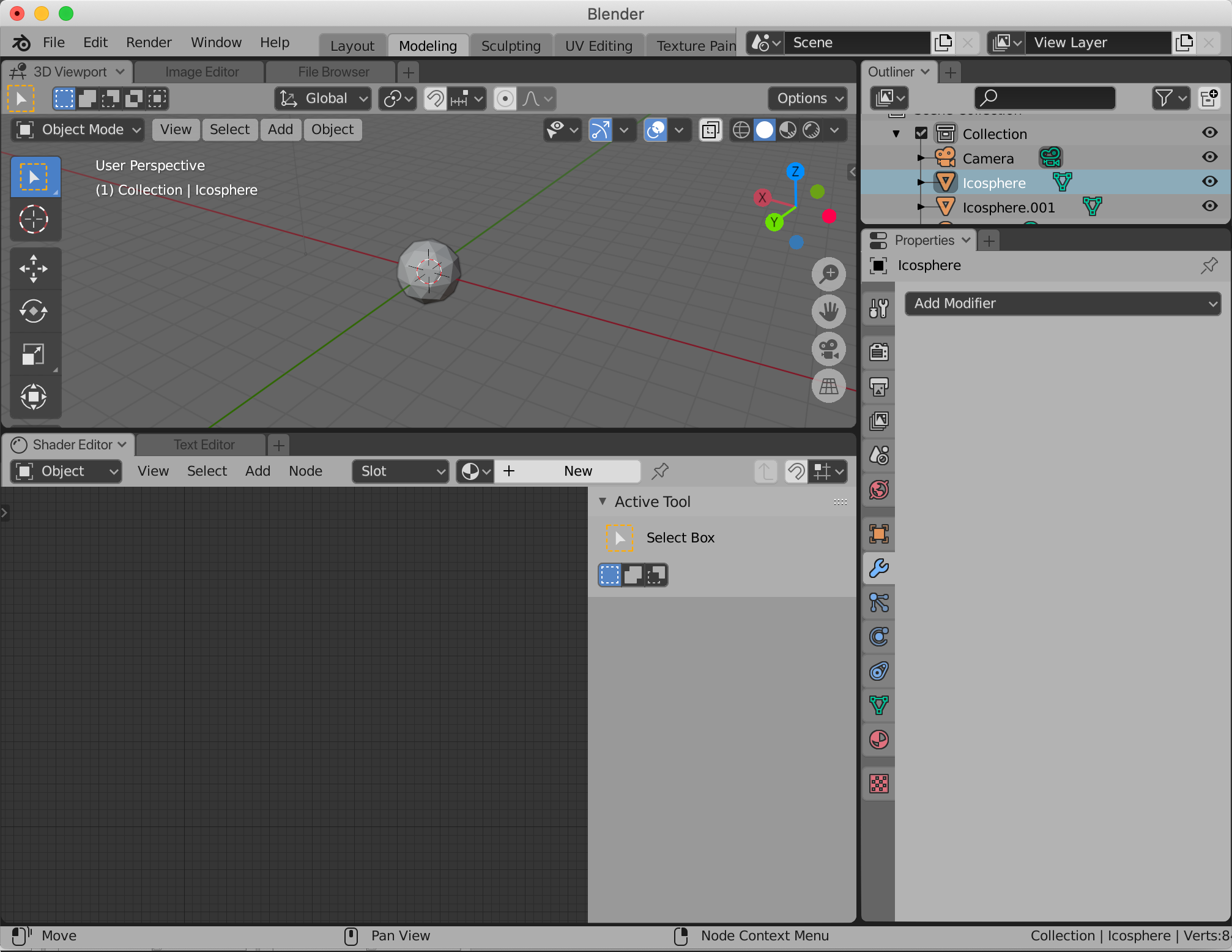
Some more mockups:
Could maybe give some more context to the earlier mentioned options:
With dropdown:
Without add button: