New modifier panel and list

Thanks for the info :+1:

On one side, text is a label. On the other side text is name of setting.
To me, that looks like less confusing choice if you want to adopt one column concept to modifiers.
In that case, continuing to add label in a row on top would result into a too long column.

IMO, a modifier’s list is redundant.

Imagine that you want to tweak a Weight Group modifier that modifies weight of a vertex group used by another modifier ; at same moment, that you set-up that second modifier.
If you want to tweak 2 settings from 2 different modifiers, you will still need to display 2 panels with a meaningful header for each.
So, you have 2 rows in list and 2 rows to name those panels.

Instead if you have buttons like in modifier tools addon to close all modifiers, closed modifiers are not taking more space than list and you gain 2 rows.
And we could have display settings to show only open modifiers and replace a multitude of in between closed panels by a line.

+1. A sub-panel for one value does not make sense.
I can understand the will to hide an array.
But when modifier is only made of 3 settings : user who will want to gain space, will simply close the entire modifier panel.
Here, we have 2 boolean and 1 value. Use of Boolean options is not something that requires minutes of thinking.
If user is not sure about a think and will take time to tweak, evaluate that will be the numerical value.
So, here, what is hidden in a sub-panel is what should be exposed during most of time of setup of modifier.

1 Like

With the new system if you have open a bevel modifier it’s hard than any other thing enter in the properties panel. It’s more easier use a list like modifier addon which has been a great success among users. More if you try to work with 5 or move modifiers.

I am downloading sources of branch. I would make a more in-depth feedback, later.

Bevel modifier is already the longest modifier in master.
I can’t imagine that use of subpanels for it, will make it longer when they are closed.
Anyways, you can’t use that specific case to explain that being able to tweak 2 different modifiers is not efficient in many cases.
For example, to adjust a generate modfier to a deform modifier.

You have to constantly click on the list when using modifiers list addon. It is not efficient.
Reality is that dragging of modifiers is a more popular request than a modifiers list (mainly popular because it reminds 3DSmax to new users).

Are you kidding me? This is the most confusing ui layout ever.
The only good thing about all of this is the drag and drop feature.

We should consider the changes done here as experimental, some (possibly all of it) may not turn out to work that great and there will have to be compromises. In fact there always are compromises to make, hence the experiments.

There is a bit of context to note here:

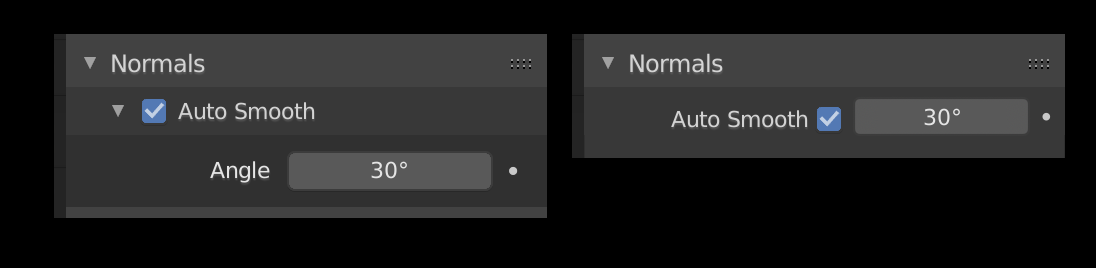
  • Regarding sub-panels for single values –
    William and I have been working on general changes to checkbox layouts (see T65965), part of that is addressing this issue. We now support these kinds of layouts, which would be used commonly: I think the modifier in the branch just wasn’t updated yet.
  • AFAIK the changes initially included a UIList for modifiers, like the Modifier List Add-on. But having both, a list of modifiers and the entire modifier stack with draggable boxes was rejected for the obvious redundancy, we need to take one or the other. I think it’s a subjective matter of what works better in practice, so I don’t see an issue with keeping the option for this via an Add-on.
  • For me, an important criteria for accepting these changes is that the panels make it clear that they are not regular panels. So the panel drawing might have to be tweaked to look a bit more like the old modifiers. This is being discussed currently, e.g. William made this mockup:
    That has big impact on the readability I think.
12 Likes

After browsing all modifiers, here, are my critics and suggestions about current status of branch.

Data Transfer : Exposed settings are not the most important ones.

  • In master, Max Distance is greyed out by default. That is an advanced option like restriction to a vertex group.
    Both settings and Ray Distance could be into a subpanel labelled advanced.

  • Main settings are into subpanels precising data to transfer.
    That does not make sense to add a Vertex Group subpanel into Vertex Data subpanel.
    Layer settings could be greyed out if Vertex Groups button is enabled.
    I would prefer simply to hide options when it is not pertinent. But it is not guideline.
    It is true that situation is different in Face Corner Data. It is necessary to distinguish Vertex Colors and UVs settings when both are transfered.

Mesh Sequence cache : Subpanels don’t seem useful at all.

  • Except Apply and Copy button, all settings are under 2 subpanels.
    So, when you add mofifier : all pertinent settings are hidden.
    3 lines are displayed but that is as informative as if modifier is closed.

  • So, if first subpanel is removed to keep only second one. That is a subpanel just for 1 line.
    That is a riduclous gain of space compared to closing the whole modifier.

So, none should be kept.

Normal Edit : Here, again. What is exposed is not the most important.

  • It is easier to use an object as a reference in Viewport than tweaking offset values.
  • And Mix mode, hidden into subpanel, is crucial.

I would rather put Offset into its own subpanel with vertex groups ; and put back Mix mode,Mix factor and Max Angle as basics of modifier.

UV Project : Projectors list may be increased by user.
That may be useful to create a subpanel for that. But that is not frequent to use many of them.
So, if it is created, it should be opened by default.

UV Warp : Here, also, Offset, Scale & Rotation could be grouped into a Transform subpanel.
Most of time, 2 reference objects (From, To) are only settings precised.

Vertex Weight Edit : I understand that FallOff subpanel is there in case of Custom Curve use.
But for all the other uses, that does not make sense. It is one subpanel for one line.
That is why there is no such subpanel in Vertex Weight Proxility modifier.
Can’t it be possible to have a button to close Curve Widget, instead ?

Bevel :
Probably, Clamp Overlap, Harden Normals, Mark Seam, Mark Sharp options could be moved to Advanced subpanel.

But I would group things, differently.

  • Mitter Types, Intersections, Clamp Overlap & Loop Slide into an Advanced Geometry subpanel.
  • Face Strength, Harden Normals, Mark Seam, Mark Sharp and Material Index into a Shading subpanel.

Mirror :

  • I think that Vertex Groups option can move inside same subpanel than UVs mirrors.
    This subpanel could be renamed Data.
  • Clipping option can be used enabled without merge enabled.
    It should not be placed under the same panel but took current position of Vertex Groups option.

Multires : That design is not functional at all.
It lacks of several essential of modifier. I suppose that should be completed.

  • I would say that Quality, UV Smooth and Use Creases could be put inside an advanced subpanel. Optimal display as a frequantly used dislay option should not be inside a subpanel.
    Same remark is valid for Subdivision Surface.

Skin : Interesting arrangement of buttons. Why not doing that for multires ?

Solidify:

  • I know it will slow down usage. But maybe, it could have a Normals subpanel like Screw.
  • Fill Rim, Only Rim, Clamp, Angle Clamp and Vertex Groups lines could be inside a unique Advanced Geometry subpanel.

Wireframe : 2 columns + decorators are making names of options unreadable.
You could keep a unique Advanced subpanel and put Even Thickness, Relative Thickness, Vertex Groups and Crease lines in it.

Shrinkwrap : For Project Wrap Method, there could be a projection subpanel to include settings added by method.

Simple Deform : Although that is a coherent grouping, Orientation is a crucial point for this modifier. It can’t be inside a subpanel.
I would rather group Limits, Vertex Groups and Locks into a Restrictions subpanel ; and let Origin and Axis exposed like Angle.

Wave : I don’t understand why same XYZ buttons as elsewhere are not used, here.

Unfortunately the branch wasn’t quite ready for this sort of feedback before it was shared. That’s why there is so much of this kind of feedback to give! I don’t think William or I have fully gone through all the modifiers to iron out issues like this yet.

That said, this is the sort of feedback that’s actually very helpful.

Data Transfer

That seems to make sense.

In this situation I preferred to be consistent between vertex data and face corner data. Although like you say it might make sense to just hide the vertex group settings.

Mesh Sequence Cache
Master puts each of these in a box, and as I hadn’t used this modifier before I figured there might be a good reason for this. I agree though, subpanels don’t help.

Normal Edit
Offset in a subpanel: seems to work
Maybe mix mode could be in the header of its subpanel. I’ll have to try out your suggestions here.

UV Project
Not sure a subpanel for projectors would help here if it’s open by default.

UV Warp

Agreed.

Vertex Weight Edit
It’s out of scope to add a close button to the curve map widget. Maybe putting the falloff type in the subpanel’s header would help. Although as that’s not done anywhere else it would need buy-in from other UI developers.

Bevel
I like your proposed grouping. I’ll try it out.

Mirror
Agreed.

Multires
You’re suggesting adding a subpanel for those three options? Keep in mind that would be below the operators.

Two buttons on a row might work here. We don’t want to cram stuff too much though.

Solidify
The main constraint here is the large difference in options for the two modes. A normals subpanel might help though.

Wireframe
The two column layout is supposed to be a “flow” layout that expands to two columns when it gets wide enough. Looks like it’s not working though.

Project
The issue is that none of the project settings apply for other modes. I’m not convinced a subpanel for it is helpful.

Simple Deform
I like the idea of a restrictions subpanel.

Wave

I suppose so the decorators can show up? It might be better like you suggest.

2 Likes

I’ll have to reserve most of my judgement until when it becomes a bit more finalized, but, I agree the “wide” view that was posted by op wasn’t a good first look. Things look a bit better when using more narrow layouts but it’s still not great right now.

A few other pieces of concrete feedback:

  • The toggles for the modes are listed as [cage/edit/viewport/render]. How about re-ordering? I would suggest either to use the existing order of [render/viewport/edit/cage] or [viewport/render/edit/cage] the latter of which would align with how the Outliner displays the viewport and render filters.

    I know you’re trying to keep the icons aligned which is definitely nice. But you can keep them aligned the re-ordered way too. Just pad with an “empty” icon space to the far right if the edit or cage options are not supported for the current modifier.

  • Single column layout. I get it, you want layout consistency. But this is instead resulting in complete visual inconsistency; and the tradeoff here is often not user friendly or aesthetically pleasing.

    • The biggest downside to single column layouts (in any UI) is when items in the layout are of different types. Single column layouts only really work when there are sequences of several items, of the same type, and they naturally group themselves. Take Decimate as an example. There’s a dropdown, a numeric input, a checkbox, a free-form input, and a text label… 5 different items all stacked on top of each other each with different styles. This doesn’t work very well in practice I think. There might be some modifiers where you could attempt to mitigate this but not in general. It would mean grouping similar items, perhaps in odd ways, to achieve a good result. Not sure what to do really.

    • The single column layout wastes too much horizontal space. The modifier pane will often live under other regions, like the Outliner, that are more naturally wide. Let the modifier pane take advantage of the horizontal space better. It’s already an absolute pain to keep modifiers tidy since they are already vertically so long. Don’t make the problem even worse.

    • The space issue is compounded by now forcing some options into subpanels that require expanding/collapsing. The management of the expanded/unexpanded panes is part of what makes working with modifiers so tedious now. I don’t think adding more panels is going to help much; especially if the modifiers with those subpanels are already so long that scrolling will no doubt have to occur anyhow.

  • I too would like a “modifier list” if anything drastic is to be done with the modifiers in general. Sure, we might get drag/drop of modifiers to change their order now, but I’d rather see the UIList widget get that instead, which would benefit many other places in the UI. I would much rather have a central list at the top, supporting drag/drop of items, while only displaying 1 active modifier below the list; though that’s mainly personal workflow talking as I rarely need to edit 2 modifiers simultaneously and if I did, I’d still prefer the list :slight_smile:

1 Like

I thought about the length it takes when several projectors are used. But you are probably right. User sets that, once and then, you close modifier.

I would not mind.

Yes. Same as UV Project. Most of animation relative to modifier is probably happening in Viewport.

The main problem I see is lack of distinction between modifiers.
Adding a bubble style system like in the past would make things much easier to see, or even an alternation of light and dark, such as the type in spreadsheets sometimes.
I would also make the ions and text automatically size to fill the entire header. :slight_smile:

After my suggestions accepted, I can see that (even if all subpanels are closed or only 1 subpanel is opened) one column modifiers are still as long or longer than previous ones, in one column.

But in two narrows columns that works. User can play with settings of 5 or 6 modifiers.
Problem is that names of modifiers are overlapped by icons.

If header of modifier could become 2 lines (1 for icons, 1 for name) when area of Properties editor is narrowed ; that kind of 2 column layout would be usable.
Currently, it is unusable because names of modifiers are unreadable.
But that is pretty much the only thing that is unreadable.
Everything else (values, first word of labels) is sufficiently readable to allow a power user to manage most of modifiers without scrolling.

Ideally, allowing user to split vertically properties editor to avoid to deal with 2 properties editors and 2 different scrolling states, would be more efficient.
I made this proposal, a long time ago. People were more interested by Grid Layout.
Of course, for modifiers, there is no way : grid layout could be more satisfying than previous UI or bring something to 1 column UI with sub-panels containing only 3 settings, most of time.

But just fixing overlapping of names and icons would be welcomed.

+1 for having a list and only one active visible modifier from me.

Drag and drop is always a bit of a pain as soon as it involves scrolling, and modifier panels tend to be pretty long so I don’t think this goes well together.

2 Likes

This new mock up is much better in terms of readability. I love the changes being introduced here (dragging, the new checkbox layouts and general cleanup of the UI of individual modifiers, …). Great work!

1 Like

Overall I like quite some of the new layout ideas for this, the more compact layouts and the subpanel idea.
But some critique is better brought up now.

I disagree on that. I personally don’t think that these both versions are on par. The addon handles the given space much better and is superior when it’s about navigating to a modifier in in a long list. It’s much easier to see which modifiers were used in which order, titles are much faster to read than it will ever be possible, eg while you are scrolling down on a list with the current layout. This is a big drawback. And the only advantage of having more than one entry visible at a time could be solved easily in the addons approach.

Another problem is, even if I generally like drag and drop behaviour as an intuitive feature for placing elements, if there is the need to scroll while you’re dragging it starts to get worse. Multiple control targets interfere then, the need to place the element and the logic for controlling the scrollamount. These kind of controls are always slow and feel clumsy, because tradeoffs are needed to make it controllable.

I can’t see how this would not continue to happen if multiple modifiers are used.

My concern with this is that the author of the modifier list addon already mentioned considerations if he will discontinue / won’t be able to continue the work on this addon caused by the changes currently planned (over at the addon thread on blenderartists). That should be seen and taken care of, especially if it used as an argument against choosing that route.

I currently fear we are steering towards a solution that still suffers from known problems and have a broken alternative.

3 Likes

Is it possible to have a better fix for narrow columns ?

Icon of modifier is already informative.
That would look less ugly if name was removed. Icons would not be squished.
Name could be visible as a tooltip by overlapping icon of modifier.

When modifier will be open, then, name will be entirely readable and editable.
fix_narrow_column

That would not be so weird.
We are already adopting that kind of solution with Tool Settings bar and Header of a view.

4 Likes

That’s a good idea Ronan. I can look into this. Technically there’s no proper way for a header to spill over to a second row, but a more manual solution may be possible.

Looking at the array modifier from https://developer.blender.org/D7517#180764
the Relative Offset subpanel Distances maybe missing X Y and Z label

Thanks, looks like an oversight there. I’ll make that change

@HooglyBoogly
I may be missing something but are the Grease Pencil modifiers NOT getting updated to the new layout ?