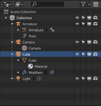
Elsewhere I suggested the idea of making the icon or tab coloring/highlighting in the properties panel context-sensitive, such as when you have an object of a particular type selected, then highlight the tab(s) which are most relevant to that object type. So for Camera, Light, etc., draw attention directly to the tab that contains the most specific items for that type. For Mesh objects maybe that’s two or three of the most used property tabs (Modifiers, Object Data, and Material say).
I thought perhaps highlighting the tab background or putting a hilight/selected color outline around the tab, as opposed to changing the icon color.
The upper most set of tabs in Properties are “weird” in that they generally don’t apply to the current selection (unless perhaps you consider the scene and view layer as selections). In other software you would have a Render “thing” that you would need to select somewhere in order to fill the Properties panel with the rendering properties. In Blender it’s just always there in the set of current tabs in the Properties panel. I could definitely see highlighting or visually grouping these “global” property tabs more strongly to indicate their difference. The current gap below the world icon is a bit subtle.
I would avoid color for the sake of color, and would argue against an “angry fruit salad” as designers like to call it. Color hilighting should be meaningful and a user should be able to figure out and tell you what the colors mean.
I see what you mean about the icon in the Outliner, I hadn’t spotted that. It might look better by borrowing from the camera and add some horizontal lines, signifying a ‘rendering’ image. I can see what the developers are going for though; a unified icon for rendering as they also use the camera in the Outliner, but front-on.
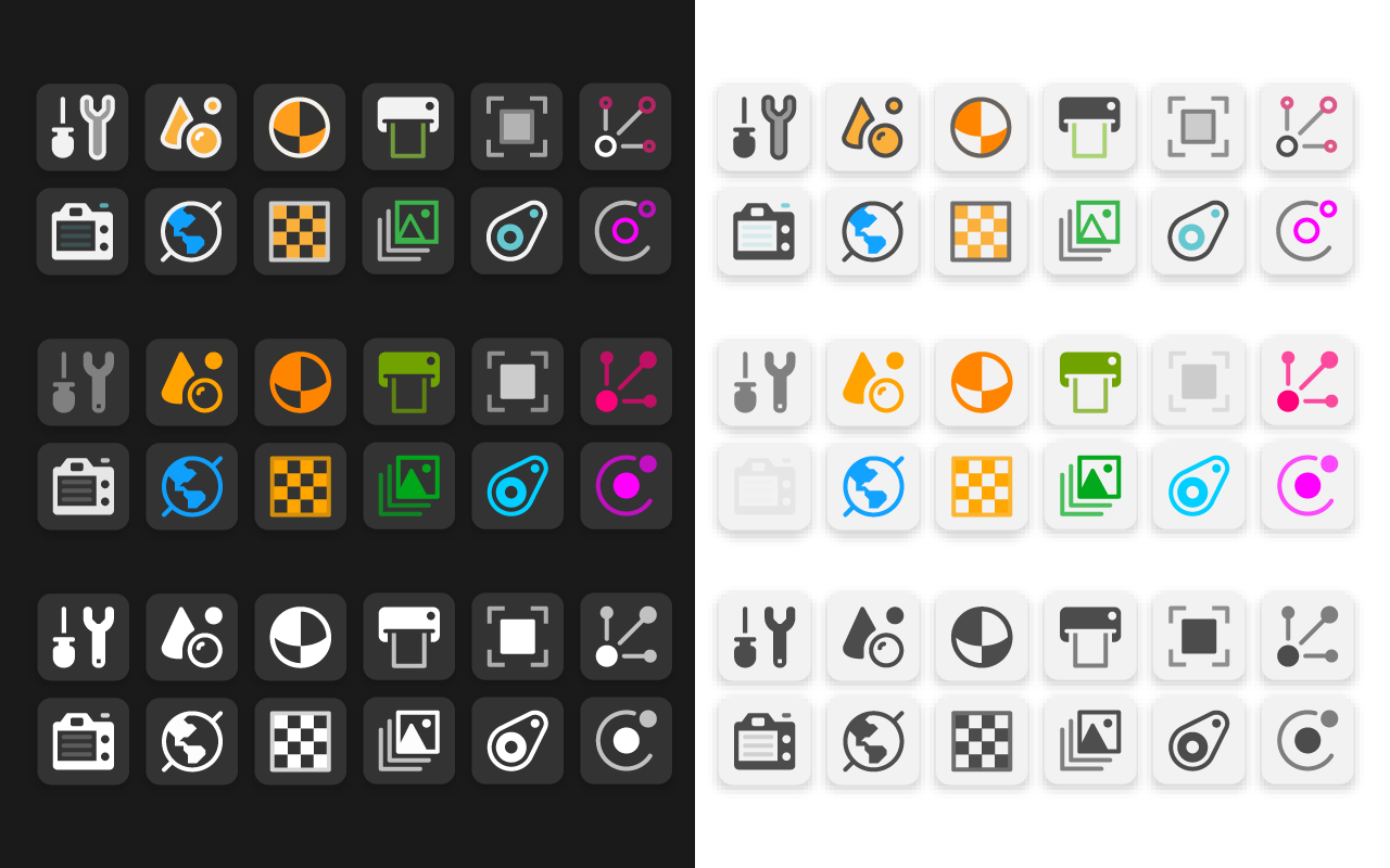
It would be nice to have ability to change outline colour of every single icon. Then they will be more visible and fully adjusted to the user preferences ( some users likes mono some likes multi colour bar ). All that icons should appear in Theme Editor with own outline colour selection field.
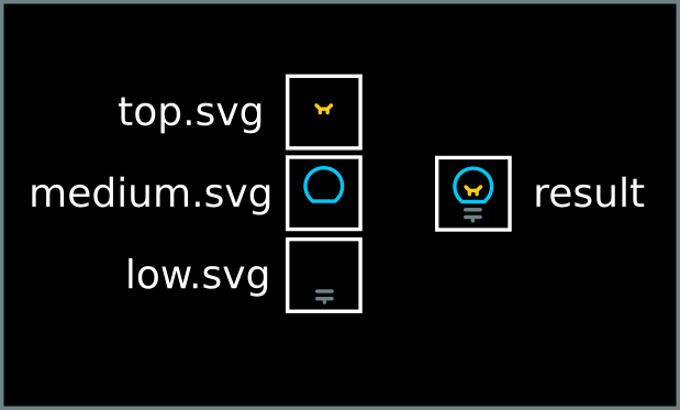
I think your example picture would be even more evocating by using a full dark background on the left side instead of a darck background only behind the icons and a white background between them.
As this is more representative of how they will fill in Blender’s full UI.
Isn’t the point to make it easy to find the icon you want? The one you have selected would be the only one that you don’t need to find. Making all the unselected ones monochrome seems like the opposite of what we need.
Also, really hoping the Colored Ribbons get implemented, seems easy and effective and could probably be used in other places.
So I haven’t really tried 2.8 extensively and I haven’t paid attention to the properties panel icons, but now that have, here’s what I noticed, first time really looking for the icons:
Icons I could not find / did not understand what they meant: Object, Constraints, and Particles.
For object, I had the urge to click Scene instead. Should be a cube imo.
Constraints looks like belts? idk what it was until I clicked, the 2.79 link icon was much clearer. Plus you can tell people “click the link icon”. Now: “click the belt thingy?” What about two dots and a link between them?
Particles screams “transform” at me because it looks like an xyz axis.
The light icon needs rays imo.
Physics icon is… eh. If you google physics icon, that’s what I expect one to look like, even if it’s noisier. At the very least, maybe have 2 atoms.
I would make the scene layers NOT have the little image mountain (so this can be used for the printer instead).
Printer should be an image icon (though “export” idea is okay) since it has a lot of typical image related settings (resolution, file format, etc).
Anyways, I really like the two color icon proposal but if a camera is used, I feel the camera body should get the color, not the entire lcd or the tiny button. Or if that’s too much, maybe draw a little focus square in the lcd? As it is, it looks weirdly blank to me. Same thing with the screwdriver and the wrench, shouldn’t the screwdriver handle be colored?
I also like the desktop icon idea for the DSLR camera since the camera looks like it should have settings related to the camera (I mean like the ones found in the movie camera icon when you click a camera), which it doesn’t.
PS: Please please please make ALL the colors customizable. I’d rather the option be there to change them, then not. Even though I hate how messy the theme editor is, it could be cleaned up in other ways.
we need special category in the preferences for changing icon colors or for making everything monochrome if some prefer dull ui. because nobody on this planet can pick such colors that will work with every theme with their own backgrounds.
If discussion about colour code is still open … @jendrzych’s proposal to rid of the green colour for ObData make a sense for me as well.
I would suggest for ObData the same orange colour (used for Object) seems to me more descriptive - relation between object and object data. “Heavy” object icon vs thin (subtle) object data icon, and mainly position of the icon in a list, clearly represent what it is. And I don’t think anybody become confuse or less orientated in a heavy list.
Since Object icon is more dominant by the shape and ObData icon thin (subtle) it’s even not necessary to look for some desaturation or something to make more distinguish from Object icon.
Jendrzych’s icons shape makes that job already.
Green colour is something that confuse me, probably not because it’s new, but in relation meaning?
BTW: Does it necessary to use red colour for shadings - light / material / texture? That is based on previous 2.7 icon experience, I suppose. What about to keep it white?
I secontd, that making Objects and all the ObData the same (or at leas similar) colour. It goes in pair with planned Properties Editor colour coding.
On the other hand, I can’t agree with making white all texture and shading related glyphs. Reddish was used for this kind of stuff in Blender since 2.5 and kinda stroka a root. It just shouldn’t be aggressive blood red.
Modifiers and Constraints should get purple pink, as I stated before ( LINK_1, LINK_2)…