Hi. I love the shapes of new icons, they give feeling of talent of artist, that created them.
Excellent work!
But there is an issue about monochrome I would like to clarify.
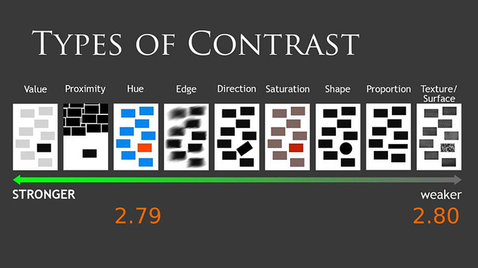
As professional artists we all remember Types of Contrast scale by Sam Nielson
So current situation is looking like this
As we can see from this scheme, colored icons are pretty much more simple to hanlde, because their contrast type is much higher on the scale.
This can be tested like this:
Colored icons are much simpler to handle even with blurry unconcentrated view, so
that’s why so many people feeling loss of comfort with monochrome icons interface.
Because you have to pay additional attention to recognise shape.
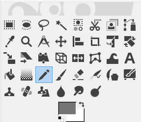
We can remeber GIMP experiment.

Steril monocrome design compels to search proper tool every time it is needed, that hurts especially if they are packed like this.
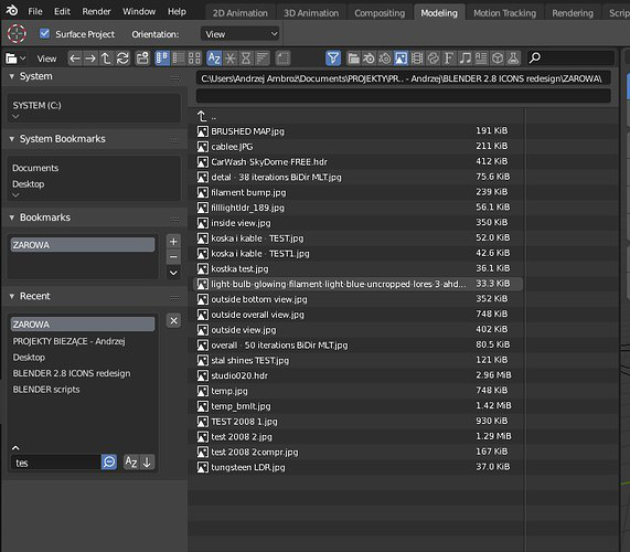
And, of course, that issue brings especially strong pain here, in file manager.

It tooks seconds to realise, that folder don’t contain blend file in every folder that contains images, if it doesnot contains it, because user forced to view through every single icon to recognize it’s shape, while there are no any problems at any other file browsers with colored icons. Just because there is no problem to find an orange in a bunch of potatoes.
There were nice solution - put some color in a part of icon, that will be enough to bring acceptable amount of contrast into the scheme.
So, monochrome scheme, like in GIMP, must necessarily be optional to avoid cognitive overload.
Thank you for attention.


