Hi there,
first of all I would like to say that some really really good work has been done on the icons both for 2.5 and now for 2.8. Thank you jendrzych!
I read the entire thread here and also on BA and even though I loved the 2.5 icons I see the problems - individiually shaded masterpieces not fit for both light / dark themes, they take away too much focus + impossible to customize.
By my estimate though about 40% people like monochromatic and 60% like colorcoded.
Also obvious is the fact that too much color is very bad as it just messes up with the head. It’s actually much worse than monochromatic as it leads away from the shapes and gives chaos.
There was one very good point made only once in the BA thread by Martynas Ziemys which was that you don’t really need to color according to category (as when you add new modifier - everything is just blue) as then the color loses it’s point. The color is to code the difference between the options.
The icons that get absolutely the most heat are definitely the ones from the properties window. There is no Blender user in the history of the Blenderth not using the properties window and constantly clicking on these icons repeatedly. Also these are the icons that have no text whatsoever and you only get what it is after hovering over it.
There are a couple of icons there that I’m having problems with understanding and therefore recognizing. Those icons are particles and constraints and because these were already pretty much flat in 2.5 I would say it’s safe to just take them from there and make them monochromatic?
When it comes to color-coding, I tried to do something based on the previous icon-set but it’s just impossible to make colors work well on flat icons.
The biggest point of colors is to immediately know where everything is though. Right now I can explain stuff to a total newbie over the phone and I did so multiple times, I also use it when teaching people … red sphere, blue sphere, orange box, blue wrench, yellow stars, … It would be so much harder with monochromatic I am sure.
Well so in the end I added a thin ribbon to be colored per theme. It doesn’t take away from the shapes and it can adhere to outliner’s depiction of modifiers, objects, mesh, materials, cameras…
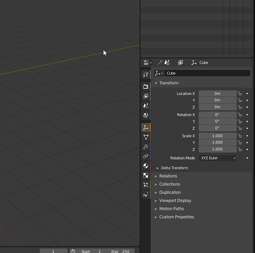
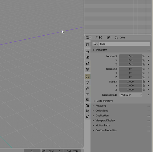
So here is list of changes in this mockup:
-
added Africa+Europe and Australia to the world icon (sorry to Asia and my geography teacher) … my reason also was that it resembled material a bit as it was also a circle with top left and bottom right quadrant filled
-
added 2px horizontally to have vertical ribbons next to the icons based on their type.
-
brought back constraints and particles icon from 2.5 and made it flat.
-
colors: white for render settings, blue for world settings, orange for object/data (quite related), purple for modifiers/constraints (quite related), red for material/texture (quite related) and yellow for particles/physics
-
the physics icon is pretty much what google told me and I am not sure about it… It could work well but maybe not? The current icon is a bit unclear but this one looks imbalanced. But then again I am not really great at creating icons.
-
The checker pattern in textures I made 2x2 (instead of 4x4) so that it visually connects with the sphere on which that texture is mapped.
-
re-ordered so that object and data is together & modifiers and constraints are together … It is my understanding that these are related so should be next to each other
Dark:
Light:
Thanks for the icons and all the work and thought put into this. This was my bit of feedback.

