Colour coded icons

Where can we find the list and names of the new icons so we can update scripts? They look great, BTW! And very excited about Modifiers in Edit mode!

Hi, is there a way to change the brightness/color of the new icons without change the text next to it.
To make them more visible I needed to crank up the text color to full white but the icons are nowhere near to full white. I’m confuse.

Thanks.

I think it’s because inactive buttons have icons a bit dimmed.

For now the easiest way to see the icon names are in UI_icons.h in Blender’s source code.

Link here: https://developer.blender.org/diffusion/B/browse/blender2.8/source/blender/editors/include/UI_icons.h

Edit: It appears that the Icon Viewer addon works in 2.8, so you can also use that if you prefer.

1 Like

Thanks for the quick response, excited to dig in!

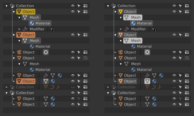
the basics of color coding have been implemented. Otuliner looks a bit too colorful now. What seemed appropriate on the mockups does not really look good in a real environment - that’s why implementing the concept is so important. It shows what actually works and what just looks good on sketches.
I would remove one of the additional information - the color assigned to ObData, as in the attached pictures:

  1. that’s how it looks out of the box:

  2. my proposal is to get rid of one of colours and to change two others. Each Object has an ObData block, so I do not see a reason to emphasize that fact with colour - let’s get rid of the green. It is more important to emphasize de blocks of data that are somewhat exotic and occur less frequently: modifiers - purple, like deforn/modification tools in Toolbox; shading related icons - light blue just because it remained unused and isn’t red, which is bined to delete/remove. Much cleaner and easier for the eyes:

  3. green I’d leave for Vertex/Bones Groups and such. Those icons are apparently less present than ordinary ObData, so it won’t be as agressive as it’s now:

The Christmas tree will disappear, we will not lose readability, and the relevant information is distinguished at first glance.

Then I’d go this route:
post%20Vegas_3

6 Likes

@billrey
I found a bug, when I save a new modified theme, the colors are reset to the default theme and the new theme is saved with the default theme colors
(after I changed the colors of the icons starting from a non-default theme)

Hmm, so I guess there’s no a workaround to remedy that.
I wish the icons were the same brightness as the text so we could have more flexibility when changing colors.
Unfortunately It seems like I’ll need to make most of the text full white so I can see the icons better. :frowning:

Thx.

Yours looks a lot better, because for now icons on highlighted rows and in circles looks very bleached out and unreadable
%D0%B8%D0%B7%D0%BE%D0%B1%D1%80%D0%B0%D0%B6%D0%B5%D0%BD%D0%B8%D0%B5

By the way, what’s planned to this old icons of modifiers?
%D0%B8%D0%B7%D0%BE%D0%B1%D1%80%D0%B0%D0%B6%D0%B5%D0%BD%D0%B8%D0%B5

with the new color coding the themes must be arranged …

Hi jendrzych! For me this “B” mockup of candy crush outliner is the best!
With the rounded shaded icons and the text colors I can easily read all the content of the outliner.
I think I could have a problem because, it’s really difficult to me read anything in the outliner mockups with few colors.

I don’t know what the plans are, but I’m working on a new set of modifier icons, I started it more as an exercise but I’m quite happy with some of them.

@billrey have you seen them on BlenderArtists?
If so can you tell me if something like that (with more polishing) could work or if a definitive decision on removing the icons have been already made?

just to see , link it

Here: New icons for Blender 2.8 - #1067 by a.monti - Blender Development Discussion - Blender Artists Community

Sorry for the wait, yesterday there was quite a raging discussion there and I preferred to post the update now. :slight_smile:

1 Like

I think addons tab also must have icons instead of text labels. They are difficult to read because they are turned at 90 degrees, and often shortened
here my mocup:

6 Likes

I also dislike with every bone I have “vertical rotated text” but I don’t know if icons is the way to go, because as @jendrzych already said, an I agree, complex subjects (like add-ons that can do a variety of stuff) are dificult to represent in such a tight matrix.

Maybe a dropdown? Or a horizontal scrollable buttons?

P.S. don’t know if this should be discussed in this topic…

1 Like

Sorry for the dumb question, how can we control the color of an icon in python?

I think we could also aspire to labels written vertically …
…like motel’s signs …
I wonder why no one has thought of it until now :grin:

1 Like

I was thinking of a dropdown at the top instead of tabs. That was an annoyance in 2.79: lots of addons=unreadable tabs.

1 Like

Now back on subject:

Two of the normals display icons are reversed in the Overlays dropdown. The Face normals as lines and the Vertex-per-face normals as lines have the correct tool tips and function, but the icons are incorrect.

Face Icon
Vertex-per-face Icon

2 Likes