Colour coded icons

Time about to talk about colour codes for icons. The topic is quite hot and subtle at the same time.
I have to claim, that at the very beginning of my project (“New icons for Blender 2.8” thread at Blenderartists.org) I didn’t consider using colour at all. Icons were supposed to be all flat and monochrome. I assumed that coloured icons are actually not needed at all in most places in GUI. The most controversial spaces in this respect are lists containing many different types of data, like File Browser or Outliner. Long list of Modifiers is another place, which could potentially gain on using colours, but I believe, that we should get rid of Modifiers icons, for many reasons, among which there is a high degree of complexity of these pictograms in the context of a small size of icons.
To achieve the goal I designed a visual language, differentiating it for: individual objects, thematic groups, the importance of the elements of the each icon and the unique silhouette of each individual symbol. In short, I’ve made an attempt to avoid using color in the most controversial areas of the interface.

OUTLINER
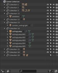
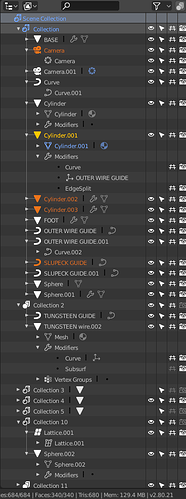
Outliner is now overloaded with informations:

  • indicating active selection of item in Outliner by highlighting entire row;
  • indicating selection of item in Outliner other then active by highlighting entire row;
  • highlighting active object by drawing a yellow splotch under the object’s icon;
  • highlighting object selected in 3D View (not active) by drawing an orange splotch under the object’s icon;
  • highlighting object’s data that is in edtition process by drawing a grey splotch under the object’s icon;
  • tiny indicators noting the number of objects of the same type;
  • colourful icons;
  • dimming icons and descriptions of data that is in colapsed branch or is under visibility/edition restriction.
    These are issues that I can call from memory, so I may ommit some more.

I find the current incarnation of the Outliner as a messy place, full of obscure visual suggestions. Indication of active, selected and edited data is now extremely insufficient, especially with colourful icons. My icon set brings out visual differentiation between objects (bold lines, filled polygons) and object’s data (thin lines, hollow polygons, clearly marked editing nodes/veritces) without any use of colour and removes Modifiers icons, so there’s not so much to extragerrate with colour. Moreover I worked hard to make icons shilouettes to be distinghishable and consistent at different levels of data description. I believe I managed this quite well.

I admire the wise colour coding, that was introduced in the Toolbox (green=creation, red=removal, pale purple=modification/distortion). This code hepls a lot when it comes to tool differentiation, but is not valid for Outliner with its complexity, by my mind.
What I propose is to stay with monochromatic icons and emphasize which items are active/selected/edited with appropriate colours that correspond with colour codes used in 3D Viewport already:

  • yellow for active item;
  • orange for the rest of selected items;
  • blue (or purple, as in the Toolbox) for data that’s edited at the time,

all with 100% opacity.
The rest of Otliner’s content would use:

  • text colour with 100% opacity for Objects;
  • text colour with 60% opacity for Object Data.

I assume, that more sophistcated search and filter tools should help finding items in complex scenes more than a couple of colours. From my point of view, clear pointing out where is the very data I did select/edit in 3D View editor is more crucial than making colour difference between, for instance, a mesh data and brush data.
Anyway I don’t see the problem with spotting Camera or Curve objects amongst other icons of my mono-set, but maybe I work with simple projects or just stare at my pictograms too long :smiley:
The dynamic filtering of the content, I am writing about below, can provide additional help.

FILE BROWSER
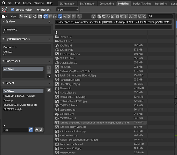
This one is extremely difficult in terms of the use of color. I can see no way to assign an universal code to types of files without making this place rainbow alike. Aside from careful silhouettes design I propose making some enhancement in Blender’s “filtering” funcionality (the thing is related to Outliner as well). Pictures are worth thousends of words, so let pictures speak:

{fig. A}
Filtering’s disabled with not a single file type button active:

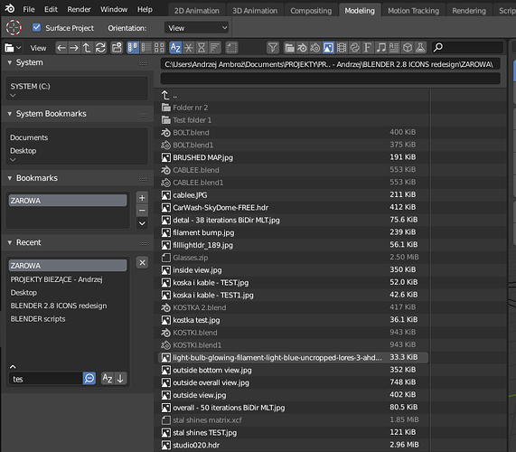
{fig. B}
Funnel icon still disabled, but the “Image” file type button’s turned on. All bitmaps in file list gets some kind of visual accentuation:

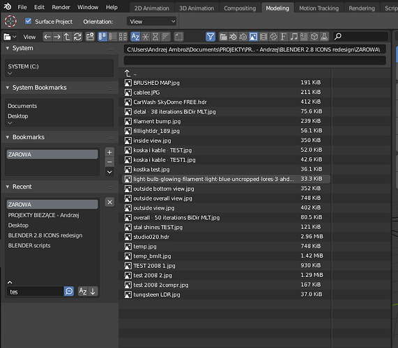
{fig. C}
Filtering’s enabled, so list notes only selected type of content (bitmaps in this very example):

Getting the instant “fig. B” would be the best. Imagine, that filtering is disabled; a user clicks/selects a certain type of file directly in the list and Blender highlights other items of the same kind automagicaly on the fly. This would help differentiating and accentuating content with no extra use of colour…


That’s how I imagine it.
19 Likes

Hey. This is one approach to color coding. Here you suggest using color to clarify what you have selected or are currently editing. However, selection state is already communicated in a different way with the circle around the icon.

I think what the other developers had in mind, was using color to differentiate between different types of data. Object, mesh data, material data and so on.

The point of color coding is to help visually identify different types of data in the Outliner quickly. In a big scene, this really helps readability in a complex Outliner setup.

In 2.7x, we used:

  • Yellow = Object
  • Grey = ObData
  • Blue = Modifier

etc.

This is what we had in mind.

3 Likes

I am perfectly aware of what others understand by color coding. I began the discussion with the presentation of the point of view that lay at the base of my icon design. I assumed from the beginning that the color differentiation of the content is not necessary and should possibly be limited to selected places (Outliner and File Browser), if it is used at all. I illustrated my own vision with graphic presentation and claim that it will work. Honestly, I have no idea for aesthetic and sensible color separation between the contents of File Browser, but Outliner is potentially an easier task.
It does not change the fact that the problems I pointed out in the case of Outliner are real and make it a tool with unused potential. What I want to communicate is that the problem is not limited to coloring individual icons. There is so much to communicate that compromises will have to be made.
I strongly believe that my proposal should be tested on a living organism.

In my design:

  • Object = bold, filled shapes with strong visual impact. 100% opacity
  • ObData = thin, subtle icons. 60% opacity
  • no modifiers…

I’m not sure I follow your reasoning.

The problem currently, is that with all monochrome icons, it’s not easy enough to differentiate the different types of data in the Outliner. This is why we will require color coding in the first place.

Your proposal does not seem to address this issue at all - but tries to solve a different problem that I am not sure we have.

Using color coding for different types of data is certainly possible.

Just so we are clear, color coding means “a system for displaying information by using different colors.”

In other words, colors are to aid visual information by helping to tell apart different things.

2 Likes

Yep. It is possible.

Your proposal does not seem to address this issue at all - but tries to solve a different problem that I am not sure we have.

I see it the other way. I work with different lists of elements and never miss the colour.
The problem I see is with underlining selected and active items in Outliner in a clear way. It is bothering me. Really.
Real question is: how to design use of colour and “glyphs/ornaments/accentuations” in a clear way - to make all the information that Outliner shows be readable at a glance and will not collide with each other.
But I’m not an orthodox - I will be happy to be convinced, but I am a visual guy.

P.S. “a system for displaying information by using different colors.” - colouring and underlining data with colour meets these requirements. Actually Blender does it now, but in a murky way.

The fun part is, that my proposal does not interfere with color assignment to individual data blocks. At least most of the suggestions.
What colours then?
I’d say preserving consistency in using colors assigned to selected and active objects, between Outliner and 3D View is a must. Yellow-gold and orange are occupated then.
Colours of data blocks should be pale and not obtrusive but different from each other at the same time (complementary, pastel colours), while selected/active items could use saturated ones. Godot does it similar way, as far I know.

Let me just loop you in with the process so far, just so we are on the same page:

Your icons work generally really well. But they were tested in the Blender Studio, and it was deemed not clear enough in certain places, such as the Outliner, because there was not enough visual distinction.

Then it was decided to postpone implementing your icons until we have the ability to theme the different data types using color coding, to make sure that complex scene setup in the Outliner remain easily readable.

The most useful thing would be, if you could put together a proposal for which colors the various data types would have.

1 Like

The use of bold for objects does go a long way to making the distinction more clear. It’s just a bit too subtle still I think.

4 Likes

That’s right.
You see a need for using colours - fine. Let’s use them, but - at the same time - an overhaul of Outliner’s appereance should be considered. Now it’s not in pair with the rest of fabuluous changes in GUI. The way Outlner reads some of informations is clumsy and ineffective (I pointed out which informations I’m talking about).

Colours names are a secondary thing - can be changed anytime. General way of using colour is the Thing. I can’t agree, that simple colouring different data type is enough.

1 Like

That’s a good mockup. I like especially pale colours used. Just combine it with my proposal of highlighting icons and names of selected and active data with strong saturated colours. White text and small circles drawn under active icons are extremely uninteresting and inefficient.

Well, we could most definitely make other improvements to the Outliner. For example, the item that is currently Edit Mode is not clearly communicated - it’s much too subtle. We could do this in all sorts of ways - by highlighting the row, for example.

I welcome you to contribute in this area too - it’s related, but somewhat different from the icons themselves.

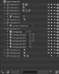
Highlighting a row won’t work. You can edit just a material in Object mode, but not Mesh data. Individual items should be underlined, not the entire row. Take look at Outliner’s mockup in my first post - mind Camera Object Data. You can’t emhasize that the very data is editable at a time by highlighting entire row. Problem gets more complicated with more complex Objecta and Objects Data relations.

This looks good to me - the color coding works well in this way.

Another way to make editing clear, is to add a mode icon next to the thing that’s in the mode. So, when an item is in Edit Mode, we could display the Edit Mode icon next to it. Same for Sculpt Mode and the other modes.

I think that bold text + wise highlighting should be enough. Adding another icon will introduce a not necessary additional visual supplement. Let me sleep over with it.

Have to ask You for one thing, though. Could You list of specific data, that You think it needs individual colour assigned? To be honest I’m a total Blender noob - tasks I use it for are quite simple and limited to architectural modeling at conceptual level (no visualisations). Rendering time to time.

@brecht - is it a handcrafted mockup, or a screenshot of working prototype?

  • Collections
  • Objects
  • ObData (Mesh, Camera, Curve, Lamp data etc)
  • Materials
  • Modifiers
  • Constraints

AFAIK that’s it?

Maybe particles, but that just uses the modifiers color, which I think is correct.
Also, brushes aren’t generally viewed in the Outliner as part of your scene graph, so it’s not really the same kind of thing. They probably don’t need color coding.

What 'bout Materials, Brushes etc.? I’d throw them to ObData box, but not sure if I’m right.
The less colours, the better.

you are right. added to the list.

Damn. Too many… Four is the best. Five - acceptable.
We have to remember, that green and red should not be used here (create + delete/warning).