Well I think both options can be integrated and the ribbon one fairly easily I presume.
As for the icons you could also have 3 different areas of the icon mappable to different color all through Themes in User Preferences.
So you can map 2 of those to white and one to orange for example. Or 1 to white and 2 to orange for different icon or you can map one entirely in one color with setting all 3 to orange.
There needs to be careful thought put into this approach though to make it useful. I presume the icons would be saved as multiple svgs each containing one layer or maybe somehow in RGB bitmap mask format? Not sure about the technical standpoint here.
But for me the ribbon approach will always be useful enough with pinpointing the location of the correct icon and also looks more classy when compared to extensive coloring of the icons themselves. It could simply be turned on with a checkbox in Theme settings that moves icons 1px to the left + adds 2px vertical ribbon on the right with color set according to the user in Themes. For me it would follow the coloring I would choose in the Outliner.
Those ribbons are ingenious - clean and informative. Multicoloured icons look messy - one colour per icon colour coding is the way to go. Still, stripes look better.
Also agreed. Adam’s ribbon proposal is the best solution IMO.
Also, everyone should note, regarding colors, that not all hues are equal.
This becomes especially apparent with colored icons. Different hues are perceived differently. Hue, Saturation, and Brightness is not a good way to measure how people perceive colors.
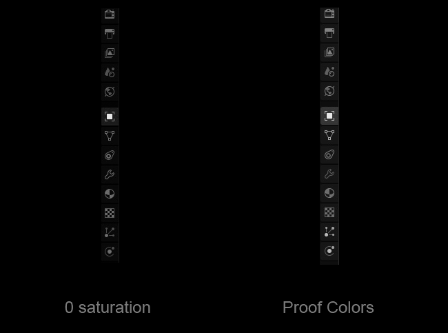
If a yellow color and a blue color have the same “brightness” (as measured in a HSB paradigm), the blue will look darker. Please take a look at this:
Value is more important for differentiating shapes than color. For that reason, it’s important to check the perceived values of your colors, and you can use the Proof Colors feature mentioned in the above link to do that.
As a demonstration, I’ve done this on Adam’s dark colored icons: (second picture in his latest post here)
While simply turning saturation to 0 shows equally-contrasting icons, using the more perceptually-accurate Proof Colors shows that some icons have a great deal more visual contrast than others. Look at the Modifiers wrench especially, compare it to the contrast of the particles and physics icons. If you blur your eyes, the wrench seems barely visible in comparison.
On top of this, some icons have much more colored space than others. Again, the Modifiers wrench is just an outline, whereas other icons, such as Material, are allowed big blocks of color.
For this reason, too, I think the ribbons are a better idea, as each ribbon has the same visual prominence with regard to its size and shape.
(Also, I like the way Adam has reordered the properties, it makes more sense to me.)
I would recommend doing mockups at an icon size of 14x14px
Also, this would introduce an insane number of theme options, and doesn’t necessarily solve all the issues, especially since the outline doesn’t cover the accent or highlight in a lot of places.
Indeed, a lot of these mockups look messy because people are using overly saturated mid-value colours that scream out of the monitor.
I don’t agree. I find the current monochrome look a little bit messy, because having no colours makes all the icons look too similar to each other. Especially since they are so tiny. And I have not found any way to scale them yet (expect Display Scale which scales everything and that’s not what I want)
Currently every time I’m using the properties panel, I have to carefully look at the icons to recognize them. Having coloured icons would separate the icons from each other and make recognizing and remembering them much more faster and easier.
Of course if the colours are done badly it look messy. But I have seen a few very good looking sketches in this forum.
Those icons look very good. I would be very happy to see something like this in Blender 2.8.
Even if it was an option that’s off by default.
Monochrome icons are very hard to distinguish apart for some people, including me. Your icons are very well designed, but just the shape by itself is not always sufficient. For example, I think I’ve already accidentally created a circle instead of a sphere about five times so far since the new icons. It’s an extra cognitive load to try and distinguish things that are all the same colour. It doesn’t matter how stylish it is if it’s hard to use.
I personally really like the subtle colours @Evandro_Costa posted. It keeps some of the cues from 2.7 all while only using one or two subtle colours. It’s not distracting and it helps distinguish the colours very well.
Oh ok, sorry!
Anyway I guess it’s clear by now that I really like and appreciate the job you’ve done, it’s just that I’ve prefered colors … that’s why I really liked Antaioz colored adaptation, it keeps the strengths of your work and adds to it.
But I will get used to the monochrome anyways, at least until we have an option to have the colored set.
These icons with color would make it significantly easier to spot a particular icon quickly. The monochromatic ones do make it slower to find a particular tab that one wants.
Hi everybody,
I tried to follow the discussion, but there are many messages. I hope that this comment is not a repetition of something that has already been proposed.
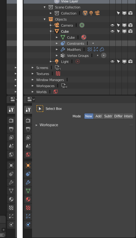
Do you think that using the colors of the outliners in the property panel as well will looks too messy or can makes things more easy to understand?
Maybe it will look less stylish, but I think that it makes more easy to spot things and to understand the hierarchy of data in blender. Don’t you think?
Just wondering if it would be worth changing some of the icons as shown here.
Rather than a DSLR camera, have a computer monitor for Render settings. Instead of a printer icon for Output have an arrow pointing out of a container. Simplify View Layer and remove the image within the square. Lastly change Particles to some floating particles rather than kinetic lines as currently it looks like an XY line graph.

 … that’s why I really liked Antaioz colored adaptation, it keeps the strengths of your work and adds to it.