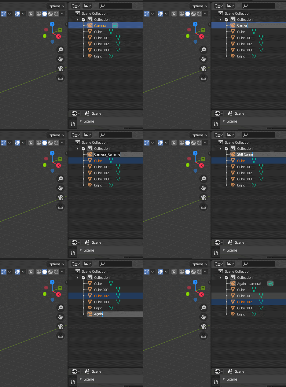
The F2 rename does not quite do what is expected. In windows if you have something selected pressing F2 allows you to rename that thing. In blender the F2 works differently and only renames object name regardless of what is active or actually selected. For example pressing F2 in the vertex colors, shape keys or uvmaps menus (the properties editor) does not give the option to rename vertex color, shape key or uvmap that is selected… but the object name. The expected behaviour should be to change the selected thing’s name and that thing should be the last selection in the active menu. Pressing F2 in 3d view should change object name, F2 elsewhere should change the active thing there.
Additionally in the outliner F2 also only renames the active object. Not the highlighted ones. Which means that when wanting to go through a list it’s not possible to do by keyboard only. You have to reach for the Mouse/Tablet.

Cry? Baby? … So it’s duplicate. This topic become way too long to allow to check it all for such dupli cases. Is any news that someone will work on it?
With multiple objects selected, press Control + F2 for the Batch Rename panel.
If multiple people here agree, I can close this topic and start a Blender UI paper cuts part 2 thread?
Or maybe multiple UI threads, separated by subject?
Suggestions are welcome.

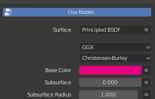
It might seem silly for those who know this already, but I’ve just spend 10 minutes figuring out why when I click Use Nodes button, my nodes don’t work! ![]()
When I see a button like this I think: ok, I’m not using nodes right now, so when I press it, I will switch to nodes.
Little did I know, as a beginner, that I am using nodes by default and this toggle state is not represented visually like other toggles.
![]()
Maybe solution is some season format. Or maybe quartals like Papercuts 2020 Q1, Q2, Q3 and Q4. With closing topic when it complete + some summarize to let people know what is already done during quartal…
This option is not available in the right click context menu from what I can see, so it should be added.
I think the size and continued growth of this thread serves to point out the blind eye that Blender developers have turned towards usability issues for far too long.
Duplicate cases is not an issue, rather if multiple people come forward with the same feedback, it could point to a bigger flaw (that and sorting the thread by number of likes). The heart of the issue is that feedback is divided in three places:
- This thread/subforum
- Right-click select
- The bug tracker
Who reads them all? Who keeps track of what is being said? Who documents this? Unless I’m mistaken, all blender developers write weekly reports, but not the two dedicated ui/ux developers/designers (I’ve found only this so far).
I am well aware of the Ctrl-F2 panel. And I use it a lot.
The behaviour I described has nothing to do with batch renaming but with individual renaming that cannot be done with the Ctrl-F2 modifier. It’s an outliner limitaion that the active object remains the active one for renaming.
If you want to rename individual objects one by one fast then it’s a lot faster to go through by using keyboard shortcuts. Batch renaming is a tool for a different task.
Agreed. The papercuts are a very integral part of making Blender a better tool day by day but currently I imagine it really difficult for devs and users alike to make sure that a papercut is logged while also sifting through the tons of duplicates.
I have no problem if a proposal of mine needs more explanation but in this thread I refrain from doing so to retain fast readability (the thread sometimes moves along VERY quickly).
I would also like to see whether something I propose is a duplicate or if it needs more focus because others see it as important as well. Sometimes I jump over from RightClickSelect to here when I see a proposal I made (sometimes over a year old) gets yet another new duplicate proposal.
Could all of these proposals be somehow easily be funneled into a central hub where we can look up if it’s on the list already and if so how high?
This would probably be in the interest of users and especially dev alike, wouldn’t it?
All we had here is collected during almost half of year. If such thread will be splitted by at least quarters it will be better for systematizing. Also issue - lack of visual response. I can come here, find that something is already described, but then i have no ideas is this thing on work or not, or even not planed.
There is no some " manager " who put some feedback thing, create task for this thing, then re post here this task status or at least link to task to let those who interested check this status manually.
It need some solution to merge somehow posts here with task tracker and real work progress.
You know what could be interesting?
Divide the Paper cuts in sections, one for outliner, another for 3d viewport and so on. In this way it would be easier for the developers to follow and not scroll through 3550 topics.
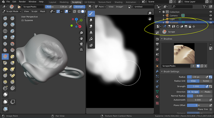
The property editor only shows the properties of the tools in the 3D view. Or the concept of an active window is introduced to show the tool repository or selection buttons should be added, right?
The N side panel is the alternative, of course.
In my opinion, or duplicates all or nothing, to be consistent.
No news.
Yes, that was a huge mistake. ![]()
There’s an even better way to handle it : just like in Nuke. In Nuke, reroutes have little arrows attached to them. That’s what you drag when you want to connect it. The reroute itself can be dragged directly like any other node.
So I’ve done some digging, and it looks like these style settings are related to a few (fairly small) UI issues:
-
Buttons in unaligned columns have 2px vertical margins, while buttons in a panel’s root layout have 5px vertical margins
-
Panels have 4px padding, while boxes have 5px padding
-
The padding between a button and its label in a row with
use_property_splitenabled is 4px smaller than the gutter between a button and an unrelated label in a 2 column layout
Looking at the commit history, these settings haven’t been touched with in ages. Some of them haven’t changed since they were added in 2009, while others have stayed the same since 2011/2012. With all of the UI changes we’ve seen since then, I think we need to make some adjustments.
While I’d love to shave off most of the auto-margins and swap to a layout strategy that relies on explicit spacers, that’s too large of a project for me to tackle in my spare time.
And so, with that in mind, I threw together a patch that lets you adjust these settings on-the-fly through Blender’s Python console. With it, you should be able to get a feel for the easy tweaks (like setting templatespace and buttonspacey to the same value) and where they turn into hard ones. I can’t say for certain what the best solution is, but this should make finding it a bit easier.
I’m not sure if this is really the best place to talk about this but I’d imagine the biggest issue with this papercuts thread is that devs probably have difficult time finding out things to fix that go well together with their current work. Being over 3.5k posts long it is also very bad source of information for devs I’m sure. It is too big to grasp, too unorganized, too difficult to find the info you need and each post is written differently making sometimes difficult to understand what is the issue.
So of course I have a solution for this paper cut paper cut. First I’d make a list of every tool in blender. Outliner, properties menu, orthographic view, extrude tool, bsdf shader node, preferences menu, file browser, etc… Everything. Then also list common actions like select, activate, move, drag, disable, hide. Maybe even add some tags for common issues like unexpected behaviour, visual glitch, limitation, etc…Then make them ALL into tags that can be searched. If devs is working on the outliner they can easily look at documentation where all these tags are listed, sorted and attached to different larger entities inside blender. Then the devs can pick the tags they want and search for different tags in this thread. That should give them a much more focused list of things they can handle. Lastly I’d create a template for reporting paper cuts. What is the issue, where it happens.
Naturally this tagging either needs to be by the users giving the feedback or some automated system. Little earlier in this thread I made a post about the F2 menu. So in this example I would have tagged that post as F2 menu, renaming, selection, unexpected behaviour. The important thing here is that the tags need to be set so that only one tag exists for one thing. If there are even two tags for one thing it causes issues very soon as leaving one tag out of a search can cause over 50% of info left out.
I’m not a dev so I can’t really tell if this kind of thing would be useful. But just from forum reader perspective I could imagine that that kind of system would at least reduce the number of duplicates. But if it is I can volunteer to get this tag list going. Blenderstackexchange does something similar but they have far fewer tags. And I’m sure the deeper you think about this the more complex it can become.
No, it’s a great source! There’s over three thousand points of information in this thread! It’s an amazing repository of user feedback (*).
The only thing that’s still unclear (and I believe the situtation was the same about a thousand posts ago last time this discussion came up) is who is doing what about all of this feedback.
I really hope it won’t be discarded, but actually used.
(*) I’d also argue that it’s great because it’s one place where a user can just go and post exactly what happened to them the moment it happens, without needing to find a category, fill out a form, etc. etc. You get feedback in this thread you’ll never get anywhere else because it’s so easy to post.
this would be great as no matter how well and organized a person is having to go through a list is a lot more difficult (esp with old eyes) than it would be to see the thumbnail of the file your looking for. Please and thank you! 
