Redesigned Data-block Selector - Feedback Thread

Where is «make single user» now?
And why duplicate do not work for material, mesh, etc?

изображение
Duplicate in property tab have exposed icon/button, but node editor have disabled option.
Bug?

2 Likes

I think that the better is to keep the classic idea with users numbers and when you click in the number show the menu with different options.

The problem with datablocks users is not the concept, is the name. Fake user must be rename to a more common term.

5 Likes

Looks like duplicate="material.duplicate" is missing for shader editor. Not sure if this was on purpose or not.

Material Properties
row.template_ID(ob, "active_material", new="material.new", duplicate="material.duplicate")

Shader Editor
row.template_ID(ob, "active_material", new="material.new")

material_properties

1 Like

Maybe the number of users could be shown superimposed on top of the icon to the left, like in the outliner when a collection is collapsed ?
users
Of course the meaning is different (number of users of a datablock versus number of objects inside a collection), but I think it would be intuitive ?

Also, it seems a bit arbitrary to show the duplicate button both directly in the field and inside the dropdown. I reckon one of the reasons behind this redesign is to allow the datablock name to be displayed entirely again (although maybe not the biggest reason), so maybe let’s just keep the unlink button (the cross) and leave the rest inside the dropdown ?

2 Likes

There’s plenty of room in your examples, those are wide header areas… I agree these should still be using button sets rather than dropdowns. However, the datablock selectors reside in places that are often cramped (vertical properties editor) and their names are cutoff very quickly, because there are so many buttons attached to the side. It makes sense that these buttons would migrate into their own menu, at least I know I’m happy I can see my datablock names again without having to enlarge the editor.

Sorry if I’m reading too much into this, but it sounded as if, going forward all feedback except what gets posted in these feedback threads is just shouting into the void (and yes, the rabbit hole in that link goes deep)?

But this could be a good thing, because the above situation is terrible at the moment, however the Blender dev fund has had such an incredible infusion of money that I feel a bit sad that nobody has been hired to catalogue and act upon all of the feedback in the paper-cuts thread and feedback forum… there’s lots of answers to be had both there and in the submitted patches that never get accepted, so I feel like Blender is leaving a lot on the table that it never intends to get to, ignoring solutions to some very fundamental flaws.

(Also, I like that HIG was mentioned, because that has also been a long standing question for me.)

Anyway, back on topic:

Since Blender sadly hasn’t eliminated the fake user yet, you now have instances where X means delete and, like here, simply unlink. This should be made more explicit in the icons representing these different, but similar, features:
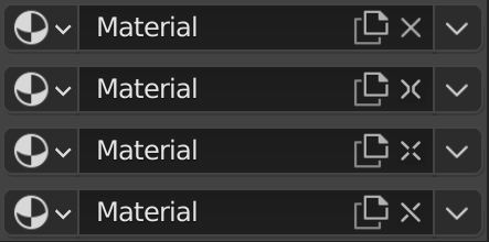
bild

I think the last design is probably the most succesful.

3 Likes

I agree the cross can be ambiguous… in the context of modifiers, constraints, etc. it’s used as “delete”. When you think of it, in the datablock selector, it also means “delete” -but what it actually deletes are the text contents in the field and the connection to that datablock -not the datablock itself.

I thought of a chain link icon, but that’s already in use for the linking system -I mean the cross-file linking system… which is also called “link”. :confused:
I like your fourth try the most, but it’s not very different from a regular cross, probably so much that most users wouldn’t even notice it.

Is there a place where I can see what’s being proposed as a replacement for the users system ?

1 Like

I haven’t actually tested the redesign, but from the screenshots/video in the release notes and the discussion in this thread, I have a few thoughts.

The goal of this redesign seems to be centered on providing the ability to better access an ever increasing number of data-block actions without totally obscuring the data-block’s name.

With the current data-block system, the most important information/actions to display are: data-block name, number of users, fake user status, duplicate, unlink, and potentially a special action relevant to a specific data-block e.g. open image on an image node.

Given this data, I can think of a couple solutions to help achieve this goal.

  1. Add a second row. Remove all extra actions from the first row except for unlink so that the first row contains only the data-block selection menu, the name of the data-block, and the unlink button. Structure the second row like this: number of users, fake user status, duplicate, special action (if present), overflow menu.

and/or

  1. Combine number of users with fake user status toggling. Fake user off: Fake_User_Off_Mockup Fake user on: Fake_User_On_Mockup_2 The number of users should be reiterated in the tooltip, for cases where there are more than 100 users, as well as the fake user status.

Another possible solution I can think of would be to have the info/actions only appear when hovering over the name field, in which case I would structure the rows as so:

  1. Data-block selector; name field containing combined fake user/user count, duplicate, unlink; overflow menu.
  2. Special action (if present).

Hopefully one or more of these solutions is helpful in addressing the concerns raised in this thread while keeping the goal of the redesign in mind.
.
There has also been some discussion in the thread of the user system in general and I have some thoughts on this, but I’ll leave that for another time/thread.

*Edited to include the blue selected highlight with the fake user on icon

5 Likes

What about this solution:
Fake user off
Fake_User_Off
Fake user on
Fake_User_ON
the arrow and number can be moved more towards the top and bottom

We still can see numbers, we still can open menu, yes it maybe a bit clunky but we need sacrifice with something to please everyone and there is enough room for 3-digit numbers.

1 Like

Other idea based in your proposal.

1 - Without instances
2 - With fake user
3 - With instances
4 - With instances and fake user

I agree about having a growing number of features in a dropdown, and think New, Duplicate etc are prime candidates (as I did on modifiers, where I’m pleased to see those buttons now in a dropdown*), but the number of users should be visible. I think the idea of having actionable buttons and informative icons separate is a good one too, although as with any change I do worry about the exact implementation.

*as a sidebar: who on earth says the most used button on their modifiers is ‘apply’?! Then it’s not a modifier, it’s a modeling tool! Just use hotkeys :smiley:

I agree with u so much . Noone wanted extra things to be removed? Its better to have more than less cuz someone might be using or liking it.
I see these changes as ‘’ Change for saying ‘I did a change’ ‘’. Other softwares dont wanna remove even old features or buttons just because some users might get used to using it or loving it and leaving them as legacy features or buttons cuz they have muscle memory or usability for some people.

I also dont understand that drop down menu love, drop downs are good if there are so many things at the list, if there are 3-5 items or 2-3 items, drop downs are not necessary. Such as shader editor has dropdown of ‘‘world , object, line’’. It was handier before without drop down by using icons side by side. It takes up the same space.

As for modifiers, drop down can be avoided by icons without making interface crowded.
Not to mention that screens are horizontal 720p or 1080p , So I also dont understand trying to make things vertically listed by using dropdown. Noone will gonna use properties editor over-narrow. It should have a minimal usable size and ı think sometimes dropdows are not required.

If drop down or hotkeys are answer for unexposed dropdowns, why do we have toolsbar? It has big icons and every feature is seperated exagerately, they have hotkeys too? so why dont we use dropdowns? We could mix move, rotate and scale options in one dropdown for toolbar?
What I mean in this example (with exagerations to convey my point) is there is a inconsistency for hiding things and exposing things. We

I always used data blocks in node editor to see how many duplicate data of nodes cuz nodes cause issues with duplicates and must be careful about it. Now nodes also dont have data block number, its such a shame and so sad. I guess I will keep using 2.91 and so happy to have 2.83 LTS. Its slowly getting harder to use blender.

Also, I didnt understand why duplication or removal button is included inside the material name box, its should stay as it was before like a button next to to material name box. I didnt like it. It got unreadable. Everyting in blender gets less colorful and more confusing.

1 Like

Me on earth said it. U cant know which workflow other have. (If most people dont use the data blocks, we can remove it too according to ur ‘‘who on earth using it’’ logic. Also, u missed the point. The point wasnt about modifiers, it was just an example to make undertanding. There are many other examples for that. (If u say that apply button is not used, then put the toolbar icons in dropdown too cuz noone click on toolbar to rotate, move objects). The point if the use of space efficiently and not using dropdowns just for 2-3 list of items so that it can be solved horizontally (if minimal editor size is allowing it )by icons instead of a dropdown.

I fully agree. Thank u so much for understanding what I mean. For example

2.79 Shader editor had icons for object, world and line in node editor , now it has unnecessary dropdown just for 3 items

Modifiers had two column compact design without using submenus and dropdowns in 2.83LTS then it became fully vertically listed, For the apply button, its just an example. the point is drop down is not necessary for just 1-2 items on the list just to hide’’ noone uses it features’’ The secreens are Horizontal, why are we trying to go vertically down by menu or subcategories for everything? It started to be like a word document or book with too many empty unused space as well.

2.79 had Different shadings ‘’ material, texture, wireframe, rendered etc’’ as dropdown then since icons are taking less space and the number of shading methods decreased to 4 from 5-6 then they turned into horizontal icons. So it was a good idea.

So I full agree , yess , the drop down is not used in a consisten logic for saving space, they are used for any other purpose that I couldnt still understand ( trying to make things vertical in horizontal screens :D)

2 Likes

Having used 2.92a for a while I share MC-Blender’s wonder “why duplication or removal button is included inside the material name box”. This just feels weird and was much clearer before as separate buttons outside name field. Might be just styling change, but it’s not that good now. And of course user count needs to get back visible and not being hidden, but everyone seems to agree on that. :slight_smile:

1 Like

As far as I know this is just making Blender more consistent with itself. See object fields : field

Hi. I understand how you see it, but I think it should be compared to constraint name field instead. Below is a screenshot of constraint and modifier as a sample. There is 2 styles currently, as World Properties is done same way as materials. In modifiers I also think that Apply is unnecessarily hidden in drop down menu (sorry for sidetracking to other parts of UI).

blender_UI_screenhot_Constr-Mod_1

Adding here for a comparison 2.83 material, which is more clear. But as I said in my earlier post it is probably just a styling change that I feel isn’t as clear as before.

blender_UI_screenhot_283_Mat_1

These fields are just names, they don’t link to anything ? as such they don’t have crosses at all.
Agree that the apply button could be more accessible.

I think if there are only 2 things to keep visible : they are the Fake User shield and User Count.
That are information. Contrary to duplicate and unlink, that are purely actions.
At least, if this information is removed from Properties Editor, it should be visible in View Layer and Scenes modes of Outliner.

I agree about people complaining about confusion brought by use of X icon to unlink a datablock instead of deleting it.
The most frustrating thing about datablock system is that it keeps unwanted datablocks around.
If there is a Purge operator, it should be present in each of datablock list to clean it.

datablock_template
It is this side of template that is problematic.

I don’t understand how it is not obvious that people want something simple and practical and why it is so difficult to obtain such simple solution.

6 Likes

Will it be rolled back in finale 2.92?, because now in latest alpha it still the same…

3 Likes