I made a dedicated thread about this already:
(I thought discussions were going to be moved over to that forum so it would be more structured?)
I made a dedicated thread about this already:
(I thought discussions were going to be moved over to that forum so it would be more structured?)
I agree that, in 2.80, the lines separating windows are a bit thick and intrusive 
The new version of blender focused on beginners. All these tips, stuff, different useless buttons, widgets, and ect. Too much extra.
Trying to become clearer for schoolchildren, 3d max users, cinema 4d, and other graphics packages, the blender copies other people’s mistakes. All these “industry standards”, context menus, and so on, all this, of course, contributes to the adaptation of others, those who think in the context of other software, but it can affect the blender, isn’tit? Probably, it would be a bad effect.
For example, context menus with the right mouse button appeared a long time ago, along with graphical interfaces. 3d max and others use such management standards because they were laid down a long time ago, and a commercial product cannot change much in order not to lose customers.
An expert during work should play the keyboard like a piano, knocking out key combinations for most actions, not poking the mouse over the drop-down menus.
Will the blender lose its uniqueness to the enthusiastic crowd applause?
I can’t believe that just few people has agreed this post…
I’ve used blender since 1.8 era, but I think blender needs more such “fool proof” feature. It need for not only beginners but also professionals who uses blender in hard work (and has not enough time to sleep). ![]()
maybe because users rarelly packs textures in the blend.
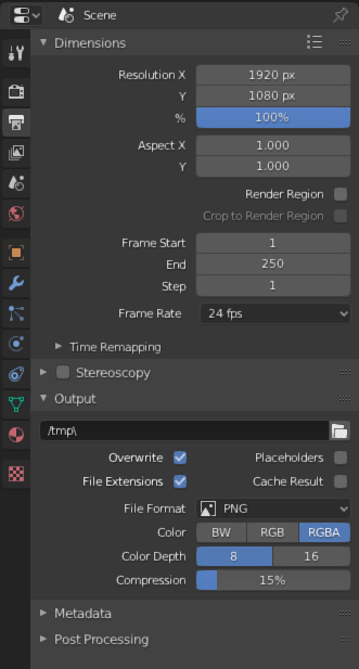
My Blender UI Papercut is that the “dimensions” and “output” of a render are on a seperate tab then any of the other scene settings. It is a bit annoying having to go back and forth between the two tabs when your working on a render, especially when your testing a render. Simply having them on the same tab would e nice.
Ideally, although I am sure it would be a lot of work, since we can reorganize the panels within a tab it would be very cool if we could reorganize the tabs, create our own with custom choice of panels, or even move the panels between tabs.
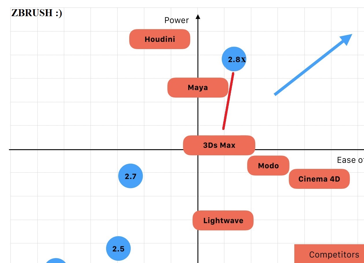
How do you get those Very Scientific™ graphs?
This is a very subjective matter, especially the x axis
That was rude!
As far as you discussion goes, you can’t help other softwares being rooted in “too old times”. It’s like so, nobody can change this (except Marty McFly maybe). So, let’s face it.
Having the option (i said option) in Blender to please people coming from left-click experience (as well as right-click contex menu, and many other UI standards) is a good thing, and you know why: it easily attracts pro users from other softwares. This triggers a chain reaction that we probably underestimate (not Ton I guess). Did you notice the big grants that are coming lately to the Blender Fund? I’m totally convinced that the less-unique feel that 2.80 brought to Blender played a big role here. Being not considered a niche softwares is important if you want to… well, exit from the niche. And an easy way to do that is to get rid of your quirknesses (or, better worded, those things that outside the niche are considered quirknesses, “niche-stuff”).
The Iphone metaphor doesn’t fit in my opinion. I didn’t only bring touchscreens, but also Apps, a powerful OS, and not least, glamour!
I happen to think that 2.8 is a massive improvement in usability and attraction to users of other software, with the possible exception of Draughtsmen (and Draughtswomen), for whom more CAD friendly drawing/modelling techniques are required. Why all the carping about the new release? What is that going to gain when the majority of users can easily adapt to some change? This is a project to appeal to the masses, not the few…
Cheers, Clock. 
PS. Making it CAD friendly is relatively easy to do, I just did it as an experimental AN Node… Adding all the features I wanted in a couple of days development work. Before I get shot down, I know adding these features to vanilla Blender will take longer to achieve, but you can always ask me to advise on this. 
Commentators of my posts do not understand what I am talking about. Everyone is happy, everyone is happy.
This is not about the left mouse button or the context menu. It’s about general politics. “Usually we moved to the right, but now we moved to the left, and they gave us a grant! Now we will constantly move to the left!”
The analogy with an iPhone is an EXAMPLE, why take it literally? You would also write: “the analogy with the iPhone is not applicable, because the iPhone is not a blender.”
By attracting new users, the blender fits into the framework of a new policy that is tolerant to all users. The blender is on a par with 3D Max, Maya, Houdini, and others. “The more users, the more money.” “The customer is always right.” “The direction of movement is chosen by the one who pays.”
I really hope that the blender will be fine, this is important for me.
WHY?
True? )))
Why can’t these “non-mediocre” users use regular, more ergonomic blender keymaps? Gizmos too for them? )))
interesting graph from what i noticed it’s not easy to have both power & ease of use, so this might be more feasible in the future for blender, and it’s clear power is more important in general but if blender can reach this position it would be in a great shape imo.
Actually Blender motto is “3d for everyone”. Did it change?
That is extrapolating in a biased way. Blender developement (and all other related activities) had never been driven by profit. For BF having more money means hiring more developers, and/or investing in infrastructures. So I don’t even barely think that Somebigcorporationdesk would be listened if they come and say “make blender a toy and I will cover BF with pure gold”. (Yeah I’m extrapolating too!)
because knowing in depth the blender workflow (using it and seeing its evolution from the earliest times)
And knowing also the deep workflow of XSI MAX Lightwave and Maya I can see well what are the strengths and weaknesses of “both worlds” and I can thus say that there is still a good margin for improvement for blender without losing its equally powerful worflow of “combo modal shortcuts”
but above all I am of the opinion that there is a good margin of yield to make blender even easier to use without losing power and speed of operating speed because I have seen examples like Moment of Inspiration 3D that show that you can reach certain peaks. MOI3D is so easy and so powerful and so brilliant that it’s hard to believe.
I’m not one of them, I prefer the blender keymap, even the current updated one. Others prefer what they are most used to.
You sound upset. I don’t understand why: you expressed some doubts about the direction Blender is going, some of us expressed opinions about why your concerns might be unmotivated.
Well… time to go back to my pink Blender installation…
always on guard with the pink project ![]()
Don’t know if it’s a papercut or a just bug, but I can’t set my desired X/Y axis colors because they are influenced by the grid color, this mix happens even if the grid has 0 alpha.
Hello, I am not sure if this was mentioned before but I find “save”/“open”/“export”/etc file dialog as a full window too cumbersome. I often really need to see the object names or their numbers or whatever state to give the file a correct corresponding name but I cant because the dialog is full window and not resizeable. Would be great if that dialog could be floatable.
yea, but it will change https://developer.blender.org/T62971#731945 ![]()
A huge papercut of mine. Pick shortest path (ctrl) overrides repeat last command (Shift R)! This is really annoying because sometimes you use Select shortest path to select certain bits of mesh and then you want to get the exact same extrusion or bevel as you did with the previously selected bit of mesh, but you simply cannot do that and have to switch to other, less comfortable selection modes and waste loads of clicks and your time. Please make select shortest path a proper selection tool that does not override the Repeat last action command.
To replicate the problem:
As a user you’d expect Blender to repeat the last action like extrude or bevel that actually modifies the mesh, not just selects parts of it. When you realize that select shortest path overrides the Repeat last action functionality (while other selection methods don’t) you will have to undo previous mesh modification if you need exactly the same results number wise. This is a huge papercut IMO.