Call for Content: Themes

Made the theme of the old concept
Concept theme:


My theme:

old_concept.xml (42.5 КБ)

8 Likes

I don’t like Light Fresh , It’s so shine to my eyes. Could you please tell me how to change to Dark ? I like Dark Fresh.

Thanks.

Your Volcano theme looks very cosy. In a way, it makes me think of Christmas. Maybe you could update it.

I hope somebody make this template or something like this for 2.8. I love it.

As usual in my life, I’m late to the party. Here is my theme, It’s called Purgatory, because I spent days procrastinating (picking perfect colors of gray) hesitant to finalize multiple projects =)).

The concept behind it is maximum practicality and focus. I really like dark themes, but they make me sleepy after long use and I can’t see a thing during the day. I like neutral gray colors in UI, not too dark to work during the day time, not too bright during the night, don’t drag attention from the center of the screen. Hell, even my custom Windows theme is gray. Perfect for a nerd spending days in viewports.

Main colors are shades of gray, bright white and pure black colors for text and icons, saturated orange color for highlights. I also don’t like thick vertices, so they are set to the value of 2. I also like to see all the active mesh elements separately, so vertices have yellow color upon selection, edges are red, while faces are orange. Active elements of the mesh in edit mode are highlighted by blue, this way they’re always visible in every mode. Display wire is dark-blue. Active objects are highlighted by orange colors and selected objects are white.

Grid is white and semi-transparent, because if you change Grid color to black the axis colors will turn dark and barely visible.

purgatory.xml (42.2 KB)

UPDATE LATEST VERSION:
purgatory.xml (42.2 KB)

Fonts used:
Interface: Noto Sans Regular
Monospace: Fira Code Regular

10 Likes

here we go, for the nostalgic and for those who want to experience the breeze of how it used to be when we were little, we go back to our origins:
Blender 2.4 pink edition theme re-adapted
Blender2_4x.xml (42,2 KB)

7 Likes
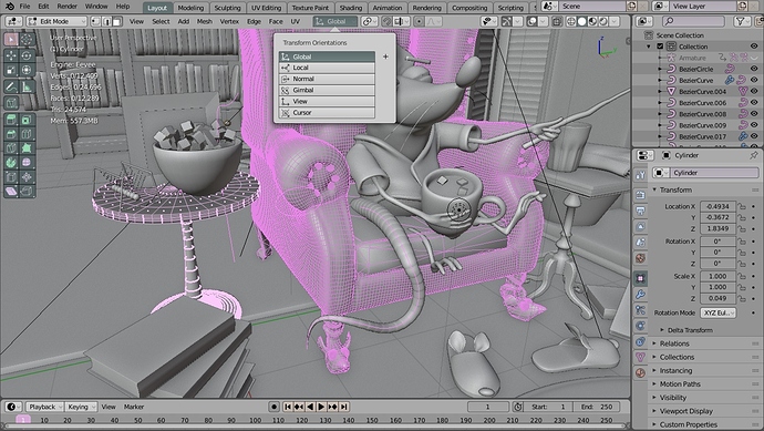
I’ve taken a slightly different approach and have angled for a theme that’s specifically geared to work well when printed or displayed on an e-ink screen (for books and print-based documentation). The idea is to retain the spirit of the default 2.80 theme, but light and with high contrast for clearly legible text.

It could use a few tweaks (like removing the drop-shadow on the text overlay in the 3D Viewport, but for the most part, I think it’s working relatively well: print-friendly.xml

I’ve tested it on an e-ink screen (Remarkable tablet) and it seems to read well.

5 Likes

2.4X Blues Refreshed Modern Times
2_4x_blues_modernTimes.xml (42,2 KB)

2 Likes

Nice - I wonder if you then should also make the icons black?

I considered making all of the icons Black, but I still wanted to have some differentiation for people working within the theme (or for color printing), so I leaned toward trying to keep the theme within the same hue ranges as the default theme and only focus on value adjustments.

I’d really like the ability to easily invert the toolbar icons, but as we’d discussed on blender.chat, that’s not easily done at the moment.

Hy there! If you consider blender default themes are too much darker or brighter, this is your theme. This one is the result of had being working several months in UI themes. At the same time blender 2.8 was redefiying its interface, I was recopiling some experience making UI Themes. The point is create a really well balanced theme. UI needs to be neutral and secondary to the viewport. So the key had being stablish a jerarqy of highlighting extremly accurated that helps user to focus better inside all UI information. Feedback welcome :slight_smile:


(upload://7qr14gADjS26HbtCsH8JIMVByAS.jpeg)

sensible.xml (40.8 KB)

10 Likes

Ozymandias 0,2
(I will update this theme as I find new interesting color harmonies or errors.)

edit: fixed same little erros and made the various space windows more consistent colors
ozymandias.xml (42,2 KB)

1 Like

Blender Pro Beta 2 – 10 July 2019
Check out the Updated Blender Pro Theme. And please let me know the areas where you would like to see improvements.


blender_pro.xml (40.8 KB) Updated 10 July 2019

4 Likes

@Paul

unselected vertices too dark and mingle with the dark background

1 Like

Thank you very much for pointing that out. And you are absolutely right. I’ve changed the vertex color to a mid gray for improved visibility. I’ll update the theme right away.

2 Likes

A new version of the Blender Pro theme can be found here: Call for Content: Themes

Where are the chosen themes in 2.8? :upside_down_face:
This thread was for nothing? :upside_down_face:

7 Likes

I guess the assset manager will take care of it when it arrives(?)

1 Like

I like your dark theme except the rounded corners of buttons.
How to reset them back to the default blender 2.8 style?

Thank you for your feedback. I’ve tighten up some of the round corners except for the option button :wink: And it looks better. Check it out: blender_pro.xml (40.7 KB)

I will update the theme post and screenshots later.