Preferences > Interface > Menus > Open on Mouse Over doesn’t seem to work at all: enabling it makes no menu opens when I hover on it with mouse. Everithing is like before. Am I missing something?
wait a second…
Ok checked better: it opens menus but only those fom window headers. I remember I used it ages ago and I swear it was opening every menu… maybe my ram is full…
edit: strange behaviour anyway, it works hovering on vector dropdowns
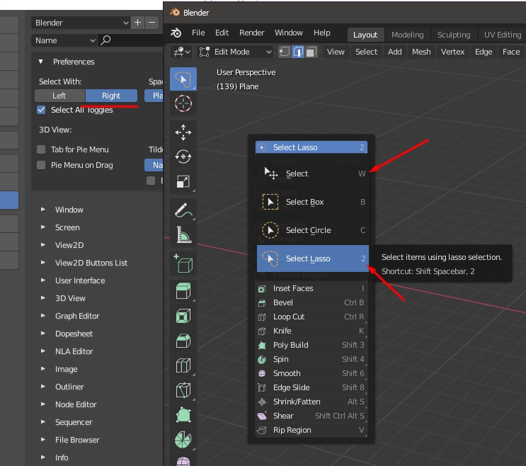
How to quickly switch the “Select Tools” when choosing a layout for the right mouse button (hot key)?
If the layout is on the left mouse button, the hot key is W
Why when choosing a layout on the Right mouse button, then the hot key of the select tool - W and on the tool of the lasso - 2. After all, 2 is responsible for selecting the edges
1 Like
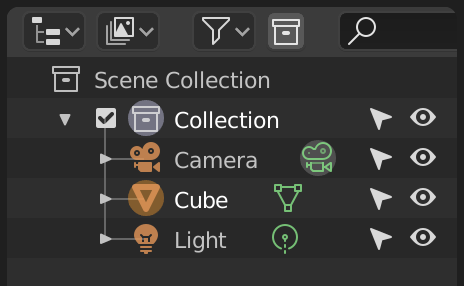
I think the filter icon and the add new collection icon should always remain visible at the corner of the outliner, while the search icon could also be auto-resizable …
13 Likes
Everything have to be in uniform units for comfortable editing.
In the sculpting new-file preset, the annotations overlay is disabled. This is awkward because an annotation tool now exists on the toolbar in sculpt-mode, so using the tool out of the box does nothing until the user enables the annotations overlay. I think it would make more sense now to have annotations visible in the sculpting preset.
1 Like
Just move the search field to the right.
4 Likes
And here is a perfect example what the Hamburger menu is actually for. Rather than moving the filter menu and collections buttons in front of the search they should collapse into child items of a Hamburger menu.
As for the search field itself in there if the header becomes too small it should collapse into a button with the search icon that when pressed would take over the header(causing other items to disappear while it’s active) and expand into a input box again.
As a convention the Hamburger menu is for collapsing Header menu items into a dropdown list in responsive design. Admittedly this is a convention for web sites and web applications first and foremost but it’s already made it’s way from there to mobile apps as well.
In the meanwhile in blender land the developers are discussing bringing a Hamburger menu into blender for the Top level application menu(file, …, Help) because they weren’t sure what to do with unconventional menu items that don’t exist in any other applications since they are the type of things that in nowhere else would ever have been added as menu items in the first place. Rather as I mentioned previously most of them belong in the preferences.
I’m sorry if I come off a bit ticked-off by this but I just don’t understand how this isn’t more obvious.
This could be a solution:
As I say in the post though this is basically a revert of a revert, it seems like devs wanted to always have the search field expanded.
1 Like
Interesting discovery, indeed.
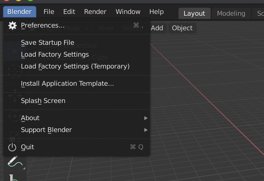
The Blender logo button opens the splash screen. Note I said button. It does NOT read as a menu.
This is a non-industry standard regression. Why does Blender want to limit growth by being different for the sake of being different?
Yes, menus can get crowded, but the fact that you can find everything in menus in 2.8 now creates a stable usability foundation (in 2.7 you needed to know about the magical “w” key to find a lot of commands, for example, which was bad).
Blender still hides some important things behind a far too small arrow button (and the magical “n” key that new users also don’t know about), which I still consider a far greater usability flaw than just a paper cut.
6 Likes
Yeah man. Why they are doing this is beyond me, I got no words.
The UI team totally lost their credibility.
This is just unacceptable!

Oof… this changes nothing. All they did was make blender even weirder.
This is not standard on windows applications.
It’s hopeless.
can’t this be OS dependent?
must call that menu: “prefs”
and slap it after “help” …
I understand their intention to put all things rarely use in a “closet”
… and “quit” put it back under file.
the question is that it must be explicitly told what that menu is … otherwise people don’t get it 
we will all look for preferences under edit or file,
and still today, I who now know that we are quit from that menu, I always click on file and deceive me.

2 Likes
I think the modifier stack should have clear titles per modifier used. In case this change is not made, a separator for the modifiers would be good, since the title wouldn’t be serving as one.
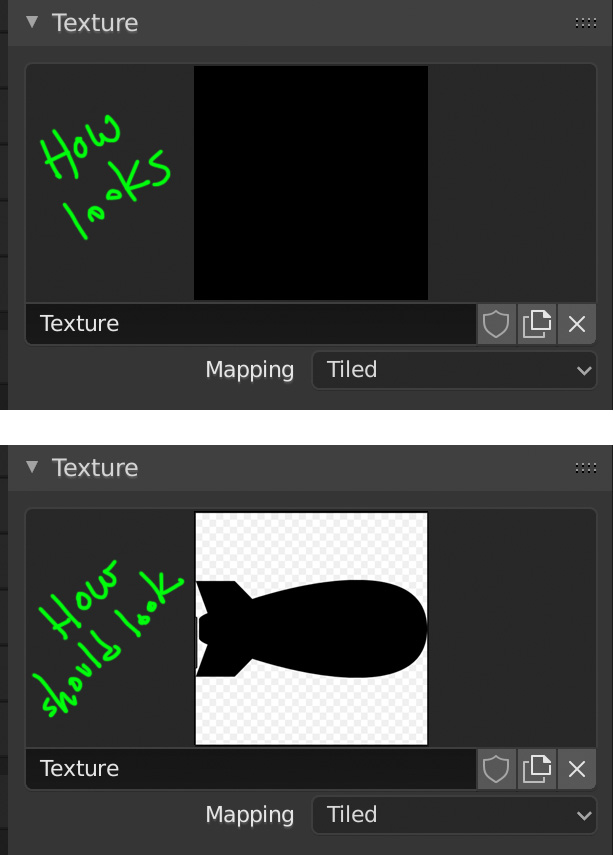
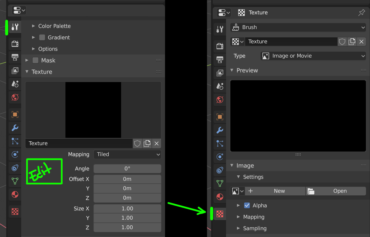
When you paint the textures in Texture Paint and you want to add a texture to the brush, it is difficult to understand where the texture is modified, a shuttle would be ideal for newbies.
1 Like