Originally it was (and it still is) a Christian symbol of God.
It might be possible to eliminate the triangle but keep the emanating rays.
Alternatively, I wonder if something like a simplified version of the Eye of Horus could work. However I’m not sure it gets across the “global” idea as well.
1 Like
The symbol is really good for global visibility controll, for the meanings it carries. On the other hand, its symbolism can disqualify it… Can’t say neither of that about the Eyey of Horus.
1 Like
Can you try a version without the triangle, but with rays coming out from the eye? That might be sufficiently removed from the concept of the eye of providence but it could get the idea across that the eye is “affecting” (with its rays) “everything” (globally).
I honestly think that the less religious we can go, the better.
Anyway I don’t get why you’re keeping the chain icon in this sheet, that was one of the alternatives for the “global” visibility, not something in addition (if I’m not missing something here).
@billrey Again on the outliner, I was trying to see if I was able to make this closing search field, and after some tries I found an old commit by Dalai that reverted exactly what I was trying to implement.
I didn’t find a design task so I was wondering why that decision was made, in my opinion this would make the outliner way more compact for the every-day use.
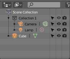
Current one:
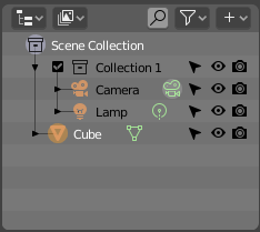
Proposed closed (I also tried to see how it would look with the popover you and @jendrzych proposed yesterday):
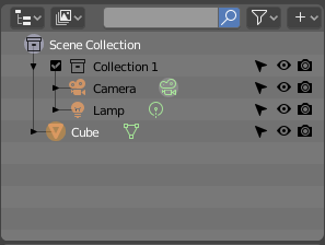
Proposed open:
2 Likes
Afaik it’s something different: it’s the toggle to make an object of a collection linkable into another file, e.g. you link a collection, but you don’t see/link the lattice/empties/bool objects that are used to model it.
Please correct me if I’m wrong
Yes, but that’s exactly what the global visibility does (among other things), that’s why is so difficult to find an appropriate icon for it 
It affect the object itself but also instances of it, visibility in other view layers on the same blend file and visibility in other blend files in which the object is linked.
@a.monti - imagine that one wants to make an item that he links in another *.blend file - lets call it Global Project. Lets suppose that the item is deformed with lattice, so - in original file one wants to see both: the item and the lattice, but in the Global Project one needs only the efect of the deformation. Only the item to be displayed. To acheve that, he has to turn off the “chain” restriction icon for the lattice in the original *.blend file…
1 Like
As I said maybe I missed a design decision, but afaik there is no way to only disable the object/collection in other blend files, there is only the “global” disable option, that affects both the current and the other files.
World is not a material. It’s a light, more or less.
2 Likes
Red is about shading. Visual part 
So the icons for lights should be red, not orange?
orange-objects, green-objects data, red-shading
@jendrzych
Since this is the last week where we can submit changes to the UI, I feel obligated to ask you about the pen pressure icon.
Even as someone who uses a graphic tablet and various graphics software eight hours a day, I was unable to recognize the icon for what it is.


Was it never considered to use something more obvious instead? (See right image.) The current version looks like it represents velocity or mass of a physics object.
2 Likes
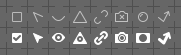
Lazy solution: what about this one?

It’s not used currently, not even defined in the code.
Do it, maybe blender obtain more money
2 Likes
But definitely defined in my brain as a perfect “edit” icon. This one needs to be mostly about pen pressure, separate from tilt, bearing, rotation, etc.
It just doesn’t make sense, that’s it. The relation between material and texture panel here is so incredibly arbitrary it will just serve as a tool to confuse newbies about the color coding logic. It will have no benefit whatsoever. At this point, the buttons could have a random rainbow colors and it would serve as much purpose as the current color coding does.
The fact that both world and materials use same node editor is only a limitation of Blender’s node based workflow, not being extended beyond that. Once it is, it will make even less sense.
That might be an improvement at least, even if it doesn’t represent pressure.