Blender UI paper cuts

Where is the “Preferences” and “Save Startup File…”?


Build: 2.80 (sub 64), 02a7e57d9c07, 2019-05-15 23:47 and 2.80 (sub 64), 2497ee31ec89, 2019-05-15 13:22

(Oh, and… maybe off, but… when “Filter Add-ons” is enabled, many import/export format is disabled, why? It’s really annoying. )

3 Likes

they were eaten by a big shark…JK, they are under blender’s logo now :slight_smile:

2 Likes

Ah… thank you! :slight_smile:
/20 charakters/

What, why?

20characters

i tried to make a case against it before the commit but i guess the UI team went with the non-convention in this one.

This really needs to be switched back.

4 Likes

Why? lol, because they can, obviously, what else could be?
Nothing justifies this weird decision, and yet they went with it.
Everyone hates it.
Shame.

See:
https://developer.blender.org/rB4965af1b7aa60466f6f8842a6f77a0d9b2cb72ac
https://developer.blender.org/D4854

1 Like

I think that use left click was a excesive change and the weird quota must be filled

It’s a *cough *cough Mac OS thing to have Prefs under the application name.

So it’s only for the mac build? That would make sense.

It’s not. Otherwise no one would be complaining.
Who still uses Mac for 3D nowadays anyways?

1 Like

But that is only in system topbar, not apps menus

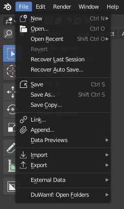
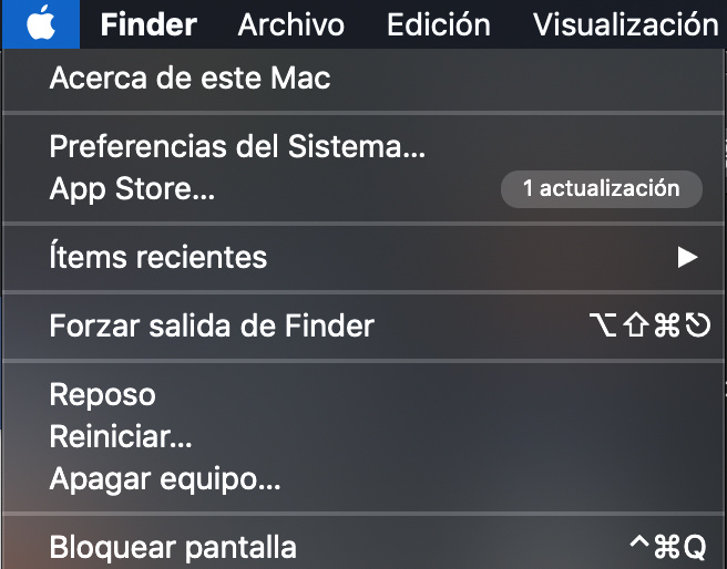
I explained it badly. I meant: it’s MacOs style to have prefs not under Edit menu
@Alberto and yes, it is in system topbar where (except for Blender) all apps menus are

And for example finder

it doesn’t have any thing about the program

It’s

about mac
system preferences
appstore
recent items
Force close finder
sleep
reset
shutdown
blockwindow
close sesion

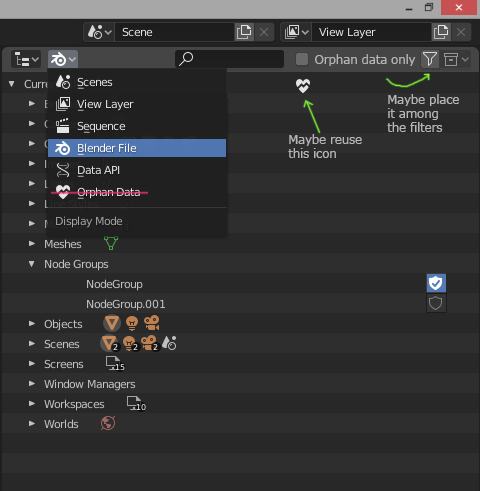
Speaking of Orphan data, the Blender file mode in outliner already has everything: why not merging them and show the shields? Or maybe having a filter to view only orphaned data. Having two similar list can be confusing? Is there duplicated code?
Just an idea…

image

No way. It can’t be real…
Seriously?

I spent a good five minutes finding the prefs. Actually thought it was a bug at first. Not sure if i like it.

yeah, they should either revert it back or change it to “Blender” or something instead of just the logo icon at least this way people will find it easily ,especially on Windows which has the majority of users otherwise they’ll get alot of complains non-stop.

Using “Blender” instead of the logo might be more discoverable, but for me both options are fine.

I don’t know if you guys noticed it,
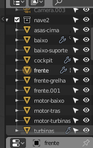
but from a few days to the outliner some limits on the horizontal scrolling have been added, I find this addition annoying, because I cannot see the rest of the tree text and the other icons, it forces me to enlarge the window of the outliner … .
why this choice of setting limits?
Is it just me who finds it annoying?

outliner

3 Likes