I can see why they did it though - as Pablo pointed out:
The current File menu is loaded with settings that don’t belong there (like Load Factory Startup, Install Application Template, etc).
I think if they’d replace it with a hamburger icon, it would be more discoverable and this would also solve the “double Blender Icon” problem on Windows…
Saying that it’s against the standard is not as true as I primarily thought it was. There is no real standard for this. Options are all over the place either in “File”, “Edit”, “Extras” or Appicon Menus in various softwares.
I think that most of those options would fit well in the Edit menu grouped together. It doesn’t really matter if it gets a bit longer, it’s not a panel that one opens so often.
The only exceptions for me would be “Quit”, that I’d put in the File menu, and the splash screen, that I’d put either on the Window or the Help menu.
I agree. The consolidation of preferences under the Blender logo is not obvious. A hamburger menu would be a much better choice, although to be honest, even that seems strange. I think the key here is “avoid things which aren’t obvious.” If you have an industry-standard menu like File, Edit, Window, etc., your options should be stored under one of those. Not a logo or even a hamburger icon.
Most of that menu could easily be moved inside of the preferences itself. Only exceptions being Splash Screen(should be named About Blender and located at the end of Help menu), preferences itself(should have stayed at the end of Edit menu) and Quit.
I like the Blender logo directly opening the splash screen. File and Edit are sufficient to hold the other things, those are the places you would expect to find those preferences in any other software application. I would even advocate moving Preferences to File instead of Edit, though.
I agree, the Factory Settings Buttons should be in the Preferences and the Preferences should be back to Edit. Using the Blender icon seems to be nifty at first, but IMHO it’s an awful idea as it goes against any convention or user expectation.
Even knowing that Preferences are now under the Blender Icon I still regularly click “Edit” when it want to open the Preferences. Please revert this!
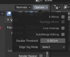
Making the restriction icons greyed out until you click and remove the mouse imho makes them look quite off and, as a first impression, gives the idea that they are disabled and that you couldn’t click on them.
This is especially true with light themes, in which they’re almost invisible.
this is the current situation of my sidebar with addons, practically I don’t understand a shit anymore,
there are no tooltips, there is no order, the texts fail to read, and after a few days I forget some features of the addons and in my mind they become meaningless shadows, mysteries to be discovered but they are a dense and dark wood, a dense Labyrinth without escape in which it is better not to penetrate
I’m trying to make explicit things that I think is a priority to solve before blender 2.80 come out
honestly the problem of crowding and space for addons was also present in blender 2.79, it has only been moved …
it would be a shame if they don’t take this situation head-on and get it out once and for all
by monday the UI improvements will freeze and we are in the weekend,i don’t think they even have time to wrap it up unless they push for more few days.
Yeah, but the problem was worst in the moment that we lost the T-shelf, all addons go to N-shelf and you put in a gigant button soup with the Topbar, outliner, properties editor in same place.
Will be really bad that some things that will left blender in a good place won’t be change before final 2.8
no was also present in the T-shelf,
in fact it has been moved from one place to another …
obviously accumulating everything in N-shelf
however, apart from the complaints:
my proposal is:
icons for compartments instead of vertical texts
(in practice we would have a sort of “second property pannels design” for addons)
tooltips describing the compartment
(and tooltips in the sidebar for each single addons)
obviously it is the duty of the addons devs to add these tooltips, but it would be good if guidelines were given by the blender developers
use of volatile windows for addons with many options,
the ideal base would be: the main functions in the sidebar,
optional and additional functions, in “floating windows-popups”
the compartments could be more local and contextual
the addons, appear only in their area …
if you are in edit mode, only the addons for edit mode will appear.
if you are in object mode, only the add-ons for edit mode will appear
so…
“mesh editing tools” “animation tools” “objects tools” “rigghing tools” “texturing tools” etc … etc …
so quickly all the addons would dilute and the chaos would become more orderly …
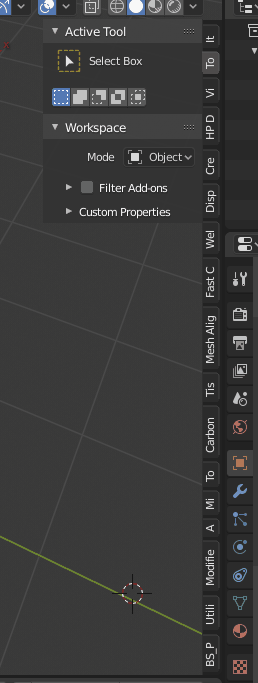
It’s already possible to show different add-ons depending on workspace (Filter Add-ons), that may help a little with this problem.
Icons instead of vertical texts, it’s not an option. Since add-ons make different people, you will get a bunch of similar icons that can not be distinguished from each other.
Tooltips. Each add-on already has a description that can be shown as a hint.