A post was split to a new topic: Hue Slider Resets if Saturation is 0
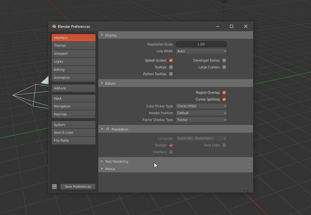
Is it normal that if I do Ctrl+N (for a new file) inside a floating windows like the preferences, the new “file close” dialog appear centered inside of that window, stays there and moves with it?
3 Likes
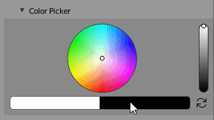
The color picker slider already works like this, so I guess it’s not impossible to add that functionality.
It would be a game changer. ![]()
3 Likes
A game changer? You are weird one dude.
Hahaha, trust me, the difference is like night and day. Blender’s sliders are a pain in the ass and very laggy.
Hi gents. I made the same proposal on this site the same day you guys were talking about this.
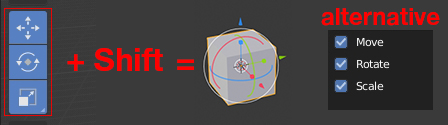
I see that your proposals got a lot of likes. I’m trying very hard to get the devs to do it the way we’ve all proposed. They have locked down the active tools so that there is no way to make this happen using python. You have to edit the C code, otherwise I would have this working by now. I have an addon that puts the move, rotate and scale buttons in the top bar. They also allow for either switching directly from one to the other exclusively or pressing the shift key to add multiple gizmos. Give it a try!
I really think this is important and can’t seem to get the devs to agree with me. They see it as simple as making an easy way to switch drag behaviors on for the tools on the fly, but that is far too slow and hidden. We need simple transform gizmos that don’t lock you out of multi selection and allow you to use other tools with the transforms active (ie extrude with the scale tool active).
Help me push this on the devs. They don’t seem to see what a workflow bottleneck the transform active tools are. They are too close to the project to see them from the perspective of end users - especially those coming from other software or for god’s sake the last version of blender!
6 Likes
On Windows it’s quite annoying that the file browser does not recognise folder shortcuts (.link folders).
Blender essentially treates these as normal files and I even tried loading one as an image which makes zero sense?
6 Likes
I think that has to do with the openGL context in which it appears. Blender’s popups/dialogs are not windows in the ‘window manager’ sense of the term, they are internal to the Blender window which is basically a ‘fixed’ graphical rendering of an interface.
Wow, do I not know what I’m talking about heheh.
1 Like
you’re right, because with the sliders to be dragged every shift-new parameter is processed and the lag is noticeable on the heavy scenes.
while with a “click-set a parameter” the calculation of the parameter is processed only once
2 Likes
Are you referring to shortcuts to folders (folder icon with arrow overlay) or to symlinks to folders (made with mklink for example)?
I propose an alternative for gizmo. If you select three manipulators with the Shift key held down, the fourth one appears. alternative to checkboxes.
10 Likes
Well I’m not that technical with windows but I’ll try and elaborate:
If I right click a folder in Windows I hey the option to “send to desktop as a shortcut”.
I guess it’s that folder with the arrow you mention.
But when I navigate to somewhere with such a shortcut-folder in blender it just shows as a “.link” file.
And I can choose that file as any other file. Img, video, txt whatever.
But what I expected was for the file browser to navigate to the folder amyhst the .link file points to…
Makes sense?
Btw. The .link files also only shows up if Alle filter options are turned off…
Ctrl+Left or Right arrow seems like an unused shortcut, can’t it be reverted to its old functionality, that was “change workspace”? It could cycle through the workflow tabs on top of the interface
Perfect. So it’s a shortcut to a folder. I’ll add that to my notes of possible things to do later on. If I remember right those can be a pain to deal with well in a file browser like this because the target could be a file, directory, search result, etc.
2 Likes
And it’s a binary format, too.
1 Like
top row of the sidebar conflicts with the “Full maximized area toggle” and even with the Viewport Navigation Gizmos.
i believe there was something like this in earlier versions when you mouse hover the button it appears, but it’s no longer there…IMO it’s best to bring it back and put it in bottom right corner.

I have this proposal about sculpt mode UI, mostly about the tool header but it can combine both tool header and header.
I’m still developing it but I thing can be a cool change adding some ideas like the one of the textures to just focus in sculpt and avoid of using panels, scrolling around the tool settings, and then change to textures panel and then change to the other one and at the end… so much actions, so with this change I propose this will be so much faster than now and a better wokflow, this is also improvable, I’m just a noob of python and Blender API but with all the feedback it can receive, a better friendly UI will come out to make Blender even more awesome!
NOTE 1: I have the UI scale a 15% bigger so you can see it more clear so don’t worry there’s more free space around here xD is not that congestion
NOTE 2: the image thumbnails are not showing because Blender seems to not show/support .psd thumbnails actually(?
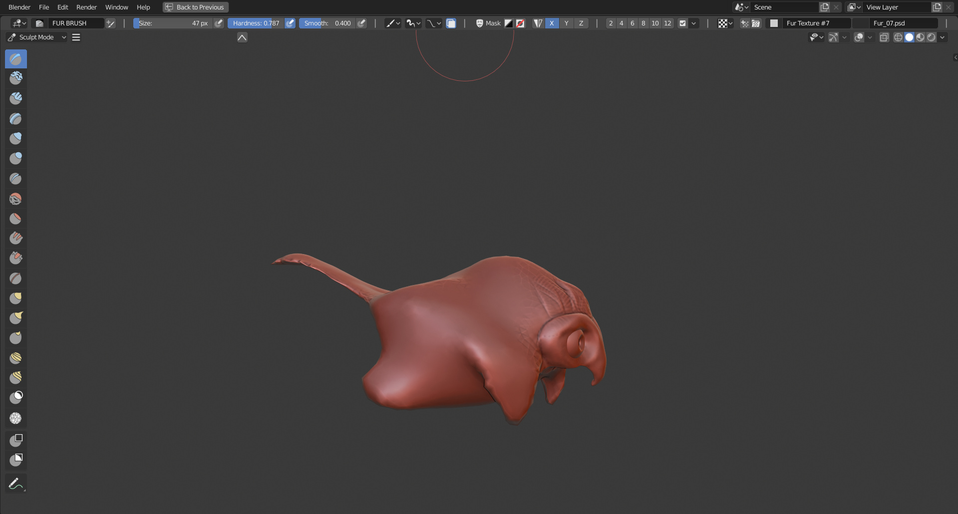
I have much more ideas and new ones when new sculpt comes to Blender 2.81 or +
[Update]
Some (summarized) future ideas for this addon (even if there’s no idea that draws attention to implement it officially):
- Remake for the quick detail size selector + configurable and dynamic
- Big texture/image preview when hover → in 3dviewport
- Delete brush and context menus
- Brush list/sets: 3 subpanels: by brush type you have selected, for recent brushes, and custom sets + slots.
- When loading a new image to an empty texture then the texture gets the name of the image so you don’t need to rename them all time.
- Better and new shorcuts… nice alternative to the malefic sliders… plus a lot of free space
- Keyboard numbers for detail size(?
- Better filters for brushes/textures/images with user predefined
- Brush configuration so better variation more than built-in brushes
- Integration and support with new sculpt tools that will come
1 Like
Bump!
The UI shouldn’t be freezed without fixing those icons. 
1 Like
Maybe it’s just me, but I feel like the edit mode green is worse for contrast, it could use some tweaking.
That said I also feel like 2.8’s edit mode orange may have already lost contrast anyway compared to 2.79, looking at it
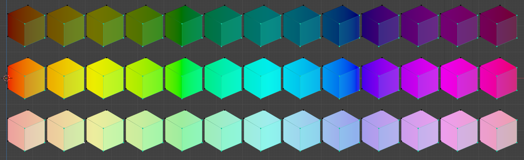
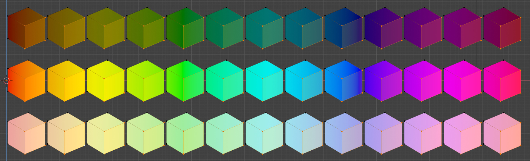
And on the default solid colour
3 Likes
Why, in the subdivision modifier the viewport / rendered subdivision has been reversed?
I think that there is no special reason to invert it: can someone explain this to me?
This is really one of the many changes that I don’t get why they happen…
Thank you,
RIckyx