Those are more single-button functions than addons.
Local devs are people who make coding way better than drawing like jendrzych
As you may know, I made entire icon pack for FreeCAD in Blender 2.8 style, and also several Blender addon packs.
But it will be too tough even for me to provide icons for every addon I produce.
There is reason why best unwrapping programs aren’t hiding them in single drop down menu… 2.79 even had improvements in that area over 2.78, which all got dumped in 2.80 for no reason.
Further Blender UV tools are not even on pair with other packages and on life support from addons like textools. As someone who changed to Blender from Max it still blows my mind that Blender doesn’t have align to edge command out of the box. Thru at this point it’s not UI problem…
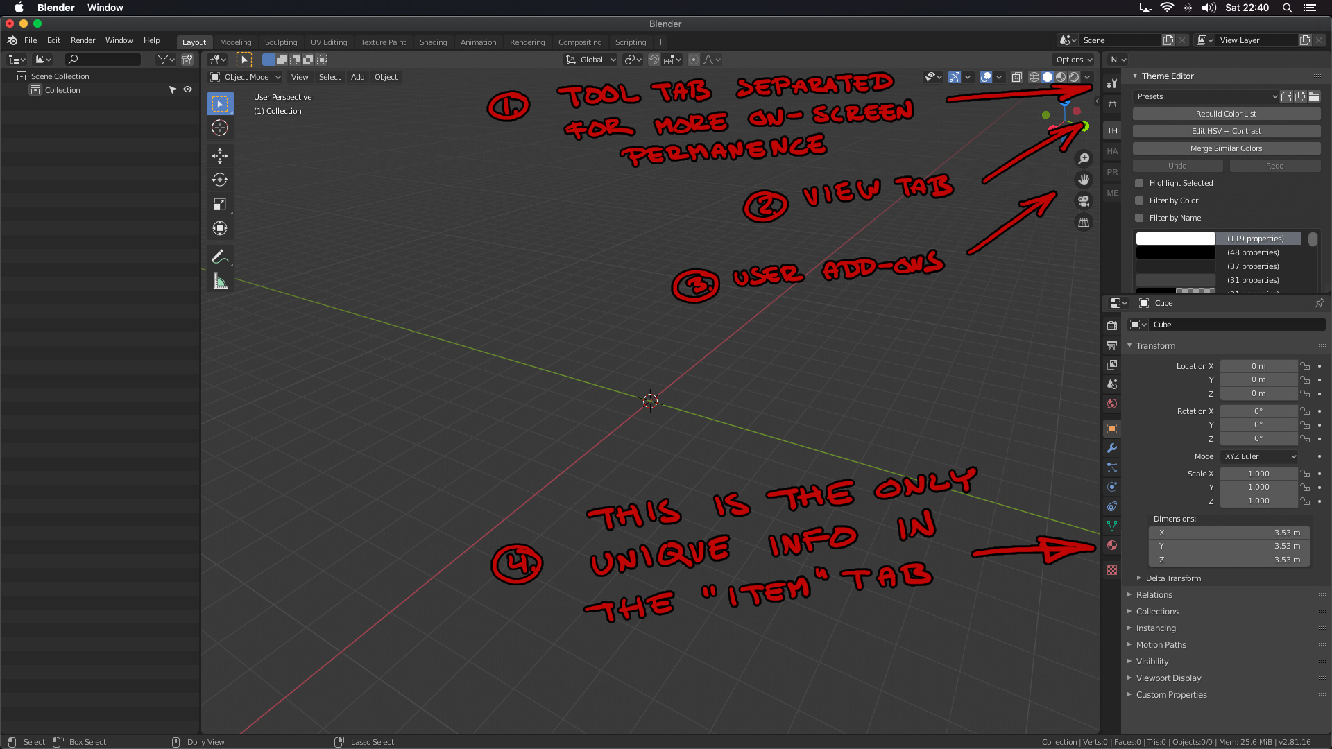
So this is an entirely new “editor type” panel which can be placed anywhere, but with the properties panel’s layout. I put the tools tab on top of it, and perhaps this panel will give users less reason to constantly have to switch away from it (especially new users with no add-ons installed yet).
The view tab is unchanged from the way it appears in the old N-panel.
Add-ons tabs are also unchanged, but they would be more visible here. In this example, I just use the first two letters in the add-on name, but add-on developers could also customise the letters, colors or even put icons there.
I am perhaps missing the point of the item tab, but as far as I can see, the only thing that’s unique about it are the dimensions, and those would fit better in the data tab.
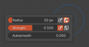
In the latest Blender 2.82 alpha master builds, the right-click brush settings dialog in Sculpt Mode has its appearance hotspot set at the top right of the dialog, which is not very convenient when you want to quickly adjust the brush size or strength slider.
The dialog appearance hotspot used to be at a more convenient, slider-centric position. It’d be great if that could be fixed, thanks a lot.
No-one has picked this up yet. Maybe you could award a token to the entry, to attract some dev attention? Thanks.
I’ve added this:
Ideally, you should be able to click and hold RMB, and move to the left or right to change the brush size, and up and down to change brush strength. And when additionally holding Shift, you’d adjust the smoothing strength.
I think the title of the pop-up “Viewport Shading” should be kept; for a new users, it is annoying not to have any clues of what a property tab or pop-up is about; plain English is good.
same thing for the subtitle “Ligthing”
to have Studio, MatCap and Flat listed vertically takes more space
why re-ordering the color?
could we select the width of the outline ?
overall it looks practical, but it feels overcrowded: it would be nice to use some empty space (e.g. top margins of the subtitles) as in the original pop-up
The 2.8 animation UI looks so much better, congratulations!
However, one thing I still found very counter-intuitive and I hope it is updated for beginners like me:
Why does a right-click on the “Armature” entry, or the “ArmatureAction” entry not give me simple options for adding a new action, or deleting the selected action? I’m sure there is some obvious button somewhere else, but it would be a lot more intuitive if it also was in this context menu. Especially since it’s such a fundamental thing to do in this view
This patch seemed like a nice solution, but is stalled because of currentscrollbar problems in Outliner. If someone can figure out the latter I’d love to get back to the former.
This is about 2.90.2 eaf7d36d66e5
Mark Seam/Clear Seam disappeared from ctrl+e menu. Is this a bug or a feature? I hope this is a bug. Because it is very inconvenient. Previously, I could use the ctrl+e menu for everything related to edges (bevel, sharps, crese, seams), but now I have to use two menus crl+e and U.
If this is a bug, then I will write a bug report. If this is a feature, please return Mark Seam/Clear Seam to ctrl+e menu.
I think this is a ‘feature’. They removed duplicate menu entries to make the UI less cluttered. Until now in Edit Mode you could find Mark Seam/Clear Seam in both the ‘Edge’ and the ‘UV’ menu as well as the ctrl+E menu.
It was mentioned in the most recent episode of Blender Today (#103 I think it’s unlisted as it was more of a casual chatting stream than usual, but here’s the link) and from what I understood Pablo was open to consider keeping in the ctrl+E menu.