Since everyone seems to post their suggestions again in this thread on apparently the odd chance that a developer will actually look at it now, guess I’ll hop on the train:
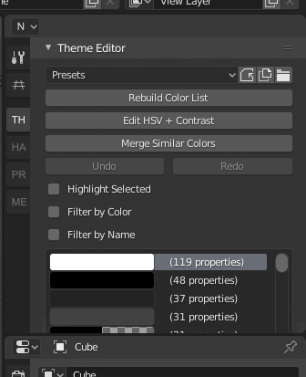
First off is the low visibility. No beginner knows how to press N:
Second, why have this cramped menu at all? Why not just make a new proper panel out of it?
I mean, some tabs don’t have a lot of unique stuff in it anyway…