Annoying “paper cut”:
Blender prevents the system to go into sleep mode.
Yes, quite frustrating. 
Try setting “Audio Device” to “None” in the Blender Preferences.
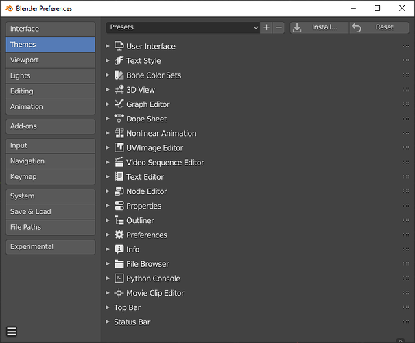
In relation to User Preferences/Themes:
-
Should this list be in Alphabetical Order?
-
I have a suggestion for the missing icons for
a) Top Bar = Blender Icon
b) Status Bar = heart rate trace icon.
Whilst not possibly the final icons of choice, they would complete the proper alignment of the list. -
Change the title ‘Video Sequence Editor’ to ‘Video Sequencer’, keeping it inline with the drop down list of available editors.
Let me known and i’ll add it to my list.
Alphabetic Ordering with the User Preferences panel.
Just out of interest. Would it be better and consistent if all the top level selections in the User Prefenences panel be arranged in Alphabetical order. Most if all of them allow the user to change the ordering, so would it not be preferential to set it in alphabetical order as standard and then let the user customize?
I like the categorization, but hiding render settings is too confusing for new users, who might not realize they have to de-select everything in order to see those options.
I suggested splitting your “show always” out into a separate panel here, but there’s no reason that your “show this if nothing is selected” couldn’t also be split out, which I think would be an improvement:
Can I suggest the Panel has a header with the ability to close it the whole Panel?
At the moment the exisiting panel allows you to open it clicking on the left arrow, but no mechanism to close it in a similar fashion.
Thinking of the newbies who are not up to speed with the Short Cut keys.
That has been suggested, along with changing that small arrow to something more visible many times, and Blender developers have always ignored it, so I guess they unfortunately like it the way it is.
My suggestion here was to simply add an entire new panel category that you could place wherever you wanted just like any other panel (the current properties panel is way too crowded, and the N-panel is way too invisible).
Same here: already filled a bugreport over two months ago (video included, which explains it compared to 2.7), but it’s already closed, because it’s not a bug - it’s more a “feature request” - Sad, but true. It still feels not like a feature, but more like a regression: It worked in 2.7 - but not the same way in 2.8.
When you hover over the ‘Copy’ icon, the information reads:
‘Duplicate Modifier at the same position in the stack’.
If you or anyone else has anything else lying on your TODO list, which you think I could tackle, email me. I can tackle from 15th January onwards.
My first port of call from the 15th will be around Preferences Panel, of which there seem to various Paper Cut type amendments. If you wish them to be highlighted here in the UI paper section on a adhoc basis, I’m happy to oblige.
In general my own interests are very obscure little things that nobody else really notices and wouldn’t be interesting to most people. But will keep you in mind.
There are piles. But I would just caution against making a mega-patch containing lots of unrelated changes together as that can make it hard to evaluate and approve. Just remember you have to sell your proposed improvement in the patch description so it can be easier to focus on a thing, or related things, together at a time.
I’m on your wavelength as against Mega-Patches.
Most of the paper cuts I have in mind I think are no brainers, like
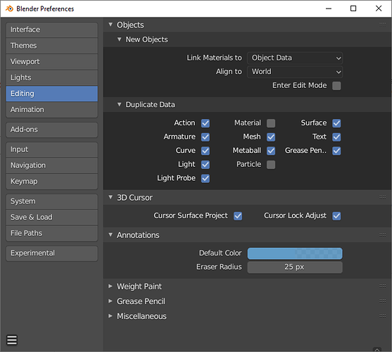
UserPrefernces/Editing/Duplicate Data:
Re-ordering of ‘Grease Pencil’, alphabetically into the correct position in the list.
As a related note. I see lists like these all over the place, that may/maynot benefit from being alphabetically arranged.
In many places we are choosing to place things in most-used to least-used order. In Preferences also pre-opening the most-used. For better or worse. There are obviously arguments for or against any ordering. I personally don’t have strong opinions on this, nor does mine matter much.
But alphabetical order in this case would be a hard-coded placement in this order based on the English labels. So when using a different language the order would then be incorrect.
Eventually I hope we’ll gain a library like ICU and then we can have language-specific sorting.
The HIDDEN side panel. Why is it hidden? So no new users can find it.
Like any N-panel, it is hidden. I also watched the lesson on 2.79 and could not find the Driver button.
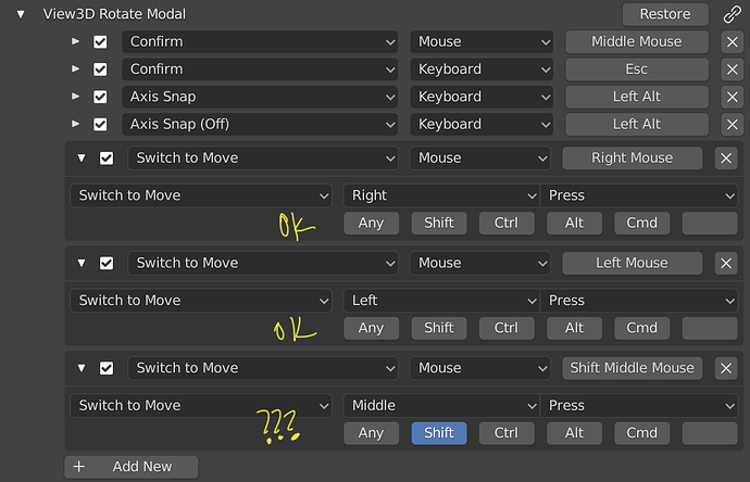
I am trying to reproduce the navigation I comment on https://blender.community/c/rightclickselect/zgfbbc/
but I encounter a couple of problems.
1.- Every time I modify a parameter of a shortcut the panel closes, and I have to reopen it. It makes me lose myself and have to constantly search for the attribute I intend to edit.
Edit: Submitted as bug
https://developer.blender.org/T72977
2.- I have achieved two new interactions by orbiting the view. By clicking a second mouse or tablet button while orbiting the camera, I can move the camera. This allows working with only one hand, and especially for the disabled I think it can greatly improve the workflow.
I do not get the same interaction by clicking exclusively the Shift key while orbiting, since it does not know how to differentiate it from the action initiated.
Many programs act in this way and I think it should be possible to switch the order in which the keyboard and mouse are pressed.
I would appreciate any information regarding this. I leave a capture so that it can be better understood. Thank you.
2.8 added a new edge ring/loop selection method where you can hold alt and double click an edge to select an edge ring. Sometimes holding alt and clicking once this does not select the edge ring so in 2.8x you can double click while holding alt to select the edge ring. However this is buggy when you want to select two or more edge rings one after another using this double click method. On second selection the double click simply doesn’t work correctly as it select and deselects. Holding shift doesn’t help either. I think this is a bug? Or maybe I just don’t know the correct keyboard buttons…
Steps to demo the issue:
-create a cube
-in edit mode select two opposite faces and press I to use that tool. Make the new faces smaller, finish the tool and then delete those small faces
- select these new edge loops in edge select mode and subdivide once
- now you have created two edge loops that require alt+double clicking to be selectable
- if you hold alt and click once you only select part of the edge loop. Click again and the whole loop is selected. Now try to add the 2nd edge loop to the selection the same way using alt (and shift) and double click. Can’t do.
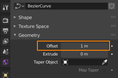
Small thing, but a Curve’s Offset default value is set to 1 instead of 0 when right clicking to Reset to Default Value. Pretty annoying to have to change it to 0 by hand.
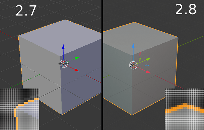
Small annoyance - 2.8 added all sorts of smoothing and anti-aliasing options to the viewport by default, and while i can disable most of them, any UI items that use the “Line Width” parameter are still too thick even with it set to “Thin”:
Here the outline width is set to 1px in the theme parameters, but in reality it’s drawn as 2px or more because of the smoothing. I just want to be able to set everything to look crisp like it did in 2.7…
