The M key works for me in the outliner. You may have overwritten the keybinding somehow…unless you’re using a different keymap. I do agree that some functionality should be added to the button on the outliner. For instance, in Photoshop, if you select multiple layers and drag them to the Group icon, it places those layers in the newly created group, whereas just clicking the button leaves the selected layers outside of the group.
1 Like
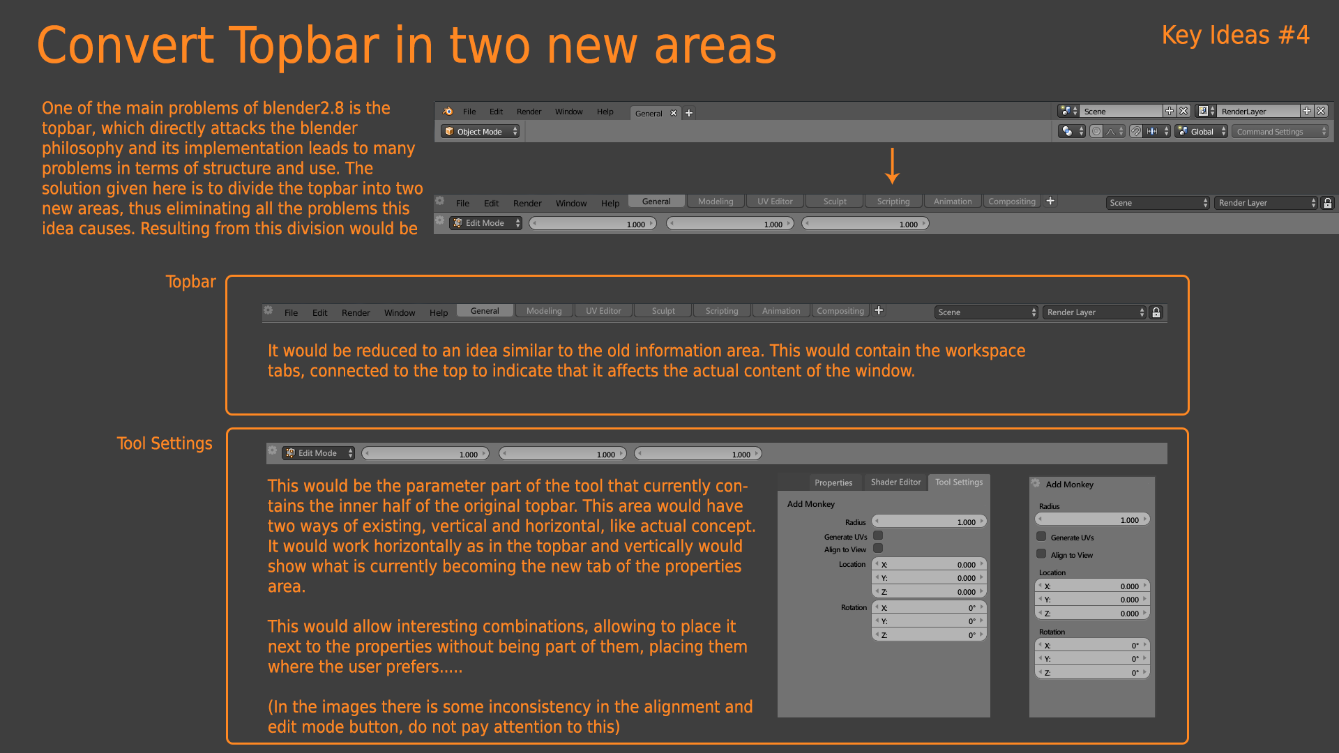
There were many clear examples that show the inefficency of a global toolbar, either on the workflow side, and on the UX side. The former is a fail since Blender can’t decide what properties display on the toolbar when you have more than one editor open (a very common scenario). The latter is a fail too when you use two monitors, or even just one and you have options on the toolbar far far away from your editor working area, making long mouse travels a necessity.
I’d like to see the M key work for collections, too. When I create a collection and it’s far down the list and I want to move it up, I have to drag-n-drop several times to get there since there is no auto-scrolling and no ‘move to’ (M) feature. Is there a trick I may have missed ?
1 Like
I’d like to double that. It is very difficult without this fun functionality
Yo @Harleya what happened to your patch that would allow us to choose different cursors for each different mode?
There’s some weird stuff happening here: https://developer.blender.org/D6046 and your patch would solve all of that.I think?
Actually my patch did go in. It updated all the cursors and added a bunch of new ones, including some alternates. And we also now have OS-specific versions too for Windows and Mac so those platforms get nicer anti-aliased versions.
Discussions like the one you linked are really just hammering out which ones should be used by default for each task. Not something for me to even weigh in on and best left for people who know those areas well. In the end they might decided that one cursor is enough, whether one in the set now or something tweaked. Or they might find that no consensus can be found and instead we have to have a user selection.
That discussion in particular is more about a race to get some change in time for the 2.81 release. With further changes, including possible user selection of alternatives, for 2.82.
Yeah, but still, customization is always better, you know, just in case they mess things up.
The dot is only good for 2d stuff, but I still see people thinking that 2d painting and sculpting are the same thing, and that’s concerning.
Personally I can’t wait to be able to get rid of the cross cursor in edit mode too.
So yeah, customization is the way to go.
1 Like
Hello lsscpp,
In terms of what properties to display, note that we already have the problem when using the tool tab of the properties editor. I believe the solution is simply to show the properties of the last selected tool (currently, it is not the case and I raised it as a paper cut).
Concerning the mouse travel, my second suggestion actually addresses that problem: the toolbar/tab would be an editor. As an editor, it could be duplicated, placed wherever we want, and be used on two monitors. It would be similar to what the tool tab is in the property editor except that it could be displayed vertically or horizontally.
Let me know what you think 
Re-reading what you wrote, it sounds better than I thought, but: let’s say I create my own screen setup with, say, two or three tool editors above the other editors, and all of them show the same properties of the last selected tool (maybe a brush), I think it’s a misuse of screen space. Let’s first fix the bug you mentioned. Then, the low hanging fruit would be better managing the space on tool headers. And on user side, take advantage of the fullscreen feature (ctrl-space), when sculpting or painting.
I think, most of the time, when using one monitor, you want one tool bar/tab for the tool you are currently using. But if indeed, the user is in a case where they want to have two tool bars, you are right: that’s probably because the user wants to use two tools or workflow at the same time (alternatively).
I can see two directions toward a solution here:
- we could have a droplist in the tool editor named “link tool editor to:” and you could chose between: “last used”, “3d viewport”, “image editor”, etc… Hence your tool editor could behave as you need it when you need it.
- the tool editor would be always linked to the last tool used in the current workspace, however, Blender could manage several workspaces: for instance, the user could have the sculpting workspace on one monitor, and the texture painting workspace on the other monitor.
The toolbar like an editor was the first proposal about the topbar that I did and was rejected. I suppose various reasons
- complexity of the UX
- add innecesary editors
- doesn’t work in full screen mode
- doesn’t solve properly the problem with multieditor and diferent active tools selected.
1 Like
So I hate the “n” side panel (or whatever it’s called) with a passion, because:
- It’s absolutely impossible to discover without help by new users
- It has a ridiculously small spot to click on to reveal it
- (I don’t even think it has anywhere to click to hide it)
- It hogs too much space once it’s revealed
Why not just fold it into the other space for panels that we already have:
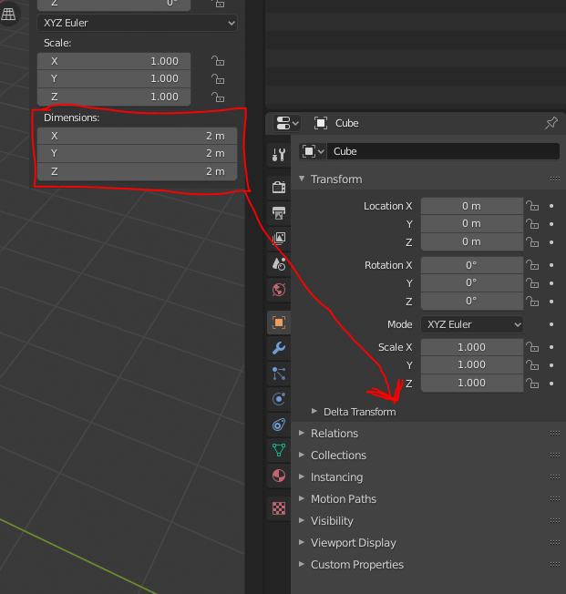
Somehow I agree with you. I don’t think that removing it completely could be ideal. But… what I do agree is that would be nice to be able to access to all the options that are present in the N panel in the Properties Editor.
For example, over the N panel when we add an editable object (Mesh, Curve, Surface, Metaball, Text, Armature and Lattice) the Dimension field is missing in the Properties Editor. In this way we could do a littler bit more without opening the N panel.
4 Likes
By Parts
-
It only need to change the default value and show by default. And yes, is a problem.
-
It’s solved with show it by default
-
You can reduce the width of the sidebar and hide it completely.
-
It use the same space that user will need
-
Blender must to work in fullscreen with multiple monitors, not only with default layout in one monitor.
Also that with your solution blender users will be clicking continuosly to see any thing, instead of had specific panel for each thing. And a lot of other limitations like don’t allow user to put the panel in the left.
3 Likes
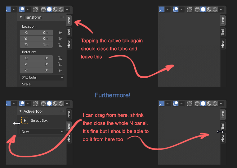
Regarding N-panel, with 2.8 I often find myself clicking the tabs headers figuring they can hide the panel, then realize they don’t and click N or drag the panel size to zero.
Solution might be (as someone mockup-ed in the past) to have the tab headers always visible and having to click them to open/close the N-panel (besides the good’ol N key of course)
1 Like
It was proposed a lot of times, so maybe we will see in the revamp of that bar.
1 Like
I think that was me as well, earlier in this thread, and I now see that it got quite a bit of likes (but no developer response?):
(Also, that made me find something similar I did even earlier, haha…)
Hello, I believe you are speaking about the tool tab related “bug”? I created a bug report here if you are interested: https://developer.blender.org/T71114
1 Like
Obviously, because of addons.
Properties are not interconnected with 3D view, so running addons from properties is a problem.
Also, fullscreen.
exactly…
Plus my (and others’) former proposal that it should hold square icons instead of vertical text.
You should be able to work the very same way with them as with “collapsed to icon” windows in Photoshop. Clicking on the icon should open and close the info in it.
I elaborated in this post:
and this post:
and IMHO N shouldn’t hide everything - it should do the same, just collapse it back to the icon column.
Hiding it completely should be a conscious act with right click menu or dragging - same as with the top bar. The current behavior is just not enough.
Here’s one of the image from the posts above just to make this one more flashy ![]()
I hope devs come back to this idea… they said they wanted something like this but I see it nowhere on the roadmap.
5 Likes