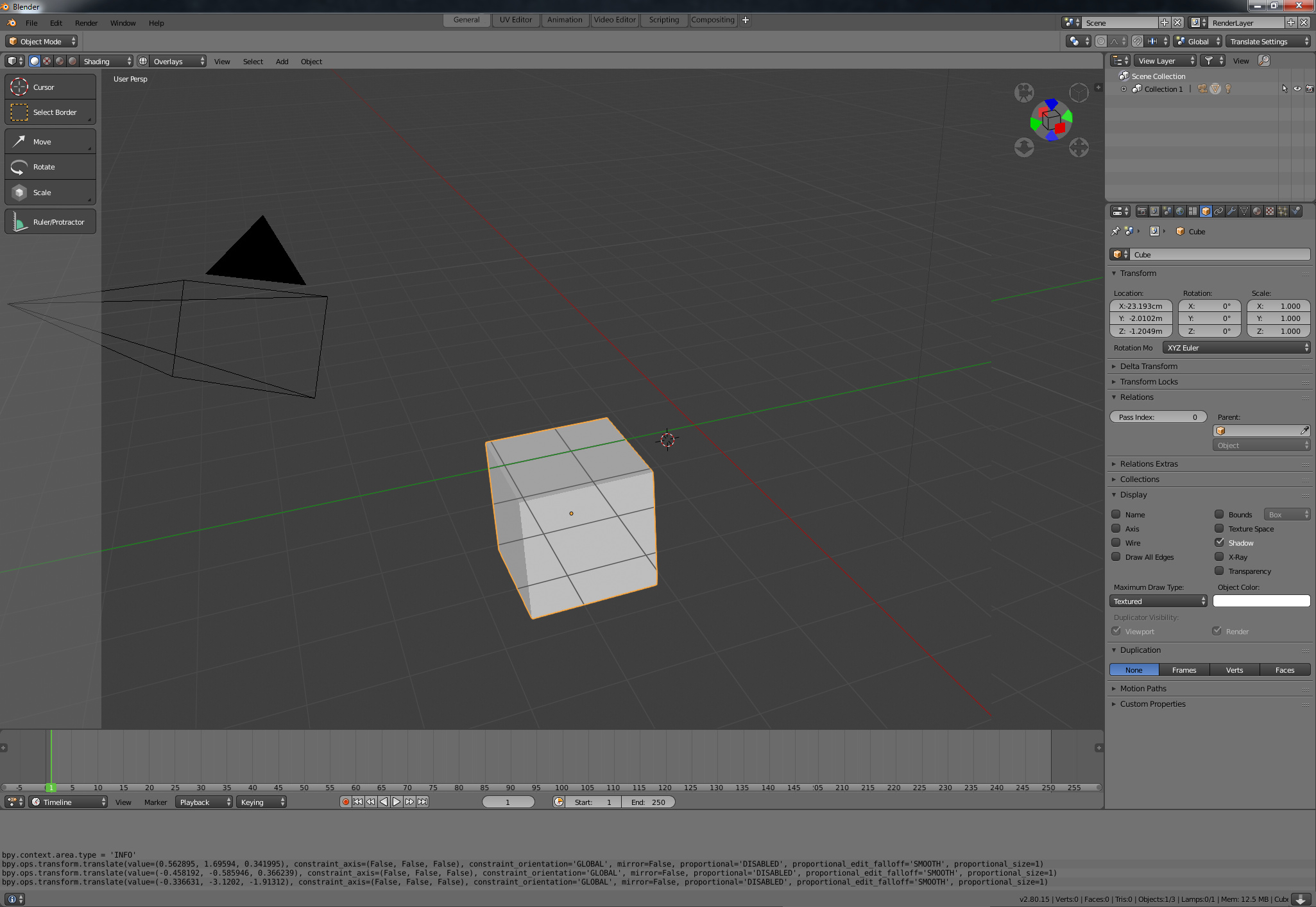
For Blender 2.8, we have made a number of interface changes, such as:
Manipulator widgets for tools
Toolbar
Updated dark, flat theme
Common Tool Settings system & tool tweaking UI
Hotkey changes to make mode switching faster and more consistent
Manipulator widgets for tools
Popovers to make UI sections less cluttered
More consistent single column properties design
Viewport Manipulator
Most of these things are still work in progress, and many of them have planned tweaks and improvements.
Rather than having user feedback scattered around the web, we would like to consolidate it here, in this thread, where we can better reply and clarify which things are unfinished, and which things work as intended.
Still unaddressed is the ‘fake user’ button. In ANY other app, I Create something, it holds on it, until I say delete, working in blender however…
Spend hours making nice materials.
Wow. that was a lot of work, better hit save!
Blender: yeahh… uhhmm… they weren’t used… and you didn’t click the magic ‘F’ button,… so when you asked me to save, i deleted your stuff! … I didn’t tell you about it, you’re gonna find out next time you open the file. SURPRISE!!
Let me be clear, I create something blender ought to hang on to it and defend it with it’s life. the users data is NOT to be deleted EVER, do whatever you want with the temporary things it internally creates, but the user creates something it stays until the user says it’s time to go.
and in the opposite direction,
Use a material on several objects,
click the X aka delete button on the material
blender: yeahhhh it’s still in use elsewhere, i’m going to keep it… go figure out on your own where it’s used.
There’s many nice improvements in blender 2.8 , but no amount of tinkering widgets, shortcuts and theme colors is gonna matter when we still get basic things like ‘don’t lose the users data’ wrong.
I call for the elimination of the Fake user button, most new users won’t know what it does, and people are losing their work because of it. not ok blender… not ok.
On all the changes of the interface, the top bar seems to not work pretty well to show tool settings with different areas etc.
Maybe you have a better idea on how it will be at the end, so, can you tell us please?
Hi,
must agree with @LazyDodo …makes perfect sense!
I cant think of better feature to be added/removed than box selection using mouse pointer like in other apps…no need to hit “B” key for every single time…why??? same goes for Outliner…have you ever saw newcommer to Blender trying to select using draging mouse pointer?! its horrible experience…most users fail at that …just bring in the ordinary standard mouse dragging action pls!
I would like to note that I really like and support Blender but we are striving making the 2.8 better tool so thats why I am proposing this. Mouse hovering above empty screen space is like another action trigger…and its standard on every OS also.
Fake Users and reference counting is not part of the Blender 2.8 topics per se, but we might look at this. There’s not full agreement on how to change it, but the forthcoming asset manager could be used to make this easier to manage, and less error prone.
We want to adopt that behaviour in the new ‘Industry Standard’ keymap in Blender 2.8. The Outliner will be improved in general so that it’s easier to manage objects and collections
The top bar serves as a consistent way to access tool settings for the active tool. We also want to add a Tool Settings editor, which shows an expanded list - especially useful for Sculpt Mode where we have many settings.
Additionally, we may add a tool settings popup too, so that users can hide both the top bar as well as the Tool Settings editor, but are still able to tweak the active tool settings in a context sensitive way. I suspect that you might want to tweak tool settings this way.
hi, most of the 2.8 changes look good to me - but im not too invested into the old blender way…
anyways, do you have any plans for the “drag” corner of the screens? in the current build they are just invisble I think its not really clear how and where one can collapse views which the current way of things.
In 2.8 you can actually now use it in any corner, not just the two as we could in the past.
There are a few answers to your question:
We actually expect that many users will use area splitting less in 2.8, because of the more prominent task-specific Workspaces. For common tasks, users can just use one of those, or create their own for re-use.
We looked at various ways to create a visual indicator in each corner. The old one actually looked like a resize-grabber, which was very misleading, and when added to all corners, it looked like spider webs. We also tried using triangles, dots and other things, but we weren’t satisfied and felt that each of them was quite visually disturbing, as it’s duplicated all over the place.
We perhaps could do something using proximity, so that you only see corner widgets close to the mouse cursor.
We’ve even considered removing this feature completely, and just rely on right-clicking the borders themselves to do the splitting.
A precise visual test or mock-up if you have one is appreciated.
Currently the topbar makes little sense in the tabs part. The tabs joining at the bottom to the topbar gives the impression that it will change the utilities or what the topbar shows, when in fact it is the only thing that doesn’t change. Wouldn’t it make more sense if the topbar tabs were attached to the top? It’s pretty much the same solution as this volume.
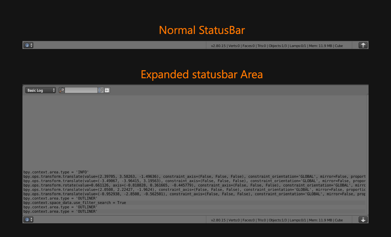
On the other hand, doesn’t it make more sense that the new statusbar is the information area? This would allow it to be hidden at the user’s discretion, and it could also be made slightly expandable with a toggle button to read the program’s messages.
Won’t be better make that? so user could resize area when use the triangle and right click a context menu that allow split/join areas. Maybe could have modifiers keys that allow to split or switch areas, for example Ctrl+click split area, Shift+CLick Join areas…
The problem with new corners is that are hard to use, really little, and few people will know the function.
just saw the recent updates for single column properties, while nice, it does mean more scrolling and searching, visual studio has a similar issue and offers a search bar for all properties,any chance we can get one in blender as well?
The topbar is planned to be affected by workspaces, with per-workspace modes or workspaces without a top bar (like video editing).
The status bar should indeed be possible to hide, and it is planned to be the place where you can access the info editor. But it wouldn’t be the info editor itself, rather there would be a button to pop open an info editor. And then the info editor could show more types of logs than we have now (python commands, tool messages, render logs, stats, …).
also regarding “Outliner”…I really love the mouse dragging on icons for selectable and renderable objects. Its a shame this doesnt work for selecting objects with LMB dragging. I know its for parenting objects when drag over other object name but this could work when dragging outside of any object name, say just dragging next to them in empty area.
Overall its pretty smart way of working using that long drag motion using LMB (ie collapsing UI categories / columns with properties etc. big fan of it overall!) Just use this action on as many items in Blender as possible… thanks just my 2 cents
How will be that? if topbar don’t decide the function of the workspace.
I don’t see incompatibility with the idea of extendable status bar. But with this change, per-workspace topbar, new open driver editor,… I suppose that blender will drop, in part, the tile interface idea to make a classic interface with floating windows for specifics tasks. Because rest of programs with similar interfaces (modo and houdini) have topbar, statusbar,… but all are areas, not locked panels.
Not sure what you are asking? What I mean is that the contents of the bar with the mode / tool / command settings will typically change when switching to another workspace tab, much like other editors. Because the “Sculpting” workspace will be in sculpt mode and show sculpt tools, “Mesh Editing” in edit mode, “Video Editing” might not have that bar, etc.
It’s not entirely incompatible. But if we want a more powerful info/log editor, for example with some filtering or search buttons in the header, ability to switch between tool/render/python logs, then that same header isn’t suitable as a status bar anymore. If you want to place that new info/log editor at the bottom of the screen in a non-overlapping way, that would still be possible of course.
But yes there’s a few cases where we will popup windows (drivers, info/log editor) in addition to the existing ones (user preferences, render window, playing render animation). It’s not an overall change to the design, just solving a few cases that were awkward before.
And perhaps we will make the topbar and status bar regular areas, but if you can show/hide them then there may not be a lot of reason to, as you wouldn’t place a status bar in the middle of the screen?
User don’t like the topbar/status in two monitors or different windows (I want my second monitor only for UVs and outliner)
User wants the topbar on the bottom. Because see on the top is always more hard that see bottom.
User wants the status bar in a better position, or classic position. In my case for example I use two 27 inch monitors (like mayority of power users that I know that use two/three big monitors). Actual controls in topbar and stats in status bar are really far from comfort zone.
User wants to make a little window only for a 3D view like always (Yes, you can use ctrl+shift+space to make only 3D view, but normal users rarelly know this options)
In the moment that split areas, join areas is really hide right now. I don’t see reasons to don’t give user the power to make this changes, also this doesn’t break with tile interface phylosophy. Maybe one of the reason because I move to blender.
That is not really a problem with a expandable area (maybe technically, but i don’t know) where that controls are in header and when you reduce the area you only see the statusbar
 …just bring in the ordinary standard mouse dragging action pls!