Actually, no. It is kinda postprocessing, it’s setup don’t influences render process.
So it is more related to Post Processing in Output tab, than Sample, Perfomance, or, for example, Light Paths in Render tab.
It is more about how rendered image will look, than about how to render image.
shift+f3 - shift+f10 - shift+f5 are a must to know (for a modeler generalist) use all the time.
optionally Shift+F6 and F12 or Shift+F7 or f9
If you work ala industry standar (only one thing one interface at a time) may not be usefull at all, but if you do a lot of tasks and constantly changing setups or moving among a lot of diferent things, those shortcuts are extremely usefull, especially those first three.
1 Like
@NahuelBelich That’s why we have workspaces.
You probably most of the time need to see at least two editors. Then you can easily switch them to full screen by Ctrl+Space.
2 Likes
the workspaces are nice presets, and in the future are a “solution” for a problem that became worse when the tool bar couldn’t handle tabs anymore with the possibility to disable things per workspace to try to merge the concept of having differents setups in a single software etc etc etc things that need to see how it goes in the future.
Even if we have this presets and custom workspaces, its a lot faster to split windows as i need and change on the fly, because the size and shape of the editors and position depended on the size and shape of the model or the textures that i want to work with or animation lenght depending the editor.
if you don’t use it and don’t bother to remember those shortcuts,
why removing them? since you are not going to use those shortcuts anyway.
Hi.
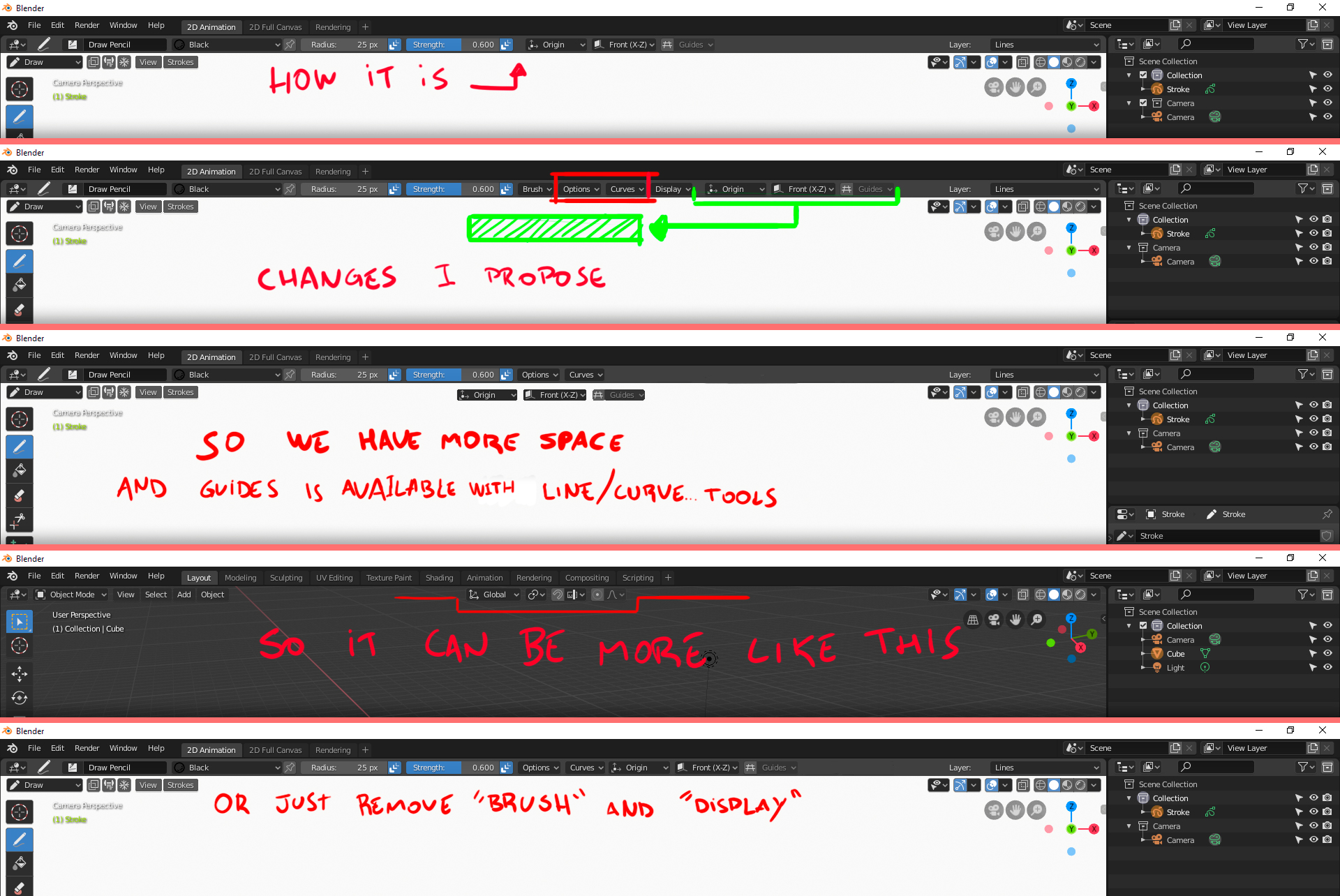
Some changes were done in the last version of blender (blender-2.80-a5b5bd2c24e0 win) in the Grease Pencil User Interface: “Options” and “Curves” menus was removed from the top bar to the “N” panel (sorry, I just forgot the name). And I believe it was not an improvement, because in my personal opinion (specialy this two), are very important while drawing. And there are so many option to improve the strokes there that I believe we should keep this options more accessible. This way also make things easier to new users, so they can find and discover easily this options.
I also understand it was done this way to give more space in the top bar. So I also suggest tweaks to UI that can make the interface more consistent with other modes and more useful. My suggestion here is just move the “Stroke Placement”, “Drawing Plane” and “Guides” down to viewport (pretty much like in 3D view, because from my point of view, Stroke Placement is a kind of “snap”).
But if this broke some UI rule inside Blender, we could simply remove “Brush” and the “Display” menus from the top bar, since they are mostly useless while drawing, what we cannot say about “Options” and “Curves”.
With this options inside the “N” side bar menu, is really hard to tweak this configurations and requires more clicks and buttons to press.
We can see the developers are doing an amazing job in Blender 2.8, and they are trying new things every day! I just think this change was just a little step back, when I think about the drawing workflow.
(I’m sorry for the long text, I didn’t had time to make it shorter).
@Harleya I don’t like the way it looks now, but how will your suggestions D4855 work together with the other elements?
I think we need a completely different approach here.
That’s why I made the patch so people could try it and see for themselves. They don’t protrude any further into the working area so don’t interfere any more than the current arrows.
1 Like
For handlers that make pop out an area that has tabs, I’d prefer using directly tabs with text as someone has suggested. For others I kinda like yours, but find them a little too wide.
1 Like
it was me and I agree here too 
I also think mine are too wide. They gained more prominence than I imagined they would. Will see what looks like if I make them smaller.
Hmm… with them smaller and less prominent they seem to lose any advantage (to my eye anyway) over the current arrows. I will probably abandon this idea for now…
We can minimize the need for the arrow button by implementing this simple proposal I wrote out. The arrow would still be needed on the top, but it would replace the need for an arrow on the right.
Not too wide at all.
Ask a new Blender user if they found the little arrow icons by themselves, or if they learned about them in a Youtube video. My bet is that exactly 0 users found them on their own. 
Me personally, I didn’t even know they existed for a very long time. I thought the only way to reach those panels were via shortcuts. New users usually have difficulty with Blender, and this is just one small reason (pun intended). 
I’m very disappointed that tool settings and options in edit mode and sculpt mode are removed from header. It makes use of the N-panel, which less compact and less organized.
People, who believe that the toll settings in header eats a lot of space, do not hold water. N-panel eats much more space.
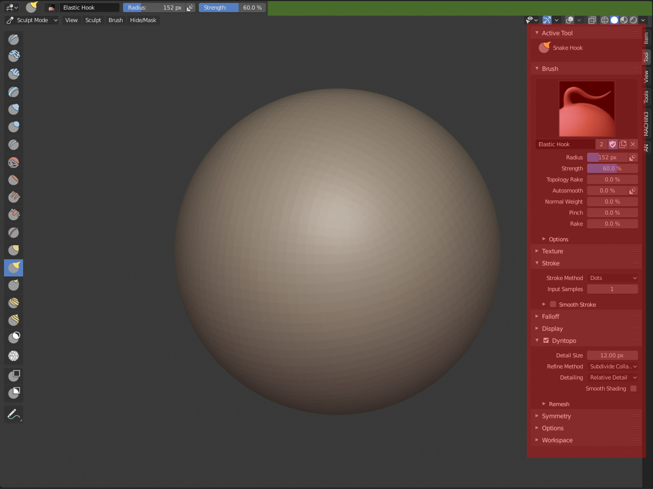
And why it removed? It doesn’t saves any pixel of space. Peoples who doesn’t want to use it, just hides tool settings header completely. Making it less functional, and hold same space, doesn’t make sense.
4 Likes
Looks like a bug. If it’s not, then there’s no point for that topbar to even exist.
Settings should be duplicated inside the topbar, if they’re not it’s probably work in progress.
Brecht has just fixed it.
By the way, I love duplicated things in this case. Many options of customization to meet the tastes and needs of each user in different situations.
The only thing that I would like is not to be too strict with what active tools means, so to allow showing all available brushes in N panel (Tool) and Active Tool tab in Properties editor. In this case, users who do not want to use the Active Tool (T) panel in their paint/sculpt workflow would be satisfied.
1 Like
The bad news is that it’s not actually full duplicates, like, the main tool settings in the properties editor only displays settings from the tools of the 3d view editor, nothing else anymore. That’s insane man.
Not to mention that we have tool settings all over the place and yet the redo panel is only available in the 3d view. Man I don’t know what to say. 