Putting it on the left seems like a weird choice, but I suppose it should be supported. However, if it is never completely optimal because it clashes with the tool shelf, that is up to the user for putting them both in the same place. I think the transparent version clinging to the right of the tool shelf is best. But it also comes to another proposal I thought about after seeing the recent switch to the current implementation of the tabbed N-panel:
I hate the ugly double bar that the N-panel adds, especially when it goes back-to-back with the bar on the Properties panel.
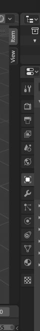
These tabs should always just live on top of the viewport, without a background bar. Furthermore, each tab really should close when you click on the tab again, since this is expected behavior in many applications involving showable/collapsible tabs. And also, the tabs should never go away because that adds unnecessary complexity making the user learn and think about “Where did my tabs go? Why aren’t they where I usually see them?”. They take up such minimal screen real estate (each tab is only 18 pixels wide, and they are usually only near the top of the screen) so it cannot possibly be harmful to keep them visible all of the time. Then that means the confusing ![]() icon can go away, which is being stuck in a very awkward place right now behind the viewport transform gizmo where it is hard to see or understand what it does or why it’s there:
icon can go away, which is being stuck in a very awkward place right now behind the viewport transform gizmo where it is hard to see or understand what it does or why it’s there:

That also helps reduce Blender’s reliance on hotkeys, because the entire functionality of the N-panel can work without ever learning the N hotkey. Tabs can be opened and closed by clicking on the tab names to the top right of the viewport. The N key can then be used to open the most recently closed tab, or to close the currently open tab.