Anyway, it would be nice to see some small updates here, just for a fresh look.


Not too wide at all.
Ask a new Blender user if they found the little arrow icons by themselves, or if they learned about them in a Youtube video. My bet is that exactly 0 users found them on their own. 
Me personally, I didn’t even know they existed for a very long time. I thought the only way to reach those panels were via shortcuts. New users usually have difficulty with Blender, and this is just one small reason (pun intended). 
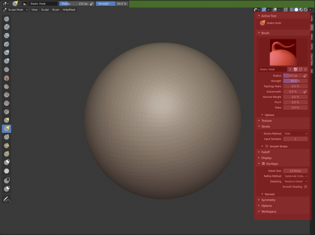
I’m very disappointed that tool settings and options in edit mode and sculpt mode are removed from header. It makes use of the N-panel, which less compact and less organized.
People, who believe that the toll settings in header eats a lot of space, do not hold water. N-panel eats much more space.
And why it removed? It doesn’t saves any pixel of space. Peoples who doesn’t want to use it, just hides tool settings header completely. Making it less functional, and hold same space, doesn’t make sense.
Looks like a bug. If it’s not, then there’s no point for that topbar to even exist.
Settings should be duplicated inside the topbar, if they’re not it’s probably work in progress.
Brecht has just fixed it.
By the way, I love duplicated things in this case. Many options of customization to meet the tastes and needs of each user in different situations.
The only thing that I would like is not to be too strict with what active tools means, so to allow showing all available brushes in N panel (Tool) and Active Tool tab in Properties editor. In this case, users who do not want to use the Active Tool (T) panel in their paint/sculpt workflow would be satisfied.
The bad news is that it’s not actually full duplicates, like, the main tool settings in the properties editor only displays settings from the tools of the 3d view editor, nothing else anymore. That’s insane man.
Not to mention that we have tool settings all over the place and yet the redo panel is only available in the 3d view. Man I don’t know what to say. ![]()
Ok, posted as bug-report https://developer.blender.org/T64652
I’m with you. The reduction of the toolbar parameters appear to be a nonsense decision.
 I downloaded last build and it is complete and working like the old ones …
Mmmm then i will quit the quotes, i’m in a park right now
Settings and related menu entries are now found in the blender icon. It makes sense to group them together, but imo it’s not the most obvios place for it. I searched for it like 10 minutes. It’s not really obvious, that the icon is even clickable.
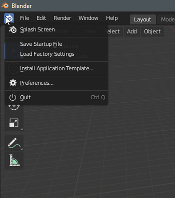
Wow, it’s one those rare occurrences where I’ll say Blender should go standard - menus are important to keep tidy and standard across programs, and even though there are some differing stances between Win and Linux afaik the user pretty much always knows where to find things : preferences are always under Edit, etc. not to mention the other entries under that new menu all relate to either File or Edit. I don’t see the point of this. Another change for the sake of glitter ?
It is a horrific change.
Now three Blender logos in a row.


I can see why they did it though - as Pablo pointed out:
The current File menu is loaded with settings that don’t belong there (like Load Factory Startup, Install Application Template, etc).
I think if they’d replace it with a hamburger icon, it would be more discoverable and this would also solve the “double Blender Icon” problem on Windows…
Saying that it’s against the standard is not as true as I primarily thought it was. There is no real standard for this. Options are all over the place either in “File”, “Edit”, “Extras” or Appicon Menus in various softwares.
I think that most of those options would fit well in the Edit menu grouped together. It doesn’t really matter if it gets a bit longer, it’s not a panel that one opens so often.
The only exceptions for me would be “Quit”, that I’d put in the File menu, and the splash screen, that I’d put either on the Window or the Help menu.
hahaha, it took me 3 days, thinking it was a bug, I even reported it
![]()
![]()
I agree. The consolidation of preferences under the Blender logo is not obvious. A hamburger menu would be a much better choice, although to be honest, even that seems strange. I think the key here is “avoid things which aren’t obvious.” If you have an industry-standard menu like File, Edit, Window, etc., your options should be stored under one of those. Not a logo or even a hamburger icon.
I don’t think anyone’s disagreeing with that.