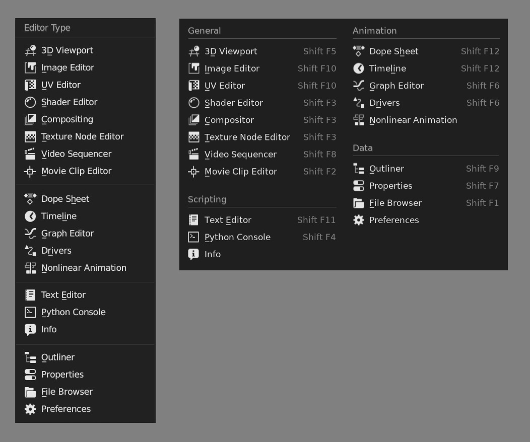
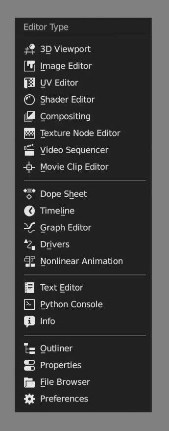
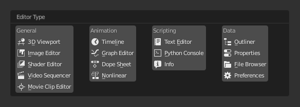
Obviously the main reason the Editor menu changed was because it was getting too long and we don’t want to scroll to get to these options.
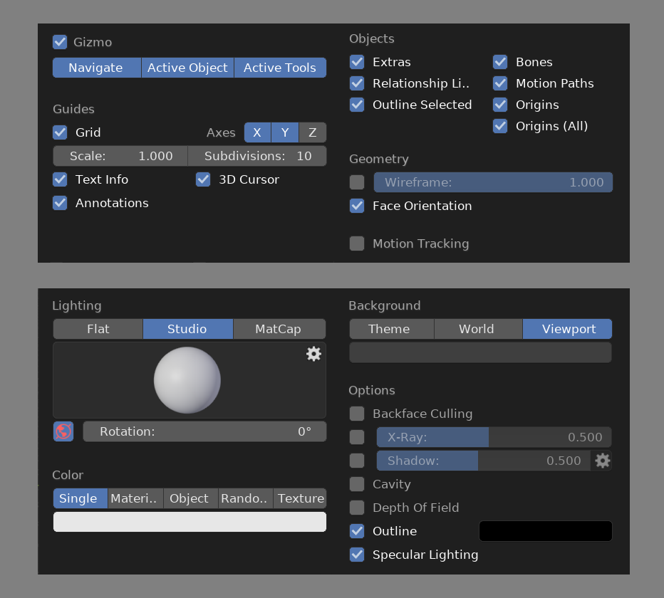
Popovers that are closer to monitor proportions are more likely to fit without needing to hide/show items or require scrolling. Following are Overlays and Shading popovers aligned more horizontally:
As you saying that menu is not used often and therefore not important, while also complaining the new arrangement is hard to read? If it is not used often and not important then it shouldn’t matter as much how it looks. Just not sure what position you are putting forward.
And it would also be harder to select one option and read all options if it were a vertical list where you had to scroll to see the items on the bottom and therefore can’t see all items at once.
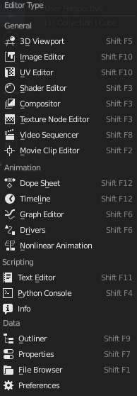
The sample that @jenkm posted for the vote (early in thread) would not have fit on a screen with less than about 1200 vertical pixels. So it would need scrolling on even a 1080 monitor.
Like I said. It’s not important. But if i no one program use multiple columns list is for one reason, i’ts hard to find things in multiple columns and it’s really easy find something and remember in only one column.
It is most likely just the greater separation between sections. Being able to digest the list in smaller parts.
So it might be my old eyes (I now need reading glasses for work) that explains why I’ve always felt the separators in menus (and the Properties Tab List) aren’t strong enough. For me I need separators that look more like this:
I feel like memorising the position of something in a long list is way harder than if that list is split up into several groups.
I prefer the horizontal based menu because it’ll be easier to memorise and parse.
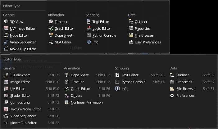
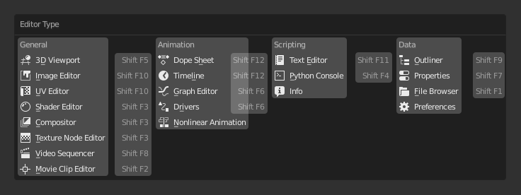
FYI it’s not a unique-to-2.8 thing, it’s in the 2.79 experimental (gfx card forced me onto experimental, has a few other menu movements that are awful, though. Edge data submenu I’m looking at you…)
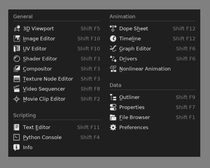
2.79 (experimental) vs 2.80 (with some colour, I’ve got my icons installed)
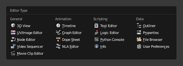
There’s also the idea of categorizing to make search easier. But it doesn’t work, especially for beginners. Only animation group is clear and logical (well, maybe scripting too), the rest are too abstract.
I use a 2D program where exactly 30 blend modes and this is the most ordinary menu, and no problem, it always fits into the screen. The blender has 24 blend modes, and for some reason it broke this menu in half. And in a completely illogical place, between Hard Light and Vivid Light modes.
summing up,
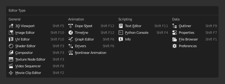
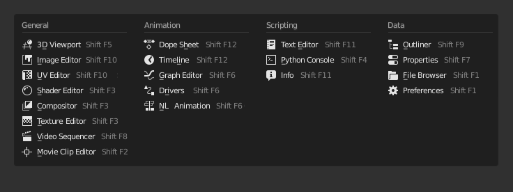
I don’t think the extra space to show shortcuts is a real problem …
the real shortcoming is the lack of colors that help to distinguish and better identify the icons.