I followed https://developer.blender.org/T61209 ( Always write unused IDs on save ) but now there is not any more activity: I’m very interested in the topic, where is the discussion going on now?
Thank you,
Rickyx
ps. I like the security pin, specially in comparison with shield.
Why does the visibility of modifiers have a chain as an icon?
It is so similar to the share link of this post … ⇒ … ⇒ … ⇒ … ⇒… ⇒ … ⇘
After the last icon set update, the question ain’t valid anymore. Just wait until the repository update.
Inspired in Avira antivirus?

1 Like
How shortly is shortly? My impression was this wasn’t happening for 2.80
1 Like
Slightly off topic but still a bit icon-related…
We have these little arrow things that show up when we hide a side panel or header. I’ve always thought they look a bit chintzy somehow.

How should they look? What kind of shape signals what they do?

14 Likes
And another question, but definitely icon-related.
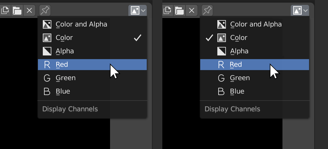
For Enum lists we are not currently indicating which item is already selected. If we were to do so, I don’t think that we should use our current “checkmark in a box” icon (CA14) because it would look like an icon beside an icon, rather than a separate indicator:
Not sure which way to do it, but I don’t think either of these options would look right with current checkmark. I think it needs something simpler, like this:
PS: I notice you made me a new “collapsed menu” (hamburger) icon! Thanks!!
12 Likes
I totally agree. Bright saturated red always looks like an error message, like, everywhere in nearyl every context. Just desaturating it already helps, I think.
5 Likes
I am wondering this as well. @billrey @jendrzych, is it really intentionally? The chain icon doesnt make any sense in most contexts.
As I already mentioned, the Monitor icon was restored. Fresh icon set sholud get its way to the repo soon.
Oh I’m sorry, I missed that.
Can you explain what is going on here?
The OUTLINER_DATA_SURFACE icon appears to look like a text paragraph? What is this meant for?
It is so old that I forgot about it … The purpose of this icon is “Complete Match (string search)” Designed based on this task: LINK
but where do we use that, and why did you replace the OUTLINER_DATA_SURFACE icon with it?
I created the icon at the very begining of the icon set redesign. Just after I found the task I likned above. Many things have changed since then, so it’s possible, that the veri pictogram ain’t needed anymore. Besides it looked like the OUTLINER_DATA_SURFACE isn’t used, since Surface ObData used (and still does) Curve ObData icon - T3. Shall the Surface ObData be restored in the T10 cell?
I think so, yes. Currently that is the OUTLINER_DATA_SURFACE icon, which seems wrong. I can make sure we use that for Surface object data
Ok then. I’ll fix it in a few minutes.
1 Like
BTW, we’ve similar problem with Text ObData, which uses T3 Curve icon instead of its own T9 design, while the Properties tab calls W5 pictogram. I think T9 should be replaced with W5. Isn’t it?
1 Like
Yes, I think you are right. It’s a bit messy