Few space, a lot of operators needs 15-20 parameters, other needs hundreds, not only 2-3.
Dynamic Multiple rows is a bad solution. A panel where you can’t figure the position of the elements is a bad solution.
Visually is a problem because is a constant popup for users.
Last Operation and tool settings still having same problems, active tools are not operators. A lot of inconsistencies.
Probable it need a lot of API changes. A lot if we think that devs didn’t change simple elements like menus of scene/viewlayer because lack of time/resources and you are asking by a floating panel. When it was a main problem of blender.
A lot of people still asking for the N-panel with tool-settings for a lot of reasons.
Try to think, what less than 10 guys think in a forum is not what thousands of user want in the real life.
I get the idea. popover tool settings definitely has cons.
Plus let me clarify that I posted completely different ideas as well and I don’t believe the ideas suggested here would be the best solution. It’s just about thinking and brainstorming how Blender could get better. One of the reasons why Blender is awesome is because there is a huge user community, and the thread within it shouldn’t be disregarded as “less than 10 guys”.
What I do believe though is that the initial post is very persuasive and the tool UI duplication problem actually exists.
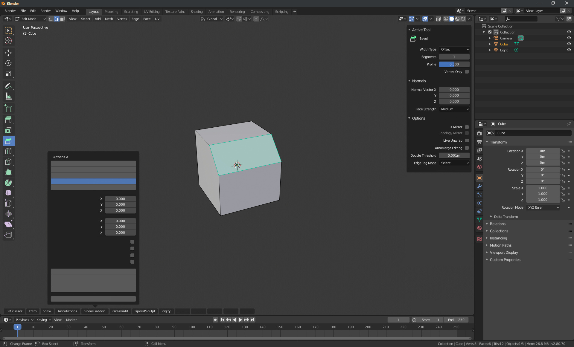
Like you said, the current tool settings in the header also cannot show more than 3 parameter in some cases(for example when the workspace is divided into two horizontally like this) which is a problem. It shouldn’t be kept that way. Currently, it’s not so user friendly.
The objective of the header was never to show all the options of a tool, but to give access to the most common or important parts. In the same way that in photoshop we don’t have access to all the tool options because we want to use the brush.
It is not a problem because there is simply NO SOLUTION to this. There are addons that need hundreds of options, presets, different “tabs”… and there is no way that one row can fix this in a good way.
Currently there is only one panel that really repeats itself, which is the one we have in the sidebar and in the properties editor. Returning to the photoshop example, in photoshop you can configure many parameters both in the toolbar and in the panels to configure the brush. And nobody has died, at least as far as I know, for this reason.
Yes, some can repeat a thousand times that adjust last-operation is the same as the active tool options but it is not, no matter how much it is repeated. An active tool is not the last operator used.
And as already said, the only coherent and functional solution is to remove the property editor. Because it doesn’t make any sense, but obviously some users don’t want this either.
There is no duplication problem)
During intensive/complex work the order of tools is constantly changing,
there is bevel after extrude after grab after scale (workflow-oriented approach),
not extrude after extrude after extrude after extrude (tool-oriented approach).
There are two types of tools systems.
The button tools system is for beginners. It allow to users to get into 3d, to make them understand that there is “extruding” and “beveling” in 3d modeling through interface. Those tools are not designed for intense work, because it takes too much time to switch between them, and they forces using gui. The button tools represents a tool-oriented approach.
The shortcut tools system is for advanced users. It is used by people who already know the difference between beveling and extrusion, because they have used them thousands of times, and the only thing that interests them is their quick call without a gui and widgets.
Shortcut tools prioritize quick access to a mixed order of tools during an intensive workflow. The shortcut tools represents workflow-oriented approach.
Previously there were only advanced system in Blender. It allow to work faster than in other software, but as a system it is not obvious for new users - basically, you have to be a 3dsmax user for decade to understand its benefits (there was time when 3dsmax was showing random hotkeys on a splash screen to make users learn them. The layout wasn’t good, but the idea of using hotkeys was nice).
So button tools system was presented in Blender to lower entry threshold, as well as industry standards hotkeys which are pretty much inconsistent, but was learned by lots of people since 2002.
There are not two tool systems. There are the Tools and there are Operators. Operators are not tools. Tools however are very likely built upon operators(without looking at the source so do take that with a pinch of salt).
TL;DR Neither is a replacement over the other. And tools can have their own ‘speed’ advantages over the operators in the right circumstances and vice versa.
Well, technically, both systems are using operators.
The Shortcut tools system consists from pure operators invoked by shortcuts, which is cleaner and faster, but requires both hands, and the Buttons tool system is a special realization, that consists from operator+button+widget, which makes the use of operators compatible with one-hand working style, which is more convenient for a new user - for learning process, lowering the entry threshold.
Yes, Button tools can have speed advantages, but in very limited cases, because widgets that initially provide visual feedback start to distract as your overall speed increases, and you stop needing them at some point.
This is not operator vs tool thread. In this context, tools means both operators and toolbar tools. The point here is that both have 4 separate places for their settings which all can be displayed at one time, and all of which display the same set of settings in different UI layout arrangement.
Yes, we know that.
I answered specific post about tools systems.
In fact, only Button tools have 4 places, while Shortcut tools have single placement (operator).
I think Button tools was placed to 4 places to provide the ability to access for different approaches.
N-panel is for fullscreen (useful, for example, for sculpting), properties placement is used when N panel is used for Item tab (useful for modeling), topbar placement is for hotspot settings only, since it is incomplete, and operator is for an actual operator, for realtime control.
I guess it was made to provide to user the ability to chose the best way that fits workflow requirements.
Ok, sure. My point was that I don’t disagree with your argument. I was just explaining to him I meant “tools” in different context.
About the flexibility of the tool properties placement. I agree. I am just really not happy that it’s 4 different unique UI panel systems. I’d like more flexible solution, where it would be just a single type of UI panels, which could be “instanced” on any place you want, and would rearrange the UI controls depending on if it’s docked on the side of viewport, top of the viewport or into properties panel. Right now, I believe it requires at least 3 different unique python implementations.
About the flexibility of the tool properties placement.
Indeed, it can be confusing, but blender have static window arrangement because of custom UI.
This is because blender is cross-platform, so this solution allows to it to be stable independently of platform and its window server.
For example, 3dsmax is win only, but I guess you remember how long it took to it to brew a proper support for floating toolbars.
It is pretty much hard to find crossplatform software that supports things like floating toolbars properly, usually it takes a lot of time to brew such a thing.
So Blender has got such kind of a solution, that works stable at any platform, but looking strange.
I see. I also understand that tools and operators are intended to be used in different ways(pros vs beginners). Though I believe someday tools should become more hotkey-friendly(mouse-friendly, too) and become one elegant option for all, It is true that this thread is all about tool properties duplication problem. I’ll try to stick back to the main topic.
Speaking about addons, while using addons that integrates into the tool system it is easy to spot that they have completely different UI between the header, sidebar and properties editor. Not only this duplication is toxic for users, but also for addon developers.
Plus let me point out that the top bar was removed(actually moved to the editors’ header) in 2.80 beta stage not only because it was taking up so much space but also it was unclear which editor should the top bar tool properties should represent. Currently this problem applies exactly same to the properties editor.
Say, if you have UV editor, image editor and 3D viewport in a single workspace all with their own active tool, which editor should the properties editor’s tool tab represent? This is the reason tool properties shouldn’t exist in the properties editor. Tool properties are per editor, unlike objects. Properties editor exists to represent properties of the active scene, world and objects, not other editors.
Of course, footer is the opposite of the header. It is located at the bottom of the editor.
The underlying principles stays the same:
No tool properties at the header, properties editor. Only at the sidebar
Sidebar with only tool properties applies equally to all editor types, such as UV editor, shader editor, image editor, etc.
This additional proposal comes out from this simple question: If the bottom part of the editor is empty and the right part(the problematic sidebar) is so crowded as described in this sidebar panel design thread, why not make use of the bottom part as a footer? It perfectly makes sense with the new concept called popover newly introduced in 2.80.
This UI is really simple, too. Even more than the current one.
Tool related things are at the left and right
Menus are at the top and bottom.
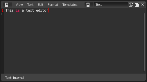
Also this footer thing is not something brand new that came out of nowhere. You can see that text editor already has a footer. The name of this thing is actually footer, if you right click on it.
This Exclusive sidebar tool properties + Extra footer menus might also be applied equally to all editor types.
In real-life scenarios and workflows:
While modeling or sculpting or painting, tool settings will be on the right sidebar. Pressing N key, this sidebar will hide and reveal really easily. Hide it if you want a bigger view, show it if you want to tweak tool options.
When installing many add-ons as many as 10 or so, the footer will still be able to handle them. It will be able to show all add-on names because it’s long horizontally. Also, no vertical text.
Sidebar can show way more tool options than the header. Easy on the eye.
P.S. Here are the reasons why header + properties editor tool settings should be removed:
Header tool settings makes header 2-lined, which is not so ideal.
Header tool settings cannot show all the sliders and buttons if the tool has many options.
Properties editor tool settings is confusing because it is unclear if you have multiple editors with multiple active tools at the same time. This is also why the top bar was removed in 2.80 beta stage.
Current 3 duplicated tool settings UI is toxic for both users and add-on developers. Add-on developers using the tool system has to deal with 3 different Python APIs and UIs.
I see that many other 3D softwares such as Cinema 4D or Modo has separate tool settings editor(in Blender terms). However they also have separate tool editor, outside of the 3D viewport editor.
Blender is different. tools belong to the editor. Therefore tool settings should belong to the editor too. In Blender, there are no such thing as the tool editor.
I want to point out that what the major softwares do is not always the answer. It is sometimes, but not always.

