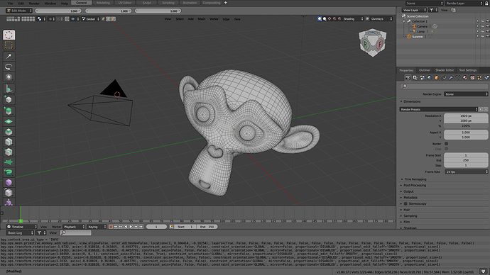
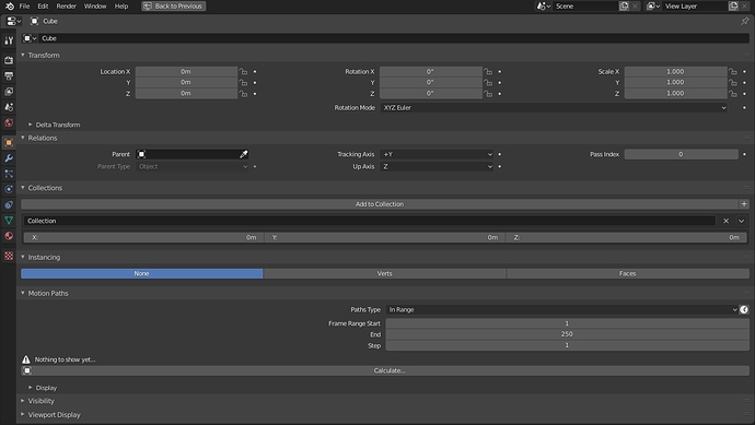
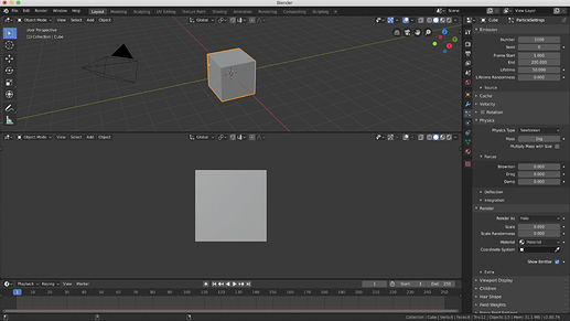
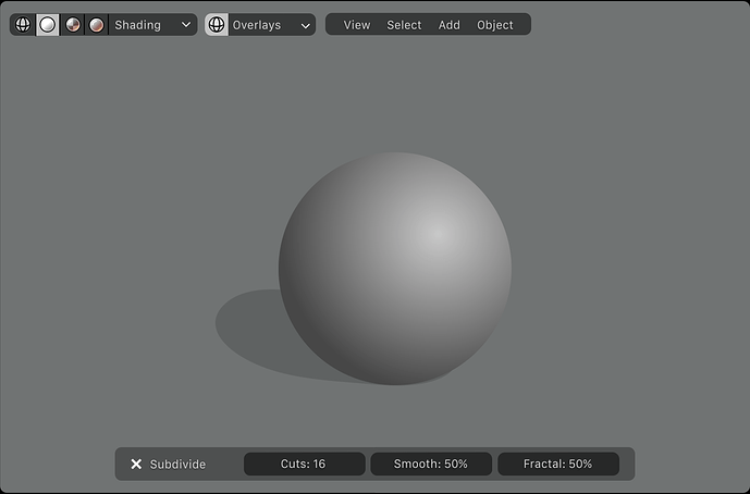
well, meanwhile ideas and refinements emerge …
the rest remains to be hoped to be taken into consideration
If that minimized panel can be used like in Mitev’s prototype by creating pop-up screens when clicking on the small icons, it would make it very useful in fullscreen mode. I think that would be the ideal compromise between keeping the UI simplistic for newcomers while allowing the more traditional interface to stay consistent with previous Blender versions. This is the kind of flexibility I like. 
honestly I don’t see any use to have popups, I prefer the classic display, click and the list of panels appears, as it is now in the sidebar
maybe taht could more possible, that show only the list of icons and if you click in some icon the areas expand and when you move the mouse areas go back to same point.
To summarize, the problem is that Blender’s tool system is too duplicated. A lot.
There are mainly two issues:
These adjust last operation(redo last) discussions are also because of tool duplication. This wouldn’t be the problem if the edit actions(such as bevel, extrude, inset, etc)were properly implemented to the 2.80 tool system. They(hotkey actions such as B, E) still use the operator, not the new tool system. If the action needs adjustments and sliders, it should use the tool system, not the operator and adjust last operation. Some tasks(such as save all images) are better suited for operators, but many others(which needs options and sliders) are better suited for the new tool system. I agree that adjust last operation is not the right thing to exist in Blender. It’s a funny thing.
On the other hand, the tool system has too much settings duplicated over the UI. A good program shoud provide one elegant way to get the job done, not many confusing ways asking the user to choose one of them on every task. (This is also the motto of Python, which makes it a beloved programming language)
That consideration is something subjective for each person, right?
What happens if you do not agree with what the UI team considers is the only one elegant way to do it, and then you have no other alternatives?
That consideration is something subjective for each person, right?
No, it is one, carefully thought-out design, suitable for all users, as in all other programs.
What happens if you do not agree…
Nothing, like in all other programs, you just work and don’t worry.
Actually, just like everything else in Blender works in some way and has no other alternatives.
In that case I expect that you just work with actual system and don’t ask for changes in tool-settings system.
Ok, so I think that the only elegant way choice form the UI team should be to leave Tool settings only in N panel. As I understand it is what blender studio artists suggested. In addition it is a panel, which can be quickly deployed/collapsed with button or shortcut, and also quickly position it to the right or left of the viewport.
yep ,The problem of duplicating the tools is, as I have already said a few posts above, is that most of the buttons pannels of property are functions exclusively of the 3d space wiew, and being in a completely different space view, conflicts arise when working in full screen mode.
This is a problem rooted in the beginnings of blender, because it was originally designed with two “work sections”: the properties of the tools and that of the 3d view.
To make everything conceptually clearer and more explicit, the property pannels were initially a sort of bottom sidebar of the 3d view. (in reality there was also the top info and setting sidebar but closed)
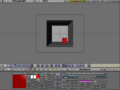
Then everything has evolved over the years, many other work modes have been included, but initially there was this area “of properties” and this area “of editing views”
At a certain point he decided to transform this area of the properties into an “interchangeable space window like that of the 3D view and others” in order to make it more flexible, but in doing so, he lost that characteristic of being the exclusive area of the properties that in the end it was more like the one in 3d view …
and over time the sidebars were added …
then blender has continued to evolve a lot but this ancient “defect” has remained rooted.
So to make a correction “of the old design flaw” it would be necessary to make most of the properties of the 3D view, exclusively local to the 3D view, and that is why I consider the proposal to make the buttons property bar and the addons bar become something unified and transport all the property panels that act exclusively with the 3d view in the N sidebar, but keeping the interesting proposal of @dotails & George.Mitev feasible in some way, so that the correction of the architecture of operation can be done without causing big visual dissento on how it is worked so far.
I agree. I had the same thought that properties editor should be integrated to 3D viewport, since one of them cannot work solely without the other one. Your suggestion is very logical and makes sense. I hope to see it applied to Blender someday.
Aside from that, This duplicated tool settings problem is the most urgent problem that needs to be fixed, maybe not in 2.80, but in 2.81. Just like you said, one wrong concept remains in Blender for years and years. Since the new tool system is introduced, we should make this new concept nice and tidy.
2 weeks before the UI freeze, the toolbar suddenly became the header in (only some)editors. This means there was not many time to review the UI of the tool settings. We definitely need to get it fixed in 2.81.
Let’s not forget and make our voice in 2.81 development. Until then, let’s collect our ideas to help developers get inspired. After all, this is one of the most popular threads inside user feedback category.
properties editor should be integrated to 3D viewport…
I totally disagree. What if I need two small 3D viewport and large Properties editor, it will be impossible.
…since one of them cannot work solely without the other one
The same can be said about others; the animation editors cannot work solely without 3D viewport.
The problem is the concept of “editors”. Look at other 3D apps (Cinema, Modo, Maya), 3D view is a separate panel, the toolbar is separate, the properties panel is separate. You can arrange them as you like. Panels can be combined/stacked into tabs, and so on.
In short, separate rather than combine. Abandon the concept of “editors”. This will solve a lot of layouts problems.
This was proposed in codequest to solve topbar problems and we never see an answer about that. Stack editors, put panels like editors, also the new status bar,…
I see that UI thing is very controversial, and there would be a better way to improve the overall usability. Yet, I wasn’t trying to talk or argue about properties editor or concept of editors.
What I wanted to point out was the problem of the tool settings. As the title of this thread indicates, main subject is about duplicated UI of the new tool system introduced in 2.80.
P.S. Now I understand that many other editors also rely on 3D viewport. Maybe integrating 3D viewport and properties editor wasn’t a good idea.
I’m not sure what you mean by large property editor
do you mean something like that?
Jokes aside…
in the previous comments my proposal is to unify the N sidebar and the propery pannels in the 3d space window, but at the same time to have options in the menu of the 3d space window that allow to hide the 3d view and make only the “sidebar of the properties” visible…
in practice the current property space window, it would become a 3d space window with the hidden 3d view and only the buttons bar and the property panels are visible.
…so you would have the exact same situation you would have now …
so those used to the old settings would change almost nothing …
but at the core functionality level the entire blender architecture would become logically more coherent.
the problem of tool settins in too many places, would disappear, or rather it would be a choice of users to have panels in more places, and not “a design flaw”
just imagine the scenario:
you will be full screen with the 3d space window, just press N and you have all the property panels available. At present you are forced to access it only when you are in “many window mode” …
this is the design flaw.
I’m not sure what you mean by large property editor.
In such cases, there is a lack of vertical space for the toolbar and sidebar inside each 3D view. And moreover, you have, for example, two identical toolbars and they are both cropped.
That’s why I think the toolbars and N-sidebar should be separated from the 3D view.
…it would become a 3d space window with the hidden 3d view and only the buttons bar and the property panels are visible.
This of course is possible, but it will be very very strange design. I think “3D Viewport” should be a 3D viewport and contain only the 3D view settings.
Yes, I know that there were problems with switching tool settings while using multiple editors and so the tool settings were moved to the inside of the editors. But this way also does not work well and may be even worse.
You will be full screen with the 3d space window, just press N and you have all the property panels available.
Yes, of course, such capability is necessary, but this can be achieved in other ways. It seems you are thinking within the current design (editors, sidebars), while I’m talking about a completely new layout engine.
Take a look at how the layouts works in the Cinema, Modo, Maya and other 3D apps. Where the tool settings are located. How fullscreen (maximized) mode works. How they use non-modal floating windows/dialog. They all have a similar approach to each other, and obviously it’s not because they lack imagination.
Blender has always had its own operating paradigm, which has always had its efficiency in terms of workflow, even better than the others in this specific section.
So in this sense, in my opinion, it makes sense to solve the gaps in illogicality and make its personal workflow more coherent and not try to imitate dynamics that come from other worlds … it was tried with the global-top bar, and blender was close to losing her soul with the inconsistencies and conflicts of functioning that the top global bar had provided her.
edit:
thinking about it better…
with the new preconfigured workspaces of blender 2.8, just one click to switch from one pre-configured work mode to another and everything is more immediate, and therefore even more in this sense, if I had the property panels integrated in the sidebar, I could configure a 3d full screen window as one of the workspaces, something I can’t afford to do at the moment due to the lack of accessible features.
between the dope sheet space window and the graph editor space window
they have already found a truly intelligent and effective solution by creating a switch crtl + tab shortcut between the two space windows …
so in this sense I could think that they could create a similar and efficient solution between the integration of the 3d view space window and the property pannels space window.
These two spacewindows must be much more integrated each other, just to resolve the conflicts of illogicality, there are no other ways.
But at the same time, the advantages of the current forkflow should not be upset. (also in evidence of the cases you pointed out)
There was this thread talking about 2.80 tool settings UI development at the early stage. Although many of them were properly visualized, this was what made Blender tool settings overduplicated.
https://developer.blender.org/T55386
Moreover, the tool settings was also added to the N-sidebar, although it wasn’t planned earlier in the link above.
During the development, the topbar was removed due to its global characteristic, but why not the tool settings tab in the properties editor?
And why do we have to have 2 tool settings(header + N-sidebar) in a single editor? It really makes no sense.
It seems like the development lost its way in some way, especially in the last few months.
In terms of brainstorming, there was one image that seemed pretty promising.
(This image is from https://developer.blender.org/T55386)
This might be the answer to the tool settings for many reasons, although this image was originally about redesigning adjust last operation and (sadly) never came out of the box.
- It is local(per editor), not global. That means it logically makes sense.
- It indicates whether the tool is active or not. It will automatically be hidden if the tool is deactivated.
- It is extremely simple and intuitive, since it is basically one row.
- Shape and size of the editor doesn’t matter. If the editor is too small horizontally, options and sliders might go into multiple rows. If the editor is even smaller, this might be able to shrink into a round button which user can click to see the popover containing tool settings.
- It can be equally applied to ALL editors. Consistency is preserved.
- Adjust last operation and tool settings can finally be integrated(at least in terms of design).
- It doesn’t need too many UI changes. Only little effort and coding would be required to visualize this UX.
- It can allow N-sidebar, header and properties editor to go back to what it was before. Duplicated tool settings problem can be solved.
Because same people that complain about anything that is not a Maya&C4D copy&paste want the tool-settings there.
