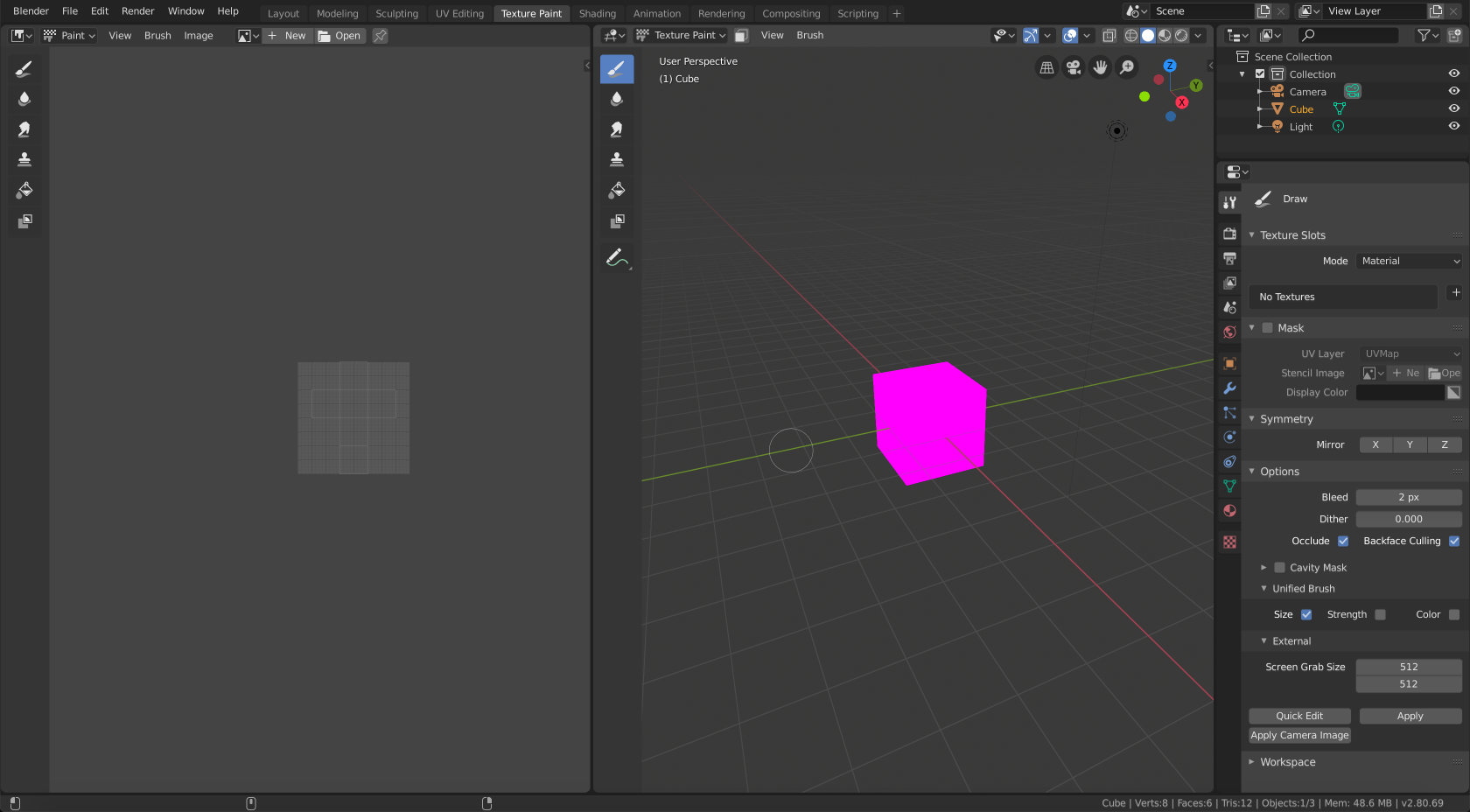
The tool tab of the properties editor was added since top bar space was insufficient, but that’s not longer the case since top bar is off by default and tool settings have been added to the properties panel.
What I propose is a simplification and a new standard:
Tool tab from properties panel would be removed. It’s not very useful anyway, as it enforces a choice between being able to edit some properties, and being able to interact with the tool settings.
Properties panel will be open by default at “Tool” tab.
Introduce a common standard for every editor, where Tool panel displays the tool and properties panel displays the properties of those tools.
I definitely do not expect this to happen in time for 2.8, and it would also require this proposal to be executed first: Solution to the sidebar panel design as the current properties panel design is still outdated, in 2.79 theme, compared to 2.8 themed tool panel and popover panel design. But this would make the user interface cleaner, with everything having its appropriate place, and it would reduce confusion, caused by for example tool settings in property panel working only with 3D view, while all the other editors have, or will have tools as well.
A simple new concept where in every editor, left side panel lists all the tools and right side panel shows properties of the active tool. No more mishmash with 3D view editor exceptions.
EDIT:
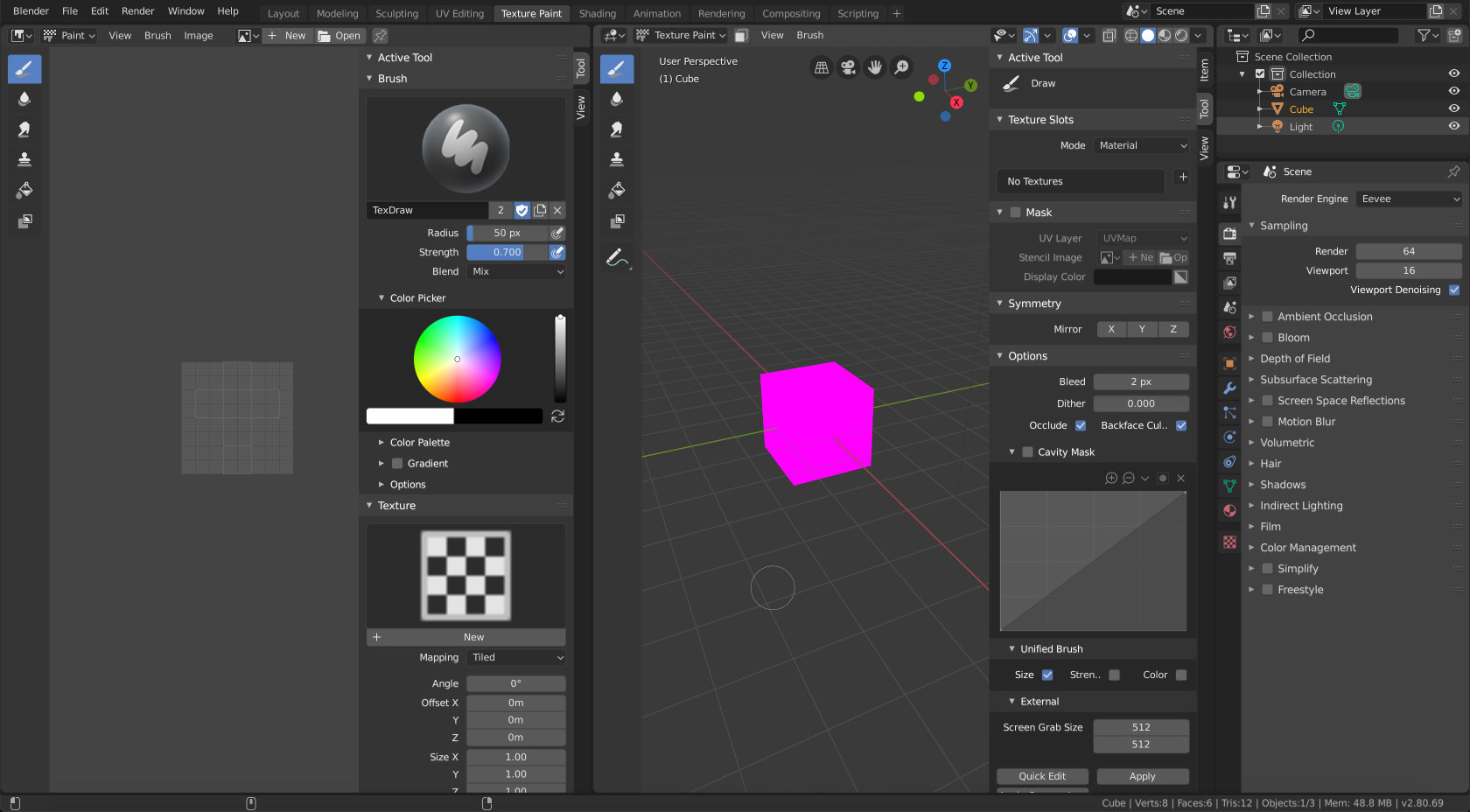
An illustration of how that would work with the improved properties panel look:
I can’t see much of use for properties panel tool settings, but I think that top bar can be useful at times. That being said, I personally would not miss it much either.
As a c4d user, the tool settings in the properties editor is the most trouble-free space for it.
Anywhere else is just not intuitive enough. A duplication of it in the N panel can exist because of the full screen users.
What I really don’t like is that now the tool settings in the properties edtor only displays the settings of the tools of the viewport, instead of show the settings of everything like before. This is a huge mistake.
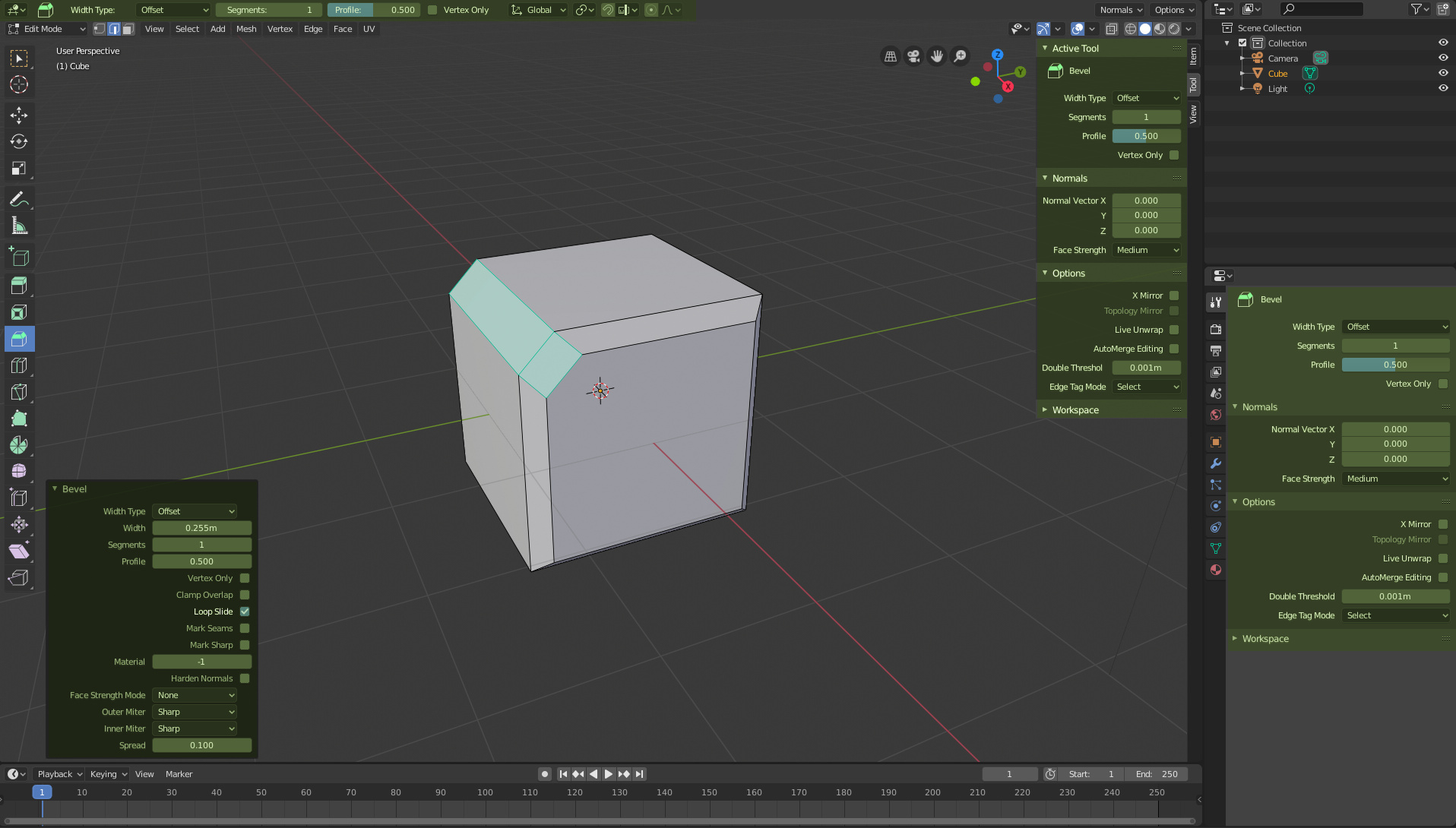
The redo panel is necessary, whether you like it or not, because it’s not about the tool options, it’s about the last operation, and they can’t be mixed for obvious reasons. Because your last operation doesn’t even have to be an active tool… In addition, for example, bevel’s active tool has 4 options. The redo of bevel tool has 15 options.
Basically, they are panels that look alike, but have nothing to do with it.
The property editor panel, well, okay, it could be removed, or not. At this point in the game I don’t care. Personally I think it has proven a failed place because it is not functional and having the Sidebar and tool-settings … no one is going to use it beyond the personal mania. Besides turning the property editor into something that it is not and breaking the logic and coherence of the interface. But as I say, at this point, I don’t give a damn.
Now, to tell you the truth, I don’t think anyone thinks about touching such a thing. Because it would be to give the final kick to the essential points of the redesign of blender2.8… And the truth is, I don’t think it will be accepted.
To reform the sidebar, yes, there are already many proposals, and the main thing that the new design must solve is the problem of the quantity of eyelashes. The theme is secondary.
I never said redo panel should go away. It just would not show up by default if you had the properties open. And you could easily change it that it always shows.
It’s not open by default, only showed. And it’s a good thing for newbies. If a pro user don’t want it because they want a clean interface they can hide it in two clicks.
And like I told. Redo panel is not the properties panel, is not the same and can’t be mixed.
I am not sure here… The properties panel is a subset of redo panel options, containing those options that are saved inbetween the tool uses. I honestly think that the right side panel should show the same thing as redo panel, by that I mean all option, but visually distinct between those that get saved for next tool use, and those that get abandoned as soon as you perform next action.
So, for example, If I have a active tool selected and I do a merge ¿What I must to see in tool settings? the parameters of the last merge operation or the parameters of the active tool that I want to use in my next click?
And other problem… If I made a bevel, with 5 subdivisions and my next bevel need 3 subdivisions and I change the “subdivision” parameters in the properties ¿What I change? the next operation or my last operation?
lol. In other apps, the redo panel doesn’t exist, everything is done in the properties panel. In that case, there are option for both cases, the next and last.
I totally agree with the initial suggestion of this thread. tool settings should be unified inside the N sidebar because tool setting is per viewport, not global. Properties editor should only show properties of the item(which exists globally), just like 2.79.
Also, putting the tool setting inside the header doesn’t seem like a good idea…and this is why.
Many other editors instead of 3d viewport doesn’t have this concept and consistency between editors is now gone.
Header should be only one line. User shouldn’t be like “Let’s see, what I’m looking for should be at the bottom of the header…”. Buttons divided into left(menus), middle(pivot stuffs), right(view setting stuffs) is a bit complicated already, although it is usable at the moment.
Tool settings at the header needs quite a few clicks to make it hidden or visible (while N sidebar needs just a single N click). When not using the tool, it is very likely to be a waste of precious space.
Additionally, yes, not-rounded corners of the N sidebar looks outdated. This should be handled as soon as possible before the UI freeze.
All default workspaces have the Properties editor, probably most users have this editor open all the time. Also, for example, this editor can be placed on a second monitor, so it is more flexible in general.
 In that case yeah, the redo panel would stay, just minimized
  That’s the worst 3d app available at the moment (workflow/UI wise).