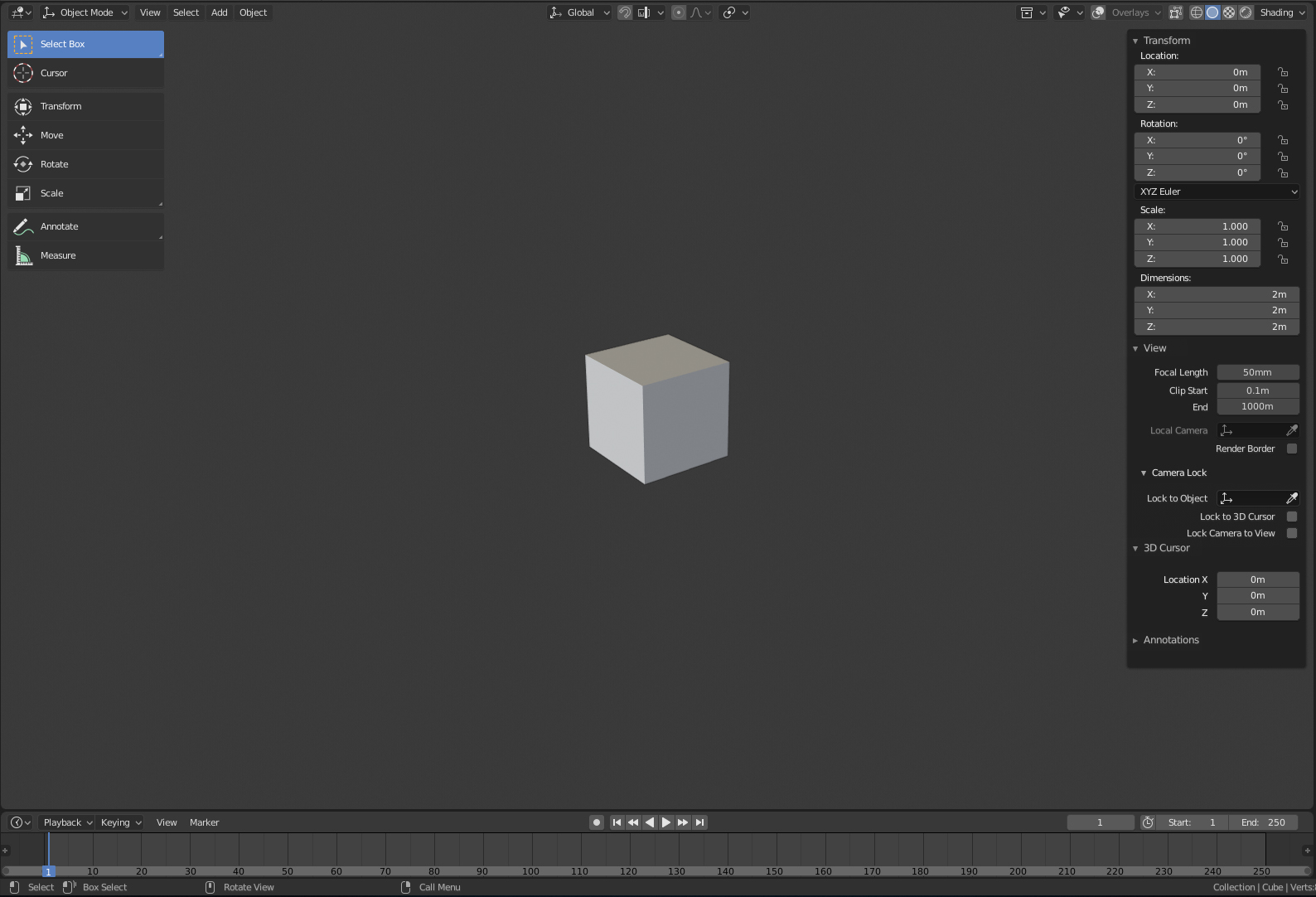
sidebar panel is one of the last things in 2.8 that still looks very Blender 2.5. I know it’s hard to solve this as there’s a lot of important tools and it will be also a primary place for all the view3d addons. But at the same time, it looks quite jarring every time it pops up. It doesn’t really look like docked panel within the UI, since it’s not been made transparent outside of the used area, and its design doesn’t fit very well with the rest.
So what I propose is a hopefully simple set of visual changes that will make it fit a lot better with 2.8 overall style:
Offset the panel a few px from the viewport edge, the same distance tool panel is.
Round the edges to match the roundness of the tool panel
Use the popover menu system instead of the sidebar menu system
(Possibly tricky) Implement roll-out functionality to the popover UI system to allow collapsing unused sections
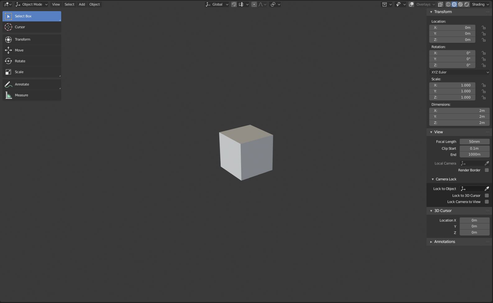
Here’s how it could look. I simply used the popover style for the sidebar:
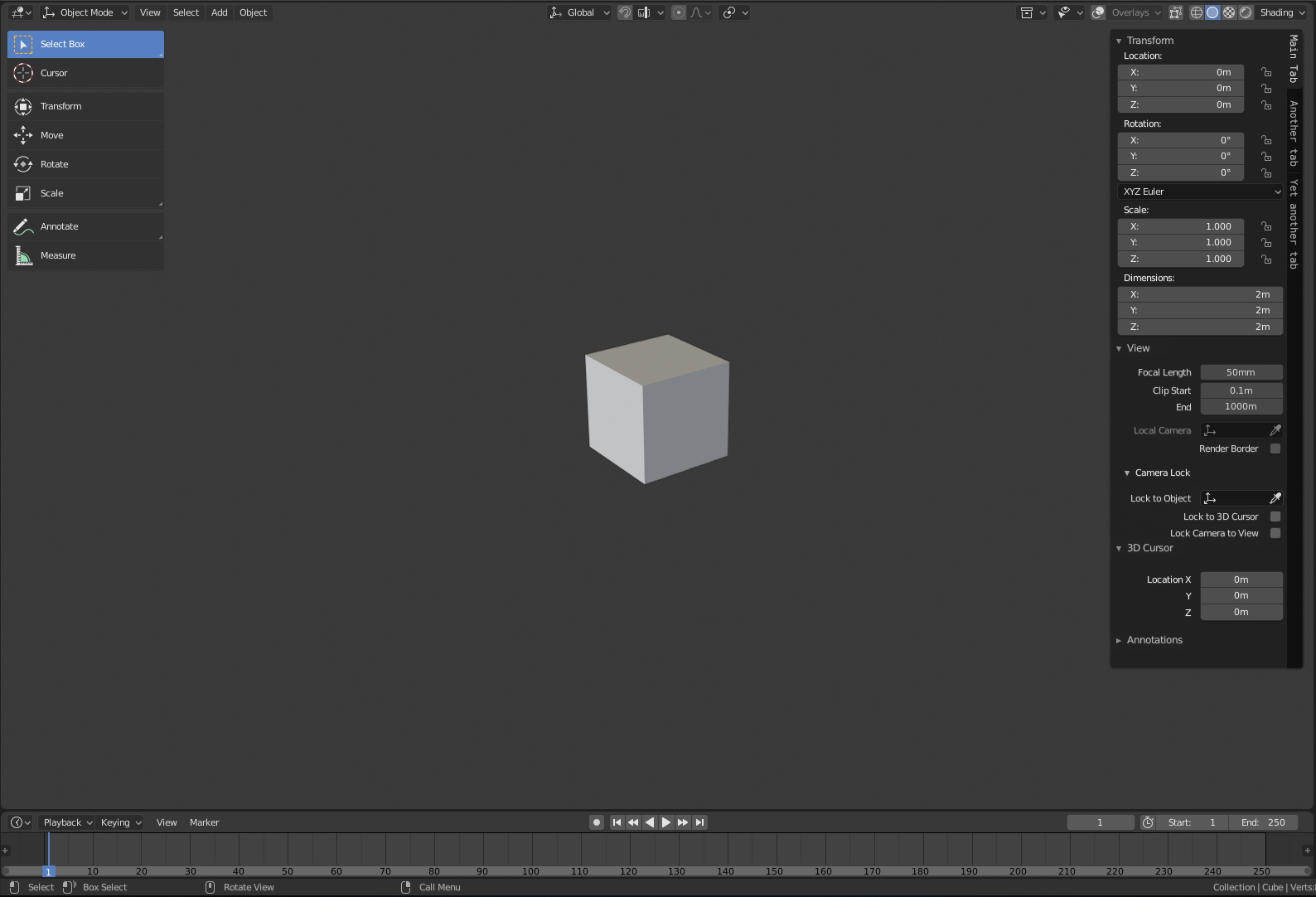
I did not expect tabs will be coming back. But if they are, then I’d simply handle it the same way as 2.78, just with 2.8 look. Something like this perhaps:
This looks nice enough I think, especially when the Sidebar doesn’t go all the way to the bottom. And, it fits better with the design of the toolbar. Overall, I think this is nicer, yes.
Transparent sidebars such as with Region Overlap are just a huge waste of rendering resources while in Cycles viewport render mode - rendering is still going on under those transparent panels. They aren’t worth a 10-20% performance hit.
On one hand you have Brecht and Sergey and Lukas fighting tooth and nail for every bit of performance they can, on the other, a silly thing like a transparent panel just wastes that for no benefit.
Region Overlap was slow in 2.7x, but in 2.8 there should be no measurable difference.
It has a few nice advantages, making it possible to regain empty space in the toolbar for user contents, and makes it so the scene isn’t pushed around when opening or closing the toolbar.
What do you mean there should be no difference? Obviously useless pixels are being rendered and shaded under the panel. Rendering those useless pixels takes time that could be spent on rendering useful pixels.
It’s not a problem in Workbench or even Eevee, but Cycles is a different matter.
There should be no real difference in terms of performance depending on the toolbar being overlapping or not, that is what I meant.
Region Overlap is not forced on, btw, you can configure it in Preferences.
If you would like the Cycles Preview to render only a subset of the viewport, use Ctrl-B to set your render region. We could make this nicer, with handles so it’s easier to resize.
please never user vertical tabs again! people get a whiplash from tilting to read what it says.
PS if you use vertical than perhaps use bottom to top. Thats easier to read than top to bottom.
Why do properties need tabs suddenly? was the scroll method good which is version prior to 2.8?
Vertical tabs are harder to read, when icons used most of the time its not very clear what it is.
I didn’t know it til the other day ,but you can do tabs for the properties/sidebar in 2.79. Doesn’t look like it’s something new for 2.8. Good place to put addons ,since you can’t do it in the toolshelf anymore.
An important aspect this mock-up currently lacks is how the sidebar panel looks collapsed while still displaying what add-ons you have installed and enable direct mouse access to them.
Of course, because when I was making this mockup, your proposal did not exist yet. I could not see into the future and accommodate for it. And even if you made it before I made this one, I’d still probably not include it unless Blender developer acknowledged to include it in Blender. Only then it’d make sense to include it in my mockup
No, but I tend to not like most ideas Alberto has, so I’d like to see them in his thread, not mine. We have very different taste and very different idea about the direction Blender should take, especially when it comes to UI design.