That is not a good example… People can use the toolsettings bar to reduce space used
Toolsetting go back to npanel because basically didnt work in properties editor. Also, i think that people that defend properties editor never will use the program to paint without the tool settings bar.
This is a good example, and the reality of the n panel, and how unusable it is.
The topbar bar can never and will never be a good place for settings, it’s just impossible.
Wrong, the tool settings is mirrored in the n panel just because of the full screen users. It works and it will always work best in the properties editor. That’s why it’s located there on most 3d apps.
Let’s see, let’s not be liars because then you won’t convince anyone… To begin with, the example given by jenkm is a falsehood, for many reasons.
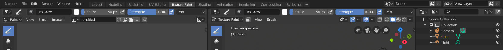
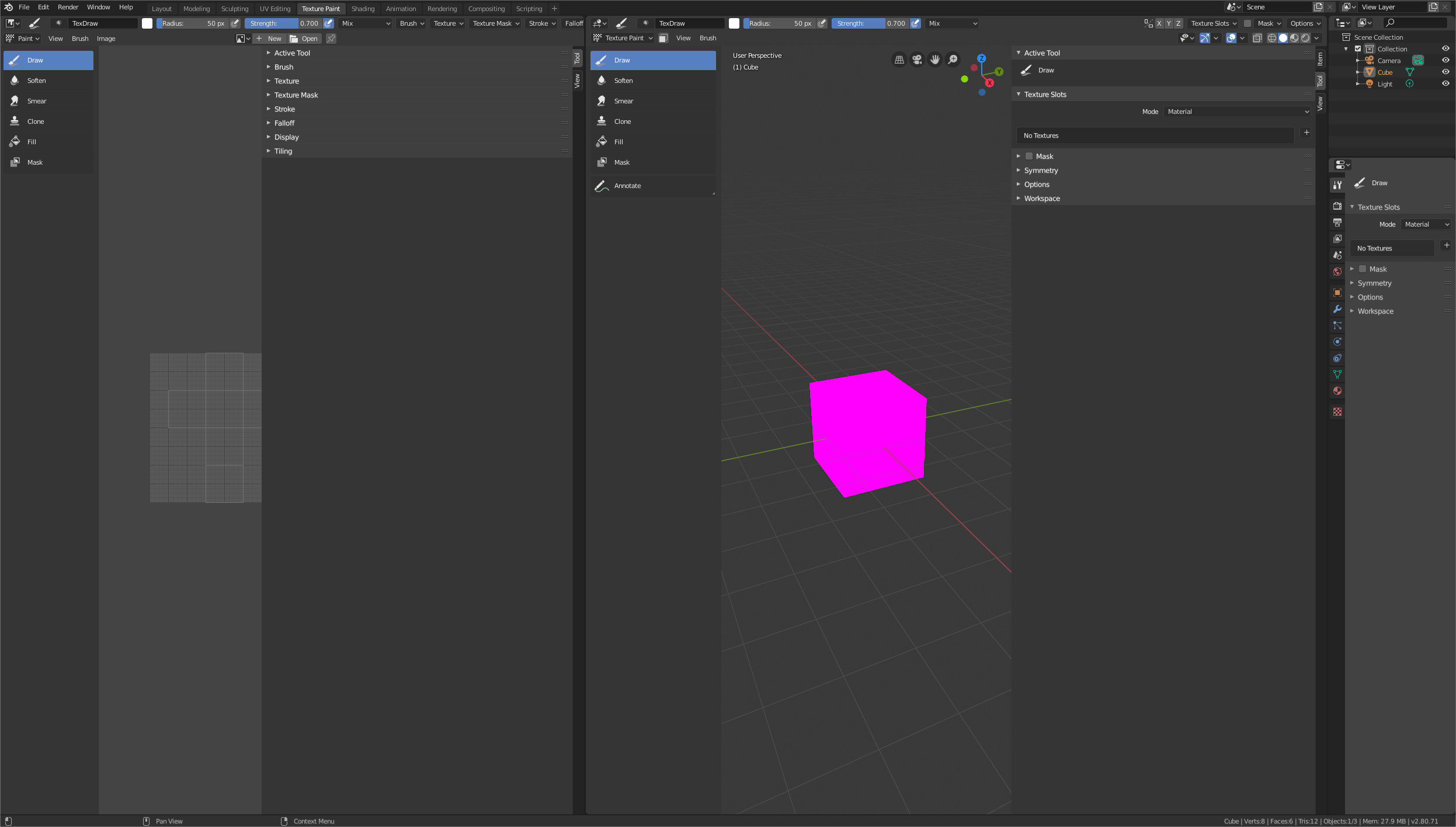
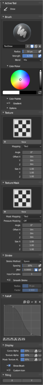
First we had to go to a layout where only this happens, the texture paint. Layout where BOTH panels show exactly the SAME tool, although it is being redesigned and therefore there is discrepancy. So having a Sidebar for each editor is to manipulate the situation.
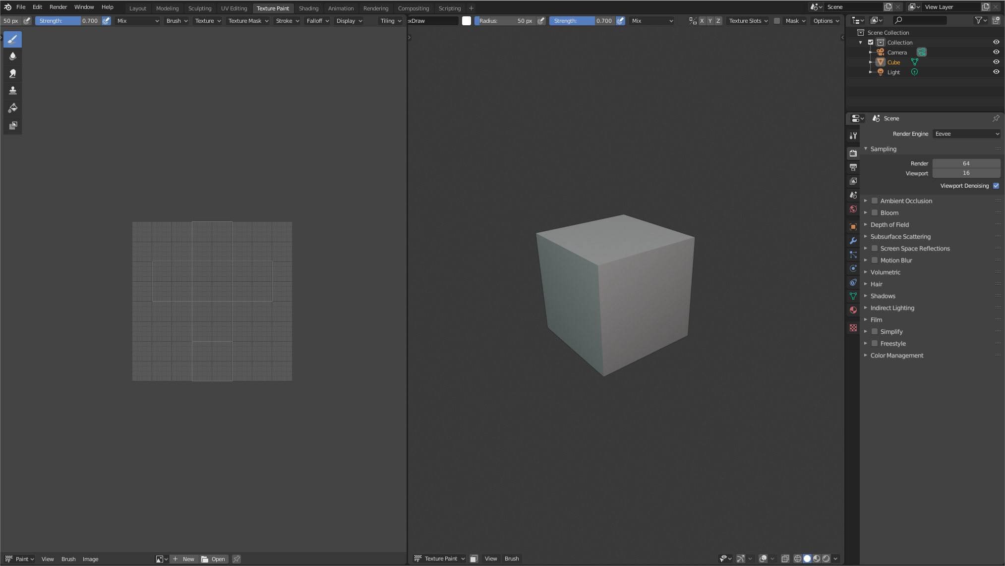
Then above has shown both sidebars wider than they come by default, so as to eat more space unnecessarily.
Shows both T-shelfs unnecessarily when they show the same tools
You have deactivated the overlap region on purpose, in order to have more screen space occupied.
You don’t want to use the tool-settings bar simply because you don’t want to, because the scroll needed to use it is much smaller than the one needed to show all the elements in the properties editor.
Yes, I could show this to tell that N-panel is a shit that don’t enter in my 2560 monitor, but I don’t
Well, this would be indeed a good thing if tool settings was something that works both horizontally and vertically, and can be drag and dropped around the UI whever user wants it. Right now, it’s on 4 different hardcoded places, not really customizable that much aside from hiding/showing it.
Being able to put tool properties anywhere is one thing, but seeing it at multiple places at once, being confused about what belongs to what and occupying UI space by displaying duplicate controls, that’s whole another thing.
Thank you. And why that very useful customization feature is only available by default for 2.7x keymap?
@LudvikKoutny, I agree with request as long as it adds more customization possibilities for each taste of different users. I do not agree with proposals to remove this or that just because a user is upset because something is duplicated. I do not mean just you, also the N panel haters for example. If you do not like it, do not use it. After all, many of them are just tabs that you can ignore. Following this same alignment of thought, I also agree that there should be feature parity between all the possibilities.
Are you following the news?
The tool settings in the properties editor is not the same anymore, now it only shows the settings of the tools of the viewport only, this means that we are forced to use the n panel no matter what. I’m still trying to find a way to fix this “bug”.
Besides, there are settings that only exist in that panel. So there’s no choice here, if there was, I would never touch that panel anymore.
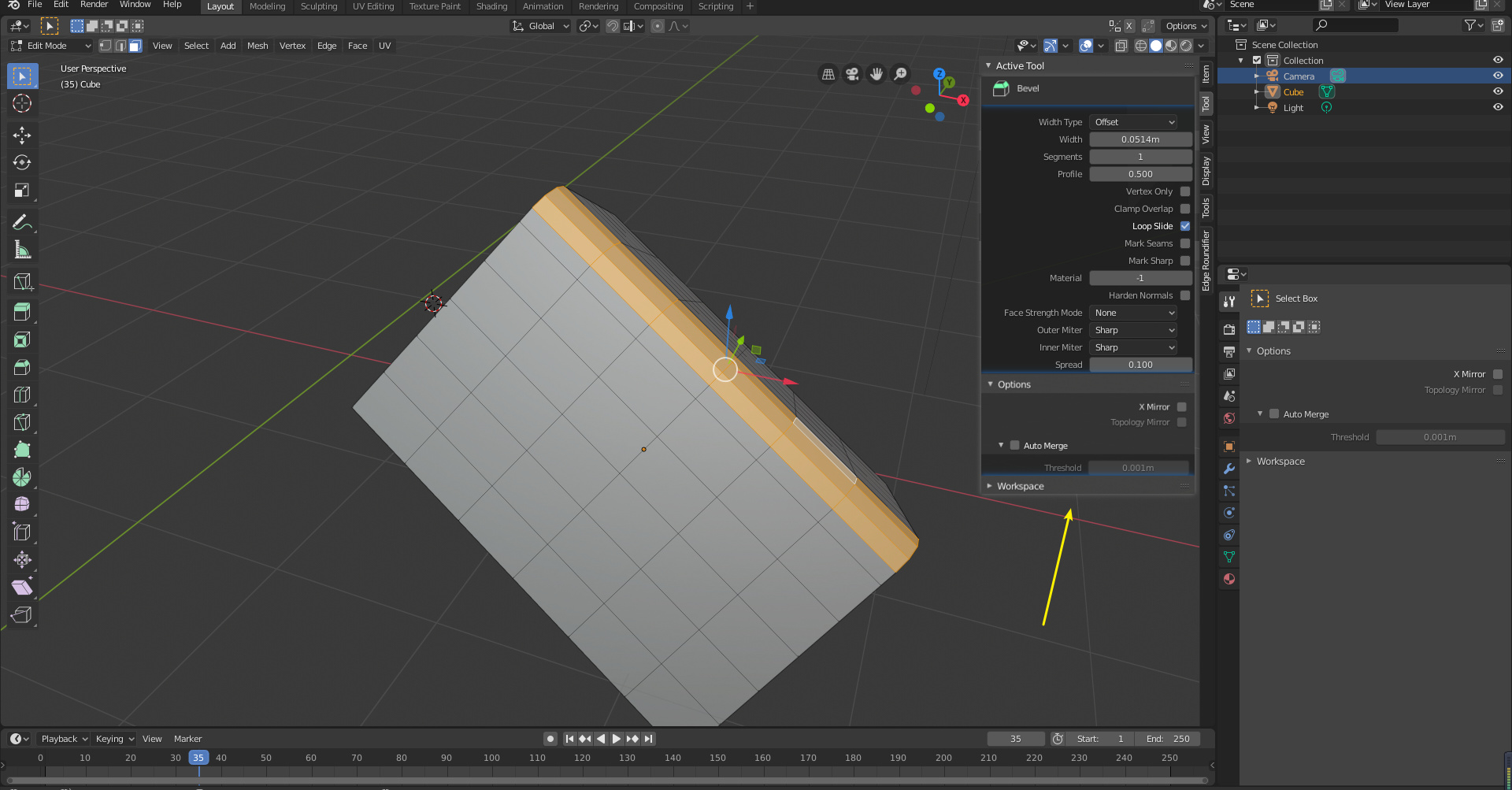
Right now, I don’t know why all bevel tools options will be disappeared when done bevel.
it can not change anytime. If I do wrong , have to undo , undo, undo again.
And Right now, Not all bevel options on the Active tools and properties panel. Why not all options ? What’s the mean exit half of options ?
To be honest, the tool system in Blender 2.8 is still incomplete. This is not the good time for UI freeze in my opinion…
Pressing B is a good example of this.
If you press B, you are doing bevel but not using the bevel tool. Settings are inside the redo(left bottom) panel.
Pressing the bevel button on the toolbar, you are using the bevel tool. Settings are inside the header, sidebar(N) and properties panel.
This Tool duplication problem between the hotkey tool and toolbar tool applies same to the 3D cursur tool, inset tool, etc. Duplicated tools don’t even share the settings together.
Maybe the solution to this is adding temporarily active option to the tool system, which replaces the current hotkey tool. It should be enabled when you activate the tool with its hotkey, such as B for bevel. If temporarily active is checked, clicking anywhere will deactivate the tool and clicking enter key will reactivate the tool.
Why would you bevel the same edges twice? Think about it. You would change your selection in between the bevels, so the redo panel would not exist any more.
The original design document for the top bar had exactly what @LudvikKoutny is suggesting. It had the redo panel mixed and settings for your next operation in one region. It’s a good way of doing it in my opinion. There is no reason to have all of these settings related to the tool all over the place. I would say we need the redo panel all the time and when you make a new selection, it is no longer a redo panel but a DO panel. And you can drag the bevel width slider and the edge selection is beveled interactively, just like you clicked and dragged in the 3d View.
Of course, there’s no reason to have a “Adjust Last Operation”.
It’s just a terrible Blender 2.4 design.
you perform some operation
you can try see in the status bar (or header) very hard readable current values, you need to press hotkeys (which you don’t remember) to be able to change parameters and enter exact values
you confirm operation
you need “adjust last operation” just because Step 2 sucks and you can’t do everything you need
No. “Adjust Last Operation” panel is a 2.5 design.
Action Validation → Interactive Adjustment that behaves under your eyes.
2.4 design was
Press Hotkey → adjust settings in a popup → action validation → if results looks bad , undo action & restart.
Active Tool settings are close to this 2.4 design. User set settings first, then validation comes with left click release.
What makes 2.8 different is the gizmo. Gizmo gives interactivity. In case of Extrude tool or Spin tool, user can continue to adjust action.
But if you take into account Bisect tool, for example, gizmo allows to adjust cut plane.
But if you want to change your mind after modifying cut plane or just made a mistake and want to invert Clear Inner, Clear Outer option; you can only do that into the “Adjust Last Operation panel”.
Or you have to undo the action like in 2.4.
“Adjust Last Operation” allows user to explore all abilities before making a definitive choice without making several cancel/undo actions, blind modifications of settings.
If you do a Subdivide action, you can guess number of subdivision needed by using active tool.
But using “Adjust Last Operation” panel, you don’t guess. Result is updated in 3DView, at each modification of amount of subdivisions.
There is an instant feedback allowing you to know if you have reached desired mesh density or if you have a cut perfectly aligned to another mesh part.
Currently, we don’t have gizmos for all active tools and gizmos that are able to handle all options.
Using active tools is a slower process.
But that is a process that brings ability to work in Blender without a keyboard.
“Adjust Last Operation” panel is still the core, the center of attention of user.
It should be highlighted, not swept under the carpet.
It is that panel that people want to see into sidebar or Properties Editor.
F9 is not satisfying because it is a key press that user have to perform all the time. User should have nothing to do to see this panel.
And it is really annoying to have stuck to left bottom corner. It is not movable as toolbar or sidebar or tool settings bar or header.
That is the most important part of UI for a modeler and we can not move it where we want.
you perform action, but you don’t have access to all options (or at least they’re hidden)
you confirm the action, for example by pressing Enter, this means that you have completed the current operation
then you get access to all options and values, and can adjust them
you perform next action
should be
you perform action with easy access to all options and values, exactly like redo panel
when you are satisfied with the result, you confirm the action or just perform next action
It’s almost the same thing, only in the first case, it looks like you did the wrong action and you fix it, you redo it. The second case is normal, expected behavior, as in all other programs.