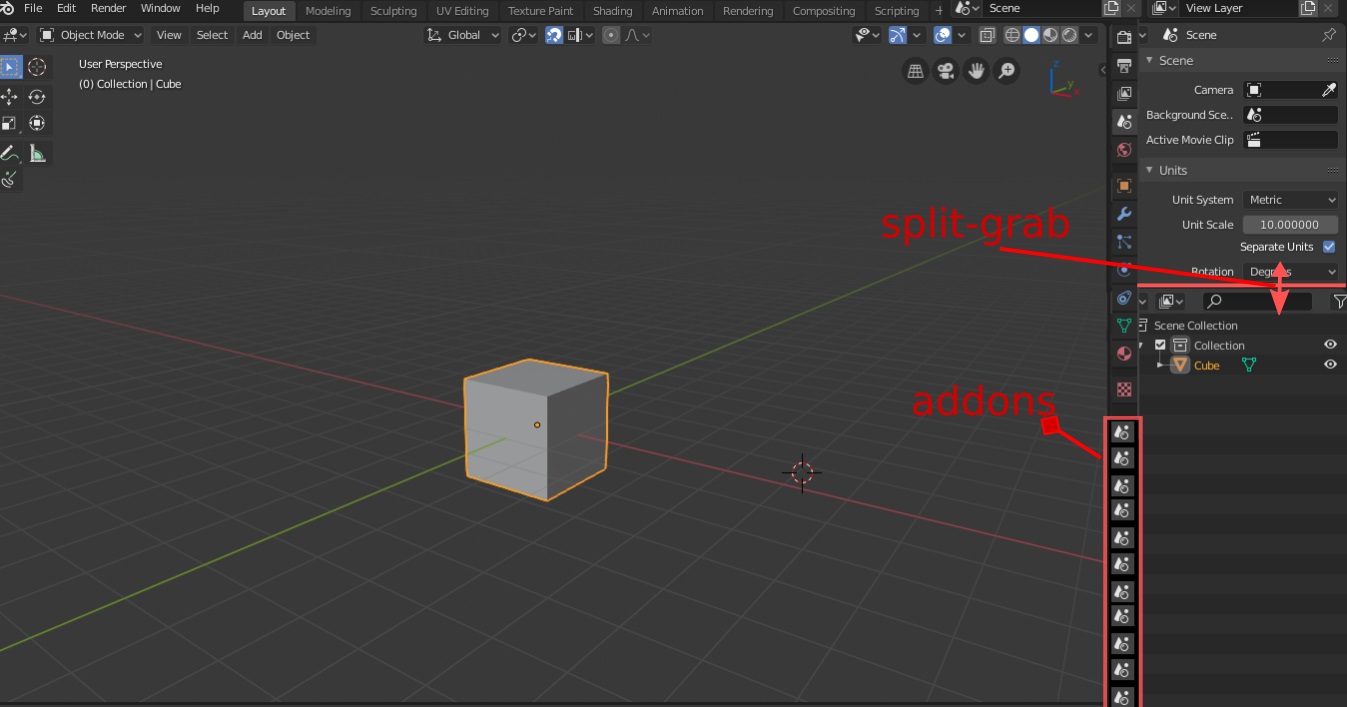
Improving “the quad view” would be in my opinion the easiest and quickest thing to do.
And from there they could start to see how the workflow goes and in case decide whether further improvements are needed or not.
I wouldn’t mind the idea of being able to grab one border of the 3D view and it splits into two views and so on …
I think that the problem with tool settings in sidebar is fault of the toolsettings header is not on by default. Making people searching that config in other places when all the parameters of 99% of active tools can be found in the header.
Thanks for the comments people! It’s great to bounce some ideas off of each other
I agree that an improved quad-view will be a necessary improvement and this was discussed and agreed upon during the homestretch at the Blender Institute.
As far as I know animators at the Blender studio weren’t much involved in the design for tools and almost no development has gone into making this work well for them. So it’s no surprise that it falls short.
This is to say - that we could approach this from a perspective of how to create something new - instead of assuming we tried something that failed - and it needs to be redone.
Having said this, animators who are fast using keyboard shortcuts may not want to use dominant tools, so having a way of exposing a handful of tools that don’t have shortcuts seems reasonable too.
Your proposals focus on heavy customization, while this could be nice, it’s a big project.
We could extend the quick-favorites menu by adding a menu editor, and even having multiple user defined menus - which could be displayed in panels as well as menus.
While this isn’t a full solution, it could get us some way towards a customizable user interface, and the rest could be handled by custom add-ons (for example).
This is a much less ambitious project of course, and I’m not aware how much developer time is available for this - so perhaps the larger projects you propose are realistic too.
Agree, think we could remove them from the “Properties” editor.
The top-bar is meant for quick access for brush radius, color etc, without having to devote a large panel. It’s also not enabled by default except for painting workspaces at the moment.
Of course if you don’t use active-tools, the toolbar isn’t useful.
Whatever the case - animators will likely need some customizations to Blender - so it’s an open question where the defaults end and their customization’s should begin.
Having the last “Active Editor” can work but it feels like something to avoid. If a panel isn’t essential it can be in a non-active category, I don’t see this as such a problem.
A fully editable UI with panels dragging around is a big project and will almost certainly expose new problems and add maintenance overhead.
Prefer this, however points about fully customizable UI remain.
Fair point, but think this is a side-effect of including addons ontop of a moving target, everyone does their own thing and the end result feels haphazard and poorly designed
We could, although would add this in the “View” menu.
While it’s up to UI mafia, I’d prefer not to do this.
Assume you mean customization happens on a panel/menu level? (yes thats simpler), if not - can you expand on this?
Agreed! A lot of customization opportunities would be nice but I realise that this can be a can of worms to open up new issues.
My favorite addon for interface customization is the “Pie Menu Edior”, which (among other things) provides an interface to add properties, dropdowns and custom macros anywhere in the interface. Maybe that can be an inspiration to enhance the Quick Favorites functionality and changing the Toolbar/Sidebar options …
it could also break the interface if not handled carfully
Sorry that open question can be removed since I updated the thread description a lot. This point doesn’t make sense anymore
That would be a terrible idea.
The topbar can’t handle tool settings nicely, and we all know that. The topbar is only useful to access simple things, otherwise it’s a disaster. The N panel is just a waste of screen space (and the worst part of blender imo). The properties editor is the only proper place for tool settings, even the redo panel should be there already.
If you guys really want to improve blender’s UI, then you should start thinking about customization. Real customization of toolbars, buttons, editors, panels, be able to dock panels, create custom panels/menus, floating windows, tabbed interface etc…
Moving settings to non-logical places will not solve anything.
I try to put myself in your shoes and in your way of working, and I can understand your point of observation. So since I agree with the perspective of @ideasman42 and since we are talking about a software and with programming we can do magic …
I would propose an automatic system of appearance and disappearance of property tools (similar to how it was for the top bar)
I think of this embryonic draft:
"When you activate the sidebar and you are in the “sidebar properties area” or you are in full screen, all the tools related to the 3d view, switch in the sidebar, otherwise they remain in the " properties area " …
In addition, customization options can be added to preferences for both redo and other tools.
I think a little bit of dynamism doesn’t hurt, and satisfies everyone.
for a better adaptation to this “switch”, I think, that at the design level it would be useful what was proposed here, with a sort of unification of the property buttons and the addons area …
I would love to be able to add my own buttons (with custom python commands & custom icons) wherever I want on the UI. Let’s say I want to add a new tab on the N panel, this should be doable, with as much custom buttons, dropdown menus, properties, sliders, etc… as I want. Full customization.
No, that effectively defeats the purpose. I’ll italicize the emphasis:
A reset interface option in RMB menu to reset specific parts of the interface to the default look?
At least that’s how I read it.
This should be available throughout the whole interface rather than just the areas with view menu, and even if it was only available in those areas, the view menus would have to become extremely over complicated to enable resetting of specific panels/parts of the interface. The more granular the better, though a general purpose reset for the whole interface could and probably should be included in the user preferences.
Uggh, agreed. I’m still of the opinion that we should get rid of the properties editor altogether. But thats a separate discussion.
Sidebar is N-key. T-key is toolbar.
I think you did not understand that when he mentioned N panel :
He is talking about the sidebar.
Sidebar is fine when you are working in a maximized view of an editor.
But problem of lack of space happens when you want to see multiple editors at once and are forced to multiply amount of opened sidebars.
That is the reason why he wants one vertical bar to rule them all.
It’s a tradeoff, you could also argue that removing tool settings from the side-bar means you cant easily show brushes and other settings in a maximized 3D view.
To my point of view, there is no reason to consider “removing active tool tab from properties” as a trade-off. Current situation is a tradeoff.
I think that both cases (maximized/minimized editor) have equal interest and should be supported.
A good trade-off is supposed to bring as many pros as cons.
“Removing active tool & workspace tab” does not provide, anymore, a solution for people that don’t want to constantly minimize/maximize editors or open/close sidebars.
Of course, we have shortcuts for that and asked solution would require to left click on editor, anyways.
But I think that corresponds to less clicks than bar opening/closing.
No visual accommodation is required. We would probably loose less time that way.
And more than anything, I would like a tab for Redo panel.
Maximized Toolbar + Redo panel + Sidebar, it completely hides background region in an editor limited to a quarter of screen.
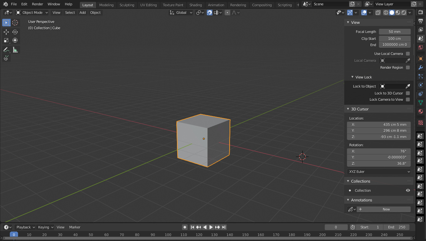
these are not three views, but it is a 3D view with a “N modern sidebar”.
this contains sub-areas which are the properties and the outliner.
the outliner and the properties can be switchable with ctrl + tab (similar to how is with graph editor and timeline) and can be split by a sublayer that is automatically formed as an outliner … as shown in the image …
what is the advantage of this? have a long strip of buttons, and clicking on this buttons, whether they are properties or addons will always be displayed in the property area …
needless to say that with this configuration, we would not need to have two other window areas for properties and for the outliner …
moreover, the current area of the properties and the outliner would not be modified by the current situation, therefore the classic configurations would always be available as usual.
of course … for working at the TOP this configuration … we would need an improved “quad-view” … which allows the splitting of two or more sub-view in the 3D view area as mentioned above …
The proposal is that, since I miss having a bar to click Commands directly, and now they’re all in menus, I’ve been considering for a time for a way to automate the process of making panels with command buttons. But the solution became clearer over time and you guys have thought of it already. If we go on the customization route, then the solution would be that every Panel can be a menu/popover, and every Menu can be a Panel. There’s a software that kind of does this already. Zbrush. All the menus on the top are more like popovers in the sense that they contain properties as well, and you can drag any of those menus to the sidebar and have it expand like panels in Blender. Blender could go on that route but with more granularity even. You could drag a menu, a submenu or a popover into the sidebar, and it would become either a tab or a panel, with more panels or subpanels, or not. Or you could grab a tab or panel from the sidebar and put it in the header, and it would then become a menu/popover, maybe with nested menus, or not. Or the whole sidebar could be put sideways with the click of a button and become an extra header with a row of menus, or viceversa, click a special button on the header and it flips vertically and with some width to reveal tabs and panels. What about going smaller? You could move individual properties over to a header and create your own topbar style bar. Just some random ideas on how it could be done. But yeah, that’s the idea. Panels = Menus, Menus = Panels
The thing to consider is that, we need to question up to what degree separating Commands from Properties from Tools is a good thing. We need to question the priority of data structure over workflow proximity when it comes UI design. Maybe it’s ok to have a Command and a Property together if they relate somehow.
I’m sure you guys have noticed if you follow development and discussions closely, but developers tend to favor separating things in terms of the place they’re stored or what they are. I’ll give you the opposite example that confirms the rule. If you go to the Shading popover in Solid shading mode, you’ll see that Shadow has a little gear icon. The properties inside that gear are stored per scene, but it took a lot of convincing for the developers to put that gear close to the shadow toggle despite the fact that they are closely related, only because they are properties stored per Scene and not per Viewport like everything else in the Shading popover. Because of this, you’ve seen things like the disappearance of the Render button, or the Object Data tab being further from the Object tab. Obviously, it can’t go fully far, there’s a limit on how much you can forego practicallity for the sake of logic, there are many examples of commands in the Properties Area, like the Bake buttons in many simulations, or the Disconnect hair button. Of course that separating properties from commands was a good thing. It was a mess in 2.49 and then it was decided in 2.5 to separate them. But, to what extent can it go? Even now, I’m battling over the removal of the Lookdev shading mode for 2.81 because developers seem to prefer structure over usability.
Customization would again be part of the solution for this. The structured approach to UI design of the developers could be used for the new user to understand the structure of Blender, then they can move those things around as they please, after having learned where a property comes from.
Another alternative could be some kind of visual feedback or visual indication that, despite two properties/commands being relatively close together, they belong to different places. To the scene, to the view, to the object, etc.
I also feel that a lot of editors could fit inside the 3d view sidebars. Particularly the more vertical ones. It would be a break on the non overlapping concept and the areas design, but if we go on the customization route, it could be an option. Once you go onto customization, you start finding patters of what things that were bespoke and different could then become generic and the same
Yeah, these were also there in MS Office 2003 if i am correct, also in Inkscape 0.92 too, in MS Paint, in Stykz. And yeah, i like them too, if properly implemented.
I mean the editor space not what it contains, obviously all of what it contains is necessary, but might contextually fit better elsewhere. With that I mean 3D editor/view related things should go there, Material shader related things in there, etc.
But I also think that is something to tackle further down the line. 2.9x maybe? 3.0?