Tool settings are on too many places

No it’s perhaps not a great time for a UI freeze, but it is what needs to happen. It’s been too long since a stable release has happened, and the UI freeze can and likely will be lifted after the release, so work can and likely will continue for 2.81. Then there will be another code-base freeze for release, and after work can continue again for 2.82, and so on and so forth. That’s simply how it works.

1 Like

You are right, it is true that it’s been a long time since 2.79.

However looking at the past, Blender gained many functions since 2.50 but not noticable UI improvements(for screenshots and tutorials). I’m worried that this incomplete UI will remain the same for many years until something like Blender 2.110 comes out.

Especially N sidebar is the biggest problem. It is the last thing in 2.80 that has 2.79 look. Not-rounded corners, Tabs with vertical text and extremely low readability(with addons making it worse) should be fixed ASAP.

And yet some of these things might not have an obvious solution, once more of other development has happened(currently blocked by the feature freeze that was established well before the UI freeze) a more obvious solution might materialize.

Lets not forget that the whole of 2.8x cycle is at least in part dedicated to UI development. Not to say that it is wholly dedicated to that however.

Currently UI development was blocking the next release from happening and the feature freeze is at least in part becoming a blocker for further UI development. Feature freeze can only be lifted after a release has happened, thus a release logically needs to happen. Makes sense?

Panel was renamed “Adjust Last Operation”. You don’t really redo it. You are adjusting what you are performing.

Facepalm… It’s literally called “Last Operation”, not current. I even specifically said these words: “you confirm the action, for example by pressing Enter, this means that you have completed the current operation”. And this operation appears in undo history, so it’s definitely done.

In 2.8, status bar shows all available shortcuts for a tool.

Shortcuts are an additional feature for quick access, it is not the main control. You can’t add shortcuts for all available options.


I am going to be the odd one it seems and disagree. Yes, the information is spread out, but here’s the thing, you are free to customize how you want to work as you see fit. You can hide the tool box in the header, you can hide the sidebar and pop-up box in the 3D viewport as you see fit, and you don’t need to open the tool tab in the properties window (I never use it actually). Some people will like one way to work, while others prefer another way. Heck, depending on what type of controls you use (i.e. a digital pen and tablet), you may prefer the header tool bar or the top right sidebar while working in fullscreen than when working with a regular keyboard and mouse.

Can stuff be improved further? Absolutely. However, I prefer having the flexibility to choose my UI rather than be dictated to a specific method. Those are my two cents.

3 Likes

I agree, Rawalanche, the first principles of property panels need unified.
Below I’ve drawn a concept today specifically as a response to this thread, that would make Blender friendly, powerful, out of the way, and unified!

Add tools shortcuts on the left,
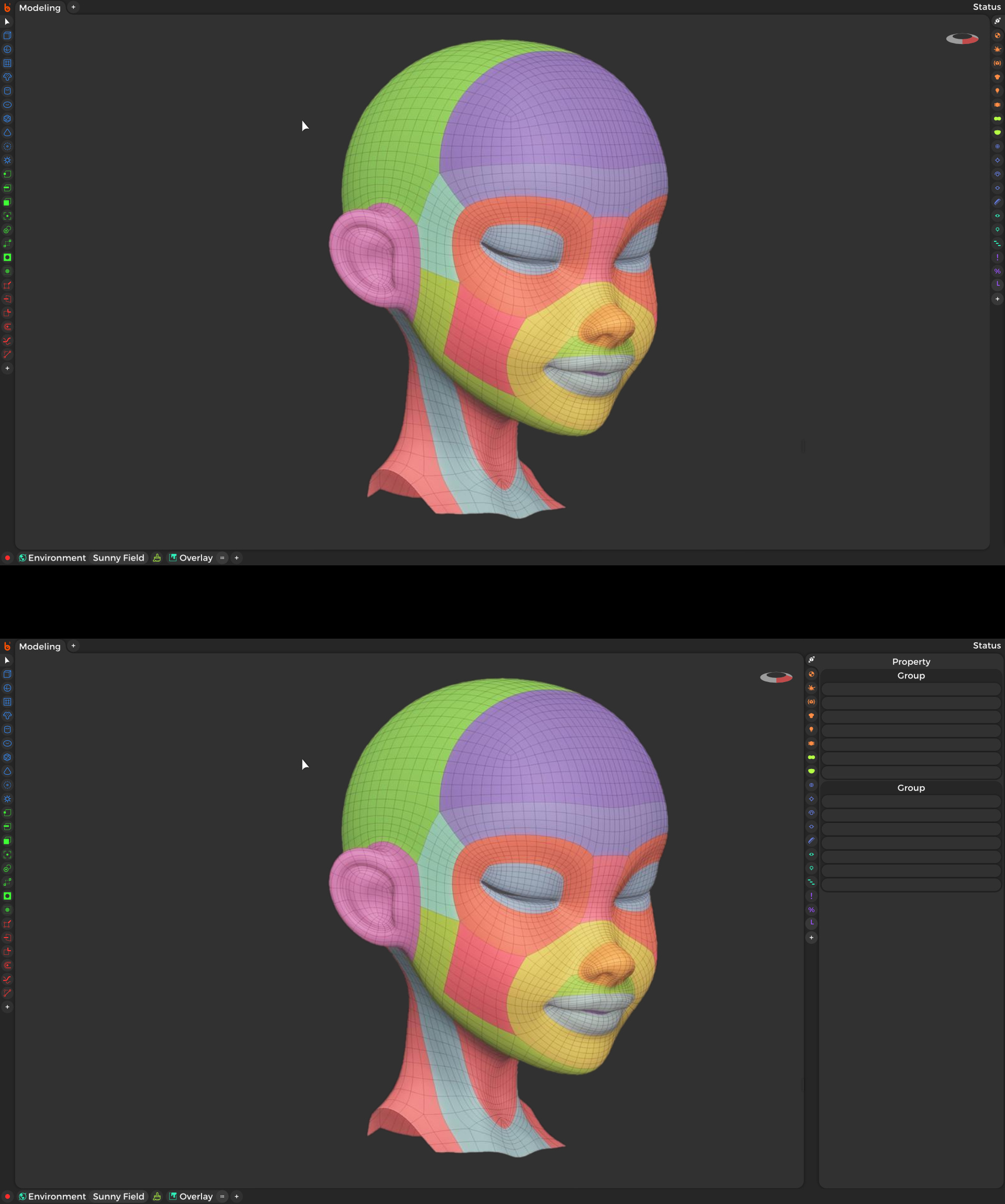
Add tabs of property panels on the right; overlays, outliner and all the other popups all in one place. Plus add your own custom property tab, or use a tool feed tab which pressed down panels chronologically based on the latest tool which summoned them.
Add shortcuts to specific property values on the bottom.

Scale and split windows like normal, but the T and N keymaps slideouts, instead of a tacked on ui, toggles a split screen for quick access and dismissal. Any area editor type could be assigned to quick split like this.

george.mitev replied to my concept above with this interactive demo https://xd.adobe.com/view/24fc3cc8-089d-4d5a-74a7-29f91c755b35-52cd/?fullscreen

4 Likes

Checked out the prototype George did, and there are two things I like that would be nice to have in Blender:

  1. The buttons when the shelves are minimized. The current buttons are very small and can be easy to miss. I like that they are named and larger so you as a newcomer know there is something there and what it does.

  2. Being able to pop-up the properties window tab on the side. Would be very useful while working in fullscreen mode where that panel is completely hidden.

As for the rest, it can either already be done with Blender (i.e. fullscreen mode), or is a bit of a regression from what Blender can already do. This is my current version of the Blender UI while using fullscreen mode (sculpt mode), and it honestly has better placement of the tools than in the prototype (i.e. shaders, symmetry, snapping, etc. are in two rows that still look clean while not being as spread out as in the prototype).

Same could be said about your own UI prototype, which has the opposite problem of putting everything in two side rows (why are vertex, edge, and face mode cramped up with with the regular tools?), making it a lot harder to add new tools and tabs down the line without easily filling up the two sidebars. The interface also doesn’t seem very flexible, which is the direct opposite of the current design, which is very flexible, and that customizability allows more advanced users to tailor his or her own workflow more. That said, if you made a separate addon for it, maybe some will jump on board for that kind of a design, kind of like that Blender Pro extension of Blender.

Please ignore which tool icons are where I just randomly filled them up as an example. This is based on my window sill ui which is scalible so you could easily stretch out the sill to add more rows. Plus these sills would be available for every split screen. You could also ctrl scroll while hovering over a sill to enlarge ui content as desired.

“This is based on my window sill ui which is scalible so you could easily stretch out the sill to add more rows.”

I already had that in mind when I critiqued your design. Even with scaling and multiple rows, it will still be a very crowded place. There is a lot of design space left open where you could put some of those tools around or inside the 3D viewport. I don’t think you can really simplify the UI to the extent you did without losing something in the process, at least not when it comes to a fully fledged 3D program like Blender, Maya, or the like, which can be more complex than most other software.

Edit: If you are hard set on having two side bars on each side of the screen and nothing else, my suggestion to you would be to find a way to divide up the tools so they don’t get piled up too easily and are easily distinguishable from other tools.

I.e., instead of having separate buttons on the toolbar for different types of meshes, you instead have one, and you can then open up an extended floating menu with all the mesh types, as well as other options involving meshes like normals, the tools for editing the normals, and more. That way you can use all that massive design space in the 3D viewport by utilizing floating boxes that can be moved around and show the more complex features of Blender. That way you can avoid bloating at least the left side bar, since you could do the same thing with most other tools by having each box open up more and more complex features within Blender.

I think putting ui over the top of your content is normally detrimental to immersion, however unmounting is an option for any tool or panel allowing you to make your own overlays. Instead of cluttering your content viewport and getting in the way, we should make popups a thing of the past. By default nothing gets in your way but in special use cases you can bring a tool panel close to your work so for example you don’t have to keep moving all the way accross the screen to switch tools every couple seconds.

I suggested an idea to another thread. Maybe this might be the solution to unifying tool settings.
It solves many other UI clutters as well.


1 Like

No. It is last operation called. You may have confirmed a mouse movement and freed influence of mouse pointer by pressing enter or left click.
In practice, the fact that panel is present means that action can be modified until you start another one.
So, it is not definitely done until you start another one and panel shows other settings.

Of course, it can be undone. What you proposed is exactly the same.
Rethink about Subdivide example or any operator that does not ask for a confirmation to be effective.
It would be ridiculous to wait for an useless confirmation to be able to undo it.

I needed 10 years inside blender community to see change the Left Click and 5 things in the interface. And you ask to rewrite all the interface…

I don’t see it possible. Also that the concept itself have a lot of problems and limitations… (But that it’s normal). The concept from Mitev is better, but basically is a cleanup of the theme.

1 Like

I would be drastic … but many beat me to this proposal …
delete the general window spaces property pannels

or better … transfer it to the sidebar, because it is a sidebar of the 3d view … that’s why it’s all a mess …

and every windows space would have its local “property buttons sidebar” …
and who will want the old combination, just keep a “3d view” that only displays the list of propery buttons…

and voila, problem solved no more multiplications, no more problems between full screen and not full screen …

in reality it is less dramatic than it seems … it’s just a logical order …
try to think about how it could be (I refer especially to the proposal of george.mitev)

actually from this operation, the next step, with the proposal to create “buttons-icons” for the compartments addons, you would have a unification between the property pannels and the sidebar addons in a single sidebar …

and here I take the opportunity to link the proposal that came to my mind just before reading this thread.
a proposal that creates even more order and clarity

Bufffff

I don’t see it, think that for blender2.8 we had few changes in the UI elements. For example, problematic buttons like the scene or viewlayer buttons didn’t change, when it are the main problem for new users. Devs didn’t implement in a good way the Active-Tools bar, they only change the T-shelf theme instead of a new panel type (floating or customizable y any side of the viewport)

The first mockups are a big-big-big change in the interface and only think in viewport-centric interface. The second is more a theme change, I think that it’s good. But for example put out of the viewport basic controls for modeling, don’t consider the tool-setting bar, addons, actual limitations of the theme… I think that it could work with some changes… but are that changes possible in few time? And if that is possible ¿Devs will allow that changes? Because we have learn from 2.80 that changes in UI design are really hard.

I think that if developer are open for this type of changes… blender 2.80 UI and development were be different, more risky since first moment… when blender2.8 was more like “we have this type of elements, how we do a different UX without touch that”

what are you afraid of, look at these empty spaces in the middle, it is so obvious that it recalls a unification between sidebar and property buttons pannels … … ^ __________ ^


( george.mitev mokup)

I don’t think there would be difficulties in acceptance, because visually it would change little if the apparent structure of the old proprery pannels would remain the same …

Except that instead of the old space window property pannels it would be a “space window 3d view” that has the hidden 3d view and shows a corner of the window that is the sidebar (with some help or option to make it easier to transform it into a pseudo property pannels space window,)

this happens already now …

The unification is the less important part. You know that I propose that icons in all Sidebars long time ago. And we didn’t see it. Also that not all editor can use that layout (text, animation, preferences, file browser,…)

The idea of that was give also months ago, but it is possible to have floating panels? that generates when you collapse an area…

I like part of the idea, but if we needs months to obtain a few changes in the middle of the 2.80 codequest I don’t think that developers will change all the interface after that.

well, meanwhile ideas and refinements emerge …
the rest remains to be hoped to be taken into consideration

If that minimized panel can be used like in Mitev’s prototype by creating pop-up screens when clicking on the small icons, it would make it very useful in fullscreen mode. I think that would be the ideal compromise between keeping the UI simplistic for newcomers while allowing the more traditional interface to stay consistent with previous Blender versions. This is the kind of flexibility I like. :slight_smile: