The idea of the toolbar and sidebar just being canvases for customization is interesting. It’s hard for me to imagine how well it would work, but it is a very intriguing idea. And bringing the tools and sidebar contents to the properties editor is interesting as well. Although I wonder if it’s ideal for the tools, because of the need for frequent tab-changing. But then, I suppose that’s the whole point of the two customizable bars…
Though I am sometimes skeptical of excessive user customization. Sometimes instead of being the best design choice it can seem like leaving design problems unsolved and simply letting the user deal with it.
I’ve thought about the toolbar and sidebar a lot myself, and was going to make my own topic to spur discussion, so I guess I’ll just post the thoughts I’ve been sitting on in this thread.
Originally I was going to write about everything here, but honestly I’m tired of thinking about it all. It’s so complicated. So I’m just going to focus on tool settings.
After thinking about it a lot, I had come up with some ideas and restrictions to help guide my thinking:
- I’m coming at this from the perspective that eliminating redundancies is in our best interest. If you’re trying to organize a bunch of elements in a UI, it’s going to be much easier to think about, organize and improve when there is only one way of doing each thing (even if that way isn’t that great). Redundancies may be there to serve the interests of the user, but if we’re trying to figure out the best design for things, I think that starts with finding the best singular solution, before providing alternatives.
Often redundancies feel like giving up on finding a better solution.
When I look at some redundancies in Blender, they seem to be avoiding solving the problem to which they are providing an alternative. For example, the collections visibility toggles in the sidebar. It’s convenient! That is to say, It’s comparatively inconvenient to do the same thing in the outliner. So instead of saying “Great, it’s an improvement!” I would rather like to ask, “Why isn’t this convenient in the outliner? How could the outliner solve this problem?” There are surely good answers to this that don’t involve throwing new stuff in the sidebar.
- I’m also coming at this from the view of optimism for the active tools. As things are now the tools are very incomplete.
We talk about people who do and don’t use the tools in these discussions…
To be frank, I think that’s only a factor because right now the active tools just aren’t very good. I believe that the tools can drastically improve in the future and become a truly simple, precise, fast, and efficient way of working. Good enough to rival the hotkeys, instead of just being a slower version of them. I think that’s possible and not even a very lofty goal. Sometimes I see little sparks of their potential with tools like the Flexi Bezier addon, the Blueprint tool in the sculpt branch, and the gizmos for tools like spin, shear, and bisect. But as it stands now the tools are incomplete. Going forward with design means we have to consider what the tools will eventually become, and I’m choosing to imagine that I would actually want to use them frequently .
This brought me to these thoughts:
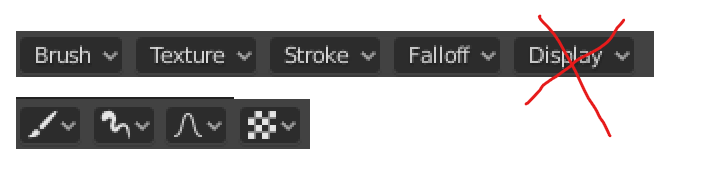
- The tool settings should be as accessible as the tools themselves. It shouldn’t be one tab of many unrelated tabs. If the tools are to become truly powerful and useful, then modifying tool settings should be as simple and available as selecting the tool. (so not in properties editor or sidebar)
- The tool settings need a lot of space for some tools. (so not in the header, though it works well for simple tools)
- Since the tool settings need a lot of space, and they would be in their own area of sorts, the user may want to hide them. And since the tool settings should be as easily accessible as the tools themselves, it would make sense that the tool settings could be toggleable at any time with a single key press, just like the tool buttons and sidebar.
What this line of thought brought me to, funny enough, was something similar to the old tool shelf of previous Blender versions, except exclusively for tool settings (and possibly redo panel).
Also, if we’re thinking optimistically about the future of the active tools, then it’s likely addon makers would be creating a lot of them, and Blender devs would make more too. There would be a lot of tools, and the current tool bar would not be able to reasonably accommodate them all. For that reason, perhaps the tool buttons would exist in this shelf with the tool settings, and there would be different tabs for different categories of active tools. (This is sort of like Modo, isn’t it…?)
Then perhaps the tools could also be organized into further sections which the user would be able to reorganize, and tools could be removed/hidden so that the user could avoid clutter as more tools are added officially or from addons. I dunno.
Last thing, there are currently two other places with tool settings:
- Redo panel
- Status bar thing (the one that changes as you do an operation)
Though they don’t apply to sculpt and paint tools, and certain other tools, I think these are also an important piece to the puzzle.
I think the redo panel and status bar can be merged into one. The redo panel is much more readable and it sits in the viewport, closer to what you’re doing. Hotkeys could be displayed somewhere during an operation, maybe just next to their corresponding parameters.
Thinking about this stuff made me wonder about the differences and redundancies between tool settings and the redo panel:
- Why, with some tools, are some settings only available in the redo panel (e.g. most bevel settings only appear during and after an operation)
- Why do some of the same settings just look different? (e.g. profile setting for bevel has an actual bar in the tool settings but is just a number in the redo panel)
- Could the tool settings and redo panel be made to be more similar? Could they have all the same settings, be organized the same way, and look the same?
If the tool settings and redo panel were to be made more similar, and we were trying to reduce redundancies as much as possible, would there also be a way to merge tool settings and the redo panel?  Could they simply be the same thing, perhaps with some toggle to choose whether you’re modifying the previous operation or the next? Would that toggle even be necessary? Maybe making a new selection/deselecting would be a fine way to allow modifications to the settings for the next operation.
Or not, maybe the redo panel would be better as it is now, a separate panel in the viewport, even with a revamped tool shelf for tool settings.
Anyway, those are just some random thoughts on the topic. Or, the tool settings specifically.