The Toolbar/Sidebar Interface Issue

This is an accumulation of countless discussions from the Blender Animation Studio, trying to solve the biggest problem of the current interface of the Toolbar, Topbar & Sidebar.
Since the text is so long I divided it into parts.

(Sorry for any inconsistencies in the mockup designs)


The Issues:

Issue 1: Tool Settings are literally all over the place

When looking at the different areas of the interface it isn’t really clear which correlates to what.
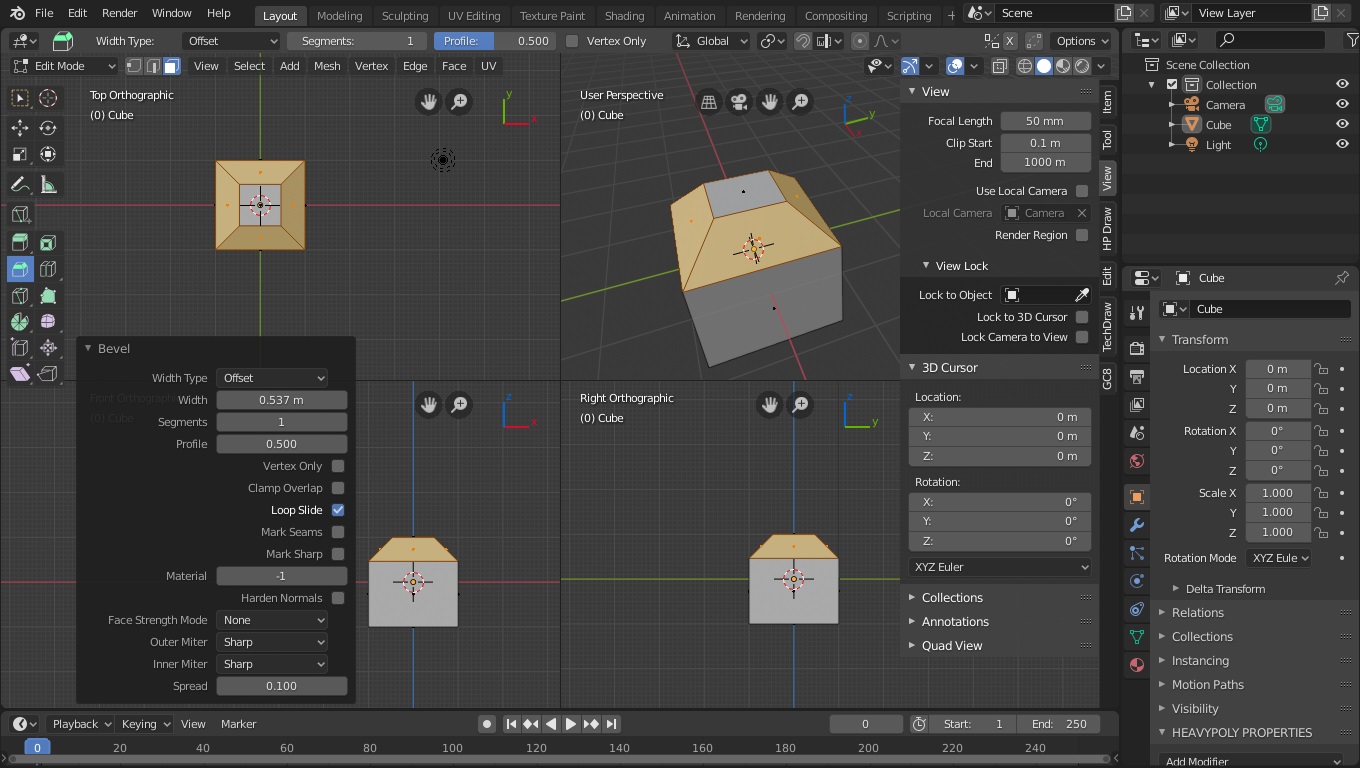
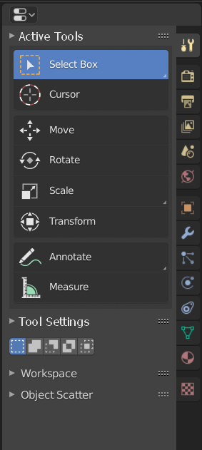
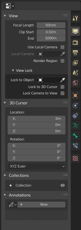
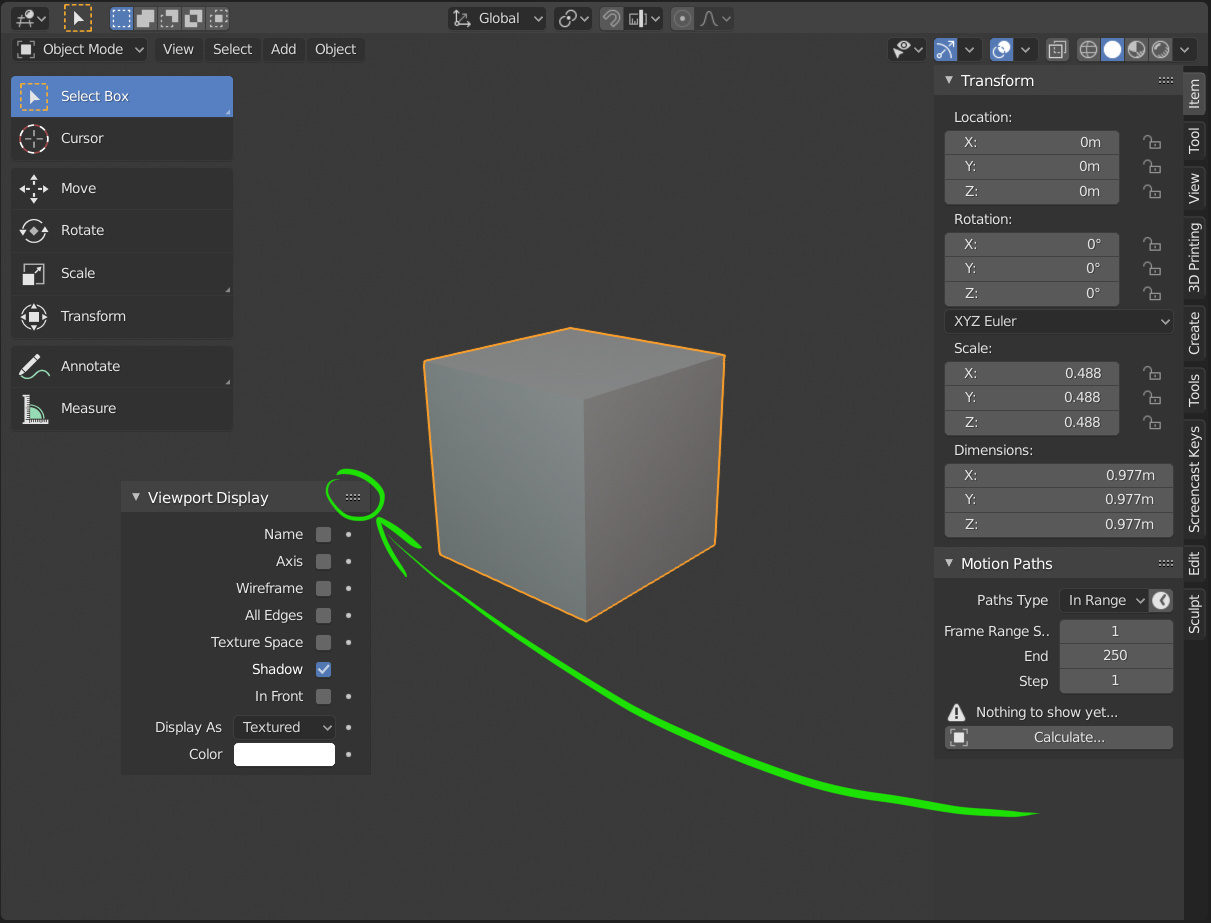
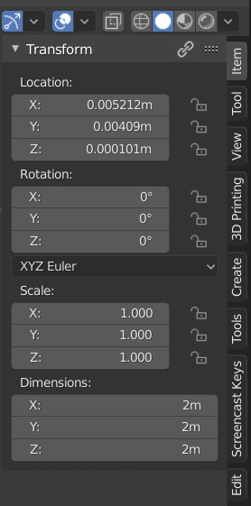
So the Toolbar is showing the Avtive Tools that can be switched between. The options of these Tools can be found in the Topbar, Sidebar (under Tool) and Tools Settings tab in the Properties Editor.
The later 2 seem to be exact copies of each other, only that the Sidebar of each Editor contains the Tool Settings of the Editor it is a part of. Meanwhile the Tool Settings in the Properties Editor are always part of the 3D Viewport.
The Topbar has all the same properties as the other 2 but is missing the Workspaces dropdown, so it also isn’t an exact copy.
All of these are similar yet slightly different.

Issue 2: These areas of the interface are too restrictive and don’t offer all the Tools that are needed

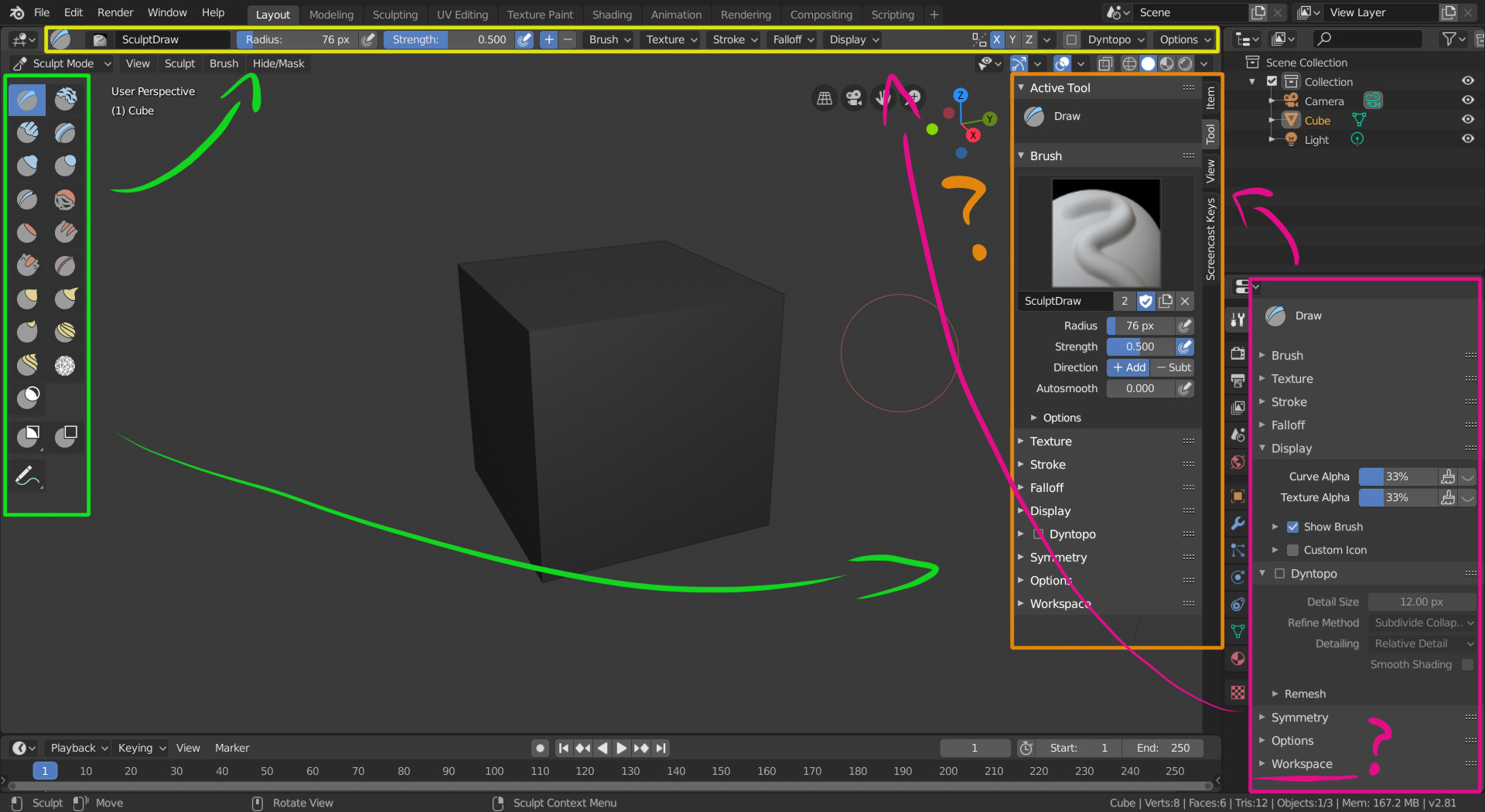
In certain modes the Toolbar has become very restricted in its use with only a tiny amount of Active Tools to select from.
For Vertex Paint Mode, Pose Mode and others, the Toolbar takes a massive hit in usefulness since there’s almost no useful information or settings in it.
And if someone decides to not use the Active Tools and to just stick with the classic operators, the Toolbar could just as well not exist. The usefulness dies completely.

vertex_paint_toolbar

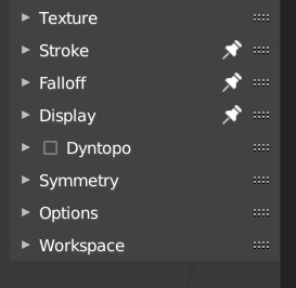
On the other hand, the Sidebar is a bubble that could eventually burst. With too many options & tabs it will become an act of constantly switching between tabs and/or scrolling to reach the desired options.
In some tasks it’s already filled up with the Transform, view, 3D cursor and any properties of the selected object. The space is already taken.
This becomes worse with the increase of addons used, since they often add their own tab to the Sidebar. Meanwhile most space in the Tool Settings & Toolbar is often left unused.

There is a way of pinning tabs in the Sidebar, but it’s very hidden feature and it has the potential of overcrowding the sidebar, since the contents of pinned tabs will always be visible in the current tab.

pinning

An example of the issues:
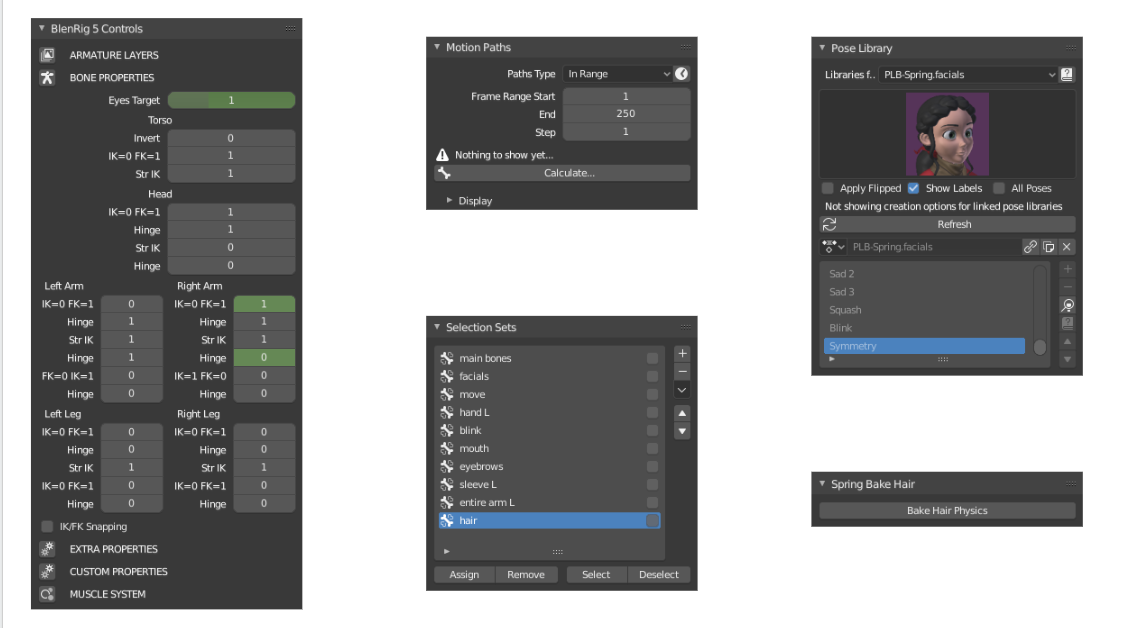
The Animators at the Studio have been struggling with this since the Code Quest.
The Toolbar used to include all of their most used tools & addons. But now they are scattered across the properties editor in the Object Data tap, Bone tab & Tool Settings.
Some of these are addons, yes, but they will have to become default features at some point soon since they are so essential. Also in any case, the best option in the current interface design is to add them to the sidebar, but that space is already taken by other frequently used animation tools like the Transform & View properties.

Some users require different parts of the interface to be visible at all times and the Developers will likely not be able to predict these cases. The Sidebar already includes different tabs of the Properties Editor … only that the user gets no say in what is being shown. The current design is just too restrictive and clicking through the interface to reach your settings is already a big issue.

You can draw your own ideas & proposals from these issues. Here are ours:


Proposal #1: Full Customizability

Step 1. Make the Properties Editor the original Harbour of all the Tools & Properties

This means, migrating all viewport exclusive settings that can be found in the Toolbar & Sidebar into the Properties Editor.
The Active Tools will be made available in their own tab in the Tool Settings:

Apart from the already existing “Tool Settings” there will have to be a new tab called “Editor Settings” which contains the options like those in the View tab in the Sidebar.
Any Editor related settings could be found there.
These 2 tabs “Tool Settings” & “Editor Settings” would be tied to the last clicked on Editor. So when using the 3D Viewport the properties in these 2 tabs would change to reflect those. Same for any other Editor besides the Properties Editor itself.

The Item tab in the Sidebar already copies a part of the Object tab in the Properties Editor.

Now the Properties Editor is the source of any options, tools & properties that are visible in the Toolbar, Sidebar & Topbar.
The missing piece of this design is this:

Step 2. Add/remove any part of the Properties Editor to the Toolbar/Sidebar

This would make the Toolbar & Sidebar a canvas to add/remove items to/from. In addition to the current way of rearranging the items, the user can also add or remove any item from the Properties Editor to show the settings they need.
These changes would then be tied to the current Workspace to optimise different workflows & tasks even further.

The general use and way the interface works should not change. By default the Toolbar is still the same Toolbar, just as the Sidebar.
The notable exceptions to make this work is removing the Toolbar resizing snapping and Toolbar tabs making a return to make it possible to add elements that are not just Active Tools.
This would also require a toggle between row & grid arrangements of the Active Tools.

So how would this work?
To add them, the user would drag & drop dropdowns from the Properties Editor to the Toolbar/Sidebar of the correlating Editor, into the tab they should be in. This would essentially duplicate them, not move them.
They could then also be drag & dropped to the other side, from the Sidebar to the Toolbar to flexibly change the layout.
Any dropdown could then be removed from the Toolbar/Sidebar by RMB clicking on it and choosing to remove it.

Tabs on the Sidebar/Toolbar would then be adjustable like the Workspaces, with the options to rename, duplicate, delete, rearrange, etc.

All options that are currently available in the Toolbar & Sidebar would be dropdowns from the Properties Editor that are added by default.

This drag & drop functionality might be a bit obscure so an alternative/additional way would be to RMB click on any dropdown in the Properties Editor and getting the options where to add it to:

  • Add to Toolbar
  • Add to Sidebar

You will then choose an existing tab or create a new one to organise the added items better.

  • Show in “View”
  • Show in “Item”
  • Show in “Tool”
  • Create new +

Proposal #2: Semi-Customizability

This proposal is basically the same as Proposal #1 with some notable difference:

Since the tools in the Toolbar and most properties in the Sidebar directly relate to the Editor that they are in, that might be the optimal design.
If we would make all tools and properties come from the Properties Editor, the options would shift & change based on the Editor you last clicked on.
That’s already a design that Blender was moving away from in the Beta of Blender 2.80.

So instead, the Tools, Tool Settings and Editor specific Properties will belong and come from the Toolbar & Sidebar of any specific Editor.
This means the Tool Settings tab in the Properties Editor can be completely removed or rather replaced by a Workspace Tab, since workspaces still need their option and could eventually increase.
Addons are also completely free to place their interface anywhere where it fits best.

Apart from that there would still be the option to drag & drop (or RMB click assign) any dropdown from the Properties Editor to the Toolbar/Sidebar of any Editor.

But since these dropdowns are linked from the Properties Editor they should be marked to reflect that.
The Transform options and Workspace options would then already be linked to the Sidebar by default. This could for example be indicated by a link icon, in addition to pinning dropdowns.


Proposal #3: Minor Customizability

Any added customizability will be very difficult to implement and has the potential side-effect of causing more problems. So with this third proposal the user would have no way of adding elements from the Properties Editor to the currently used Editor, but the developers need to be aware of what the most used properties are and add them to the Sidebar by default.

For example the Animators this would include the Motions Paths, Pose Library, Selection Sets.
Other options like Object Visibility & Material Visibility settings for the Viewport would also be helpful additions since they directly relate to the Viewport shading.
All of this would involve a lot of communication between the developers and artists to not leave out anything important.
It’s vital to note that the options that should be included are meant be often accessed and would be missed if the user decides to go full screen on this editor. There would need to be a middle ground between adding too many options to the Editors and having too few.

The issue with this is that the Sidebar would harbour even more information than right now and it wouldn’t be that useful to scroll & click through it constantly. That’s why the Toolbar would need to be used for these settings as well.
The changes to the Toolbar from the previous proposals would then still apply.


In Conclusion

Although these suggestions might not be perfect and it likely isn’t this straightforward to implement, this would add the much needed customizability.
The Toolbar & Sidebar would essentially become a canvas for users to add the tools they need. Other software is also using the same system of having a common origin for all/most settings and a canvas for the user to add these to.

Artists at the Blender Animation Studio have been struggling with the current interface since it isn’t making the Tools available that are needed for specific tasks.
If some basic level of customizability won’t be implemented then the current alternative is to script our own interface and develop addons to make the Tools available at all times.
I honestly don’t think that the solution for the user should be to break the current interface to make it more useful.

There could be a far more simpler solution to these issues. This is just our take on it. Hearing more opinions/feedback on this would be great in order to find common ground to build on.


Open Questions

  • A reset interface option in RMB menu to reset specific parts of the interface to the default look?
  • Currently in most cases Addons are added to the Sidebar as new Tabs. Would these then all land in the Properties Editor by default, and how?
20 Likes

Having all (I mean ALL) the properties and settings available the properties editor is something I always wanted, yes, but I don’t think the tools themselves would fit nicely there.
But yeah, the toolbar needs to be customizable, so we can add or remove any tool there.

The Tool-settings header must not have options for anything other than the selected or related tool. That’s the idea, simple and clear. The idea of this header is just to have accessible only a small part of the options of the active tool along with the options of the modal tools. Any other idea is to kill it. To use it like a canvas where user can put anything is better remove it.

To propose that all this compressed in the properties editor is not to have taken into account many details of how blender works, how its users use it and that that idea has already failed. Few people use the tool in the properties editor simply because it is uncomfortable to use. Only the modeling activetools will need a whole Screenscroll for themselves. Due to the new property editor Vertical tabs it is already directly difficult to move between tabs. If you put here all addons, editor options, tools,… It would simply create a maze of tabs that no one would use.

Also it is not taken into account in your proposal that the tools ARE SPECIFIC TO THE EDITOR, you can have multiple editors with different tools selected and contexts at same time in differents monitors. Hence the existence of the toolbar and the sidebar. The reason why the Topbar was removed from the workspace. Besides how complicated it would be for the new user to understand why the options you see in the properties change and do not logically affect the interface. Why do I have to change the viewing options of my UV editor on a different monitor in a remote panel that has nothing to do with this? And what do we do with the properties of the node? Do you hide the properties of the selected object? Do you add the control to the sidebar of what? The UV editor? The 3dview? Shader editor? There are a thousand problems like this with that proposal… that for a newbie will by like a big wall imposible to learn.

Asking the user to configure the toolbar completely, or the sidebar seems crazy to me. Beyond a “to be able to configure all the interface like a canvas” that seems only a good purpose difficult to achieve. It would create an interface customization practically impossible to use for any user. And with a complexity to customize that in the end nobody would use because having to configure an interface that changes hundreds of times depending on the editor where the mouse is, the context, the type of object or the selected tool.

I think that exist other way more simple to solve main problems that dont need innecesary solutions that create more problems that it solves.

2 Likes

Why do you struggle to understand that “the globality of the property pannels” is an original defect ?
The property pannels are almost exclusively the 3d window tools, they should be exclusively in the 3d window. this explains “the multiplicity” of the instruments in more places …

Moreover if you move all the tools in the propery window you limit the great possibility of working in full screen … which believe me is very useful.

The Tool-settings header must not have options for anything other than the selected or related tool. That’s the idea, simple and clear.

I agree. I thing its probably best to keep the Topbar exclusive to the properties of the active tool.

Few people use the tool in the properties editor simply because it is uncomfortable to use.
Only the modeling activetools will need a whole Screenscroll for themselves. Due to the new property editor Vertical tabs it is already directly difficult to move between tabs. If you put here all addons, editor options, tools,… It would simply create a maze of tabs that no one would use.

Sorry I don’t really understand this. The vertical space is very much needed and used all the time by many people. It’s not just the modeling tools but also any painting or sculpting related tools that have an extensive set of options that needs to be organised into dropdowns and made accessible in a vertical way.
And are you arguing against vertical tabs in the Properties Editor? How is that making it “difficult” to switch between them? The vertical tabs are a great improvement.
Also, my point is not to make the Properties Editor the area to access everything at all times, but to make it clear that all properties are having their roots in the Properties Editor, instead of the Sidebar.
And a “maze of tabs” is already what the Sidebar can become, only that there is little customizability to prevent that.

Also it is not taken into account in your proposal that the tools ARE SPECIFIC TO THE EDITOR, you can have multiple editors with different tools selected and contexts at same time in differents monitors.

I did take it into account but I think with the new direction Blender went into lately you are right.
A couple months ago the Topbar & Tool Settings were detached from any Editor you were working in. So based on the last Editor you clicked on, the Tool Settings and Topbar options would change.
In the current system, that doesn’t seem to be the case anymore. The Topbar & Sidebar now contain all this information and are part of individual Editor. The Tool Settings in the Properties are still there but they only ever show the options from the 3D Viewport … which is very confusing.
I guess that’s something more to think on.

Asking the user to configure the toolbar completely, or the sidebar seems crazy to me.

It would be optional :wink:
Users also don’t need to configure the Workspaces but they can. If it’s too overwhelming or annoying they can also just work with the Workspaces that are included in Blender.
Users are also free to change the behaviour and look of their brushes but are not required to. The default set of brushes works fine.


Why do you struggle to understand that “the globality of the property pannels” is an original defect ?
The property pannels are almost exclusively the 3d window tools, they should be exclusively in the 3d window. this explains “the multiplicity” of the instruments in more places …

I do understand this. The properties in the Sidebar (if that’s what you mean with properties pannels?) are partly from the Properties Editor (Item, Workspaces), partly relate to the current Editor (Whatever Editor you are in, not just the 3D Viewport) and Addons.
It’s a mix from different places but it mostly relates to the Editor that it’s a part of.

Moreover if you move all the tools in the propery window you limit the great possibility of working in full screen … which believe me is very useful.

I don’t think you understand my intentions with this proposal. I want to make a full-screen workflow even more powerful, not less.
The current issue is that certain tools and settings are gated off in the Properties Editor, which makes a full-screen workflow not possible for certain tasks. If all properties are originally coming from the Properties Editor and are just linked to each Toolbar/Sidebar in any Editor then more elements can be added freely. The Toolbar/Sidebar would be a canvas to put anything into, which makes any Editor work better in full-screen.

1 Like

I edited the description of the thread to remove the customizability from the Topbar and I added an alternative Proposal #2 to make the Active Tools, Tool Settings and Editor specific properties come from the related Editor instead of the Proeprties Ediotr.
This would be less complicated and would fit the current design better.

The original proposal is still in the bottom of the description but it’s mostly the same.

@ThinkingPolygons, @nokipaike Can you please not start a fight in the comments. This is extremely counter productive and just distracts from the topic :angry:

4 Likes

Don’t get upset. I had already asked not to start with ideological battles.

let’s get back to topic.

Let’s try to make explicit why “have local tools” for each “generic local area”

let’s take a generic example of traditional work to make some concepts explicit.

If you’re a painter, you have your painting in the center, you have a palette of colors on one hand and a brush on the other hand. and in a bucket the set of brushes and other tools … all these tools must be at hand in the same work area and in order not to be disturbed all other tools must not be there.
it is a Zen discipline.

The same work structure should be for all working area types.

Now let’s talk about blender tools.

It is clear that the area of properties is increasingly becoming a cluster of many instruments and is increasingly full and will continue to fill up.

Now blender is divided by always in Areas and each Area has its specific type of ​​work with:

We have “the 3D view area” we have “the 2D view area” we have “area of ​​shading nodes” we have “area compositing” we have “video editing area” and so on that they are all local with their own sidebar with their own tools.

And then we have “the area of the properties” which is largely a rib of the 3d space view BUT which is a “global feature” and this is a design flaw that blender has always taken from its origins.

Solution to this:

In my opinion, also in view of the continuous growth of tools, we should bring all the tools exclusively “around their own work area locally”

This would bring the great advantage that having the various 3d view working mode: “edit mode” “sculpting mode” “texture painting” “retopology” “greace pencil” etc … at each switching between set of tools and another blender would show you only the tools you need in that particular way of working. Doing so you would avoid all the crowding that is now in the property area.

Your terminology is a bit confusing but I think I get what you mean.
I think I need to update the description again since I think it’s a bit confusing on this point:
Just because all properties would be in the properties editor does not mean they would be made globally accessible

The tool settings tab is supposed to change based on what other Editor you clicked on last and what the active tool is.
The scene tabs are based on the scene you are in.
The material tabs are changing based on the last selected material.
The object tabs are changing based on the active selection.
The contents of the properties editor is changing constantly based on context and this would stay that way with this proposal :wink:

1 Like

My terminology is a bit confusing because my English is not the best, I am aware of it.
I’m trying to improve myself but it will take some time.
Anyway i’m glad you understand what i mean.

No it’s not a comment on your English. Blenders interface uses specific terminology to define what each area is called. Terms like “2D Area”, “Property Panels” & “Space Window” can be a bit confusing or misleading, that’s all I’m saying.

1 Like

I corrected the terminology, sorry for this.

I like the idea of having all the tool settings/redo panel inside a tab of the properties panel because its easier to teach and lean, since you would have just one place to look.

And use the sidepanels of the editors just to run the tools. Even if you have multiple editors in a window, you always can only run one operator at a time, so this last tool you run would have its settings displayed at the properties panel.

We already have this kind of interoperability in some workflows. Some simple scenario examples:

  • To manage materials in the node editor we need the material tabs of the properties editor;
  • To edit a modifier of a object of the 3d viewport editor we need the modifier tab of the properties editor;

I’ve been using Blender since version 2.31(lol) and although I’m very used to the “blender-way of doing things”, my personal opinion is that I would prefer to have a better workflow consistency than being 0.5s faster by having smaller mouse travel.

EDIT:
Here is an example of the properties window usage for tool settings from the PolyQuilt addon:
https://twitter.com/sakanaya/status/1155444678226898945

1 Like

In terms of space and design the vertical tabs are very good. In terms of UX and search is very different. We always have a hard time searching vertically because of how our brain works.

If you add 10-20 to that list of icons, it will simply make it impossible to use the property editor.

The sidebar has a similar problem, and ways have been presented to improve it. But at least it simply allows the user to know that in the sidebar there is a type of tools and panels, which are used relatively little. While maintaining the simplicity of the property editor that gives access to elementary functions that you are constantly accessing.

Likewise, it has clear design problems… if I work with several monitors and want to access the options of a viewport. I have to go to another monitor to click on the editor and then go back to a different one to search among dozens of tabs the one I need? It sounds directly bad and little raised.

And I repeat, the fact of putting the options of the tool in the properties editor has proved to be a failure. And that the users asked for the return to the sidebar which is where logically should be.

The problem is not that it is optional, the problem is that seeing the complexity of what you ask for the implementation will be wrong, because there is simply no way to do it right. And in the end it will be half done, with half of functionalities and users who currently have no complaints will see their UX truncated, and those who want improvements will not see enough improvements. In other words, instead of both groups of users seeing improvements none of them will see them and one on top will see their experience worsened.

For example, a highly complex system like that… you have two options

  • Leave like actually by default = all users that need the changes in UI will never do it due complexity to any change
  • Change the default to make more like you like = All users of actual default will want kill you.

For me the problem that have all this is the same that initial codequest wanted for 2.8, That some changes for the UX and UI is not what works well in real world and mayority of users wants.

The T-shelf was tried to be eliminated… in the end the T-shelf had to be left again but on the other side of the screen. To use a global topbar that was going to be the solution to all problems … The idea had to be discarded and a header had to be used for each area. Tool options were put in the property editor… few people use it because it is uncomfortable and forces you to be moving the tab of the property editor you need constantly. To put the Xray somehow forced… Finally I accept to put the wireframe as always.

All these ideas have been wasted time in the development of 2.8. And what you propose is still going to be a well of development time and need a lot of work at design… I can imagine that proposal correctly implemented without a new area only to make all this customization process.

Will be better put some problems over the table and search close solutions for that

Hmm, mulling over a lot of the items here, I think my favorite is proposal #1. I like the idea of the “Editor Settings” tab in the properties area.

So if I understand this correctly, let’s say we’re in the video editor currently,in the current 2.8 build, the tabs in the sidebar are “strip, modifiers, Proxy&Cache and View”. These would basically all be moved to the Editor Settings correct? Then if I split the video editor to have, say, the UV editor open, and clicked on the open window of the UV editor I would get the UV editor settings, like 2D cursor settings, correct?

I also understand having the tools from the toolbar in the workplace/active-tool tab. That way you don’t have to cross all the way from the left, selecting the tool in the toolbar, then ALL the way to the right just to play with the settings in the workplace tab. Consolidating it in once spot in the properties panel makes a lot of sense after thinking it through. As well having a nice big area to display all of the settings feels better than perhaps the “Tool Settings” on the top, which could potentially be a bit small under certain circumstances?

I just can’t help but feel this might nullify the meaning of the Tool Settings on the top, as well as the Side Panel. What would their identities becomes? Side panel would just be for addons? And the Tool Settings would be for tool settings redundancy purposes (which isn’t necessarily bad)? Is that right?

@JulienKaspar After some of the dust has settled in this thread, is there any plans to maybe make a build with the agreed on plans. That way we could demo these proposals and see if they are improvements or not.

Thanks for you work :slight_smile:

First post with proposals says nothing about 2 important pieces of UI that are panels/subpanels and Adjust Last Operation panel.
I already said thousands of time that I would like to have ability to move Last Operation panel at another fixed place.

@leandro_cavalheiro mentioned it.
What @ThinkingPolygons is excited about is to have it into Properties Editor more than View Properties of any editor.

Advantage of Properties Editor as an editor is that fits an area of any size, that can be set into any window, at any place into layout of workspace.
So, what is present in it does not have to be repeated anywhere into layout of workspace, and usecase for that property is typically when workspace is sharing same tools or same kind of tools between several editors.
Typically, doing mesh editing using several 3DvIews is a case when Adjust Last Operation panel will be used into all editors.
It is also the case into Painting workspace. Tool Settings bar is currently repeated, twice into Image Editor and 3DView showing same thing.

I agree with @Alberto. It would probably be overkilling to let user placing anything from Properties Editor anywhere into Toolbar/Tool Settings/Sidebar.

@JulienKaspar forgot to mention that user would also have to be able to determine into what panel, what subpanel of his custom tab of sidebar, property from properties Editor should go .
So, right click on property, would have to be followed by 4 popovers to confirm editor, toolbar/sidebar, tab, panel.

I think that ability to let user set anything from Properties Editor to any bar is needed.
But unless there is an ability to enter a kind of Workspace UI edit mode, and then, drag and drop property where it is pertinent, I think that ability should be done through python script editing.

Addons writers are in need to set things different than custom active tools into toolbar and tool settings bar. They are putting all their buttons into Sidebar that should only welcome properties.

I think that toolbar should handle panels/popover. I am not saying tabs should be necessary.
At early state of 2.8 beta, Active tools were introduced as a panel.

Addons creator would write a panel with buttons and into its minimized version, toolbar would show a popover. Then, if toolbar is maximized with names available, things will be displayed as panels.

If addons creator provides icons for buttons, they could be displayed as another set of buttons under active tools. Or icons of an alphabet could be provided and Initial letter of button name could be used.

If these panels can have subpanels, closing a subpanel could be a simple way to hide a set of buttons into minimized display of toolbar.

Toolbar should be allowed to handle mode options that are often booleans, hidden into a popover or closed panel. I think that would be perfect candidate to make an attempt of that kind.

To me, problem of Texture Paint Workspace is not really how to organize things between Toolbar/Sidebar and Properties Editor.
Problem is how to organize things between Tool Settings bar and Sidebar/Properties Editor.
Toolbar is not sharing settings with Sidebar.
Tool Settings bar/Sidebar/Active tool of Properties Editor are showing same thing : Active tool properties.
So, what is required is a way to dispatch active tool properties efficiently into those 3 places.
Tool Settings bar is great for sliders and booleans. But a certain number of things have to be hidden into popovers.
Settings of a brush + mode options, it is too much settings for a bar. It is also too much settings for a column where some panels are inevitably closed.
On a small tablet, painter will optimize space and try to use only one editor with Tool Settings bar.
On a comfortable workstation with multiple screens, he would have a workspace with several editors and use an opened sidebar and properties editor.
I think the right click menu proposal make sense, here.
Limited to Active Tool tab and Texture Paint mode, it should be simple to use.
It would correspond to simple choices :

  • Add into Tool Setting bar as global property
  • Remove from Tool Setting bar as global property
  • Hide popover into Tool Setting bar / panel into Sidebar.
  • Reveal popover/panel.

To overcome this problem, we should make the “quad view” more evident and improved to be able to split the 3d view (and the same working system would be useful for the textures and uv view) in two or more views. Doing so, the user would not be forced to create more 3d view areas that multiply the tools … and I believe that by doing so, he would solve many doubts from the users who come from other software … we thus had a sort of “global tools” for the 3d view with many split views.

1 Like

That is an old proposal, that could solve easily the only problem that sidebar and toolsettings header have.

1 Like

I don’t know, but all your complain about active tools is solved moving with F5, in the 2,79keymap, the active tools panel to the right…