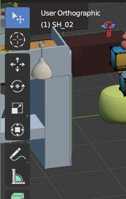
That’s more clear, thank you.
However, all those transparent gaps are pretty distracting when viewport is overloaded with details, they make the interface “sink” into the scene, so this solution definitely should be optional.

That’s more clear, thank you.
However, all those transparent gaps are pretty distracting when viewport is overloaded with details, they make the interface “sink” into the scene, so this solution definitely should be optional.

Yes, I totally agree. I also turn off region overlap from time to time. The region overlap toggle would be the solution to the optionality(of the rounded+offsetted sidebar) you just mentioned. That is, no gaps when region overlap is turned off.
I strongly agree here.
Side panel is becoming an annoyance at that point. You spend more time figuring out where the correct plugin is. When you have many even at big monitors it’s a tough task to find it.
The whole logic of side panel should be revised. It doesn’t help, really. Every time I have to use it I feel miserable. Not like the rest of my experience with Blender where it’s a lot of joy working with.
I don’t see a good solutions to improve what it is right now. There are some things that helps like:
Still the fixes above are half measures to my taste. They’ll improve the experience but not solve the underlying issue which makes side panel very rigid in it’s design.
I believe the only way to solve this is to:
To be hones I think we already have this in Properties editor. We just need to broaden the concept and make it more flexible in terms of customization.
Here is an idea that i think might work…I have ran into an issue with the addon side bar tab…I am out of room for all my addons and now is a pain to work with…Hopefully somebody can expand on this idea or implement it…thanks!
would be nice to be able to rearrange the tabs in different orders and colors or even have the tab bar dockable and undockable to put on another monitor. The layout could be horizontal or vertical. Conforms to how you drag the box it auto adjusts to fit.
Personally I would love the tabs to be icons, and the developers to create an icon for their addon.
Also the option to have icon + text could be fine, but that would be a user decision.
how big of a icon? how could you do it so it would make sense for the addon? maybe a drop down menu? the hamburger bars with icon and text? that could be collapsible? to only show the icon or text like the tool bar?
Give three sizes, like in the Tool Bar
Thats responsibility of the addon developer
Not sure about that one, @Alberto did a mockup once with a drop down menu I think
I don’t understand this
maybe? not sure what you mean XD
That I understand, yes, something like that could be good, but in vertical text, however I hate vertical text, but in this case kind of “make sense”
Oh! Yes I know what a hamburger menu is, but I was not seeing the relation with the menu being mentioned, but yes, now I understand it 

I do some mockups for this sidebar (please, see the general idea, not only the shape of thing)
And some people add other alternatives to the base idea
There are too many suggestions and no consensus happening, even though this thread is more than 2 years old. Let me organize these.
Proposals:
In my opinion, these three solutions can be implemented altogether. It’s just a matter of selecting among them.
Tabs problem has to be solved not only since Blender literally cannot handle many addons right now making sidebar tabs unreadable mess, but also prevents rounded design being finished. I saw many people from the community complaining about this problem but no improvements were made to the sidebar after the long old 2.80 release. I hope any kind of consensus happen so that code contributors or the main developers can dive into the code.
Yes. Iconography is by far faster to read than linear eye movement over text, and up to down at that! One single glance, you can read an icon. Any words take a few eye movements.
Icons mock-ups have been discussed in another similar thread - they add a lot of clutter.
I, as an addon developer, also see no reason to draw icons.
How about a cache-like system + collapsing/hiding? When you work on a project, you don’t need all the addons at once, just some of them. So those “some” should be quickly accessible.
Last used on top: The addon used last will stay on top. Old addons keep moving down and get collapsed/hidden, and newer ones keep coming up. This can get annoying if you alternate between two addons and their position keeps changing from their last position.
Most used on top: If an addon is used say 10 times, it stays on top unless some other addon is used more than 10 times. This fixes the annoyance in the last option.
I do believe icons are not appropriate for addons(because addons without icons will have a problem, and not all addon developers will respect it).
The most promising approach looks like the ability to turn each tab on and off. This is similar to ‘filter add-ons’ which is already in Blender, but should be saved per-editor rather than per-workspace.
It doesn’t solve the problem - developers still can’t design a sustainable solution.
Basic design failures should not be solved as addons, otherwise developers will keep doing them.
The same issue is about Group Pro, so the very basic functionality is still unavailable by default.
As a company we can afford an army of local developers who will make even custom builds, but this will not help to core developers realize their mistakes .
In fact, over the past two years they have made so many design mistakes that our local developers are tired of fixing them.
Thanks for sharing this. It helps to relieve some pain related to N-Panel but it’s a workaround.
I fully agree with @1D_Inc. It’s a design flaw currently in Blender that has to be solved at the core level and not with more addons.
I didn’t see any plans in 2021 roadmap to address this yet. Hopefully someone will pay attention to this because N-Panel issue downgrades Blender experience significantly in many use cases.
Care to share some of the custom builds with better implementation and feed them back into the main Blender branch as a feature proposal, then? Maybe we would all benefit from discussing a test build of your solution. Heck - maybe it’s even better or more intuitive. If it stays within your own company that won’t help better anyhting, though.
This may not be the best solution ever, but it is a solution, it is customizable and it is available and free to use and improve upon. At first glance it seems pretty solid, IMO.
@chippwalters
Nice. Thank you and your two co-designers. Pretty cool stuff, actually. 
I especially love the Tab merging. That’s pretty awesome.
Three things I immediately tought would be super helpful when watching the video:
These things sound unpleasant to implement, already, while only typing them out - but it’s just my initial thoughts, anyways.
Will check it out in practice immediately. 
(edit) Also, is the project available on GitHub or some equivalent - or would you consider putting it up there?
Gumroad is nice for comercial addons but a little convoluted to keep rtack for blender addons. For actually free projects I’d find an open plattform to get the latest version maybe a more fitting solution.
My view of Plugins design (used full screen to show how it fits).
I was inspired by the @chippwalters addon
[details=“More is here “Click Me””]
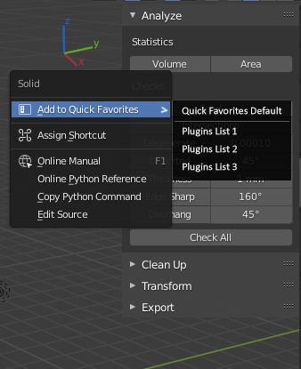
Also Quick Favs can be per list
so we can add custom operator to quick favs for custom list or blender default Quick Favs

and button can be at the left side, if some one found it more suitable, to not cover 3dView when expanded

[/details]