I made a proposal based on @LudvikKoutny’s at this thread. This makes the use of the footer. What do you think about it? Maybe this design might solve a lot of problems all at once. Description is at the link.
1 Like
By parts
-Actually blender have two headers (a header and a footer, the two on the top), so this space is used
- The popups don’t work with big addons and little screens
1 Like
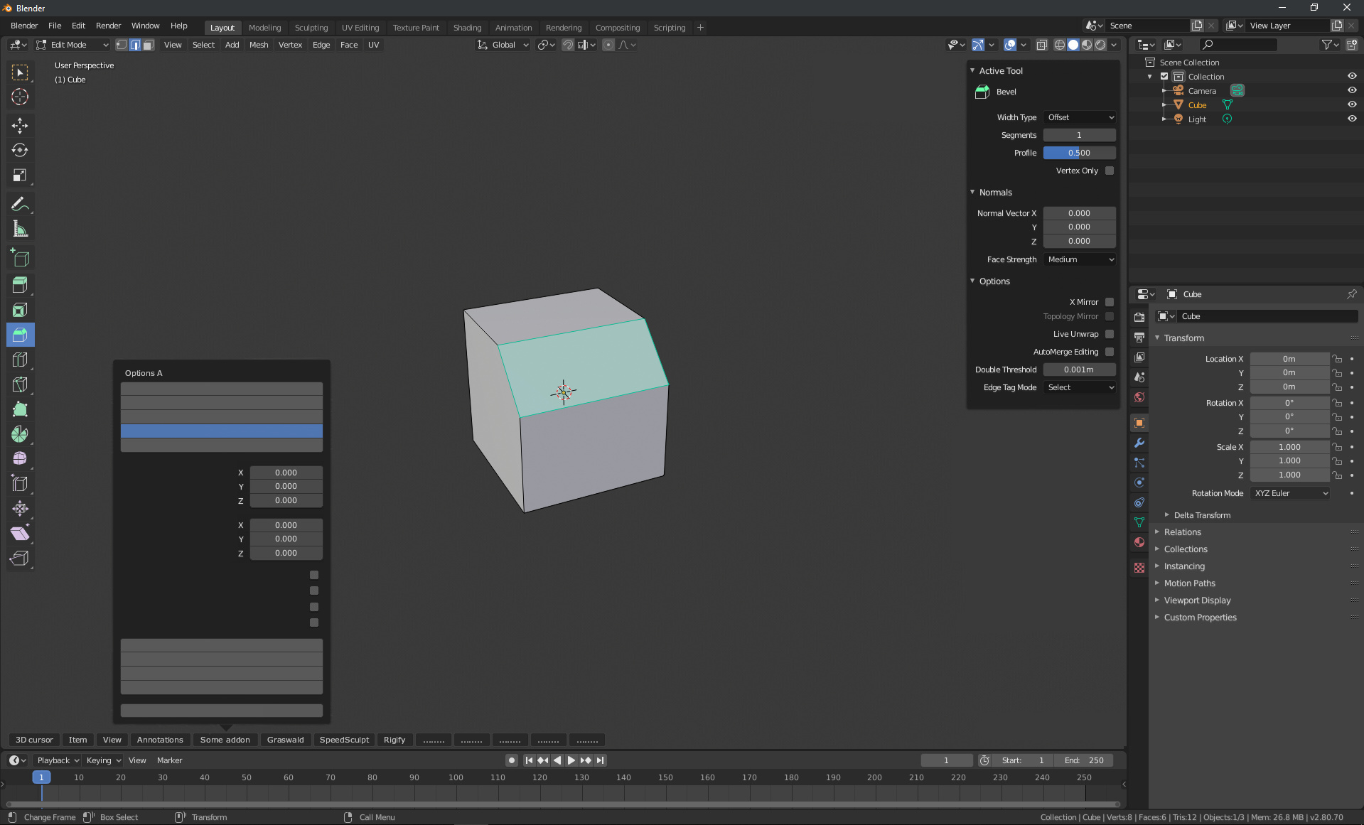
The first problem I see right away is that all panels will open in different places and cannot be moved manually (it’s not a floating panel) and the central panels will overlap the objects you are working with. There’s already a stupid “Redo Last” panel.
Another issue is that apparently these addon panels would behave like popovers, so you don’t always have “at hand” the parameters but you should move the mouse all the way to the bottom and click on the required label each time you want th change or simply read a value.
One thing that is overlooked in any of the sidebar discussion is how all this would work when you got multiple viewports, like in a quad view.
The inbuilt quad view mode is limited to only having three extra ortho views (okay I had a look and apparently you can change them but it isn’t saved if you go out of it and you can’t lock your custom view which could be accidentally nudged), and the toolbar and N bar floats over them.
If you want views other than this you end up replicating the toolbar and N bar with the new split viewports and making them smaller which makes using multiple viewports annoying especially on smaller screens.
I think its rather necessary that we get some improvements to the inbuilt quad view (perhaps putting the view lock in the header and storing the custom views), and get a special separate non-viewport rendering “editors” much like the outliner and properties that can hold the Toolbar and N Bar.
Something similar has been proposed within one of this year’s GSOCs as something for a custom menu.
https://wiki.blender.org/wiki/User:Tempo/GSoC2020/Proposal
This post up above echos this idea as well.
As for eliminating the toolbar and N bar if we got such an implementation, I don’t think that would be good for usability as they float over and take up less space.
One complication for the this though is the presence of multiple different N bars in the various views such as in shader and the image editor.
Would a separate N bar editor have to change to whatever viewport a person is using?
The point of N and T panels is the ability to access them in fullscreen.
1 Like
The point of N and T panels is the ability to access them in fullscreen.
If you do a quick research (just watch YouTube videos) and take a look at how Modo or C4D work, for example, you’ll see that there’s no problem.
You can create groups of “editors” and if you want you can maximize/fullscreen only one editor (e.g. pure 3D View), or if you want you can maximize the group (e.g. 3D View, toolbar and tool settings panel).
The main problem is that all other programs have “panels”, i.e. the interface of one program is divided into pieces (panels). In the Blender, there is also the concept of “editor” – it’s like separate programs. And as a result of this concept, you can not freely move the panels throughout the program, but only inside the editor. And that’s the reason, for example, why the global top bar didn’t work out…
You are trying to fit the toolbar, tool settings, redo-last panel, add-ons… into a single “editor” (which, for example, can only take up a quarter of the screen), while you have plenty of space around that editor.
2 Likes
It IS right to fit the panels, add-ons(if appropriate), tool settings, adjust-last-operation(redo-last until 2.79) panel into a single editor. You made the point, that each editor works like seperate programs. This individual editor concept is the core of Blender UI.
In a figurative sense, it would be really strange if we have to click on the Internet Explorer menu button to activate the Chrome extension, isn’t it? Those two are separate programs, which should not interfere each other.
Same here. Each editors should be able to get their job done without relying on other editors(although they can share the active item selected). I think what @1D_Inc meant by “fullscreen” was equivalent to “in its own”
1 Like
In addition, this popover UI concept introduced in Blender 2.80 was to make the maximum screen efficiency while maintaining everything that editor has to keep in itself. Until now, it seems to be working pretty well.
i.e. viewport settings, overlays, transform orientations, pivot point…
I explained this issue here
You may know that modo fullscreen (num 0) is not a fullscreen, and also how laggy its interface is.
Both C4D and Modo also have top-to-bottom text alignment in tabs, which is a design mistake
that violates readability standards.
It fits very limited area of use, like shading setup, since they are not scroll-able, autohiding and also obstruct the viewport.
1 Like
This individual “editor” concept is the core of Blender UI…
And it doesn’t work well, it limits the possibilities of the interface layout, for no particular reason. This reminds me of 20 years of “right click select”, then just made a normal “left click” and it turned out that there is no problem, everything works fine. The same with the concept of “editor”, it can be changed and only gets better.
I want to point out that you’ve been looking for a “solution” (as the title says) for two years now. This topic was started in Nov 2018, and there are still no results. Worth thinking about.
2 Likes
As a result, Blender have the most responsive interface in the industry, even in cross platform which is a serious bottleneck.
This is more important than floating panels, without which we do all this time well.
Also, don’t see the problem with RCS - there was ability to switch it to LCS all this time, as I usually did.
Well, it worth thinking about do we really need to redesign the entire interface paradigm to get famous industry standards UI lags. I didn’t liked them not in modo, not in 3dsmax.
3 Likes
Concept of editors really works well, even more than any other software. I’m not talking like this simply because I’m a Blender user. I’m used to the workflows of many other programs such as Sketchup, Rhino, Modo, CAD, and I’d like to explain why Blender’s editors are much better:
- Selecting an object in 3D viewport, UV editing in UV editor
- Selecting a node in Shader editor, texture painting on that slot in 3D viewport
- Selecting an object in 3D viewport or Outliner, tweaking object properties in Properties editor.
- Selecting an object in 3D viewport, animating with keyframes in Dopesheet editor or graph editor
- Organizing and hiding objects in Outliner, Seeing the results and go on in 3D viewport.
- Selecting an object in 3D viewport, applying drivers in Driver editor
- Rendering in Image editor, post-processing in Compositor
are all parallel workflows that makes Blender so capable of doing so many things. While sharing selected items globally, each editor plays its strict role. Blender’s like many softwares bundled into one. Blender is now moving toward the concept of everything nodes, where this individual editor concept is going to do a bigger job.
In other softwares, they are struggling so much to make the UI capable of using nodes or simple lists, but most of them are keep failing for years and years. Blender solved this problem 10 years ago from now, which is really awesome.
Let me note that Blender is kind enough to make the user enter and quit fullscreen of the particular editor in fraction of a second(with ctrl+space) when the user feels that the editor’s a bit small to use it.
5 Likes
At this point, maybe we all know no drastic changes are able to happen.
Shouldn’t we at least apply the ‘popover style’(which was suggested at the start of this thread), for the sake of consistency? Current design looks really outdated. Even though tabs and all those things remain the same, the rounded sidebar still would be much better than now.
2 Likes
Can you clarify what do you mean?
Blender has got a lot of outdated design features from maya during 2.8 development.
I’m talking about the difference between two images posted at the beginning(The first post) of this thread. What @anan90946105 suggested does make sense. Sidebars need rounded corners and offset from the viewport edge.
I also want to clarify that I’m not talking about changing tabs and panels. Those will remain the same. No drastic UI change can occur at the current state. However the rounded sidebar might be possible.
It makes no sense since they are scrollable. It will look like a chat widget inside Blender.
Offset also have no any practical use for Region overlap turned off.
An example how offset with rounded edges looks like

I agree that offset has no practical use when region overlap is turned off. When region overlap is turned off, offset should be set to 0(Just like what it is now).
I do not agree that it will look like a chat widget. Rounded design is already widely adopted in Blender after 2.80. For example there are adjust last operation panel, viewport popovers, etc…
2 Likes
Well, if you mean adjustable setting, so why not.
Just want to say that I don’t see much practical use of it, while we are still trying to handle critical usability issues like that.
I meant auto-offset by region overlap toggle, just to be exact. Providing the pixel width through the theme setting would be possible though.