Solution to the sidebar panel design

Hi guys! It was very interesting to see how the discussion has been going on for two years what the next stage of development should be for N-Panel.
I read the topic with interest and found many interesting ideas. After thinking about them (I confess not very long), I came up with an interesting concept which I am glad to share with you. A lot of ideas were taken from the proposals of other guys, I also used pieces of other people’s layouts, I hope the authors will not be angry with me, because we are doing a common thing, improving Blender!
I immediately apologize for my English and make a reservation that I was not a user of Blender before version 2.8 and my view of the problem with N-Panel is quite fresh.
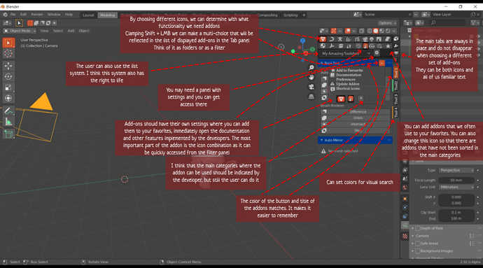
My concept is based on the fact that instead of a large amount of textual information, we must provide the user with visual images and color spots in order to develop quick memorization and search for the desired add-on.


We have a section with permanently fixed tools, this is the section Item, Tool, View that we are used to. They can be displayed as icons or, as usual, as text. The most important thing is that they are always fixed and do not change from context.
We have folders where addons are located by functionality. The developer specifies which folder to place the addon initially. Subsequently, the user can also specify where the addon should be located.
It may happen that the developed add-on is not included in functionality in any folder, I think for such cases it should be possible to create an additional folder.
The most important thing in my concept is that the addon is not only located in one folder, it can be linked to other folders. And in this case, I assume that the user can make a selection of folders in a row (in this context, these will be categories), that is, by selecting the mesh icon and then using the shift key the curve icon, for example, we quickly find a set of tools for converting the mesh to curves and back. The most convenient thing is that the combinations of categories that need to be selected to find the desired add-on can be configured independently and used intuitively.
In this case, we sort of filter addons by the functions we need every time. The combinations can be very different.
In different editing modes, different types of folders can be used, which in their meaning are suitable for this mode.
In addition, you can use ready-made lists with the addons indicated there.
Also, I think it’s a good idea to make a bunch that the add-on buttons on the panel should be able to set the color associated with the add-on title (you can see it more clearly in the provided image).
You ask me, what about the addons that need to be pinned to the n-panel? Yes, I do not know a normal solution for this issue, but I think it is interesting to discuss it. Thanks to everyone who read to the end. I apologize to whom I took the parts of the layout, the UI artist from me is so-so. Write your thoughts.
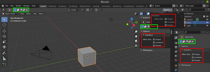
Why I don’t like N panel for addons, because if we want to be View or Item panel expanded, then the space for addons panel will be minimum.
But if we would have float window like in my design, we able to choice where it need to be right now and move it to other location if needed to not cover 3d view in that location.

Also about icons “By choosing different icons…”, I think it only make UI more unreadable. But making own list for specific addons make it more usable. It’s only my IMHO.

I could live with Alberto’s tab filtering. Seeing I have many tabs. I don’t like it when they bunch up and I can’t read them. The only way I work-around this is I have to use workspace filters. Each workspace has different add-ons based on function. Thus I can keeps add-on tabs to a minimum.

I tried this add-on. It ONLY works across all workspaces and it doesn’t work on individual workspaces with different filters. It will only work if you have around a dozen add-ons or less. Even though you can bunch add-ons onto tabs, it only works well if you DON’T split your workspaces, and your 3d viewport editor DOESN"T still crunch the tabs. Chipp made a great stab at this. But it is not up to 3rd parties to try and fix this Blender issue… It is Blender that needs to fix this soon. People are getting frustrated by it.

I could live with Alberto’s tab filtering. Seeing I have many tabs. I don’t like it when they bunch up and I can’t read them. The only way I work-around this is I have to use workspace filters. Each workspace has different add-ons based on function. Thus I can keeps add-on tabs to a minimum.

I think this solution is great :)) Thank you

  1. For me ı think the solution is to have a new window called ‘’ Addon Manager’’ where you can click a addon and use it or change addon you use or pin one addon to that window just like node editor window or other windows. In this new workspace window, addons will have icons,not names and they will be on top horizontally aligned stacked tabs instead of vertical side tabs nowadays where we had to read names with hardship. This way sidepanel can be used for editing properties or camera only just like before

  2. it was more logical before when the creation was done on the T (TOOL BAR) while the Properties for changing created items were on the left N Properties. So Another idea is to extend toolbar on the left just like before by having different tabs
    Tools
    Create Primitive
    Addon 1
    Addon 2

And on the NProperties some addons can be put for adding extra functionality or properties for cameras etc. rather than creation of things

1 Like

My solution to the sidebar panel design ?

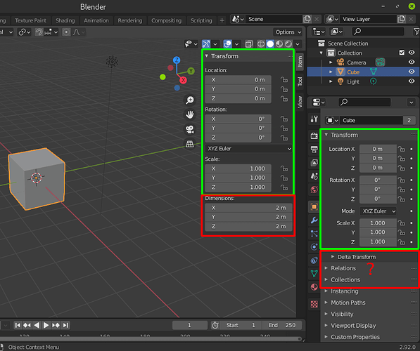
Remove it altogether, and merge it’s components with the properties editor.

Right now half of what is displayed on the sidebar panel is redundant.

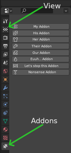
As for the “View” and “Add-ons” tabs they can just get their own property editor icon like this:

Burrowing the physics tab layout for the add-ons tab as the closest implementation to what I have in mind.

4 Likes

No, addons are additional tools, not properties.

2 Likes

Yes, addons are additional tools, not properties.

agreed… i read that suggestion and physically recoiled lol.

Easy, make an addon specific “editor” to host all addons related stuff, and let the user control it’s placement like any other blender editor.

1 Like

sounds like your idea is to sweep the mess under the carpet

1 Like

Not sure I’m following here.

Well- unless I’ve misread it, your idea is to take virtually everything that’s in the N panel, and then move it to another spot that is more obscure. It’s not more organized, it’s not easier to use, it’s just harder to see. Hence, sweeping the mess under the carpet.

My idea is the exact opposite, take what’s already is hidden behind the N shortcut and make it more visible in the only editor that is always visible no matter what workspace you switch to.

In my experience with all kinds of software, there is always a plugin/addon menu/tab/section where you can pick from, in Blender, plugins are everywhere, whenever you activate one, you have to look “where” is it, the more you add, the more it becomes a game of hide and seek.

Making a dedicated Addon tab/editor/menu is in my opinion the only solution, once that part is done, organizing them “visually” becomes less difficult.

1 Like

we’re just going to have to agree to disagree here :slight_smile:

Tabs Management tab was already suggested (as far as I remember)

any news?
hate this N panel

3 Likes

Currently method use Simple Tabs Addons …

2 Likes