Similar to the approach mockup up by @LudvikKoutny, here’s a further tweak:
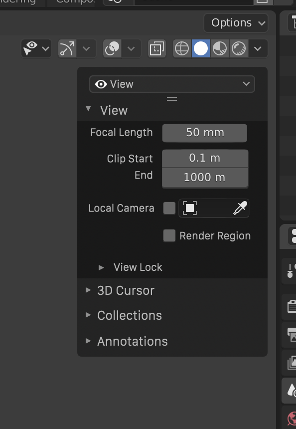
This removes the need for vertical text, which also add an annoying vertical bar all the way down the view, which push the controls further into overlapping with the viewport.
Part of this concept is that the user would be able to expand open the menu to reveal a list:
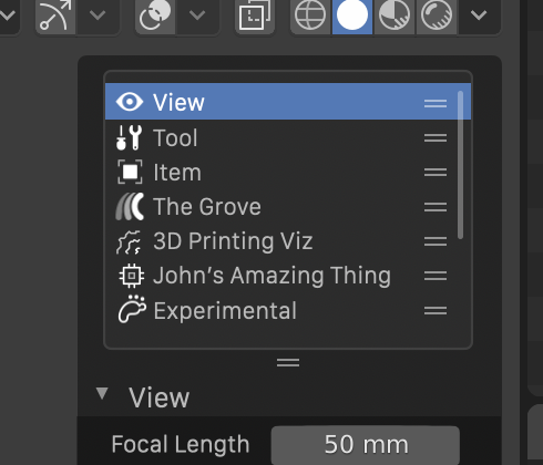
This list could be re-ordered by the user, so if he/she uses a few things mainly, they can be moved to the top of the list.