@lsscpp Sorry for that joke, caused by your formulation it somehow suggested itself. I’m pretty sure William will be able to give you the answer you’re looking for.
Considering that there is no way to close it by mouse on the panel mock-up image I’m inclined to guess that the only way to open and close it will be from the header menus. And the shortcut.
I am 99% sure it will work the same way as tool panel. There will be invisible border line you can click drag to one side to expand the panel further or towards the edge of the viewport to collapse it. Once collapsed, it will show the tiny arrow button as usual, to let user know there’s a sidebar available.
When we are it it, I guess it could be nice to have some sort of highlight of the drag-able resize area when the user hovers over it. But other than that, there’s no reason mouse based opening and closing would not work the exactly same way it does now.
It will be optional to expand it, and it will be expandable by custom amount of rows, with ability to scroll up and down.
This is an extreme example with excessive UI scaling. And even in this case it will work well if you simply don’t expand the tab dropdown.
Is the only way to have the same functionality that actually. Expand the menu.
Yes, it will take one more click, but it’s not like those panels are being switched that often.
That being said, I personally do not mind the vertical tabs at all. They may be harder to read, but once person reads them once, they usually save it in their memory in form of the text silhouette rather than having to re-read it every time. So in my original proposal, the vertical tabs stayed.
I use a lot in my workflow in some special moments. Specially in UV editor where I change between texel density, textools, UVPackMaster,…
I don’t have any against the panel idea, I defend myself, but the menu are various extra step that consume a lot of space when we have better UI solutions in any software for that problem without add a new concept of interface in blender that we don’t have in any other program.
I think it should be avoided because it only solves one problem by generating several more and there are solutions that only solve problems without generating new problems
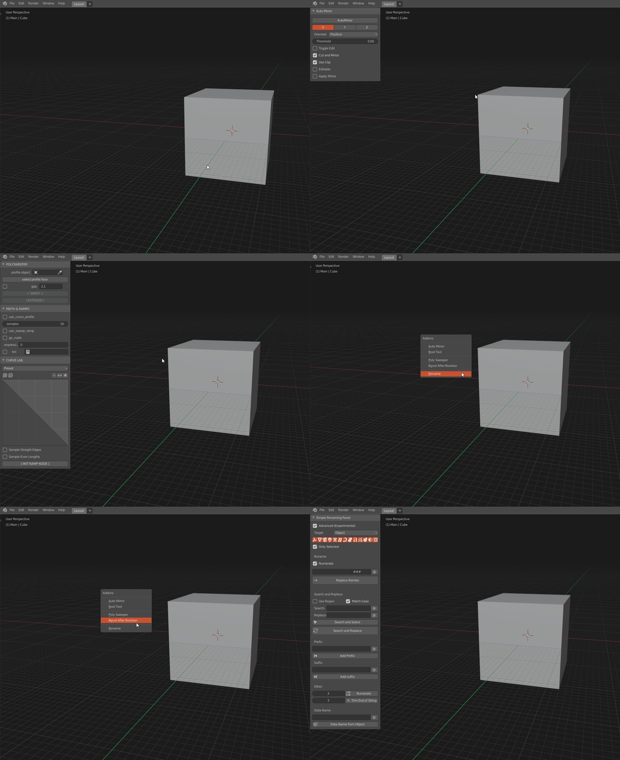
Is that an addon that lets you have all those panels in the N-shelf?
I suppose, I don’t know the addon that he used to show the problem but I remember some addons with similar behaviour
Aren’t you guys planning to bring back the tabs to the toolbar? at least that’s what this task says.
Move sidebar panel to the toolbar side, so the toolbar becomes tabbed with one tab being the active tools.
https://developer.blender.org/T68885
If i understood it correctly.
Combining it with your idea that means we’ll have two tabs, one for the siderbar & one for the toolbar both in one side, this leaves an entire side empty for users custom panels, so basically bringing back the 2.7 sidebars with just better tabs for the default ones.
So there’s a lot of suggestions regarding this menu in the big paper-cuts thread (and other threads here). Will they now be reviewed? Do you have a method of finding them even, since this forum doesn’t use tags? Or will you only look at right-click select? Will suggestions posted in the task thread itself take priority? Will the influences of user feedback be documented anywhere?
Looks more cleaner and readable I like it !
Actually I’m using a personal method (pie menu editor addon based) which is fast also but you can’t select more than one addon at time, until now I never had to do so but it can be interesting in some case.

Hope your proposal will come soon or something better if any ?
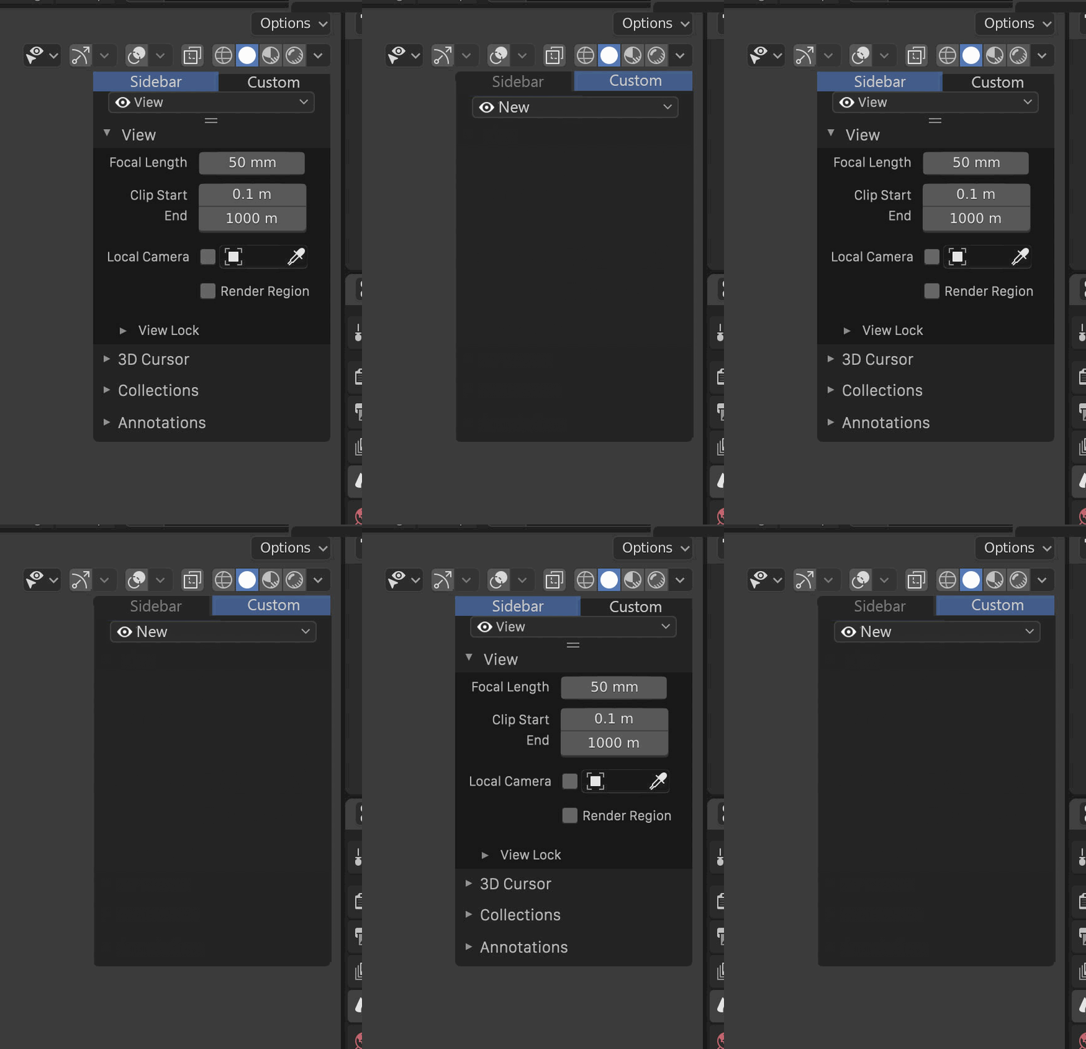
I made a quick mockup for another idea, basically having only two sidebar “header” tabs.
One for the regular sidebar and one for custom, it’ll probably take a bit of space but it’ll give more flexibility as you can put more addons there or when there will be the possiblity to pin or drag & drop favourite panels and with the dropdown list added it’s even more flexibility ,similar to what other Softwares like Maya have.

PS; we could even add icons to both tabs so when the panels size is small only the icons shows up, something like how the toolbar does it.
The problem here is that even with vertical layout, there was sometimes not enough space to fit all the tabs in. With horizontal tabs, the whole thing would become overcrowded even with 3-4 default tabs and no addons installed.
My idea is not to have more than 2 vertical tabs (columns), and combined with William’s idea of a dropdown list then it becomes much more extensible than before.
Imo this is better than just one column and a long list, you hit two birds in one place.
Hi.
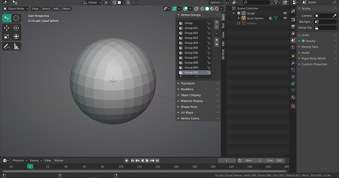
As some of you already mentioned it, the real issue here is not to make the N panel prettier, but to find a solution for this sidebar that can become vertically cluttered by tabs, especially if the user has activated many add-ons.
As you already know, an add-on is not simply displayed in a tab, but also in an expandable drop-down menu, some kind of “container”. Some addons sometimes have many of them.
Since there is currently no real solution (at least not yet) to fix this “N panel tab clutter”, I decided for the last weeks, to contact several addon developers to ask them if they’d agree to add an option (in the add-on preferences) to let users customize the location of their add-on. …To let users choose where they want it to be placed.
The overall response has been really positive and most of them consented to add this option.
For the moment, I have asked about 50 developers to add this option (some devs have created several add-ons).
- 15 devs implemented the option
- 11 devs added this option on their todo list
- 23 devs haven’t answered me yet
- 1 dev refused to add the option (preferring the solution to come from Blender itself)
This particular thread IS about the look of the sidebar panel though. That being said, I think the main reason for the sidebar clutter is that Blender’s python API still does not allow addon developers to implement addons in form of custom editors or custom tabs in the Properties editor. That would help addon developers a lot in finding better place to put their addons in. Right now, the sidebar has became a kitchen sink for everyone to throw their addon in.
Hi.
This particular thread IS about the look of the sidebar panel though.
There would be no point of redesigning the “sidebar panel” without fixing this annoyance: the “tab clutter”.
IMO, the right location for add-ons is where they currently are: in the N Panel.
I don’t see how, allowing add-on devs to place their add-ons in the Properties Editor would fix the clutter. It would just move the clutter in the Properties Editor.
The N Panel is a better suited area because add-ons are very accessible there, being very close to the center of the viewport: the distance between the scene and the N Panel isn’t that far, which is good for a speed workflow.
I don’t think that any improve better the look of the sidebar that talk with addons developer to make optional the tab in the sidebar. It’s more improvement that any other decision.
And some of us want to use the viewport without a properties editor. Do you know that we use multimonitor, fullscreen mode, workspaces,…?
