For some addons, certainly. And it certainly will be too much to contain them all in there as is. But there’a bound to be addons better fit elsewhere too.
Add-ons can already be placed in expandable drop-down menus in the Properties Editor (Proxify, Animated Render Border, …) but indeed, not as tabs.
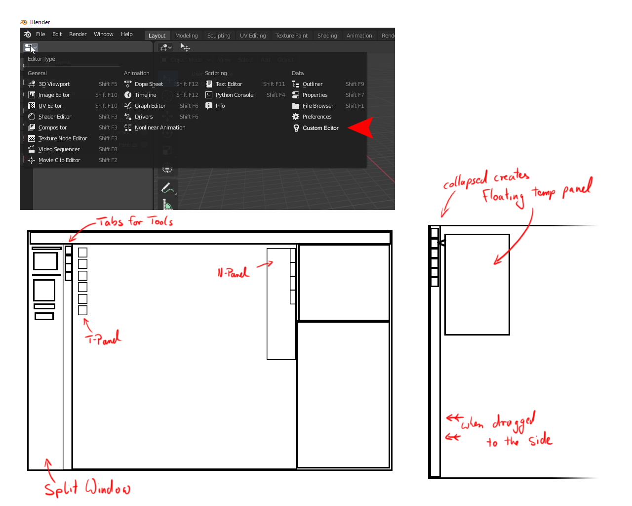
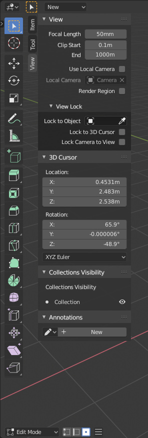
Just to make sure that I am on the same page wit everybody else, here. Currently the N-Panel is supposed to be the place where all the Addons are going to be instead of the T-Panel where they used to be in Blender 2.79, correct?
Since there has been a discussion about the T-Panel in another thread I was wondering if an additional empty shelf for custom editors would be really such a bad idea. Obviously there is the danger that addons and everything else could get thrown into it again to create the kitchen sink phenomenon (which is to be avoided).
Yet 3D programs with as many addons as Blender are a large thing and the UI needs to go somewhere.
Also I am not sure if I’m comfortable with only one panel that has to stick on the right side.
I mean - I do like William’s proposal. The drag and drop access seems like a good thing.
But I also do feel like the N-Panel alone could be overburdoned by all the things that are going to be thrown at it. And we probably do need some place to stick additional interfaces, don’t we?
In reality I do 4-5 proposals different. I made the last only in response to this thread and I can’t find the other proposals.
The problem is known
-
There are no tabs where you can put addons that can enter other categories, such as create, edit,… where the developers can put things.
-
The T-shelf was removed, which allowed to divide the viewport in two easily distinguishable panels and more space for tabs
There are many ways to solve the problem. The right one in my opinion is to return the T-shelf to its place of origin with some predefined categories where the developers can put tools without having to create their own tabs as a side effect in 2.79. And to separate the addons without categorizing, in the same tab bar or that only use the sidebar the addons with own tabs. It would be a very good solution, tools on one side, addons on the other, so we can make a better mind map of the program, as in 2.79. Right now the tools are spread all over the interface for no reason.
But that’s at a hierarchy level, at a technology level there are also many ways to fix it, icons, lists, tabs that can be without selecting anything, buttons instead of tabs…
The problem is the same as always, with the movement of everything to the sidebar. And forcing it to be on the right any solution that is adding icons next to the icons of the property editor does not look as good as on the left of the viewport. With the sidebar on the left, this problem would disappear.
2 Likes
I like the idea of decoupling addons from others things (view,transform,etc) and that is how I’m doing it currently with my custom pies. Having addons on the left and coupled with the William’s proposal it can be interesting. But where to put the active tools in this case ? Personally I don’t use them but I guess that the devs would not want to hide them or move them to the bottom of the 3d view ?
We have a hard design task here🤯
I kind of agree to this. For now the T-Shelf is mostly intresting for the more painterly workspaces like sculpting and drwing or painting vertex colors or -weights.
When the proposals for using the t-shelf as a toolbox were introduced initially I kind of thought it would go more ito Modo’s direction of offering a quick access to several tools and a way to expand or add tools yourself. Basically I thought that the tools that were already there would just be expanded and clarified better by clearer Icon and color coding.
The way that the tools are very limited and especially fixed by working mode does feel a little wasteful.
I am totally fine with cleaning up the N-Panel and all the discussions around it so far. I do not have any better input for the tabs or structuring proposals right now. All of you seem to have put much more thought into it.
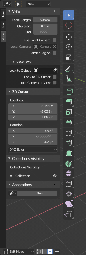
It is werd, that Item Tool and View are also incorporated in the Sidebar. Those are not plugins and some of these need to be either accessed or checked frequently. During work traveling with the mouse to switch between vital areas should be minimzed as often as possible, though.
I kind of fear that it would become a bit like the tool settings - changing the settings for the creation of a new primitve or invoked tool on te lower left of the screen: having to move the cursor and focus away from the object and to the lower left of the screen, then having to open/expand the settings panel and having a disconnect beween looking at the object itself and the values. That is always a slight pain to work with. And I completely admit that I do not know all the shortcuts to every tool by heart or think I need to (if there even are shortcuts for everything).
If we don’t bring back the T-Panel we could still offer a secondary, customizable toolshelf:
4 Likes
No, at least some of the things that used to be in the T panel should actually be converted into tools and be in the tool palette/bar. Some that used to be buttons in the T panel should be menu options per each of those previous buttons, categorized appropriately. etc.
The properties panel should only really be for properties, under the current paradigm it would still result in a lot of add-on tabs though.
1 Like
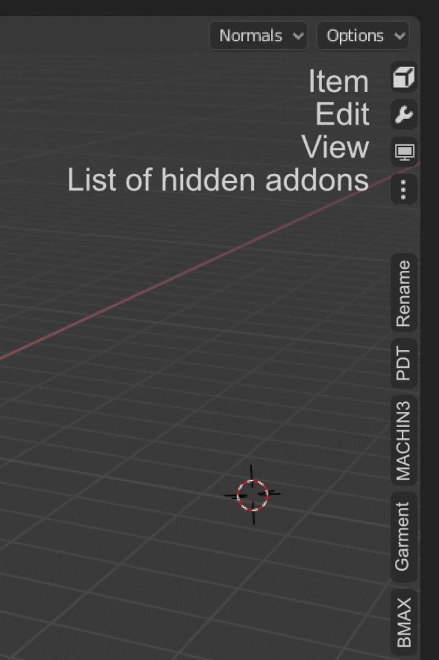
Another idea:
This uses a few concepts from previous proposals. Here there are two drag zones. One is at the end of the icons, and one is at the end of the panel. The icon drag zone expands to show labels. The labels would also be displayed with tooltips when it’s not expanded of course.

I didn’t bother changing the icons, I think I have better things to do : P

If there are too many tabs the list would scroll, just like in the properties editor. And the text should probably be smaller too, so if wouldn’t have to be as wide.
Pros
- It keeps the tab concept for interaction
- Uses the same system as the properties editor tabs
- Quick interaction with buttons already exposed
Cons
- Somewhat confusing interaction with two drag points
- Addon-created tabs need icons (like other icon proposals)
- Labels would probably be hidden by default
A note about the last con
We already use only icons for the tabs in the properties editor, so clearly this concept works. I would argue that withe the proper icons the tabs would be even more clear and quicker to read than with text.
7 Likes
I experimented a bit over the weekend to see how feasible it’d be to let users ‘dock’ panels in the header via a set of configurable popover buttons. It didn’t take much to get a bare-bones system together:
It doesn’t solve the issue of sidebar crowding, but a more polished version might alleviate some of the pressure.
1 Like
A custom pop-over instead of yet another tab in the properties editor is certainly an alternative that add-on developers can use, but it is an option for them already and it has as much of a potential to become overcrowded and potentially even worse.
There’s a huge difference between a bar and a popover. Popover is something that stays visible only as long as the mouse cursor is over, and disappears as you click in the viewport. That’s completely different to a sidebar which stays available all the time. Most of the addons are in the sidebar because you need it constantly available as you work. Like a tree generator for example, you don’t want your tree generator panel to disappear every time you click inside a viewport to turn it around and look at the tree from a different side before continuing to tweak the settings. Or even when you just accidentally move the mouse cursor away from the popover.
Futhermore, popovers will end up covering important parts of your viewport while sidebar is always on the side, leaving your viewport clear.
Anyone who is suggesting replacement of sidebar with the popovers really has no clue what’s going on.
5 Likes
This would fail too. You’ve intentionally resized the outliner above the properties panel because you yourself have realized the issue. If you had a cluster of icons for the viewport sidebar right next to the cluster of icons of the properties editor, it would because quite messy and confusing very fast.
1 Like
It’s easy to solve, go back the sidebar to the left.
And the toolbar on the right?
Main toolbar on the right isn’t in any software as far as I can tell, but most of all this doesn’t sound as a good idea, if it’s just to solve the icons-next-to-icons issue.
It would be a patch over a wound that would expose a bigger wound. My 2c
Could be both in the left. The problem is the transparent background, that sometimes you can have an addon with two buttons and the active tool bar. Other idea could be that Active tools be a tab inside sidebar, like originally.
That was a problem that we told when the properties editor used vertical tabs, that made impossible to use vertical tabs where we really needs.
2 Likes
mmm… Looking at those mockups I can’t see an optimal solution. I tend to lean more towards this solution https://developer.blender.org/T76023 that doesn’t overcrowd one side or the other and will lead to a layout like the well-set adobe family default, which I please: thin Toolbar on the left, wider panels on the right, both hideable. (let’s forget the fact that adobe lets you put panels everywhere you want…)
Optimal solution to please everyone, would be being able to choose to show whatever in either L/R side. This already happens for topbar and optionbar (up or down at will), so why not?
Let’s not get confused. I don’t see how you can say it’s a solution that pleases everyone when it doesn’t please anyone who wants direct access to the tabs and in the same thread there are a dozen proposals asking not to take that direction because of obvious problems.
Honestly, between not liking aesthetics, and others saving 1000 clicks a day, I prefer to save the clicks.
What’s more, nobody haven’t even thought about how unusable that system will be the moment you have 40 plugins and have to go looking for them in a list that disappears as soon as the mouse goes out of its limits.
2 Likes
“Pleases everyone”: I meant the left/right positioning of sidebar and toolbar. Just that 
For the rest, rereading the whole task (T76023) I’m now quite fan of the layout proposed by Alberto (is that you??) ⚓ T76023 Sidebar changes. A very important feature from my pov would be to have the sidebar open-close with a click on the tab/icon, instead of having panels+tabs completely hidden.
I think that you must to read the proposals before told that you don’t like, because my proposal have that idea.
Also that is showed in the same images of the proposal
2 Likes
One of the main problems with the N-Panel IMO is still that it includes View, Tool and Item which are very frequently used Tabs. As I’ve learned only a few weeks ago - the hotkey for knife (k) invokes the modal, not the tool itself. It has a selection of options already set when activated and consequently does not even show all the options in the Tool-Palette.
Now if the Tool Tab is supposed to show all the options for an active tool we already have a huge travel distance with the cursor. Left (t-panel) to invoke the tool - whole way to the right (n-panel) to set the options and if the N-Panel holds all the options for plugins we also have a tab to switch in addition.
I hope this is not the intended way of working but it sounds an awful lot to travel as is and add many tabs on top of that. °__°